Chapter 28: Using Menus
Menus are perhaps the oldest idioms in the GUI universe—revered and surrounded by superstition and lore. We accept without question that traditional menu design is correct because so many existing programs attest to its excellence. But this belief is like snapping your fingers to keep the tigers away. There aren't any tigers here, you say? See, it works! That said, menus as currently structured aren't going away any time soon. This chapter discusses both problems with menus and how to use them appropriately.
Standard Menus
Most every GUI these days has at least a File and an Edit menu in its two leftmost positions and a Help menu to the right. The Windows, Macintosh, and even the Motif style guides state that these File, Edit and Help menus are standard. You might also think that this de facto cross-platform standard is a strong indication of the proven correctness of the idiom. Wrong! It is a strong indication of the development community's willingness to blithely accept mediocre design, changing it only when the competition forces us to do better. The File menu's name is the result of implementation model thinking about how our operating systems work. The Edit menu is based on a very weak clipboard. And the Help menu is frequently the least helpful source of insight and information for the befuddled user.
These menu conventions can trap us into designing weak user interfaces. The menus on most of our programs may be familiar, but are they good ways to organize functions? Selections like View, Insert, Format, Tools, and Options sound like tools and functions, not goals. Why not organize the facilities in a more goal-directed way?
Can't you hear the programmers shouting, "How can you change something that has become a standard? People expect the File menu!" The reply is a simple one: People may get used to pain and suffering, but that is no reason to perpetuate them. Users will adapt without significant problems if we change the File menu so that it delivers a better, more meaningful model. Arbitrarily changing the menu items without considering user goals would indeed be the big mistake these programmers worry about.
The key to figuring out a reasonable menu structure goes back to understanding your users' mental models. How do they think about what they are doing? What terms make the most sense to them? If your users are computer-savvy, and you're designing a productivity application, it might make sense to stick to recognizable standards, at least at the top level. If, however, you're designing an application for children or for a specialized niche, the structure might very well need to be different.
All that said, there is obviously still a place for the standard menu structures. The rest of this chapter provides some practical advice for those instances where you need to design "inside the box" of standard menus.
The File menu
In Chapter 13 we described a better File menu. Although we removed the save command from the menu, we shouldn't dispense with the function entirely. The program should save automatically, but allow users to save on demand as well. The Save function doesn't necessarily have to overwrite the original copy on disk the way it usually does now. It just needs to save the data in an easily recoverable way that is independent of and invisible from within the application.
If we change from a file-centric view to this document-centric view, we should also change the name of the menu from File to Document.
The Most Recently Used (MRU) list on Microsoft applications is an excellent shortcut idea. You can see it in Figure 28-1.
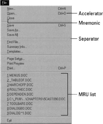
Figure 28-1: The File menu from Microsoft Word shows off the excellent Most Recently Used (MRU) list. In Chapter 13, you saw how to reconstruct the first six items so that they better reflect the user's mental model, rather than following the technically faithful implementation model as shown here.
The Edit menu
The Edit menu contains facilities for cutting and pasting and importing and exporting. Don't use it as a catch-all for functions that don't seem to fit anywhere else. Instead, gather them up into an Options or Preferences dialog that is accessible from the Tools menu.
The Windows menu
The Windows menu is for arranging, viewing, and switching between multiple windows opened by the program. It can also offer tools for laying out multiple documents on-screen simultaneously. Nothing else should go on this menu.
The Help menu
Today's Help menus are poorly designed reflections of poor help systems. We'll talk about help in general in Chapter 35, but it should be mentioned here that the Help menu sorely needs an item labeled Shortcuts that would explain how to go beyond relying on the menus. It could offer pointers on more powerful idioms such as accelerators, toolbar buttons, and direct manipulation idioms.
|
|
EAN: N/A
Pages: 263