Using the Mouse
When you mouse around on the screen, there is a distinct dividing line between near motions and far motions: Your destination is either near enough that you can keep the heel of your hand stationary on your desktop, or you must pick up your hand. When the heel of your hand is down and you move the cursor from place to place, you use the fine-motor skills of the muscles in your fingers. When you lift the heel of your hand from the desktop to make a larger move, you use the gross motor skills of the muscles in your arm. Gross motor skills are no faster or slower than fine motor skills, but transitioning between the two is difficult. It takes both time and concentration, because the user must integrate the two groups of muscles. Touch-typists dislike anything that forces them to move their hands from the home position on the keyboard because it requires a transition between their muscle groups. For the same reason, moving the mouse cursor across the screen to manipulate a control forces a change from fine to gross and back to fine motor skills.
Clicking the button on the mouse also requires fine motor control—you use your finger to push it—and if your hand is not firmly planted on the desktop, you cannot click it without inadvertently moving the mouse and the cursor. Some compromise is possible between fine and gross motor control for the movement aspect of working a mouse. However, when it comes time to actually click the button—to pull the trigger—the user must first plant the heel of his hand, forcibly going into fine-motor control mode. To manipulate a control with a mouse, the user must use fine motor control to precisely position the cursor over the check box or push-button. However, if the cursor is far away from the desired control, the user must first use gross motor control to move the cursor near the control, then shift to fine motor control to finish the job. Some controls compound the problem with their interactions (see Figure 21-1).
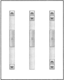
Figure 21-1: The familiar scrollbar, shown on the left, is one of the more difficult-to-use GUI controls. To shift from scrolling up to scrolling down, you must transition from the fine motor control required by clicking the button to the gross motor control you need to move your hand to the opposite end of the bar. You then change back to fine motor control to accurately position the mouse and click the button again. If the scrollbar were modified only slightly, as in the center, so that the two buttons were adjacent, the problem would go away. (Macintosh scrollbars can be similarly configured to place both arrow buttons at the bottom.) The scrollbar on the right is a bit visually cluttered, but has the most flexible interaction. For more on scrollbars, see Chapter 26.
It should be obvious at this point that any program that places its clickable areas more than a few pixels apart is inviting trouble. If a control demands a click nearby followed by a click far away, the control is poorly designed. Yet the ubiquitous scrollbar is just such a creature. If you are trying to scroll through a document, you click the down arrow several times, using fine motor control, until you find what you are looking for; but you are likely to click it one too many times and overrun your destination. At this point you must click the up arrow to get back to where you want to go. Of course, to move the cursor to the up arrow, you must pick up the heel of your hand and make a gross-motor movement. You then place the heel of your hand back down and make a fine-motor movement to precisely locate the arrow and keep the mouse firmly positioned while you click the button.
Why are the arrows on scroll-bars separated by the entire length of the bar itself? Yes, it looks visually more symmetrical this way, but it is much more difficult to use. If the two arrows were instead placed adjacent to each other at one end of the scrollbar, as shown in Figure 21-1, a single fine-motor movement could change the direction of the scroll, instead of the difficult dance of fine-gross-fine. Microsoft and mouse manufacturers have made an effort to address this problem in hardware by adding a scroll wheel to the mouse, located between the left and right button. Scrolling this wheel forward or back scrolls up or down, respectively, in the active window (if the application supports the scroll wheel).
Not only do the less manually dexterous find the mouse problematic, but also many experienced computer users, particularly touch-typists, find the mouse difficult at times. For many data-intensive tasks, the keyboard is superior to the mouse. It is frustrating to have to pull your hands away from the keyboard to reposition a cursor with the mouse, only to have to return to the keyboard again. In the early days of personal computing, it was the keyboard or nothing, and today, it is often the mouse or nothing. Programs should fully support both the mouse and the keyboard for all motion and selection tasks.
| DESIGN TIP | Support both mouse and keyboard use for motion and selection tasks. |
A significant percentage of computer users have trouble with the mouse, so if we want to be successful, we must design our software in sympathy with them as well as with expert mouse users. This means that for each mouse-idiom there should be at least one non-mouse alternative. Of course, this may not always be possible. It would be ridiculous to try to support some very graphic-oriented actions in a drawing program, for example, without a mouse, but these examples are in a clear minority. Most business or personal software lends itself pretty well to keyboard commands. Most users will actually use a combination of mouse and keyboard commands, sometimes starting commands with the mouse and ending them with the keyboard and vice versa.
How many mouse buttons?
The inventors of the mouse tried to figure out how many buttons to put on it, and they couldn't agree. Some said one button was correct, whereas others swore by two buttons. Still others advocated a mouse with several buttons that could be clicked separately or together so that five buttons could yield up to 32 distinct combinations. Ultimately, though, Apple settled on one button for its Macintosh, Microsoft went with two, and the Unix community (Sun Microsystems in particular) went with three.
One of the major drawbacks of the Macintosh is its single-button mouse. Apple's extensive user testing determined that the optimum number of buttons for beginners (who wasn't, back in 1984?) was one, thereby enshrining the single-button mouse in the pantheon of Apple history. This is unfortunate, as the right mouse button usually comes into play soon after a person graduates from beginner status and becomes a perpetual intermediate. A single button sacrifices power for the majority of computer users in exchange for simplicity for beginners.
There are fewer differences between the one- and two-button camps than you might think. The established purpose of the left mouse button is tacitly defined as "the same as the single button on the Macintosh mouse." In other words, the right mouse button is widely regarded as an extra button, and the left button is the only one the user really needs. This statement is no longer true today, however, with the evolution of the right-button context menu.
Even though many of the Unix workstation providers chose to provide a three-button mouse with their systems, the middle button is seldom used and is often claimed to be "reserved for application use." Needless to say, there are few applications that ever use it.
The left mouse button
In general, the left mouse button is used for all the major direct-manipulation functions of triggering controls, making selections, drawing, and so on. By deduction, this means that the functions the left button doesn't support must be secondary functions. Secondary functions are either accessed with the right mouse button or are not available by direct manipulation, residing only on menus or the keyboard.
The most common meaning of the left mouse button is activation or selection. For controls such as a push-button or check box, clicking the left mouse button means pushing the button or checking the box. If you are clicking in data, the left mouse button generally means selecting. We'll discuss this in greater detail in the next chapter.
The right mouse button
The right mouse button was long treated as nonexistent by Microsoft and many others. Only a few brave programmers connected actions to the right mouse button, and these actions were considered to be extra, optional, or advanced functions. When Borland International used the right mouse button as a tool for accessing a dialog box that showed an object's properties, the industry seemed ambivalent towards this action although it was, as they say, critically acclaimed. Of course, most usability critics have Macs, which have only one button, and Microsoft disdains Borland, so the concept didn't initially achieve the popularity it deserved. This changed with Windows 95, when Microsoft finally followed Borland's lead. Today the right mouse button serves an important and extremely useful role: enabling direct access to properties and other context-specific actions on objects and functions.
The middle mouse button
Although application vendors can confidently expect a right mouse button (except on the Mac), they can't depend on the presence of a middle mouse button. Because of this, no vendor can use the button as anything other than a shortcut. In fact, in its style guide, Microsoft states that the middle button "should be assigned to operations or functions already in the interface," a definition it once reserved for the right mouse button.
The authors have some friends who do use the middle button. Actually, they swear by it. They use it as a shortcut for double-clicking with the left mouse button—a feature they create by configuring the mouse driver software, trickery of which the application remains blissfully ignorant.
Pointing and clicking with a mouse
At its most basic, there are two atomic operations you can do with a mouse: You can move it to point at different things, and you can click the buttons. Any further mouse actions beyond pointing and clicking will be made up of a combination of one or more of those actions. The vocabulary of mouse actions is canonically formed and this is a significant reason why mice make such good computer peripherals.
Mouse actions can also be altered by using the meta-keys: Ctrl, Shift, and Alt. We will discuss these keys later in this chapter. The complete set of mouse actions that can be accomplished without using meta-keys is summarized in the following list. For the sake of discussion, we have assigned a short name to each of the actions (shown in parenthesis).
-
Point (Point)
-
Point, click, release (Click)
-
Point, click, drag, release (Click and drag)
-
Point, click, release, click, release (Double-click)
-
Point, click, click other button, release, release (Chord-click)
-
Point, click, release, click, drag, release (Double-drag)
Each of these actions (except chord-clicking) can also be performed on either button of a two-button mouse. An expert mouse user may perform all six actions, but only the first five items on the list are within the scope of normal users. Of these, only the first three can be considered reasonable actions for mouse-phobic users. Windows and the Mac OS are designed to be usable with only the first three actions. To avoid double-clicking in either OS, the user may have to take circuitous routes to perform his desired tasks, but at least the access is possible.
POINTING
This simple operation is a cornerstone of the graphical user interface and is the basis for all mouse operations. The user moves the mouse until the on-screen cursor is pointing to, or placed over, the desired object. Objects in the interface can take notice of when they are being pointed at, even when they are not clicked. Objects that can be directly manipulated often change their appearance subtly to indicate this attribute when the mouse cursor moves over them. This behavior is called pliancy and is discussed in detail later in this chapter.
CLICKING
While the user holds the mouse in a steady position, he clicks the button down and releases it. In general, this action is defined as triggering a state change in a control or selecting an object. In a matrix of text or cells, the click means, "Bring the selection point over here." For a push-button control, a state change means that while the mouse button is down and directly over the control, the button will enter and remain in the pushed state. When the mouse button is released, the button is triggered, and its associated action occurs.
| DESIGN TIP | Single-click selects data or changes the control state. |
If, however, the user, while still holding the mouse button down, moves the cursor off of the control, the push-button control returns to its unpushed state (though input focus is still on the control until the mouse button is released). When the user releases the mouse button, input focus is severed, and nothing happens. This provides a convenient escape route if the user changes his mind. The mechanics of mouse-down and mouse-up events in clicking are discussed in more detail later in this chapter.
CLICKING AND DRAGGING
This versatile operation has many common uses including selecting, reshaping, repositioning, drawing and dragging and dropping. We'll discuss all of these in the remaining chapters of Part V.
The scrollbar treads an interesting gray area, because it embodies a drag function, but is a control, not an object (like a desktop icon). Windows scrollbars retain full input while the mouse button is clicked, allowing users to scroll successfully without having the mouse directly over the scrollbar. However, if the user drags too far astray from the scrollbar, it resets itself to the position it was in before being clicked on. This behavior makes sense, since scrolling over long distances requires gross motor movements that make it harder to keep within the bounds of the narrow scrollbar control. If the drag is too far off base, the scrollbar makes the reasonable assumption that the user didn't mean to scroll in the first place. Some programs set this limit too close, resulting in frustratingly temperamental scroll behavior.
DOUBLE-CLICKING
If double-clicking is composed of single-clicking twice, it seems logical that the first thing double-clicking should do is the same thing that a single-click does. This is indeed its meaning when the mouse is pointing into data. Single-clicking selects something; double-clicking selects something and then takes action on it.
| DESIGN TIP | Double-click means single-click plus action. |
This fundamental interpretation comes from the Xerox Alto/Star by way of the Macintosh, and it remains a standard in contemporary GUI applications. The fact that double-clicking is difficult for less dexterous users—painful for some and impossible for a few—was largely ignored. The industry needs to confront this awful truth: Although a significant number of users have problems, the majority of users have no trouble double-clicking and working comfortably with the mouse. We should not penalize the majority for the limitations of the relative few. The answer is to go ahead and include double-click idioms, while ensuring that their functions have equivalent single-click idioms.
While double-clicking on data is well defined, double-clicking on most controls has no meaning (if you class icons as data, not controls), and the extra click is discarded. Or, more often, it will be interpreted as a second, independent click. Depending on the control, this can be benign or problematic. If the control is a toggle-button, you may find that you've just returned it to the state it started in (rapidly turning it on, then off). If the control is one that goes away after the first click, like the OK button in a dialog box, for example, the results can be quite unpredictable—whatever was directly below the push-button gets the second button-down message.
CHORD-CLICKING
Chord-clicking means clicking two buttons simultaneously, although they don't really have to be either clicked or released at precisely the same time. To qualify as a chord-click, the second mouse button must be clicked before the first mouse button is released.
There are two variants to chord-clicking. The first is the simplest, whereby the user merely points to something and clicks both buttons at the same time. This idiom is very clumsy and has not found much currency in existing software, although some creatively desperate programmers have implemented it as a substitute for a Shift key on selection.
The second variant is using chord-clicking to cancel a drag. The drag begins as a simple, one-button drag; then the user adds the second button. Although this technique sounds more obscure than the first variant, it actually has found wider acceptance in the industry. It is perfectly suited for canceling drag operations, and we'll discuss it in more detail in the next chapter.
DOUBLE-DRAGGING
This is another expert-only idiom. Faultlessly executing a double-click and drag can be like patting your head and rubbing your stomach at the same time. Like triple-clicking, it is useful only in mainstream, horizontal, sovereign applications. Use it as a variant of selection extension. In Word, for example, you can double-click in text to select an entire word; so, expanding that function, you can extend the selection word-by-word by double-dragging.
In a big sovereign application that has many permutations of selection, idioms like this one are appropriate. But unless you are creating such a monster, stick with more basic mouse actions.
Up and down events
Each time the user clicks a mouse button, the program must deal with two discrete events: the mouse-down event and the mouse-up event. With the lack of consistency exhibited elsewhere in the world of mouse management, the definitions of the actions to be taken on mouse-down and mouse-up can vary with the context and from program to program. These actions should be made rigidly consistent.
When selecting an object, the selection should always take place on the button-down. This is so because the button-down may be the first step in a dragging sequence. By definition, you cannot drag something without first selecting it, so the selection must take place on the mouse-down. If not, the user would have to perform the demanding double-drag.
| DESIGN TIP | Mouse-down over data means select. |
On the other hand, if the cursor is positioned over a control rather than selectable data, the action on the button-down event is to tentatively activate the control's state transition. When the control finally sees the button-up event, it then commits to the state transition.
| DESIGN TIP | Mouse-down over controls means propose action; mouse-up means commit to action. |
This is the mechanism that allows the user to gracefully bow out of an inadvertent click. In a push-button, for example, the user can just move the mouse outside of the button and the selection is deactivated even though the mouse button is still down. For a check box, the meaning is similar: On mouse-down the check box visually shows that it has been activated, but the check doesn't actually appear until the mouse-up transition.
The cursor
The cursor is the visible representation of the mouse's position on the screen. By convention, it is normally a small arrow pointing diagonally up and left, but under program control it can change to any shape as long as it stays relatively small: 32×32 pixels. Because the cursor frequently must resolve to a single pixel—pointing to things that may occupy only a single pixel—there must be some way for the cursor to indicate precisely which pixel is the one pointed to. This is accomplished by always designating one single pixel of any cursor as the actual locus of pointing, called the hotspot. For the standard arrow, the hotspot is, logically, the tip of the arrow. Regardless of the shape the cursor assumes, it always has a single hotspot pixel.
Pliancy and hinting
As you move the mouse across the screen, some things that the mouse points to are inert: Clicking the mouse button while the cursor's hotspot is over them provokes no reaction. Pliant objects or areas, on the other hand, react to mouse actions. A push-button control is pliant because it can be "pushed" by the mouse cursor. Any object that can be picked up and dragged is pliant; thus any directory or file icon in the File Manager or Explorer is pliant. In fact, every cell in a spreadsheet and every character in a text document is pliant.
When objects on the screen are pliant, this fact must be communicated to the user. If this fact isn't made clear, the idiom ceases to be useful to any user other than experts (conceivably, this could be useful, but in general, the more information we can communicate to every user the better).
| AXIOM | Visually hint at pliancy. |
There are three basic ways to communicate the pliancy of an object to the user: by static visual affordances of the object itself, by dynamically changing visual affordances, or by changing the visual affordances of the cursor as it passes over the object.
STATIC AND DYNAMIC VISUAL HINTING
Static visual hinting— when the pliancy of an object is communicated by the static visual affordance of the object itself—is provided by the way the object is drawn on the screen. For example, the three-dimensional sculpting of a push-button is static visual hinting because of its manual affordance for pushing.
Some visual objects that are pliant are not obviously so, either because they are too small or because they are hidden. If the pliant object is not in the central area of the program's main window and is unique-looking, the user simply may not understand that the object can be manipulated. This case calls for more aggressive visual hinting: dynamic visual hinting.
It works like this: When the cursor passes over the pliant object, it changes its appearance with an animated motion. Remember, this action occurs before any mouse buttons are clicked and is triggered by cursor fly-over only. A good example of this is behavior of butcons (icon-like buttons) on toolbars since Windows 98: Although the button-like affordance of the butcon has been removed to reduce visual clutter on toolbars, passing the cursor over any single butcon causes the affordance to reappear. The result is a powerful hint that the control has the behavior of a button, which, of course, it does. This idiom has also become quite common on the Web.
Active visual hinting at this level is powerful enough to act as a training device, in addition to merely reminding the user of where the pliant spots are.
CURSOR HINTING
Cursor hinting communicates pliancy by changing the appearance of the cursor as it passes over an object.
Most popular software intermixes visual hinting and cursor hinting freely, and we think nothing of it. For example, push-buttons are rendered three-dimensionally, and the shading clearly indicates that the object is raised and affords to be pushed; when the cursor passes over the raised button, however, it doesn't change. On the other hand, when the cursor passes over a window's frame, the cursor changes to a double-ended arrow showing the axis in which the window edge can be stretched. This is the only definite visual affordance that the frame can be stretched. Although cursor hinting usually involves changing the cursor to some shape that indicates what type of direct-manipulation action is acceptable, its most important role is in making it clear to the user that the object is pliant. It is difficult to make data visually hint at its pliancy without disturbing its normal representation, so cursor hinting is the most effective method. Some controls are small and difficult for users to spot as readily as a button, and cursor hinting is vital for the success of such controls. The column dividers and screen splitters in Microsoft's Excel are good examples, as you can see in Figure 21-2.
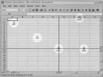
Figure 21-2: Microsoft Works Spreadsheet uses cursor hinting to highlight several controls that, by visual inspection, are not obviously pliant. The width of the individual columns and height of rows can be set by dragging on the short vertical lines between each pair of columns, so the cursor changes to a two-headed horizontal arrow hinting at both the pliancy and indicating the permissible drag direction. The same is true for the screen-splitter controls. When the mouse is over an unselected editable cell, it shows the plus cursor; and when it is over a selected cell, it shows the drag cursor. The addition of text to these cursors makes them almost like ToolTips.
In a broad generalization, controls usually offer static or dynamic visual hinting, whereas pliant (manipulable) data more frequently offers cursor hinting. We talk more about hinting in Chapter 23.
| DESIGN TIP | Indicating pliancy is the most important role of cursor hinting. |
WAIT CURSOR HINTING
There is a variant of cursor hinting, called wait cursor hinting. Whenever the program is doing something that takes significant amounts of time in human terms—like accessing the disk or rebuilding directories—the program changes the cursor into a visual indication that the program has become unresponsive. In Windows, this image is the familiar hourglass. Other operating systems have used wristwatches, spinning balls, and steaming cups of coffee. Informing the user when the program becomes stupid is a good idea, but the cursor isn't the right tool for the job. After all, the cursor belongs to everybody and not to any particular program.
The user interface problem arises because the cursor belongs to the system and is just "borrowed" by a program when it invades that program's airspace. In the pre-emptive multitasking world of Windows or Mac OS X, when one program gets stupid, it won't necessarily make other running programs get stupid. If the user points to one of these programs, it will need to use the cursor. Therefore, the cursor must not be used to indicate a busy state for any single program.
If the program must turn a blind eye and deaf ear to the user while it scratches some digital itch, it should make this known through an indicator on its own screen real estate, and it should leave the cursor alone. It can graphically indicate the corresponding function and show its progress either on its main window or in a dialog box that appears for the duration of the procedure, and offer the user a means to cancel the operation. The dialog box is a weaker idiom than drawing the same graphics right in the main window of the program.
Windows only displays the hourglass cursor within its own windows, which is logically correct. However, this means the program that is busy now offers no visual feedback of its state of stupidity. If the user inadvertently moves the cursor off of a busy program's main window and onto that of another running program, the cursor will revert to a normal arrow. The visual hinting is thus circumvented.
Ultimately, each program must indicate its busy state by some visual change to its own display. Using the cursor to indicate a busy state doesn't work if that busy state depends on where the cursor is pointing.
Input focus
Input focus is an obscure technical state that is so complex it has confounded more than one GUI programming expert.
Windows and most other desktop OS platforms are multitasking, which means that more than one program can be performing useful work at any given time. But no matter how many programs are running concurrently, only one program can be in direct contact with the user at one time. That is why the concept of input focus was derived. Input focus indicates which program will receive the next input from the user. For the purposes of our discussion here, we can think of input focus as being the same as activation: There is only one program active at a time. This is purely from the user's point of view. Programmers will generally have to do more homework. The active program is the one with the most prominent title bar.
In its simplest case, the program with input focus will receive the next keystroke. Because a normal keystroke has no location component, input focus cannot change because of it, but a mouse button click does have a location component and can cause input focus to change as a side effect of its normal command, a new-focus click. However, if you click the mouse somewhere in a window that already has input focus, an in-focus click, there is no change to input focus.
An in-focus click is the normal case, and the program will deal with it as just another mouse click, selecting some data, moving the insertion point, or invoking a command. The conundrum arises for the new-focus click: What should the program do with it? Should the program discard it (from a functional standpoint) after it has performed its job of transferring input focus, or should it do double-duty, first transferring input focus and then performing its normal task within the application?
For example, let's assume that two file system folder windows are visible on the screen simultaneously. Only one of them can be active. By definition, if folder Foo's window is active, it has input focus and visibly indicates this with a highlighted caption bar. Pressing keys sends messages only to folder Foo's window. Mouse clicks inside the already-active folder Foo window are in-focus and go only to folder Foo's window.
Now, if you move the mouse cursor over to the window for folder Bar and click the mouse, you are telling Windows that you want folder Bar's window to become the active window and take over input focus. This new-focus click causes both caption bars to change color, indicating that folder Bar's window is active and folder Foo's window is now inactive.
The question then arises: Should folder Bar's window interpret that new-focus click within its own context? Let's say that new-focus click was on a visible file icon. Should that icon also become selected or should the click be discarded after transferring input focus? If folder Bar's window was already active and you in-focus clicked on that same icon, the file would be selected. As a matter of fact, in real life, the file does get selected. The window interprets the new-focus click as a valid in-focus click.
Microsoft Windows interprets new-focus clicks as in-focus clicks with some uniformity. For instance, if you change focus to Word by clicking and dragging on its title bar, Word not only gets input focus, but is repositioned, too. Ah, but here is where it gets sticky! If you change input focus to Word by clicking on a document inside Word, Word gets input focus, but the click is discarded—it is not also interpreted as an in-focus click within the document.
Experts hold contradictory positions on the issue of interpreting new focus clicks, so neither policy is necessarily "right." Generally, ignoring the new-focus click is a safer and more conservative course of action. On the other hand, demanding extra clicks from the user contributes to excise. If you do choose to ignore the click, like Word and Excel do, it is difficult to explain the contradiction that a new-focus click in the window frame will be also used as an in-focus click, even though the interaction somehow feels right.
Meta-keys
Using meta-keys in conjunction with the mouse can extend direct manipulation idioms. Metakeys include the Control key, the Alt key, and either of the two Shift keys.
In the Windows world, no single voice articulated user interface standards with the iron will that Apple did for the Macintosh, and the result was chaos in some important areas. This is evident when we look at meta-key usage. Although Microsoft has finally articulated meta-key standards, its efforts now are about as futile as trying to eliminate kudzu from Alabama roadsides.
Even Microsoft freely violates its own standards for meta-keys. Each program tends "to roll its own," but some meanings predominate, usually those that were first firmly defined by Apple. Unfortunately, the mapping isn't exactly the same. Apples have a Clover key and an Apple key that roughly correspond to the Ctrl and Alt keys, respectively. Keep in mind that the choice of which meta-key to use, or which program to model your choices after, is less important than remaining consistent within your own interface.
Using cursor hinting to dynamically show the meanings of meta-keys is a good idea, and more programs should do it. While the meta-key is pressed, the cursor should change to reflect the new intention of the idiom.
| DESIGN TIP | Use cursor hinting to show the meanings of meta-keys. |
We will discuss the specific meanings and usage of the Control and Shift meta-keys and how they affect selection and drag and drop in Chapters 22 and 23.
|
|
 The Essentials of Interaction Design")
EAN: N/A
Pages: 263