How Tables Work in Frontpage
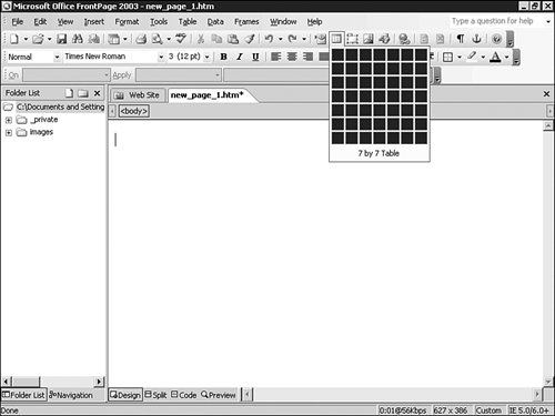
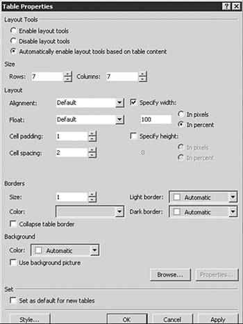
| The Insert Table button in the Standard toolbar, seen in Figure 10.5, lets you create a table x cells across by y cells down similar to other products in the Microsoft Office System. Table properties can be set through the Table Properties dialog box, shown in Figure 10.6. The Table Properties dialog box can be invoked by right-clicking anywhere within the table and selecting the Table Properties option from the menu. Figure 10.5. A 7 by 7 table is selected from the Insert Table button in the Standard toolbar.
Figure 10.6. The Table Properties dialog box lets you set almost all options of any table in your site.
NOTE You can also insert tables through the Table toolbar or the Layout Tables and Cells task pane, both discussed later in this chapter. TIP The Insert Tables button in the Standard toolbar can also be called in Code or Split view. If you insist on hand-coding your Web site, allow FrontPage to do the tedious work of writing the tags associated with a complete table. Tables are sized either by pixel or by percentage of screen size. When a specific pixel size is set, the browser will usually show the table in the desired size. If a percentage is set, the table will be presented as a percentage of screen size.
NOTE If a picture is placed in a table larger than the selected pixel size or percentage, most browsers will present the entire graphic, ignoring the table size definitions. All content that can be placed on a Web page can be placed within a table. In addition, tables and cells can have separate background images and colors. TIP Mastery of tables is mastery of Web design. Spend some time in this chapter and practice layout processes and approaches using tables. There are no limits to the cells that can be placed within a table. In addition, tables can be placed within tables for additional design power and flexibility.
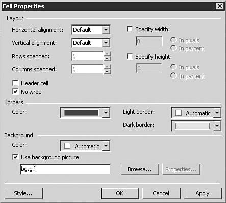
In Figure 10.6, the Table Properties dialog box was shown. In Figure 10.7, the Cell Properties dialog box is shown. Notice the difference in variables between the two. Where the Table Properties dialog box sets issues that will affect the entire table, the Cell Properties dialog box can be used to better define specific areas of the table. Figure 10.7. Cells have fewer variables for design than tables do, as seen in the Cell Properties dialog box.
NOTE If you tell a table to do one thing and a cell to do another (such as show background color), the cell will win. Cell PropertiesYou are not confined to table modification in FrontPage. You can also edit numerous cell properties. The Cell Properties dialog box shown in Figure 10.7 lets you set the following options for each cell:
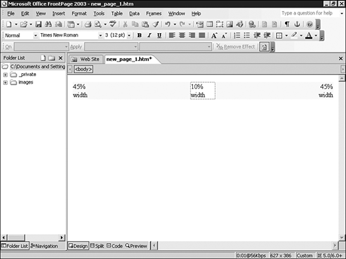
Pixels Versus PercentagesWhen tables are used in the Web page layout process, basic layout effects can be produced by setting table and cell sizes as percentages of page or table layout. This has the additional benefit of providing page content that "works" despite browser screen size. In Figure 10.10, a three-celled table is used to produce a two-column effect by giving the columns 45% of the table size and giving the middle spacer area a 10% setting. Figure 10.10. A three-celled table is used to provide a two-column effect that will work on any screen size.
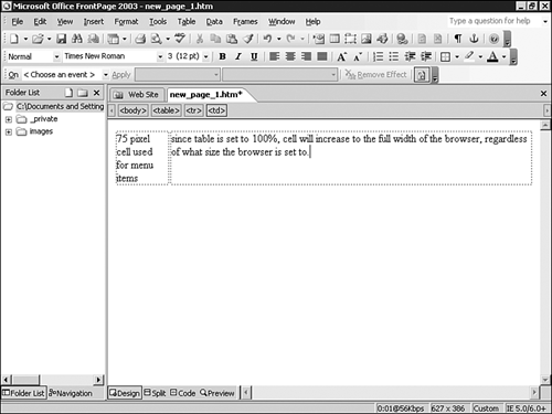
NOTE If you are going to assign cells based on a percentage of screen size, make sure that the total percentage adds up to 100%. Tables can also be sized by pixel, providing an exact sizing element for page design. Although it gives the ability to provide a specific design specification, odd effects can result when a browser sized differently than the page views the page content. Pixel-specific page design should be used with this issue in mind. Effective page design can be accomplished with a careful combination of pixel and percentage specific sized cells. In Figure 10.11, such a combination is used to set the menu bar to a specific pixel size while allowing the rest of the page to fix the browser window. Figure 10.11. The menu bar to the left of this table has a specific pixel size. Content to the right of the menu bar will expand as the page does because the table is set to 100%.
Table PropertiesThe Table Properties dialog box shown previously in Figure 10.6 enables you to set the following options for each table:
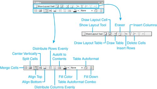
The last check box in the Table Properties dialog box enables you to request that FrontPage set all tables on that page with the same variables. The Tables ToolbarIn some cases, most table and cell requirements can be set through the Insert Table button and modification of the table and cell properties as described previously. FrontPage also provides additional table and cell modification and creation through the Tables toolbar, shown in Figure 10.12. Figure 10.12. The Tables toolbar provides numerous options for table creation and modification.
Each of the buttons in the Tables Tools bar are as follows (from left to right):
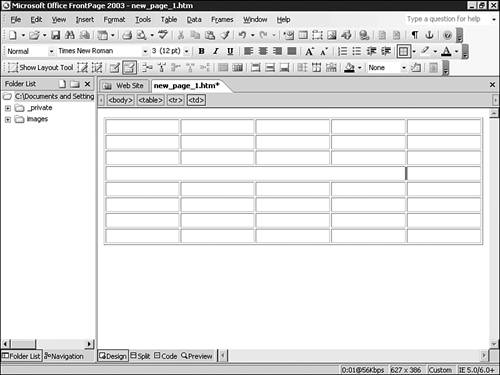
Another option for modification and creation is in the Layout Tables and Cells task pane, described later in this chapter. Using the Drawing and Erase ToolsSelecting the Drawing tool (table and cells) replaces your pointer with a pencil-like icon. You can use this tool to "draw" a table or cell on your screen, as can be seen in Figure 10.13. Figure 10.13. The drawing tool can be used to quickly draw a table of any size in Design view.
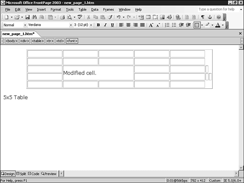
When the Erase tool is selected, the pointer is replaced with an eraser icon that can be used to "erase" cell and table borders. This results in two tables or cells merging with each other and is used to produce additional layout effects. An example of this can be seen in Figure 10.14. It is essentially the same as merging cells. Figure 10.14. The Erase tool is used to erase the fourth cell border in a table, producing a single cell in that area of the table.
|
EAN: 2147483647
Pages: 443