Breaking New Ground in Text and Typography
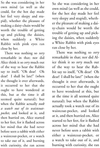
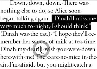
| When we first saw Adobe InDesign 1.0 in 1999, Sandee and Steve immediately fell in love with the quality of the type that it could set. Steve had set type on traditional typesetting machines like those made by Compugraphic. Sandee had worked in an advertising agency where art directors would hand-kern their text by cutting out spaces with a razor blade. While the advent of desktop publishing empowered graphic designers, the quality of type from the earliest page-layout applications PageMaker and QuarkXPress didn't match that of the traditional typesetters. As desktop publishing became more and more accepted, certain time-honored typography nuances were forgotten by older designers, or, worse, never learned by students. Adobe InDesign changed all that: It offered much higher quality composition (rules used to decide how type is fit onto a line). It provided new ways of kerning and handling the margins of type. Later versions of InDesign have introduced text, table, and typography features that continue to break new ground. In this section, we'll focus on some of InDesign's type features that set it above other applications in its field. Some of these features are also now available, in somewhat modified form, in Illustrator and Photoshop. Fine TypographyThe factor that has the greatest effect on the appearance of type is also one of the subtlest to describe. This is composition, the complex process of fitting words into lines by weighing the hyphenation and justification settings and the break-points specified in hyphenation dictionaries. When Aldus (later Adobe) PageMaker, the first page-layout application for desktop computers, and QuarkXPress, which dominated the page-layout market in the 1990s, were developed, computer microprocessors were much less powerful than they are today. The developers of these applications took shortcuts to be able to fit lines of type, losing some of the quality of the earlier dedicated typesetting systems. Justified type didn't look as good any more, so more type was set flush left (ragged right) to compensate. Single Line Versus Paragraph ComposersQuarkXPress and PageMaker use a single-line composer, which sets only one line of type at a time, ignoring lines above and below. The result of this process is that, while many lines look fine, some lines in a paragraph will be much looser or tighter than the others, giving an overall unevenness to the "color" of justified type. This is the equivalent of the Adobe Single-line Composer in InDesign CS2. The default setting for text in InDesign CS2 is to use the Adobe Paragraph Composer. This has a more complex job. While it uses the same rules as a single-line composer, it looks through all the words of the paragraph in deciding how lines are to end. It moves words around until the best overall appearance is reached (Figure 6-8). You can see the process while you're typing in InDesign. As you type, words you have already typed are shifted up and down, or hyphenated. Figure 6-8. Type was set justified in 12-point Adobe Garamond with 14-point leading. When set with the Single-line Composer in InDesign CS2 (left), the text has poorer line breaks and more gaps between words than when set with the default Paragraph Composer (right). Choose the Adobe Paragraph Composer or the Adobe Single-line Composer from the InDesign Paragraph palette menu. The Paragraph Composer provides more even spacing between words. The Single-line Composer takes up slightly more space, but may be the better choice if you're trying to match the copyfitting of a legacy QuarkXPress or PageMaker document. Illustrator CS2 and Photoshop CS2 use a different composition engine than InDesign CS2. These applications are not designed for the complexities of multipage composition found in InDesign. Each of them offers a choice of two composers Adobe Single-line Composer and Adobe Every-line Composer. You may think of the Every-line Composer as the same as InDesign's Paragraph Composer. Good thought, but not true! The composers in Illustrator and Photoshop set type somewhat differently than in InDesign because they lack some of its sophisticated text controls. These choices are also found on the Paragraph palette menu of each application. These applications also compose more slowly, and the default for each is the Single-line Composer. Hyphenation and JustificationHyphenation and justification (which we like to call H&J) are the controls (along with the hyphenation break-points in the application's dictionary) that determine how much text to fit on a line. InDesign, Illustrator, and Photoshop each use two separate features to control H&J Justification and Hyphenation which are found on the Paragraph palette menus and on InDesign's Control palette menu. The Hyphenation setting (Figure 6-9) provides the rules the application uses to apply hyphenation. Most of the Hyphenation controls in these applications mirror the settings you find in other layout applications. But InDesign and Illustrator have one special control: the Hyphenation Penalty Slider, affectionately known at Adobe as "Nigel." If you move the slider to the left toward Better Spacing, the composer relies more on hyphenation and less on adjusting spacing. If you drag the slider to the right toward Fewer Hyphens, it makes more adjustments with spacing, and uses fewer hyphenation break points. Be sure to turn on the Preview check box so you can see the effect on selected paragraphs. Figure 6-9. The Penalty Slider provides great control over how much hyphenation is allowed.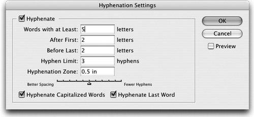
The second set of controls for H&J Justification is also found in the Paragraph palette menu of each application and in the Control palette menu in InDesign (Figure 6-10). Justification controls the spacing of letters and words across the text column by setting a range of acceptable spacing that the composition engine can use. Figure 6-10. InDesign CS2's Justification Settings includes a control for scaling glyphs.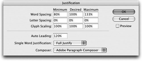 Here again, the controls match what you would usually expect, but with one difference: InDesign, Illustrator, and Photoshop have a new way to adjust the spacing. The Glyph Scaling feature allows you to subtly change the width (horizontal scaling) of the characters. Steve believes that if you set a modest Glyph Scaling value like Minimum 98% and Maximum 102% the difference in letterform shapes probably won't be distinguishable. Sandee is a typographic purist, and she tries to avoid distorting letterforms whenever possible. DictionariesEach of the CS2 applications uses language dictionaries to check hyphenation and spelling. The language assigned to the selected text determines the dictionary that is used. You can assign a language by selecting the text and choosing a language from the Control or Character palette in InDesign CS2 and Illustrator CS2, and from the Character palette in Photoshop CS2. InDesign now provides 28 language dictionaries; Illustrator and Photoshop offer 23 dictionaries. InDesign CS2 also offers a new feature to improve the hyphenation of text. It supports using more than one dictionary in multiple locations, and setting a dictionary priority. This feature lets a workgroup share a common dictionary on a server while also using a local dictionary. It's also easier to import and export word lists for these dictionaries (choose Edit > Spelling > Dictionary and use the Import and Export buttons) than it was in earlier versions of InDesign. Managing dictionaries is controlled in InDesign's Dictionary Preferences. Tip: Using a Network Dictionary When a user dictionary is stored on a server, the first user to load the dictionary locks the file. Other users can use the dictionary, but not write to it. You can also use the operating system to lock a dictionary. Hanging PunctuationThose of us who love well-set type are always concerned about the "look" of type. One high-quality look that disappeared during the first decade of desktop publishing is having even edges along the side of each column of text. Normally, when some punctuation marks (periods, commas, dashes, and quotation marks) and the edges of some letters (like a capital A) touch the left or right edge of a text frame, they appear very slightly indented from the edge. Hanging punctuation subtly adjusts the position of these characters, moving them slightly outside the frame, and making the column appear straighter and cleaner. InDesign introduced optical margin alignment as an attribute of a story and a solution to the conundrum of hanging punctuation. (A story is the text in a text frame or any linked series of text frames.) You'll find the controls in the Story palette (Type > Story) in InDesign CS2 (Figure 6-11). Settings for optical margin alignment apply to all the linked frames of a story. Figure 6-11. In InDesign CS2, optical margin alignment turned on and turned off (right).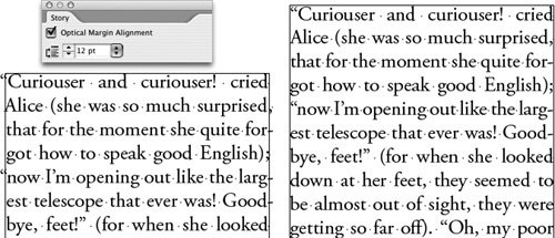 Tip: Adjusting Optical Margin Alignment in InDesign Use the font size menu in the Story palette to adjust the amount of the hang. Your type usually looks best when you set it to match the size of the font you're using. Illustrator CS2 also has an Optical Margin command on the Type menu. However, it's much slower and less controlled than its counterpart in InDesign. Illustrator also has a Roman Hanging Punctuation command (called Hanging Punctuation in earlier versions, and renamed Roman Hanging Punctuation because it does not work on Japanese and other non-Western fonts). Turn on Roman Hanging Punctuation using the Paragraph palette menu. Optical Margin Alignment affects the edges of letters; Roman Hanging Punctuation does not. The latter command moves certain punctuation marks 50% of the width of the character outside the margin. Optical KerningKerning is the space between two characters. To create high-quality type, certain character pairs must be brought closer together so they look better. Most applications let you apply kerning manually using commands, or they use the built-in kerning values in most fonts. Of course, you can choose these options in CS2 applications as well. In InDesign, Illustrator, and Photoshop, you would choose these options in the Character palette of each application or in the Control palette in InDesign. Most of the OpenType fonts that are installed with the Suite are well kerned, and their spacing doesn't require much tweaking. However, not all fonts are well kerned, and manually kerning can be a pain. The CS2 applications also offer optical kerning. This option calculates the kerning values based on the visual appearance of the character shapes. Optical kerning can be particularly useful when working with a poorly kerned font, or when you're mixing sizes or styles (Figure 6-12). The following illustration shows kerning set three ways in Illustrator CS2; the middle setting of Auto is called Metrics in InDesign and Photoshop. Figure 6-12. Examples of three kerning settings in Illustrator CS2: 0no kerning (top); Auto (middle), and Optical (bottom). Typography Features in CS2 ApplicationsTable 6-2 summarizes some of the fine typography features in the CS2 applications.
Text Handling in InDesign CS2Typically, InDesign is used more for text than either Illustrator or Photoshop. InDesign is designed for long, complex formatting that can be applied to dozens or hundreds of pages. It has powerful text-styling features that we discuss in Chapter 8, "Working with Style." It also has some innovative text-handling features that make it a natural for managing complex text. These features are not found in Illustrator or Photoshop because these applications normally work with smaller amounts of simpler text. Story EditorIn addition to the Layout window that is the InDesign default, at any time you can open a second view of your current story in the Story Editor. This shows a simple text-editor view familiar to PageMaker users. You can open a Story Editor window by choosing Edit > Edit In Story Editor, or by pressing Command/Ctrl-Y (Figure 6-13). Figure 6-13. The Story Editor (left) and Layout (right) windows in InDesign CS2 are compared side-by-side. When you edit text in one view, the changes are immediately reflected in the other.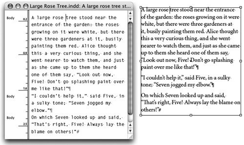 The Story Editor window can be customized in several ways. By default, it shows the paragraph styles applied to the text and a column depth viewer marked in the current ruler units. These items can be toggled by choosing View > Story Editor and showing or hiding a setting. Footnotes in a story can be collapsed or expanded. You can change the appearance of the text display in the Story Editor Display Preferences. The Story Editor has many uses. You can type as fast as you can and see the changes reflected in the layout view. Using the Story Editor works well when the type in the layout is small or hard to read. A single window displays text that may flow from frame to frame across several pages in layout. The Story Editor also displays a marker to indicate overset text (text that doesn't fit in a frame). Tip: Displaying Hidden Objects Use the Story Editor to view and select objects that are hard to see in layout view for example, anchored or inline objects, or hyperlink sources or anchors. Pasting TextInDesign has always supported cutting and pasting text; InDesign CS2 gives you more control over the process. When you paste text from another application, you can determine whether InDesign preserves formatting and style attributes. To preserve formatting and styles, in Type Preferences choose All Information in the When Pasting Text And Tables From Other Applications section. This "preservation" option is helpful, for example, when copying short sections of already-formatted text from Microsoft Word. If you want to strip out all formatting, choose Text Only. This is extremely helpful if you need to paste text from an email document or web page and don't want all the HTML formatting to come in with the text. (For pasting text between CS2 applications, see the "Moving Type Between CS2 Applications" section below.) If you want to copy text from one InDesign frame to another, you can also paste using the Paste command, of course. Normally, this will paste all the formatting from the original frame. If you want to strip out this formatting, choose the new Paste Without Formatting command from the Edit menu. Tip: Use the Place Command Instead of Pasting Text You'll get more control selectively importing styles and local overrides from a Word document if you use the Place command. We discuss this in the "Importing Styles from Word" section in Chapter 8, "Working with Style." InDesign CS2 is also more intelligent about the way it pastes text than earlier versions. When you cut a word or a sentence and paste it in another location, InDesign can pay attention to the context. It can either remove extra spaces or add spaces as necessary to make complete words and sentences. This feature, Select Spacing Automatically When Cutting And Pasting Words, is turned on by default in Type Preferences. Dragging and Dropping TextWhenever page designers discuss the ability to drag and drop text, there's bound to be strong feelings: Some people find drag-and-drop annoying, while others can't do without it. If you'd like to use this feature, InDesign CS2 now supports dragging and dropping text within InDesign and also from other applications, and it can do it in a very smart way. To control this feature, use the Type Preferences and choose the options to Enable In Layout View and Enable In Story Editor. The latter is turned on by default. To drag and drop in either a Layout or Story Editor window, simply drag to select the words you want to move. Then, keeping the mouse down, drag where you want the words inserted, and release. When dragging, a small "T" icon appears next to the cursor, and an I-beam cursor shows where the words will go when you release the mouse (Figure 6-14). Figure 6-14. The "T" icon indicates you're performing a drag-and-drop function, and the I-beam cursor shows where the text will drop. You can add some special tricks to the drag-and-drop functionality in InDesign CS2:
If you want spaces appropriately deleted or added when dragging words and sentences, the Select Spacing Automatically preference described above works with drag-and-drop text as well. Tip: Dragging from Other Applications You can also drag text from Microsoft Word, text editors like TextEdit, and some web browsers into InDesign. This copies, rather than cuts, the text. Calling Out Special CharactersWhen Steve worked in older page-layout applications, he had to keep a crib sheet taped next to his computer to remember the keystrokes required to produce a special character (like a section mark) that he hadn't memorized. When he moved to Adobe InDesign, he threw the crib sheet away. Adobe InDesign provides three special-character submenus under the Type menu Insert Special Character, Insert White Space, and Insert Break Character. You can also get to these submenus by Control/right-clicking to bring up a context menu. Even better, you can use the Keyboard Shortcut controls to add your own keyboard shortcuts to the characters that don't have keyboard shortcuts. This is very helpful for Windows users who have to use numbered codes to insert characters in other programs. Creating Bulleted and Numbered ListsOne of the most common feature requests for working with text in page-layout applications is the ability to automatically create bulleted and numbered lists. InDesign CS2 features the built-in capability of creating and editing bulleted and numbered lists, although without some of the finer points that Microsoft Word or Adobe FrameMaker users may be familiar with. The easiest way to create a bulleted or numbered list is to type the list of items, select the list with the Type tool, and click the Bulleted List or Numbered List button on the Control palette. Turning on and off these buttons turns on or off the list feature. You can also include bulleted and numbered lists in a paragraph style (see "InDesign's Paragraph Styles" in Chapter 8, "Working with Style"). The bullet or number that gets added isn't a character. It's an effect that appears onscreen and when printed much like making a choice from the Effects menu in Illustrator (see the "Applying Filters and Effects" section in Chapter 4, "Pixels and Raster File Formats"). It can't be searched for in the Find/Change dialog box and it won't appear in the Story Editor window. The properties of a bulleted or numbered list are created and dynamically edited in the Bullets And Numbering dialog box (Figure 6-15). You can open this dialog box at any time by choosing Bullets And Numbering from the Control palette menu, or by Option/Alt-clicking the Bulleted List or Numbered List button. Figure 6-15. The InDesign CS2 Bullets And Numbering dialog box provides the controls for bulleted or numbered lists, including choosing bullet characters from a different font.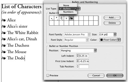 By default, bullets and numbering take on the attributes of the first character of the paragraph that they're in. This can be changed in the Bullets And Numbering dialog box. Bullets can be assigned from a different font, and you can choose whether the font is remembered. You can choose a bullet's font family, font style, size, and color. With numbering, you can set the numbering style, separator, starting number, and font attributes. For both bullets and numbering, you can choose either a hanging indent or a tab position. One of the biggest limitations of the numbering feature is that it allows only one level of lists; thus, this feature can't easily be used to create an outline format. Only sequential paragraphs can be numbered; if you want to insert non-numbered paragraphs in between, you must manually start the renumbering using the Start At option in the Bullets And Numbering dialog box. Also, numbers must always be flush left; they cannot be flush right or align to a decimal. This is the reason Sandee and Steve did not use the numbered list option when creating this book. We didn't want to be limited to lists less than ten. At any time, bullets and numbering can be turned into real characters by selecting the text containing them and choosing Convert Bullets To Text or Convert Numbering To Text from the context menu or the Paragraph palette menu. This is the equivalent of choosing an Illustrator effect and applying the Expand command. The list loses the "liveness" and editability of the effect. Fancy TypeInDesign, Illustrator, and Photoshop all have ways of applying "fancy" effects to type to give it a special appearance. These include creating type on a path, skewing or adding a stroke to it, and adding underlining or strikethrough type styles. The CS2 applications differ somewhat in the way these effects are applied. Type on a PathPath type has been part of illustration programs for a long time. (Sandee calls this roller-coaster text, as it can move along a path as it curves up and down.) With Adobe Creative Suite 2, you can now create path type in almost identical ways in InDesign, Illustrator, and Photoshop. First, create a path using the Pen tool. Then, in either InDesign or Illustrator, select the Type On A Path tool found under the Type tool; in Photoshop, select the Type tool. In all applications, click the path to create an insertion point, and begin typing. In InDesign, you can also drag along the path to more precisely set the position of the text. Editing path type is a snap. Switch to either the Selection or Direct Selection tool to adjust the position of the type on a path. Side handles (and in InDesign and Illustrator, center handles) appear, which you can drag (Figure 6-16). To turn the type upside down, just drag it across the path. InDesign and Illustrator also give you additional controls (Type > Type On A Path > Options). You can choose between five path type effects Rainbow, Skew, 3D Ribbon, Stair Step, and Gravity and you can set alignment and spacing options. Figure 6-16. Use the Selection or Direct Selection tool to reposition path type in InDesign, Illustrator, or Photoshop, using the handles. Styling TypeIn older page-layout applications like PageMaker and QuarkXPress, it's easy to select a font and apply a type style (like Bold or Italic) that doesn't actually exist in the font. Onscreen, the font may be made bolder or slanted, but if the printer font doesn't contain the actual bold or italic style, it will print incorrectly to a PostScript printer. By contrast, the font menus of CS2 applications list only the type styles that exist in the font; it's not possible to pick a non-existing style. So what if you've chosen a typeface that doesn't have italics? InDesign CS2 lets you apply the Skew type style that lets you create a false italic effect in a font that lacks that feature. You can apply this type style from the Control or Character palette or as part of a paragraph or character style. In addition, in InDesign, you can apply a stroke to type that can create the effect of emboldening it, while still keeping it editable. InDesign is very smart in the way it does this: By default, it applies the stroke weight around the outside of the characters, preserving their shape. Illustrator CS2 has no feature for skewing individual letters or words. You can skew the entire text frame, but not certain words within it. Illustrator CS2 lets you add a stroke to type, but in a different way than InDesign: Create your type as usual, and then select it as a type object with the Selection tool. In the Appearance palette menu, select Add New Stroke. Use the Control or Stroke palette to set a stroke weight. By default, the stroke will be applied above the characters; this will deform the shapes of the letters. In the Appearance palette, drag Stroke below Characters to put it behind them (Figure 6-17). Figure 6-17. Apply a stroke to type in Illustrator CS2 using the Appearance palette.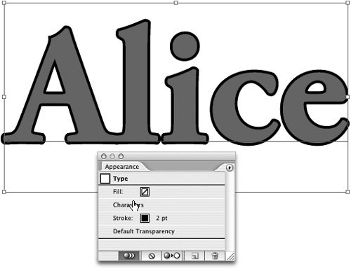 In Photoshop CS2, because it shares the same core type technology as other CS2 applications, you can select only an available font family and font style. However, Photoshop's primary medium is images, with type (and graphics) secondary. Its images may be just as likely used on the web as in print. So Photoshop CS2 also adds the option of creating Faux Bold and Faux Italic (faux meaning false) for selected type. These options are useful for web designers who don't need to worry about their fonts printing correctly. You can choose these options from the Character palette buttons or menu. Just don't use faux bold or italic if you're printing vector type to a PostScript printer. Underlining and strikethrough type styles are also available in InDesign, Illustrator, and Photoshop. (This is a new feature in Illustrator CS2.) Illustrator and Photoshop just apply a default effect for each style, with no options. InDesign CS2 gives you the most control: You can select Underline Options or Strikethrough Options from the Control or Character palette menu or as part of a style. Here you can set the weight, offset, color, line style, overprinting, and other attributes. Tip: Customizing Underlines and Strikethroughs in InDesign Underlines and strikethroughs in InDesign can be overprinted to produce a colored line without registration problems on press. You can create special effects like a "highlighter" pen with a custom strikethrough style. Fancy Type Features in CS2 ApplicationsTable 6-3 shows some of the fancy type features in Adobe CS2 applications.
Tables in InDesign CS2Tabular material and tables have long been a way of communicating structured information. You can, of course, create tabbed data in either InDesign or Illustrator with the Tabs palette. However, InDesign CS2 has a powerful table feature that is one of the best in any application. Creating a table has several advantages over using tabs:
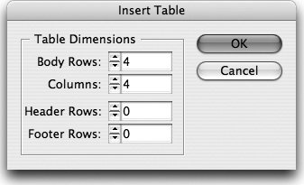
Creating TablesOften the information for a table already exists in another source a database, a spreadsheet, or a text file. Fortunately, InDesign CS2 makes it easy to import tabular information so that it doesn't have to be recreated. InDesign supports placing tables from Microsoft Word, from Excel spreadsheets, or from tabbed text (most databases can easily export tabbed text). Choose File > Place, and select Show Import Options for the most control. For Excel spreadsheets, choose a cell range to import, and either import the Excel formatting or strip it out. For Word tables, either remove or preserve styles and formatting (we discuss these options more in "Importing Styles from Word" in Chapter 8, "Working with Style"). You can also create a table from scratch in InDesign CS2. First, create a text frame (in InDesign, a table is always an inline item in a text frame). Then select Table > Insert Table. You'll be given the option of setting the initial number of rows and columns, as well as any header and footer rows that will appear (Figure 6-18). These attributes can of course be changed as you're editing and formatting the table. Figure 6-18. You must be in a text frame to create a table; choose Table > Insert Table to set its initial dimensions. Table FeaturesInDesign CS2 has many more table features than we can cover here; refer to Real World InDesign CS2 or InDesign CS2 Visual Quickstart Guide from Peachpit Press for a deeper discussion. When working with tables, be sure to use the Type tool to select the cells, rows, or columns you want to work with. All the commands for working with tables are found in the Table menu. The most common table commands are also found in the Control palette, the Table palette, or in context menus. Here are a few of the features that make InDesign's tables so powerful:
|


EAN: 2147483647
Pages: 192