Re-lighting a Scene
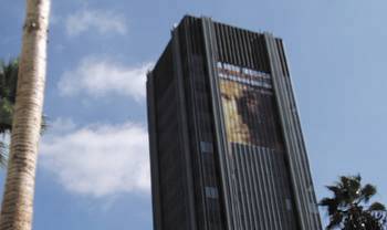
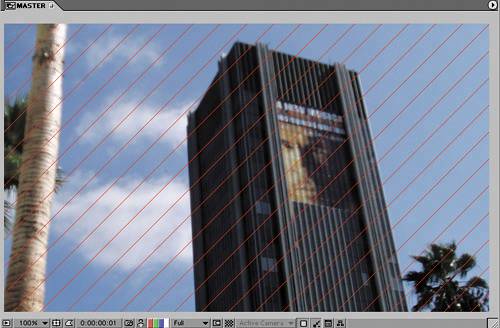
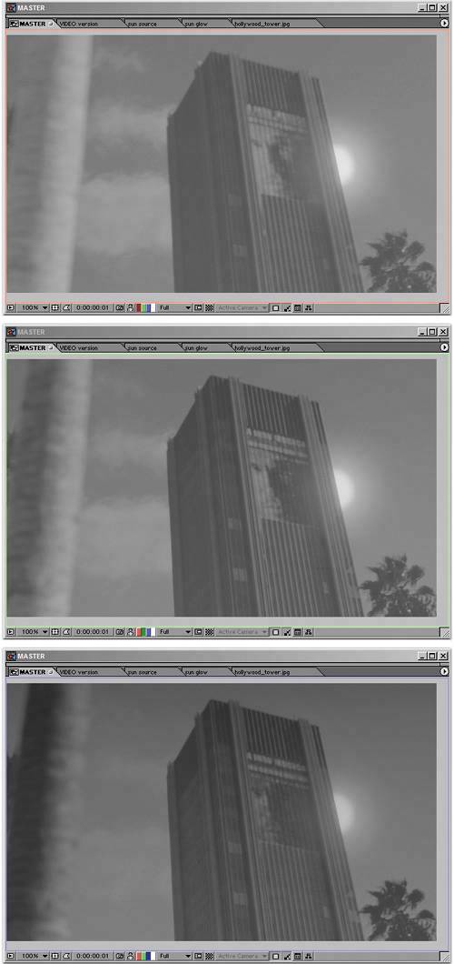
| Hopefully there will not be too many cases in which your source footage was shot so incorrectly, in terms of fundamentals such as light direction, quality, or intensity that you're asked to do the seemingly impossible: to completely relight a scene. Particularly with exteriors, however, there are bound to be cases in which natural conditions didn't cooperate at the time of the shoot. Even more likely, there will be cases in which the footage that was shot is adequate but lacks something. You could call it visual punch, artistic style, essential drama. With episodic television, your establishing shot can't tell the viewer much more than "downtown, daytime." But feature films and other more ambitious stories demand that the shot do more than that; that it propel the drama and mood of the story forward, and it's not always possible to get what's needed with the camera alone. The two chapters that follow will look at creating specific effects related to weather and pyrotechnics that would be difficult, expensive, or both to capture on camera. For now, consider taking a source shot with rather ordinary lighting conditions, on a rather ordinary pretty day in Holly-wood (Figure 12.34) and giving it lighting conditions that could be shot at only one particular time of day and only on certain days of the year (Figure 12.35). Figure 12.34. This source shot shows an ordinary day-lit exterior on a pretty, clear day.
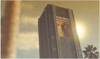
Figure 12.35. In the manipulated shot, it's no longer pretty or clear and no longer so ordinary.
This example is directly inspired by a similar video demonstration by Stu Maschwitz, to show the basics of using eLin, the set of tools for linear color compositing that Brendan Bolles described in Chapter 11. Stu and Brendan know a lot about eLinthey worked together to develop it for use at The Orphanage. Most of the rest of the world knows very little about eLin, although the plug-in has been available as shareware for several months at this writing. (It is included on the book's CD-ROM, free for noncommercial use; a pop-up appears on start-up reminding you to register if you're using it commercially, but you are free to work and render with the full features.) I'm going to show how much less cheating you have to do to make a dramatic metamorphosis of light conditions if you work in true linear color space. I'll also describe where the tried and true method falls short. It's a comparison of old school and new school compositing methods. With eLin, After Effects is among the last of the major compositing packages to have the capacity to work with linear color at a 1.0 gamma (if the concept eludes you, check out Chapter 11 for a thorough run-down). For work on feature films, this is fast becoming the standard approach at facilities using such competing packages as Apple's Shake and Digital Fusion's Nuke. If you apply for a job compositing at a company that relies on one of those, you may be downgraded as an After Effects user for not having any familiarity with radiometrically linear images (also called photometrically linear, scene-referred values, gamma 1.0, linear, or lin). Don't let this happen; win them over, if not to After Effects and eLin, then at least to your skills and knowledge.
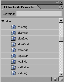
After using these plug-ins extensively on The Day After Tomorrow and subsequent projects, I am convinced that linear color spaces and the ability to calculate brightness values that are higher than your monitor can display are the wave of the future. Most other software used for film compositing includes this feature set, and it is likely to trickle down to other types of users and more software packages because, once you understand the underlying concepts, this method of working makes so much sense. Getting used to it takes time, however; in many ways it marks the biggest change to occur to digital compositing since its inception. But why take my word for it? Following is my version of the demo that helped convince me. Check out the steps involved in transforming a neutrally lit scene into a dramatically lit one, specifically showing where eLin compositing eliminates compromises that you've probably become accustomed to accepting. Even if you're not ready to switch your workflow, you'll get an idea what's involved with or without linear color The Basic Linear Set-UpBefore you can compare linear and video workflows, you need to get familiar with eLin. Working with eLin requires a little bit of preparation. If you want to play along, you should first install eLin using the installer from the book's CD-ROM. This adds a set of Effect plug-ins under the category eLin (Figure 12.36), as well as a couple of useful scripts that I'll get to in a moment. Figure 12.36. The full set of eLin effects in the Effects palette and the eLin palette. You'll use three effects more than all others: vid2eLin, elin2vid (which convert in and out of lin space, respectively), and eLevels (which gives access to adjusting pixels whose values are above the brightest white your monitor can display).
As was pointed out in Chapter 11, there are two predominant benefits to working in linear color space. The first is that light adjustments interact as they would in the real world, and the second is that you get access to overbright pixels, areas of the image that have become brighter than your monitor can display.
Just in case that doesn't sound life-changing and exciting, there is a major side-benefit to consider: The combination of light adjustments behaving naturally and the overhead for overbright pixels means that you can layer color adjustment upon color adjustment, turning the exposure up and down, dialing color up and then pulling it back, without ever seeing the color turn flat and quantized. This example makes that distinction very clear. As a source image, the example uses Figure 12.34, a normal 8-bit-per-channel file, lightly JPEG compressed, similar to one you would get out of any digital camera (this one came from an Olympus point-and-shoot). The key here is that the source image is not overexposed (save that bright spot on the side of the palm, which can be eliminated). If there were highlights in the sky that were already looking blown out, the image would not be a suitable candidate for this treatment because no matter what you did they would still appear blown out. Figure 12.37 shows the image looking just the same, but now set to work in linear color space using eLin. If you've installed eLin and want to try this yourself, a few simple steps will offer you this basic setup. You'll use the same basic steps every time you prepare footage for eLin:
Figure 12.37. The image is the same, but three changes were made automatically using the eLin palette. The layer was set with a vid2eLin adjustment, sending it to lin space and an adjustment guide layer was added with a view LUT, sending it back to vid space so you can see it look as it should.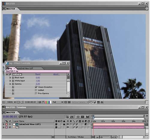 You're now set up for eLin compositing, but your image looks just the same as it did. All of your visible images will include the VID to eLin adjustment, which allows their compositing operations to be performed in linear space, and will have to be converted back out of linear space in order to be seen normally. And that is the major downside to eLin: You now need that LUT adjustment over the eLin layers for things to look right. A LUT is a look up table, a reference adjustment that tells each pixel how it should be displayed differently from its own value. At this point, nothing is different because you've only lowered gamma and raised it back up again with the LUT. If you were to render this frame right now, you would get the almost black version because the LUT is on a guide layer and does not render. Experimenting with ExposureNow you're ready to begin reaping the benefits. Here's the first one: You can change the exposure values of the image in exactly the way a camera would, and freely adjust the image back and forth above and below the top visible white point. Figure 12.39 shows the completely disastrous result of adding the source layer to itself in regular video spaceyuck. As you will recall from way back in Chapter 3, "Selections: The Key to Compositing," Add mode simply adds pixel values together. In this case, many pixels in the image start with a value above the midpoint (0.5 or 128 in RGB colors), so adding that value to itself blows out the value. It looks horrible. You would never brighten an image this way, certainly not without dialing it way back. Figure 12.39. This is one big reason Add mode is seldom used in normal After Effects work. It is often much too strong an effect when a pixel above middle gray is added to another of that value, in which case the result is pure white.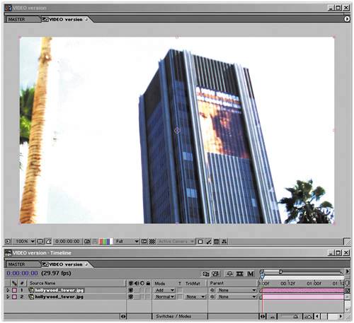 Figure 12.40 demonstrates the same operation but in linear color space. Only the detail in the clouds and on the palm tree is blown out, and the image looks less like a disaster and more like an image that has been overexposed by one f-stop, which is exactly what it is compared with the source. Figure 12.40. Adding an image to itself in eLin space is the equivalent of opening the camera's aperture one stop, and it looks just as natural as a slightly overexposed version of the source image.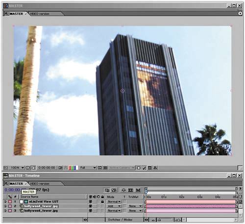 That's cool, you think, but I could get the comp in video color space (or vid space) to look like that, if I wanted to. All I have to do is reduce the Opacity of the top layer to 45%, and it looks identical (Figure 12.41). This brings us to the second cool thing about linear space: You can dial it back without undoing prior corrections. Colors can travel above absolute white and be brought back. Figure 12.41. Add in vid space has been dialed back to roughly match the result of Figure 12.39.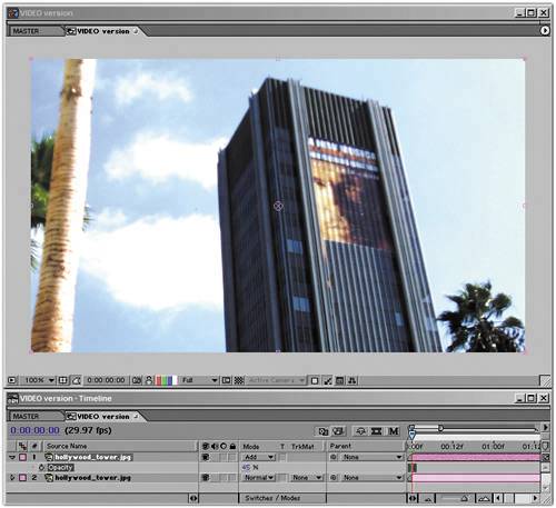 Figure 12.42 shows an overlaid solid that is the equivalent of adding a filter over the lens to bring the exposure down one stop; it is masked to cover only part of a cloud so you can see that the masked area looks identical to how the source image looked in that area, yet the previous correction remains behind. This was done by creating the solid at a color of exactly 50% gray (RGB values of R: 128, G: 128, B: 128) and setting its blending mode to Multiply, which is the perfect inverse of Add in linear space. Figure 12.42. That disc in the image is only a 50% gray solid, but it acts like a filter, knocking the exposure down exactly one stop. Detail that was at values above full white is recovered. Try the same thing in vid space (Figure 12.43), and behold the ugliness of the result. The detail is gone, and the color under the multiplied gray is the exact color of the solid: flat gray. Now you're thinking, "Why would I do that? Ever since I started adjusting digital images I've understood that once my color values are clipped, there's no bringing them back, so I just don't do it." Figure 12.43. Where did the detail go? In video space, once it's gone, it's not coming back, so you've become used to taking great care never to let this happen. And what that means is that you've been creating kludges to live with digital color. You may have avoided creating anything that looks as bad as that darkened area in the adjusted video image, but you haven't been using your digital imaging programs as if they were a real camera, shooting real film. None of which may bother youyet. But now, try some practical applications of this information and see what you can learn about the real benefits.
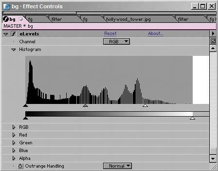
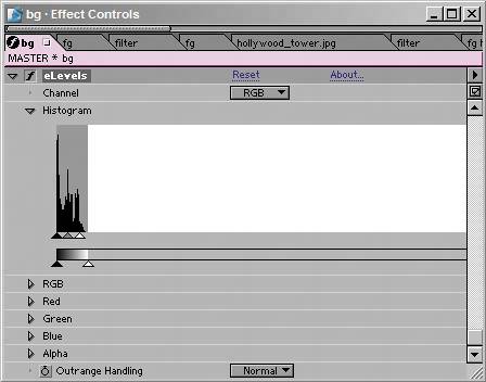
Crafting the ChangeAn actual Levels adjustment to this image to make it look like it was illuminated by the bright, warm light of dusk will employ the eLin version of Levels, called eLevels. It is similar to Levels with the one major difference that its controls and histogram can account for values greater than 1.0, pure white on your monitor. Figures 12.44a and b show that there are two modes for eLevels: one for the visible range and one showing the extended range. Figure 12.44a and b. The normal view of eLevels (12.44a) looks like Levels. But, what happens if you click that white space at the right? You get access to the overbright range (12.44b) where all of the pixels that are beyond white are kept. At this stage, there's not much there.
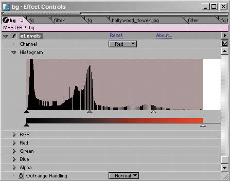
Revealing the eLevels settings you need, Figure 12.45 shows your first step toward giving the shot a look that corresponds more to the golden hour of sunset. Looking at the histogram for the red channel (Figure 12.46), you can see that the Red Input White has come in quite a bit, breaking the usual rule about clipping white values. (Remember, Chapter 5 recommended you stay just to the outside of the whitest white). Figure 12.45. You can introduce a more golden hour look with eLevels in much the same way as you would with Levels, channel by channel.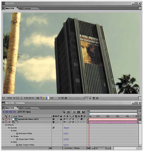 Figure 12.46. In regular Levels this setting, with Red Input White below the visible range, would be considered clipped.
That looks pretty good, except for the already clipped values on the palm tree at the left. Those could be painted out, but in this case, you have the option of adding a foreground element instead, heightening the dramatic composition of the shot. Drama in this case means contrast; you've already added a little color contrast and now you're adding contrast between the foreground and background. Import a close-up of the tree, tree_fg.jpg, which was taken at higher resolution than the same source shot. It needs to have the same settings as the existing tower.jpg layer, so duplicate that one and swap tree_fg.jpg for the duplicated layer (by Alt-dragging/Option-dragging tree_fg.jpg to the selected duplicate layer of tower.jpg). To simplify things, rename these layers bg and fg, meaning background and foreground, respectively. Next, look at the foreground layer with the same levels settings as the background (Figure 12.47). To remove it from its background, give it a quick six-point roto mask; the sky is probably good enough to actually key it, but you only need a quick-and-dirty removal here because the element will also be heavily blurred to match its depth of field in the shot (Figure 12.48). Figure 12.47. The foreground element is added, but not masked. It does not blow out with the levels settings the way the tree at the left of the plate did.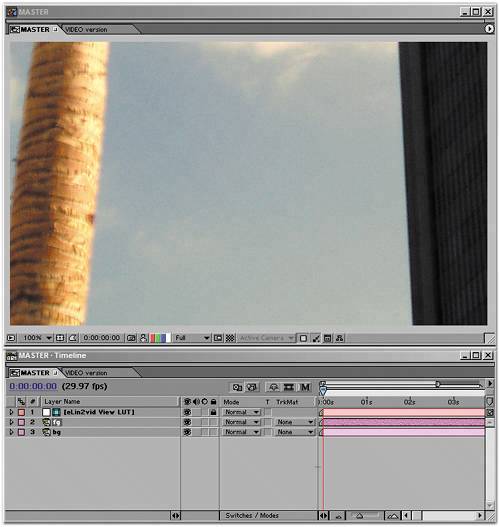 Figure 12.48. The mask is added in the Layer window. The mask doesn't have to be as perfect as a blue-screen key would be because it will be heavily in the foreground and have camera blur.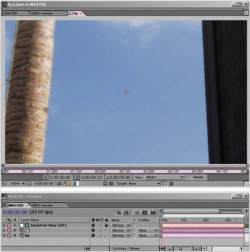 Figure 12.49 shows the before and after of adding camera blur to the foreground tree. Box Blur is a quick way to create a pretty good-looking representation of a defocused element; Blur Radius is set to 12, and Repeat Edge Pixels is turned on. Figure 12.49. The masked tree in the scene with camera blur added via a 12-pixel Box Blur.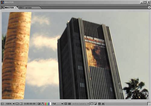 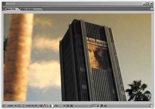 The result looks good, but the equivalent settings in video color space aren't holding up so well (Figure 12.50). By dialing them back, you're able to visually match the other shot, except that the clouds are becoming more blown out and subtle highlights are lost in the blur of the foreground. These aren't deal-killers yet, although it's not good to see what should be warm highlights turning green (due to the overweighting of the blue sky in vid space). Figure 12.50. Video color space isn't holding up well.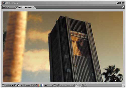 Now it's time to alter the shot more dramatically. The story calls for it to be a smoggy day, at sunset. You need to add the equivalent of a lens filter over the lens for the smog look (as is often done with a physical camera). To do so, add a solid the size of the comp, call it filter, and place it between the fg and bg layers. The color doesn't matter, because you next apply a Ramp effect. Yes, it looks very strange; that's because it's in video space (Figure 12.51). Figure 12.51. Whoa, what happened to Ramp? It should appear as a smooth black-to-white gradient, but it has been crushed by the LUT. This is exactly what eLin does: pushes the middle gray point down to make room for highlights. I include this image only because these types of surprises will occur along the way as you work with an adjusted gamma. Anytime something looks completely blown out or dark, there is a missing LUT involved. It's managing little shocks, such as things not looking right because of the view LUT, that constitutes the downside of eLin. In this case, you're not going to add a LUT, however. Solo the layer, disabling the view LUT, and change the Start Color in the Ramp effect to a bright, medium saturation orange smog color. Now apply this with a Multiply blending mode, turn off the Solo setting, and it behaves just like a lens filter (Figure 12.52). Figure 12.52. The Ramp was adjusted to behave similarly to a real camera's lens filter, creating the smog look. It's multiplied to burnish the image with its orange color. 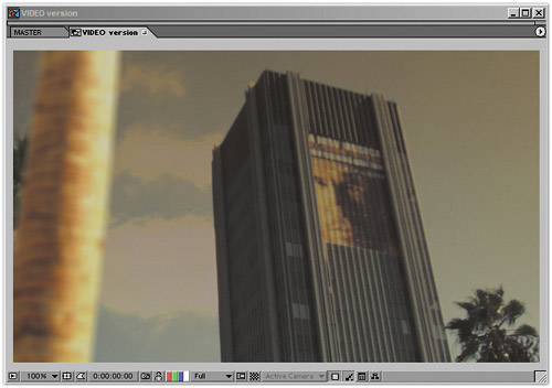 The same step applied in video color space lacks subtlety and flattens out detail in the clouds more; the result looks a lot like early computer graphics work, before common cheats were devised. Your best option is to dial back its Opacity to about 70%. That's better, but look at the clouds: They're really starting to look flat and discolored in comparison (Figures 12.53a and b). Figure 12.53a and b. The filter doesn't work as subtly in ordinary vid space (12.53a). It has to be dialed back (12.53b), just as with Add earlier, and you're losing detail in the clouds. 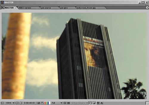 To complete the smog look, you can add a couple of layers of haze in the foreground and midground using an orange-hued solid with luminance and saturation values each around 30% (fairly dark and gray). These layers will be visible as-is, no blending mode, so they need the vid2eLin plug-in (click VID to eLin with the solids selected). Dial back midground haze (between the fg and bg layers) to 45% Opacity and the foreground haze (above the fg layer) to 20% Opacity. It's starting to look smoggy enough that I can feel the itch in my scalp (Figure 12.54). Figure 12.54. I've seen L.A. days like this, achieved by adding dark gray solids with a hint of orange at medium opacity settings.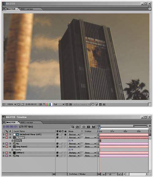 In the video version, you'll encounter more trouble with this approach. The overall contrast flattens out even more, and there is a comparatively greenish-gray look to the highlights (although it may not be visible in the printed Figure 12.55). Figure 12.55. The same trick just doesn't work very well in ordinary vid space. The highlights can't punch through the overlapping layers, so the image just becomes muddy.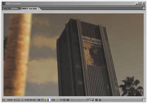 At this point the haze has dimmed down the overall image a bit much, so I'd be inclined to add more white contrast by bringing down the Input White value in eLevels for the bg layer and copying the result to fg. And here the video color approach is dealt its final, fatal blow: The equivalent adjustment in vid space makes the image painful to behold (Figures 12.56a and b). Detail in the clouds is completely gone, and the building, which is real, now looks like a cheap, computer-generated model. Figure 12.56a and b. Here's where the serious benefits start to kick in. The image was looking a bit dim in both versions, so Input White in the background eLevels is moved in to punch up the highlights (12.56a). You can make that simple adjustment in linear color space, but in video color, the image is pretty much wrecked (12.56b). What was a straightforward approach with eLin is untenable with normal methods.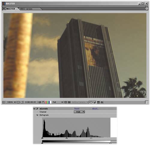 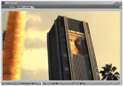 Setting the SunWhere the benefits of the eLin approach really kick in, though, is with the addition of the bright sun peeking out behind the building. The brightness and glow of the sun can be built up, step by step, without concern for blowing it out and with results in the scene that are very realistic. Figure 12.57 shows the basic sun glow element: a glowing orange ball, masked by the edge of the building. It looks like a masked solid in the color of a 1970's kitchen countertop, and so it is. How the heck is that going to look like a sun? Figure 12.57. Wow, how is that going to end up looking like a sun?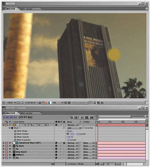 You're not going to convert this element to eLin. Instead, you're going to let it blow out the way that Ramp in Figure 12.51 did. Furthermore, to make it blow out in a really interesting, sun-in-the-sky kind of way, combine it with itself, using an Add and a heavy 75-pixel Fast Blur on the upper layer; set both to 70% Opacity to allow them to interact (Figure 12.58). Figure 12.58. Still not looking impressive, but now it's ready to be dropped into the master comp.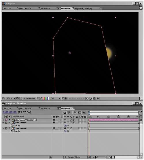
This still looks like a masked orange solid in vid space, but pop the element into the scene, just above the bg layer, and you've already got a pretty nice sun (Figure 12.59). The hotspot rolls off well, and the glow interacts with the layers of haze. You can keep building the effect from here, using what you already have. Figure 12.59. Suddenly, those dark orange tones are rocketed above whitest white, but the overlaid blur is paying off with a nice glowing decay. The Add trick is performed again, twice, with the Opacity and Fast Blur settings on the upper levels used to fine-tune the look of the glowing ball.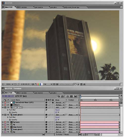 Duplicate the layer, and the sun gets bigger and hotter. Knock back Opacity to 25%, add a modest Fast Blur, move this duplicate sun above the foreground haze, and you've created a glow that reaches around the edge of the building in a very photographic way. Duplicate this and raise the blur much higher (to 100), and you have your desired result: the dramatic descent of the sun on a smoggy day. |
EAN: 2147483647
Pages: 156