Chapter 2. Block-Level Elements in HTML 4.0
 | CONTENTS |  |
|
Topics in This Chapter
-
Section headings
-
Basic paragraph types
-
Bulleted and numbered lists
-
Tables
-
Horizontal separator lines
-
Options for setting default paragraph alignment
This chapter describes how to specify the major paragraph types or text blocks that appear in the BODY portion of an HTML document. These "block-level" elements define how blocks of text are formatted and displayed by the Web browser. They are in contrast to text-level elements that only affect the appearance of the text. Block-level elements can contain text, text-level elements, and other block-level elements, whereas, text-level elements can only contain text and other text-level elements.
The HTML 4.0 specification adds JavaScript event-handling attributes (ONCLICK, ONDBLCLICK, ONKEYDOWN, ONKEYPRESS, ONKEYUP, ONMOUSEDOWN, ONMOUSEMOVE, ONMOUSEOUT, ONMOUSEOVER, and ONMOUSEUP) to all elements except APPLET, BASE, BASEFONT, BDO, BR, FRAME, FRAMESET, HEAD, HTML, IFRAME, META, PARAM, SCRIPT, STYLE, and TITLE. These attributes are discussed only where commonly used in HTML documents. See Chapter 24 (JavaScript: Adding Dynamic Content to Web Pages) for details on event handling with JavaScript.
In addition, the cascading style sheet specification adds CLASS, ID, and STYLE attributes to all elements except BASE, BASEFONT (ID allowed), HEAD, HTML, META, PARAM (ID allowed), SCRIPT, STYLE, and TITLE. These three style sheet attributes are covered in Chapter 5 (Cascading Style Sheets) and are not discussed for each HTML element.
Furthermore, the HTML 4.0 specification adds DIR, and LANG attributes for all elements except for APPLET, BASE, BASEFONT, BR, FRAME, FRAMESET, IFRAME, PARAM, and SCRIPT. These two attributes are covered in Section 1.4 (The Basic Structure of HTML Documents) and are not discussed separately for each HTML element.
Lastly, the TITLE attribute, also covered in Section 1.6 (BODY-Creating the Main Document) is allowed for all elements except BASE, BASEFONT, HEAD, HTML, META, PARAM, SCRIPT, and TITLE. The TITLE attribute is not covered individually for each element.
2.1 Headings
| HTML Element: | <H1 ...> ... </H1> <H2 ...> ... </H2> <H3 ...> ... </H3> <H4 ...> ... </H4> <H5 ...> ... </H5> <H6 ...> ... </H6> |
| Attributes: | ALIGN |
H1 through H6 are used for document headings, with H1 being the first or top-level section headings, H2 second-level headings, H3 third-level headings, and so forth. However, a common style is to start the BODY with a level-one heading containing the same text as the TITLE element, treating H1 as a document title. In the remainder of the document, level-two headings (H2) are used for the major section headings, H3 for section subheadings, and so forth.
Most browsers render headings in boldface, with H1 the largest size and H6 the smallest size. The smaller headings should be used with caution because, depending on the browser being used and the user's selection of font sizes, the minor headings may be rendered smaller than the default paragraph text. A paragraph break is placed directly beneath the heading. Unlike many other block-level elements, headings cannot contain or be contained in most other block-level items except for TABLE cells and input FORMs. They can, however, contain text-level elements. Thus, the two headings of Listing 2.1 are legal because the text-level elements that italicize the text and create an anchor for a hypertext link are completely contained within the heading element.
Listing 2.1 Properly formatted headings containing text-level elements
<H2><I>An Italic Heading</I></H2> <H2><A id="Section5">Section Five</A></H2>
On the other hand, the two headings of Listing 2.2 are illegal because they are embedded in text-level elements.
Listing 2.2 Illegally formatted headings contained inside text-level elements
<I><H2>An Italic Heading</H2></I> <A id="Section5"><H2>Section Five</H2></A>
This example also illustrates the benefits of a formal HTML validator. Because most, but not necessarily all, browsers display both sets of headings identically, authors could conclude that both formats are fine, leaving a heading that displays poorly on more rigid browsers.
ALIGN Headings are left-aligned by default, but centered or right-aligned headings can be created with the ALIGN attribute (legal values LEFT, RIGHT, CENTER, JUSTIFY). For headings greater than the width of the browser window, JUSTIFY aligns the text to both the left and right margin. The default alignment can be changed with the DIV tag (Section 2.6). The ALIGN attribute for headings is deprecated in HTML 4.0 in favor of style sheets. See Chapter 5 (Cascading Style Sheets) for details.
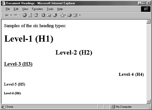
A sample of the six heading types with various alignment options is shown in Listing 2.3. The third heading is underlined. Figure 2-1 shows a typical result in Internet Explorer 5.0 on Windows 2000 Professional.
Figure 2-1. Typical rendering of Document-Headings.html.
Listing 2.3 Document-Headings.html
<!DOCTYPE HTML PUBLIC "-//W3C//DTD HTML 4.0 Transitional//EN"> <HTML> <HEAD> <TITLE>Document Headings</TITLE> </HEAD> <BODY> Samples of the six heading types: <H1>Level-1 (H1)</H1> <H2 ALIGN="CENTER">Level-2 (H2)</H2> <H3><U>Level-3 (H3)</U></H3> <H4 ALIGN="RIGHT">Level-4 (H4)</H4> <H5>Level-5 (H5)</H5> <H6>Level-6 (H6)</H6> </BODY> </HTML>
2.2 Basic Text Elements
The basic text section elements include P (basic paragraph), PRE (preformatted text where white space is preserved), ADDRESS (for listing contact information), and BLOCKQUOTE (for large quotations or for regular paragraphs with indented left and right margins).
Basic Paragraphs
| HTML Element: | <P ...> ... </P> (End Tag Optional) |
| Attributes: | ALIGN |
The P element designates basic paragraphs, resulting in a section of text with blank space above and below. Although P is a container, the end tag is optional and most other block-level elements imply an end to the previous paragraph. Furthermore, body text not appearing inside any other block-level element is assumed to be inside a P element. Thus, many authors treat P as though it was a paragraph separator , even though it is really a paragraph container . Listing 2.4 illustrates the use of the paragraph tag, where in example (a) the ending tag is explicitly listed, and in (b) the ending tag is implied.
Extra white space inside a basic paragraph is ignored, with the text filled to fit the space currently available. Multiple consecutive P tags do not result in extra blank space. Cascading Style Sheets (Chapter 5) enable you to specify the size of the top and bottom paragraph margins. In the absence of style sheets, you can use the BR element (see Section 3.7, "Controlling Line Breaks") or a PRE element (discussed next) to put blank lines in a Web page.
Listing 2.4 (a) Explicit and (b) implied ending paragraph tags
<BODY> <BODY> <P> Paragraph 1 Paragraph 1 <P> </P> Paragraph 2 <P> <P> Paragraph2 Paragraph 3 </P> </BODY> <P> Paragraph 3 </P> </BODY> (a) (b)
Core Warning
 | Multiple consecutive <P> entries generally do not result in multiple blank lines. |
ALIGN The ALIGN attribute of P is used just like ALIGN in headings. Like headings, basic paragraphs are aligned flush left with a ragged right margin by default, but can be centered or right-aligned by use of the ALIGN attribute (legal values are LEFT, RIGHT, CENTER, JUSTIFY). For a multiple-line paragraph, JUSTIFY aligns the text to both the left and right margin.The default alignment can be changed with the DIV tag (Section 2.6) or style sheets (Chapter 5). Again, ALIGN is deprecated in HTML 4.0 in favor of style sheets.
Paragraphs with White Space Preserved
| HTML Element: | <PRE> ... </PRE> |
| Attributes: | WIDTH |
Normally, extra white space (such as carriage returns and multiple spaces) in an HTML document is not displayed by the browser. The PRE element specifies a preformatted paragraph that maintains the white space from the source document and uses a fixed-width font. The PRE element is often used to display sections of code from sample programs. HTML elements that do change the font size are not allowed within the PRE declaration. As a result, sample code containing < or & can also be interpreted as HTML markup. For example, if (a < b && c < d) will likely cause formatting errors within a preformatted paragraph, since the < b will be interpreted as the beginning of a <B> tag. Correct such text by replacing < with &< and & with &.
In general, any ISO 8859-1 (Latin-1) character can be inserted by &#xxx;, where xxx is the decimal value of the character in the ISO Latin-1 character set. For instance, © results in . In addition, most characters have a mnemonic entity reference, such as © in the case of the copyright symbol. A full list of the Latin-1 character set, with mnemonic character entities, can be found at http://www.htmlhelp.com/reference/html40/entities/latin1.html.
Table 2.1 lists popular entity references supported by all HTML 4.0 browsers. These characters are considered plain-text and thus can be used in the TITLE element, as labels of SUBMIT buttons and in other places that prohibit HTML markup.
| Desired Character | HTML Required |
|---|---|
| < | < |
| > | > |
| & | & |
| " | " |
| Nonbreaking space | |
WIDTH The WIDTH attribute is deprecated and not widely supported. The intent is to specify the expected width in characters so that the browser can choose an appropriate font and indentation.
Indented Quotations
| HTML Element: | <BLOCKQUOTE> ... </BLOCKQUOTE> |
| Attributes: | CITE |
The BLOCKQUOTE element is intended for long quotations. The majority of browsers display BLOCKQUOTE sections with indented left and right margins. However, because this indentation is technically not required, authors should be wary of using BLOCKQUOTE purely for indentation unless it is for an internal application where they can be confident of the browsers that are used to read the pages. Style sheets are the preferred way to control indentation, but in a few circumstances, BLOCKQUOTE or a borderless TABLE can be used instead. The CITE attribute, not rendered by the browser, allows specification of a URL from which the quotation originated.
Core Approach
| | HTML 4.0 does not define an element to give indented left and right margins. Some authors use BLOCKQUOTE or a centered, borderless TABLE as a way to implement indentation. Both approaches have drawbacks, so use style sheets instead. |
Addresses
| HTML Element: | <ADDRESS> ... </ADDRESS> |
| Attributes: | None |
The ADDRESS element supplies author and contact information for the current document and usually appears at the top or bottom of the document. Most browsers display the address in italics. With ADDRESS, just as with most section types other than PRE, the browser wraps the resulting text. If you want line breaks in specific places, you must explicitly insert BR.
2.3 Numbered, Bulleted, and Indented Lists
HTML enables you to create numbered or ordered lists (OL), bulleted or unordered lists (UL), and definition lists (DL) with left-indented sections but without a number or bullet. Lists can be nested and can appear inside table cells. The older MENU and DIR lists are still supported by browsers, but because these lists have been superseded by newer constructs, we do not discuss them here.
Numbered Lists
| HTML Element: | <OL ...> ... </OL> |
| Attributes: | TYPE, START, COMPACT |
The OL element creates numbered (ordered) lists. The LI (list item) element specifies individual entries within a list and can contain most other block-level elements (including tables and other lists) except for heading (H1 through H6) and ADDRESS elements. For instance, Listing 2.5 shows a simple ordered list. Figure 2-2 shows the result in Netscape 4.0 on a Sun/Solaris workstation.
Figure 2-2. Numbers in OL lists, like this one from Listing 2.5, are generated automatically.
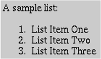
Listing 2.5 A simple numbered list
A sample list: <OL> <LI>List Item One <LI>List Item Two <LI>List Item Three </OL>
The OL tag has three optional attributes: TYPE, START, and COMPACT.
TYPE The TYPE attribute specifies the style of numbering to use. Legal values for TYPE are summarized in Table 2.2. Officially, TYPE is deprecated in favor of style sheets, but many authors find its use convenient.
START START, also technically deprecated, is an integer specifying where numbering should start. It can be used with any value of TYPE. There is no option to specify a prefix to appear before each number.
| Value | Meaning |
|---|---|
| 1 | Arabic: 1, 2, 3, etc. Default. |
| A | Alphabetic uppercase: A, B, C, etc. |
| a | Alphabetic lowercase: a, b, c, etc. |
| I | Roman numeral uppercase: I, II, III, IV, etc. |
| i | Roman numeral lowercase: i, ii, iii, iv, etc. |
COMPACT COMPACT specifies that the list should be rendered more compactly (i.e., in less space) than usual but is deprecated and not widely supported.
Listing 2.6 gives a more complex use of numbered lists; Figure 2-3 shows a typical result. Note that nested lists are indented and are numbered starting at 1, not at the last value of the outer list.
Figure 2-3. Nested lists, like this one from Listing 2.6, are automatically indented.
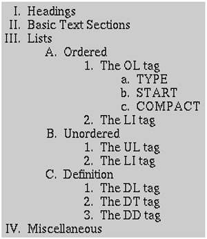
Listing 2.6 Nested ordered lists
<OL TYPE="I"> <LI>Headings <LI>Basic Text Sections <LI>Lists <OL TYPE="A"> <LI>Ordered <OL TYPE="1"> <LI>The OL tag <OL TYPE="a"> <LI>TYPE <LI>START <LI>COMPACT </OL> <LI>The LI tag </OL> <LI>Unordered <OL TYPE="1"> <LI>The UL tag <LI>The LI tag </OL> <LI>Definition <OL TYPE="1"> <LI>The DL tag <LI>The DT tag <LI>The DD tag </OL> </OL> <LI>Miscellaneous </OL>
| HTML Element: | <LI ...> ... </LI> (End Tag Optional) |
| Attributes: | (When inside OL) VALUE, TYPE |
LI entries support different attributes depending on what type of list they are in. Numbered lists support the VALUE and TYPE attributes in list items. Strictly speaking, LI is a container element, but in many cases the end tag is omitted.
VALUE The VALUE attribute, technically deprecated in favor of style sheets, specifies a specific number for an entry in a list. the VALUE attribute affects not just the current LI, but all the subsequent LI elements in the list.
TYPE List items can also have a TYPE attribute with the same potential values as in the OL element, used in the rare case when you want to switch numbering styles within a list.
Bulleted Lists
| HTML Element: | <UL ...> ... </UL> |
| Attributes: | TYPE, COMPACT |
The UL element creates bulleted (unordered) lists. The LI (list item) tag specifies individual entries within a list. For instance, Listing 2.7 shows a simple bulleted list; Figure 2-4 shows the result in Netscape 4.0 on Sun/Solaris workstation.
Figure 2-4. The UL element generates bullets for each LI item.
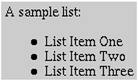
Listing 2.7 A simple bulleted list
A sample list: <UL> <LI>List Item One <LI>List Item Two <LI>List Item Three </UL>
The UL tag has two optional attributes: TYPE and COMPACT.
TYPE The TYPE attribute, officially deprecated in favor of style sheets, specifies which bullet style to use. Legal values for TYPE are summarized in Table 2.3.
COMPACT COMPACT, also deprecated, signifies that the list should take up less space than usual. COMPACT is not widely supported.
| Value | Meaning |
|---|---|
| DISC | A solid circle. Often the default for nonnested lists. |
| CIRCLE | A hollow circle. Often the default for nested lists. |
| SQUARE | A solid or hollow square, depending on the browser. |
| HTML Element: | <LI ...> ... </LI> (End Tag Optional) |
| Attributes: | (When inside UL) TYPE |
Depending on the type of list, different attributes are supported by the LI element. In bulleted lists, only the TYPE attribute is supported in list elements. LI is a container element, but the end tag is omitted in many cases.
TYPE The TYPE attribute, deprecated in favor of style sheets, specifies the bullet type of the particular list element. It has the same allowable values as the TYPE attribute for UL itself (legal values are DISC, CIRCLE, or SQUARE).
Definition Lists
| HTML Element: | <DL ...> ... </DL> |
| Attributes: | COMPACT |
| HTML Element: | <DT> ... </DT> (End Tag Optional) |
| Attributes: | None |
| HTML Element: | <DD> ... </DD> (End Tag Optional) |
| Attributes: | None |
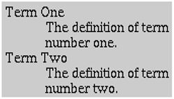
The DL element creates lists containing both indented and nonindented items. Items are not numbered or bulleted. The standard use is for definition terms (DT) to have normal margins and the definition descriptions (DD) to have indented left margins. For instance, Listing 2.8 shows a simple definition list, with the result shown in Figure 2-5. DL has an optional COMPACT attribute, but it is deprecated and not widely supported. Strictly, DT and DD are container elements, but the end tags are optional.
Figure 2-5. This rendering of Listing 2.8 illustrates the typical indentation of the DD element.
Listing 2.8 A simple definition list
<DL> <DT>Term One <DD>The definition of term number one. <DT>Term Two <DD>The definition of term number two. </DL>
DD elements are allowed to contain other block-level elements except for headings and addresses. A DD element can appear in a DL list without an associated DT; it is the only HTML block-level element that is normally rendered with an indented left margin but a standard right margin. In previous HTML releases, DD elements (and borderless tables with empty, fixed-width, left columns) were used to implement left-indented paragraphs. In HTML 4.0, style sheets are a more flexible and reliable alternative.
2.4 Tables
HTML tables are widely used not only for traditional tables (data presented in tabular format) but also to control layout and group related items. The majority of the most popular Web sites use tables to control the overall layout of the main page. Table entries can contain images, multiple paragraph types including lists, and even other tables. The border around the table and between cells can be suppressed so that the reader is unaware that a table is being used. Creating complex tables by hand can be tedious and error prone, especially if there are nested tables or entries that span rows and columns. HTML editors that let you lay out tables visually can be a big help, especially if they let you go back to the "raw" HTML to add features (such as BGCOLOR) that they might not support.
The Basic Table Structure
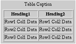
A basic HTML table consists of the TABLE element containing an optional CAPTION element, followed by table rows specified by TR. The rows can contain either TH (table heading) elements or TD (table data) elements. TH uses centered, bold text by default, and TD uses normal, left-aligned text. This structure is exemplified in Listing 2.9, with a typical result shown in Figure 2-6. Note that the </TR>, </TH>, and </TD> end tags are optional but help to organize the HTML.
Figure 2-6. This is a typical rendering of the simple table given in Listing 2.9.
In addition to the basic structure of individual rows in a table, the HTML 4.0 specification adds new elements for grouping table rows (THEAD, TBODY, and TFOOT), and new elements for grouping table columns (COLGROUP and COL). These new elements, provide formatting control of individual or grouped columns. We talk about table grouping elements after our discussion of the basic TABLE structure.
Listing 2.9 A simple HTML table
<TABLE BORDER=1> <CAPTION>Table Caption</CAPTION> <TR><TH>Heading1</TH> <TH>Heading2</TH></TR> <TR><TD>Row1 Col1 Data</TD><TD>Row1 Col2 Data</TD></TR> <TR><TD>Row2 Col1 Data</TD><TD>Row2 Col2 Data</TD></TR> <TR><TD>Row3 Col1 Data</TD><TD>Row3 Col2 Data</TD></TR> </TABLE>
| HTML Element: | <TABLE...> ... </TABLE> |
| Attributes: | BORDER, ALIGN, WIDTH, CELLSPACING, CELLPADDING, FRAME, RULES, SUMMARY, BGCOLOR, BORDERCOLOR (nonstandard), BORDERCOLORDARK (nonstandard), BORDERCOLORLIGHT (nonstandard), BACKGROUND (nonstandard) |
The <TABLE> tag can be used with no attributes, yielding a borderless left-aligned table. For more control, the following attributes can be specified.
ALIGN The ALIGN attribute, deprecated in favor of style sheets, gives the horizontal alignment of the table as a whole. Legal values are LEFT, RIGHT, and CENTER, with LEFT being the default. Note that text immediately after a right-aligned table is displayed on the left side of the table in the browser. To force the text to appear below the table use <BR CLEAR="ALL">. See Section 3.7 (Controlling Line Breaks) for discussion of the BR element.
BORDER The main purpose of the BORDER attribute is to control the width in pixels of the the visible border around the table. However, if set to zero (the default), BORDER also turns off the dividing lines between table cells. This width is in addition to the border around each cell (CELLSPACING). Some browsers allow <TABLE BORDER> to mean the same as <TABLE BORDER=1>. The latter should be avoided because it prevents validation by the formal HTML validators.
Core Note
| | The thickness of the outside border is the sum of BORDER and CELLSPACING, assuming BORDER is not zero. |
CELLSPACING CELLSPACING gives the space in pixels between adjacent table cells. The space is drawn as a 3D line if BORDER is nonzero; otherwise, the space is simply drawn in the background color. The default space size is usually three pixels.
CELLPADDING CELLPADDING determines the empty space, in pixels, between the cell's border and the cell data. The default is usually one pixel.
FRAME The FRAME attribute is new in HTML 4.0 and specifies which outer borders are drawn. All four borders are drawn if this attribute is omitted. Legal values are BORDER or BOX (all), VOID (none), ABOVE (top), BELOW (bottom), HSIDES (top and bottom, despite the somewhat confusing name), VSIDES (left and right), LHS (left), and RHS (right). Listing 2.10 gives a simple example, with the result shown in Figure 2-7. The FRAME attribute is not supported in Netscape, at least as of Netscape version 4.7.
Figure 2-7. A table with the outside borders turned off.
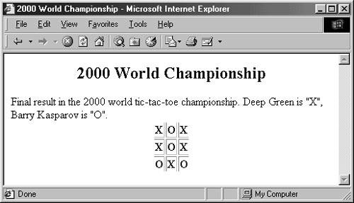
Listing 2.10 TicTacToe.html
<!DOCTYPE HTML PUBLIC "-//W3C//DTD HTML 4.0 Transitional//EN"> <HTML> <HEAD> <TITLE>2000 World Championship</TITLE> </HEAD> <BODY> <H2 ALIGN="CENTER">2000 World Championship</H2> Final result in the 2000 world tic-tac-toe championship. Deep Green is "X", Barry Kasparov is "O". <TABLE ALIGN="CENTER" BORDER=1 FRAME="VOID" > <TR><TH>X<TH>O<TH>X <TR><TH>X<TH>O<TH>X <TR><TH>O<TH>X<TH>O </TABLE> </BODY> </HTML>
Core Warning
| | Netscape does not support the FRAME attribute of the TABLE element. |
RULES This new HTML 4.0 attribute, supported by Internet Explorer, but not Netscape, specifies which inner dividing lines are drawn. All are drawn if this attribute is omitted. Legal values are NONE, ROWS, COLS, ALL, and GROUPS.
Core Warning
| | Netscape does not support the RULES attribute of the TABLE element. |
SUMMARY The SUMMARY attribute, new in HTML 4.0, provides a description of the table for user agents rendering the document in nonvisual media such as speech or Braille.
WIDTH The WIDTH attribute specifies the width of the table, either in pixels (<TABLE WIDTH=250>) or as a percentage of the current browser window width (<TABLE WIDTH="75%">). Specify absolute sizes with caution in most cases you know little about the window sizes used by visitors to your page. If you specify a percentage, be sure to enclose the value in double quotes. The default size is derived from the size of table elements.
BGCOLOR Specifying colors for tables (or individual table rows or cells) adds greatly to the appearance of Web pages. You can use the BGCOLOR attribute of TABLE to specify the color of the whole table (alternatively, you can use style sheets as discussed in Chapter 5). The advantage of style sheets is that if you change your mind about the specific colors, you only have to make a single modification to effect changes on all pages that use the same style sheet.
BORDERCOLOR, BORDERCOLORDARK, BORDERCOLORLIGHT These nonstandard attributes, supported only by Internet Explorer 4.0 and above, specify the colors to use for the borders of the table. BORDERCOLOR defines the main color, and BORDERCOLORDARK and BORDERCOLORLIGHT define the colors to use for the 3D shading. They are applicable only when the BORDER attribute is nonzero.
BACKGROUND This attribute is an Internet Explorer-specific method to specify an image file that will be tiled as the background of the table. With borders turned off, this attribute provides a way to overlay images with text, but it is not portable to other browsers. Style sheets provide the same capability in a manner supported by many new browsers, so avoid the BACKGROUND attribute even for internal applications that primarily use Internet Explorer.
| HTML Element: | <CAPTION ...> ... </CAPTION> |
| Attributes: | ALIGN |
The CAPTION element, placed between the TABLE tags, adds a title above (ALIGN="TOP") or below (ALIGN="BOTTOM") the table. The default placement is TOP. Many developers forego the use of CAPTION and create captions using HTML elements that give them more control over the caption format.
Defining Table Rows
| HTML Element: | <TR ...> ... </TR> (End Tag Optional) |
| Attributes: | ALIGN, VALIGN, BGCOLOR, BORDERCOLOR (nonstandard), BORDERCOLORDARK (nonstandard), BORDERCOLORLIGHT (nonstandard), CHAR, CHAROFF |
TR defines each row in the table. Each row will then contain TH or TD entries.
ALIGN ALIGN (legal values are LEFT, RIGHT, CENTER, JUSTIFY, or CHAR) sets the horizontal alignment for the content of the table cells. LEFT is the default. Neither Netscape nor Internet Explorer support JUSTIFY or CHAR cell alignments.
VALIGN VALIGN (legal values are TOP, MIDDLE, BOTTOM, or BASELINE) sets the vertical alignment for the content of the table cells. BASELINE positions the first line of text in each cell to a common baseline. MIDDLE is the default.
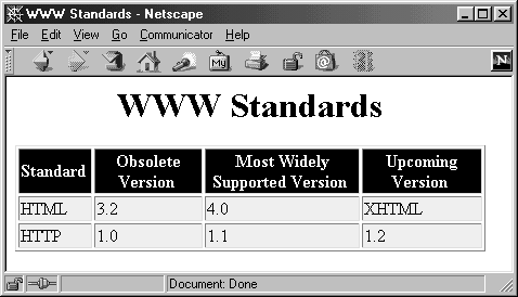
BGCOLOR BGCOLOR sets the color for the table row, overriding any values set for the table as a whole by the BGCOLOR attribute of TABLE. It, in turn, can be overridden by a BGCOLOR attribute in a TD or TH entry in the row. This feature is useful for making tables in which the header row is shaded differently from the remaining rows. For instance, Listing 2.11 defines a table with the headers presented with white text on a black background, and the other rows presented with black text on a light gray background. The result shown in Figure 2-8 is a common table format that is preferred by a number of users.
Figure 2-8. The BGCOLOR attribute makes some tables look nicer.
BORDERCOLOR, BORDERCOLORDARK, BORDERCOLORLIGHT Supported only by Internet Explorer, these attributes specify the color to use for the borders of the row. BORDERCOLOR define the main color, BORDERCOLORDARK and BORDERCOLORLIGHT defines the colors to use for 3D shading. The attributes are only applicable when the BORDER attribute of the TABLE is nonzero.
Lastly, the HTML 4.0 specification defines CHAR and CHAROFF attributes for TR, TH, TD, THEAD, TBODY, and TFOOT elements. For the CHAR attribute, the browser will align each cell in a a row so that the given character, for example, a decimal point, always appears in the same relative location. The CHAROFF attribute specifies an offset to the first alignment character. Neither Netscape nor Internet Explorer support these two attributes, and we do not discuss them for each of the table elements.
Listing 2.11 BG-Colors.html
<!DOCTYPE HTML PUBLIC "-//W3C//DTD HTML 4.0 Transitional//EN"> <HTML> <HEAD> <TITLE>WWW Standards</TITLE> </HEAD> <BODY BGCOLOR="WHITE"> <H1 ALIGN="CENTER">WWW Standards</H1> <TABLE BORDER=1 BGCOLOR="#EEEEEE"> <TR BGCOLOR="BLACK"> <TH><FONT COLOR="WHITE">Standard</FONT> <TH><FONT COLOR="WHITE">Obsolete Version</FONT> <TH><FONT COLOR="WHITE">Most Widely Supported Version</FONT> <TH><FONT COLOR="WHITE">Upcoming Version</FONT> <TR><TD>HTML <TD>3.2 <TD>4.0 <TD>XHTML <TR><TD>HTTP <TD>1.0 <TD>1.1 <TD>1.2 </TABLE> </BODY> </HTML>
Table Headings and Data Cells
| HTML Element: | <TH ...> ... </TH> (End Tag Optional) <TD ...> ... </TD> (End Tag Optional) |
| Attributes: | COLSPAN, ROWSPAN, ALIGN, VALIGN, WIDTH, HEIGHT, NOWRAP, BGCOLOR, BACKGROUND (nonstandard), BORDERCOLOR (nonstandard), BORDERCOLORDARK (nonstandard), BORDERCOLORLIGHT (nonstandard), ABBR, AXIS, HEADERS, SCOPE |
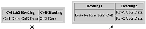
COLSPAN COLSPAN defines a heading or cell data entry that spans multiple columns. Listing 2.12 gives a simple example, and Figure 2-9(a) shows a typical result.
Figure 2-9. (a) This is a typical result from the column-spanning example of Listing 2.12. (b) This is a typical result from the row-spanning example of Listing 2.13.
Listing 2.12 A heading that spans two columns
<TABLE BORDER=1> <TR><TH COLSPAN=2 >Col 1&2 Heading <TH>Col3 Heading <TR><TD>Col1 Data <TD>Col2 Data <TD>Col3 Data </TABLE> ROWSPAN ROWSPAN defines a heading or cell data entry that spans multiple rows. Listing 2.13 gives a simple example, and Figure 2-9(b) shows a typical result.
Listing 2.13 A data cell that spans two rows
<TABLE BORDER=1> <TR><TH>Heading1<TH>Heading2 <TR><TD ROWSPAN=2 >Data for Row 1&2, Col1 <TD>Row1 Col2 Data <TR><TD>Row2 Col2 Data </TABLE> ALIGN and VALIGN The ALIGN attribute (legal values are LEFT, RIGHT, CENTER, JUSTIFY, or CHAR) specifies the horizontal alignment of items in a table cell. The default is LEFT for TD and CENTER for TH, unless overridden by the ALIGN attribute of TR. The VALIGN attribute (legal values are TOP, MIDDLE, BOTTOM, or BASELINE) specifies the vertical alignment of the table cell items. See the TR element for definitions of CHAR and BASELINE. The default is MIDDLE.
WIDTH and HEIGHT In the absence of WIDTH and HEIGHT attributes, cell sizes are set by the browser, based on the window size and the data contained in the cell. The WIDTH and HEIGHT attributes enable you to specify an exact size in pixels. Use absolute sizes with caution because they may prevent reasonable formatting if the browser window is not the size the document author expected. HTML authors sometimes use fixed-size cells when implementing toolbars with images, since the image size is known and at least one other column or row in the table is specified with a variable size. According to the HTML 4.0 specification, percent values are not allowed. However, both Netscape and Internet Explorer support using the value as a percentage of the table width or height (not of the browser window width or height). Both WIDTH and HEIGHT are deprecated in favor of style sheets.
NOWRAP The NOWRAP attribute, deprecated in favor of style sheets, suppresses word wrapping within a cell. A similar effect can be achieved with nonbreaking spaces ( ) between words or with a PRE paragraph inside a cell (this also results in a fixed-width font and an unwanted carriage return in some browsers). NOWRAP should be used with caution because it can result in text extending beyond the browser limits if the browser window is not sized appropriately.
BGCOLOR and BACKGROUND The BGCOLOR attribute, officially deprecated in HTML 4.0, sets a background color for the particular table cell. The BACKGROUND attribute, supported by Internet Explorer 3.0 and later, specifies an image file that will be tiled as the background of the cell.
BORDERCOLOR, BORDERCOLORDARK, BORDERCOLORLIGHT Supported only by Internet Explorer, these attributes specify the color to use for the borders of the cell. BORDERCOLOR defines the main color; BORDERCOLORDARK and BORDERCOLORLIGHT define the colors to use for 3D shading. The attributes are applicable only when the BORDER attribute of the TABLE is nonzero.
Finally, the new HTML 4.0 attributes, ABBR, HEADERS, SCOPE, and AXIS, are not yet widely supported. ABBR, HEADERS, and SCOPE provide simplified information for nonvisual browsers. The AXIS attribute (unsupported) can assign a category to one or more table cells for selection by a browser query.
Grouping Table Contents
| HTML Element: | <THEAD ...> ... </THEAD> (End Tag Optional) <TBODY ...> ... </TBODY> (End Tag Optional) <TFOOT ...> ... </TFOOT> (End Tag Optional) |
| Attributes: | ALIGN, VALIGN |
The elements THEAD, TBODY, and TFOOT group parts of a table into logical sections that, when used in conjunction with the TABLE attribute RULES="GROUPS", are displayed separated by a horizontal rule. Technically, only one header and footer section is allowed in the table; however, multiple body sections are permitted. Each section group can contain one or more table rows, TR, with formatting applied to all rows in a group simultaneously. This approach is more advantageous than setting the format for each row separately. Interestingly, these grouping elements originated as Internet Explorer extensions and were later adopted as standard in HTML 4.0. However, Netscape 4.x does not support these elements.
Core Alert
| | Netscape 4.x does not support the table grouping elements THEAD, TBODY, and TFOOT. |
ALIGN and VALIGN The ALIGN attribute (legal values are LEFT, RIGHT, CENTER, JUSTIFY, or CHAR) specifies the horizontal alignment of all cells in the section group. The default is CENTER for THEAD, and LEFT for TBODY and TFOOT. See the TR element for a definition of the CHAR alignment. The VALIGN attribute (TOP, MIDDLE, BOTTOM, or BASELINE) specifies the vertical alignment. See the ALIGN attribute of TR for a definition of BASELINE. The default is MIDDLE.
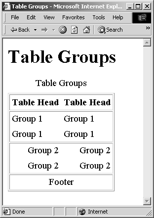
Listing 2.14 gives a simple example of a table divided into a header, a footer, and two body sections. The result, as displayed by Internet Explorer 5.0 on Windows 2000 Professional, is shown in Figure 2-10. Specifying GROUPS for the table RULES causes a horizontal line to be displayed to separate each of the four defined table sections.
Figure 2-10. Result of Listing 2.14; the table borders are delimited by groups.
Listing 2.14 A table divided into group sections
<TABLE BORDER=1 CELLPADDING=4 RULES="GROUPS" > <CAPTION>Table Groups <THEAD> <TR><TH>Table Head<TH>Table Head <TBODY> <TR><TD>Group 1<TD>Group 1 <TR><TD>Group 1<TD>Group 1 <TBODY ALIGN="RIGHT"> <TR><TD>Group 2<TD>Group 2 <TR><TD>Group 2<TD>Group 2 <TFOOT ALIGN="CENTER"> <TR><TD COLSPAN=2>Footer </TABLE>
| HTML Element: | <COLGROUP ...> ... </COLGROUP> (End Tag Optional) <COL ...> ... </COL> (End Tag Optional) |
| Attributes: | ALIGN, VALIGN, SPAN, WIDTH |
Originally an Internet Explorer extension, the COLGROUP element establishes a common group of columns in the table. The COLGROUP element provides a big advantage for controlling the format of different columns. Without this element, formatting of cells in a table is only accessible on a row-by-row basis using TR and TD. The most common application of COLGROUP is to control the horizontal alignment of text in one or more columns. When displayed by the browser, the boundary of each COLGROUP is delimited by a vertical line (when used in conjunction with the TABLE attribute RULES="GROUPS"). If individual columns within a COLGROUP require different formatting attributes, then provide individual control through the COL element. Note that the COL element must appear immediately after a COLGROUP element; note also that the COLGROUP element must appear before the THEAD or TBODY element.
ALIGN and VALIGN The ALIGN attribute (legal values LEFT, RIGHT, CENTER, JUSTIFY, or CHAR) specifies the horizontal alignment of all cells in the COLGROUP or COL. The default is LEFT, unless the cells are in the THEAD, in which case the default horizontal alignment is CENTER. Unfortunately, specifying an alignment for a column overrides the default alignment for the header cell, which is CENTER. By adding an ALIGN attribute for the individual TH cell or by using style sheets, you can easily resolve this side effect. The CHAR alignment is defined by the TR element. The VALIGN attribute (TOP, MIDDLE, BOTTOM, or BASELINE) specifies the vertical alignment of all cells in the column group. The default is MIDDLE. A definition of BASELINE is provided by the TR ALIGN attribute. Not all browsers support JUSTIFY, CHAR, or BASELINE attribute values.
SPAN and WIDTH The SPAN attribute specifies how many consecutive columns are governed by the corresponding COLGROUP or COL element. The WIDTH attributes defines what percentage of the total table width the COLGROUP or COL should occupy.
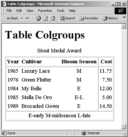
Listing 2.15 gives a simple example of grouping the columns in a table and controlling the alignment of individual columns. Prior to the THEAD element, one COLGROUP is associated with the first three columns, and a second COLGROUP is associated with the remaining column. The alignment of each column in the first group is individually controlled through the COL element. The result, as displayed by Internet Explorer 5.0 on Windows 2000 Professional, is shown in Figure 2-11. Specifying GROUPS for the table RULES causes the two column groups to be separated by a horizontal line.
Figure 2-11. Result of Listing 2.15; COLSPAN and COL control column borders and alignment.
Listing 2.15 Controlling column alignment and borders
<TABLE CELLPADDING=3 RULES="GROUPS" > <CAPTION>Stout Medal Award</CAPTION> <COLGROUP> <COL ALIGN="CENTER"> <COL ALIGN="LEFT"> <COL ALIGN="CENTER"> <COLGROUP ALIGN="RIGHT"> <THEAD> <TR><TH>Year<TH>Cultivar<TH>Bloom Season<TH>Cost <TBODY> <TR><TD>1965<TD>Luxury Lace <TD>M <TD>11.75 <TR><TD>1976<TD>Green Flutter<TD>M <TD> 7.50 <TR><TD>1984<TD>My Belle <TD>E <TD>12.00 <TR><TD>1985<TD>Stella De Oro<TD>E-L<TD> 5.00 <TR><TD>1989<TD>Brocaded Gown<TD>E <TD>14.50 <TFOOT> <TR><TD COLSPAN=4>E-early M-midseason L-late </TABLE>
2.5 Fill-Out Forms
HTML FORM elements enable you to create data-entry documents that can be filled out by the reader and to send data to programs on a server for processing. Common FORM elements include textfields, text areas, password fields, check boxes, radio buttons, combo boxes, list boxes, image maps, and button controls. These HTML form elements are discussed in detail in Chapter 18 (HTML Forms).
2.6 Miscellaneous Block-Level Elements
The remaining block-level elements include HR for a horizontal rule used as a divider, DIV for setting up default alignments for other block-level elements, and CENTER for centering a section of text.
| HTML Element: | <HR ...> (No End Tag) |
| Attributes: | ALIGN, WIDTH, SIZE, NOSHADE, COLOR (nonstandard) |
Horizontal rules, indicated by the HR element, divide sections by drawing a horizontal "etched" line all or partway across the browser window. The following paragraphs summarize the five optional attributes, all of which are deprecated in favor of style sheets.
ALIGN ALIGN specifies the horizontal alignment. Legal options are LEFT, RIGHT, and CENTER, with CENTER being the default.
WIDTH This attribute gives the width in pixels (<HR WIDTH=75>) or as a percentage of current window width (<HR WIDTH="50%">). The default is 100%.
SIZE SIZE is the thickness of the line in pixels. This thickness is in addition to any shadowing used to make the line etched. The default is about one pixel.
NOSHADE If present, NOSHADE tells the browser to use a solid color instead of the default etched line.
COLOR COLOR is a nonstandard attribute supported by Internet Explorer that changes the color of the line. Color names and RGB values are legal (see Table 1.1 for values).
| HTML Element: | < DIV ...> ... </DIV> |
| Attributes: | ALIGN |
The DIV element divides a document into distinct sections. Through use of the ALIGN attribute or style sheets, the alignment of large sections of the document can be independently controlled. Acceptable values for the ALIGN attribute are LEFT, RIGHT, CENTER, or JUSTIFY. Style sheets are preferred for aligning divisions because the ALIGN attribute is deprecated in HTML 4.0.
| HTML Element: | < CENTER> ... </CENTER> |
| Attributes: | None |
Officially deprecated in the HTML 4.0 specification, <CENTER> is shorthand for <DIV ALIGN="CENTER"> and is still widely used to accommodate earlier browser versions.
| HTML Element: | <SCRIPT TYPE="..." ...>...</SCRIPT> |
| Attributes: | TYPE (required), LANGUAGE, SRC, DEFER, CHARSET |
SCRIPT is used for embedded programs, usually JavaScript. See Chapter 24 (JavaScript: Adding Dynamic Content to Web Pages) for details.
| HTML Element: | <NOSCRIPT>...</NOSCRIPT> |
| Attributes: | None |
The intention of NOSCRIPT is that the contents be ignored by browsers that support JavaScript, and thus, NOSCRIPT provides alternative text for browsers that do not support JavaScript. See Chapter 24 (JavaScript: Adding Dynamic Content to Web Pages) for details.
| HTML Element: | <MULTICOL COLS=xxx ...> ... </MULTICOL> (Nonstandard) |
| Attributes: | COLS (required), GUTTER, WIDTH |
MULTICOL is a Netscape-specific extension introduced in Navigator 3.0 to support multicolumn text, as in a newspaper or magazine. Creating multicolumn text with MULTICOL differs from standard HTML tables (Section 2.4) in that MULTICOL lets text flow from one column to another but requires that all the columns be the same width. Tables, on the other hand, require you to assign sections of text to table cells in advance but let the columns be of varying sizes. Tables in Netscape and Internet Explorer also let you assign different background colors to different cells, something that MULTICOL does not support.
COLS This required attribute specifies the number of columns of text, which should be two or greater.
GUTTER This optional attribute specifies the number of pixels between the columns. The default is 10.
WIDTH This optional attribute specifies the width in pixels of each of the columns. If WIDTH is omitted, then Netscape divides the space available, after the gutters, evenly among all the columns.
2.7 Summary
Block-level elements enable you to define the major sections of your Web page. You can define headings, several different paragraph types, lists, tables, data-input forms, and a few miscellaneous elements. However, in order to specify formatting changes within a text section, you must use the text-level elements discussed in the next chapter.
Finally, remember that many of the HTML 3.2 elements and attributes are deprecated in the newer HTML 4.0 specification, as indicated throughout the chapter. Though still supported by Netscape and Internet Explorer, deprecated elements or attributes in a document require the transitional DOCTYPE statement to validate as legal HTML 4.0. Furthermore, a lot of the newer constructs (like THEAD, COLGROUP, and MULTICOL) are not supported by all browsers, and authors should use them with care.
| CONTENTS | |
EAN: 2147483647
Pages: 31