Example: A Quick Evaluation of ZDNet
|
The following is an excerpt of a rapid competitive usability test done of ZDNet for an online news site. In the interest of saving space, the description of the research process and the way that these results feed into the larger list of core competencies have been omitted.
-
The general perception is that ZDNet is mostly for software and hardware reviews, not for cultural information. When asked to categorize what they thought the site was about, the evaluators generally focused on the technical review aspects of the site. They did not feel that this was a site to go to for information about how technology would affect their world in a broad sense, but appeared to feel that it was a comprehensive site for information about what's happening now in terms of new mainstream hardware and software.
-
Because of email newsletters, many people never go to the front door (shown in Figure 14.1). At least one of the evaluators said that he had been to the site in the recent past, yet when shown the ZDNet front door—which has been redesigned for several months—he was surprised by the design. Therefore, depending on how much traffic comes through the front door directly versus links from other sites or from newsletters, the navigation and information on deep pages may be as equally important as or more important than that presented on the top page.
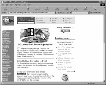
Figure 14.1: The ZDNet interface (circa 1998). -
Section naming was confusing and didn't invite exploration. "CI" is a reference to Computer Intelligence, a ZDNet property. The abbreviation was not known or recognized by any of the participants. "Infobeads" and "Garage" were picked out as especially confusing. "Help!" was possibly the most egregious example of this (even verging on deceptive) since people took it to be help with the site, when in fact it was a site for tips to use with other software. In fact, even after surfing around the "Help!" section for a while and looking at the actual content, the expected content was sufficiently strong to continue to confuse users since they were still trying to align reality with expectations.
-
Evaluators did not see the navigation bar because it was placed between an ad and the top headline. One evaluator thought that it was an ad at first. The confusion between advertising and content because of proximity and shape has come up before and could be one of the reasons for evaluators' dismissal of the suggested words at the top of Excite's results pages.
-
Navigation to specific stories was confusing. One evaluator said, "[This site has] exactly what I would have wanted, if I could ever find it again."
-
Stock quote navigation was almost impossible to figure out and made an almost perfect example of how to design an interface that was consistently misunderstood. Everyone (including me) made exactly the same sequence of mistakes with the stock quote interface when trying to find a quote for Netscape (NSCP).
-
When typing into the provided type-in box, everyone typed in the actual ticker symbol. However, because the interface did not understand ticker symbols, it just brought back a blank page.
-
Everyone then, seeing the line of numbers and letters above the type-in box, clicked on the "N." This brought them to the top of the "N" list of companies, showing 20 at a time.
-
Everyone then clicked on the "Next" button, bringing them to the next "NA" portion of the database.
-
Realizing that this was a large data space and that getting to the intended information would involve a lot of clicking, everyone then typed "Netscape" into the type-in box, generating the intended information.
All this (roughly 30 seconds' worth of work) could have been solved by a single line underneath the type-in box reading "Company name, NOT ticker symbol."
-
-
Search is a major method of site navigation. When asked to locate an article on a specific topic—though not for a specific article—people universally used the site search engine. Fortunately, the "Find" popup button was memorable, and people quickly gravitated to using it. However, for one evaluator there was a little confusion between it and the Search page, as listed on the navigation list on the left (which searches the whole site).
-
In the downloads section, users appreciated the rating system, but didn't know what the system was rating. Since shareware is so numerous and overlapping, people appreciate an "expert" opinion about the quality of the shareware. However, the metric of that quality may be an important piece of information to educate people on since they would like to know how a four-star program differs from a three-star and why.
|
EAN: 2147483647
Pages: 144