Modifying a Chart
| [ LiB ] |
Creating a chart is so simple that it probably made you want to enhance the chart to improve its appearance. Items you can change include the size, style, color , and placement.
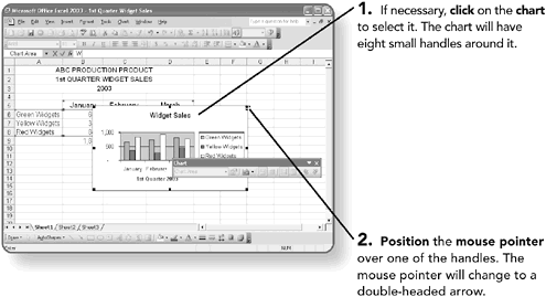
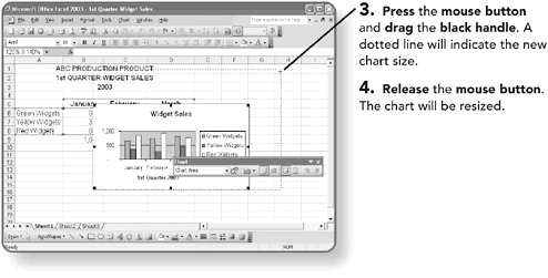
Resizing a Chart
When a chart is inserted on the worksheet page, it will probably be too small for you to read the data correctly. You can use your mouse to resize it.
NOTE
If your chart is on its own page, you don't need to click on the chart to select it. Just having the chart displayed makes it eligible for modification.
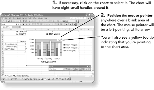
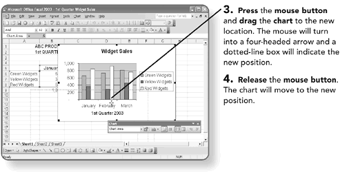
Moving a Chart
When a chart is inserted on the worksheet page, you can easily move it to any location on the page.
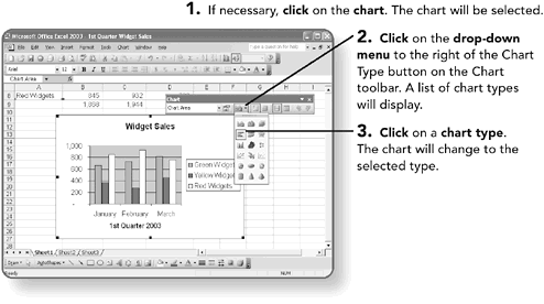
Changing a Chart Style
If you want to change the style of the chart, you can select a bar, area, pie, line, or a number of other style charts. Most of these charts can also be 3-D.
NOTE
Use 3-D charts lightly. Adding the extra dimension might make the chart look nice, but can also make the data difficult to read.
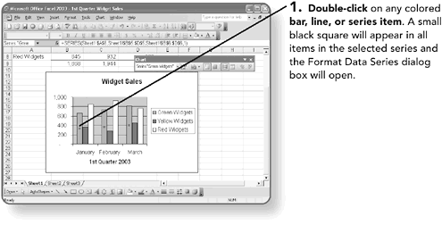
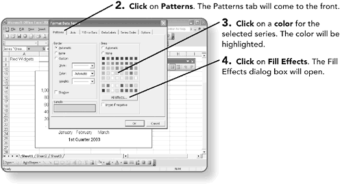
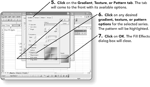
Editing the Series Appearance
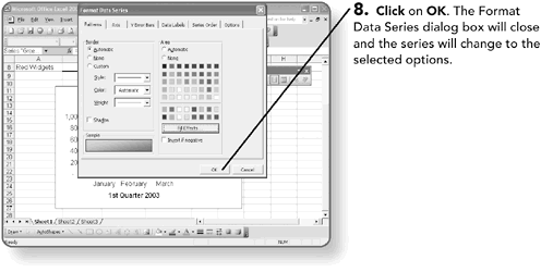
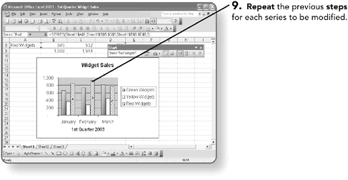
If you do not like the default colors or patterns assigned to a chart, you can change them for any series.
NOTE
Double-click on any section of the chart to edit options for that section.
Modifying Chart Text
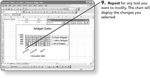
You can add or modify any text font, size, color, or border by double-clicking on the text.
Working with Labels
Labels are the descriptive text you add, including the chart title or labels for the x or y axis of the chart. The legend is also made of labels.
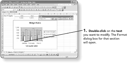
For example, here the Format Axis dialog box appeared, because the axis text was selected.
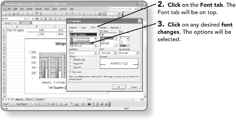
You can modify the alignment of your labels, including rotating them.
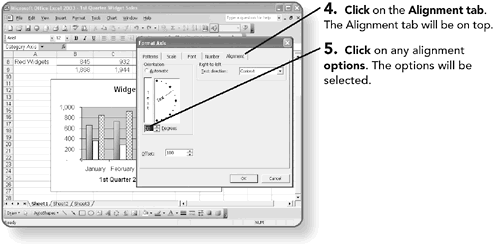
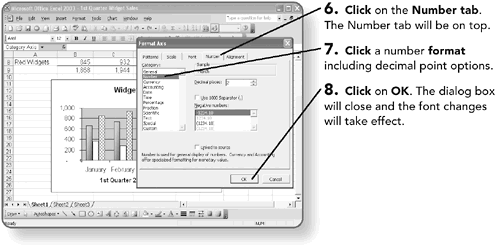
You also might want to apply a number format to your y axis, which displays the values in your chart. The same number formats available in an Excel worksheet are available for an Excel chart.
Placing the Legend
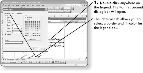
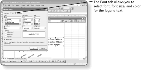
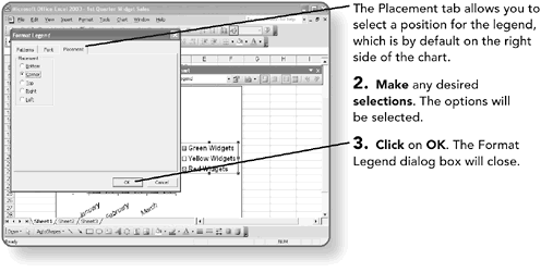
You can move the legend box, which is the key describing your y axis data, anywhere on the chart. Additionally, you can modify the legend box color and style. You cannot, however, modify the legend data since the legend is tied to the data series.
NOTE
You can also click and drag the legend to any desired location.
Displaying the Data Table
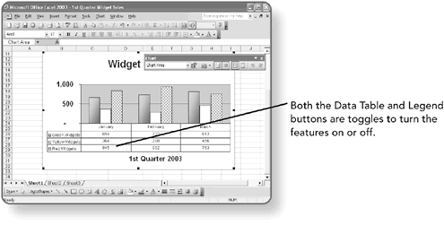
A data table is a grid that contains the numeric data used to create the chart. You can add a data table to your chart; it is usually attached to the category axis of the chart. The data table will also display the legend for your chart.
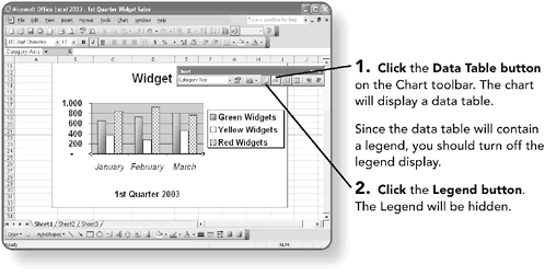
Since the data table will contain a legend, you should turn off the legend display.
NOTE
Double-click the data table to set data table formatting options.
| [ LiB ] |
EAN: 2147483647
Pages: 157