User Interface Diagramming
User Interface Diagramming
The user interface is one of the more subjective aspects of programming. For the most part, we are talking about forms in which the user enters data, but the user interface is also composed of menu items and reports . Basically, whatever the user sees or interacts with defines the user interface.
Although programmers may tend to lay out the user interface in a manner they find both attractive and functional, the initial designs will often not be perfect the first time. As you design these sets of diagrams and forms, be prepared for change.
For example, we may think that the student s address comes before their grade information in the user interface. However, an SME might point out that the student s address is commonly entered just once, whereas the grade data is modified many times over the student s academic life. Having the address fields before the grades simply means the end user must move through those fields to get to the ones they work with the most, thus wasting time.
Use of screen real estate is also important. Try to fill up the screen with as much data as possible, but leave a consistent amount of space (both horizontal and vertical) between the controls on a form. If there is simply too much data to display on a single page, consider adding user interface elements specifically designed to handle this situation, such as tabs or pages, depending on the platform.
User Interface Flow Diagramming
User interface flow diagramming lets you define the flow of the program, from a menu selection to a specific form, then to another form or dialog box. As with all diagrams, the basic goal is to identify what is needed and how things should work. User interface flow diagrams are most often used to define how the user will interact with the system for a particular use case.
Figure 10-2 shows a simple user interface flow diagram for our registration example. The text on the lines between the boxes indicates the form or user interface element to be used at that particular stage, and the boxes contain the text defining the operation or stage. In this example, we can see the following:
-
The student (user) selects the Register option from the main menu.
-
The student is then presented with a form titled Enrollment.
-
From the Enrollment form, the student must select a class. To enable them to do this, the Course Selector form is displayed.
-
Once a course is selected, the student then selects a section (or schedule) for the desired course using the Selection Selector form.
-
Once the student is registered, he is shown the Enrollment Verification form, which displays the summary of his new registration.
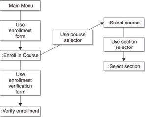
Figure 10-2: A simple flow diagram describing the user interface for the registration example
Note how we have each section or step of the user interface designed in terms of flow, including the course selection, section selection, and confirmation. Every aspect of the program must be accounted for.
User Interface Prototyping
User interface prototyping initially uses a diagram to define basically what will be displayed on a specific form. We can t write source code for a form until we know exactly what s on it.
Figure 10-3 shows a simple user interface prototype diagram. Note that at this stage, we don t care about the specific types of controls and their layout. We are still in the design and analysis phase, and spending too much time here in perfecting a user interface screen would be a waste of time because it is a commonly changed aspect of most programs.
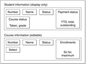
Figure 10-3: Boxes are used to group sets of one or more data elements.
Figure 10-3 uses boxes to group sets of one or more pieces of data. You can see that, at the top, the Student Information area shows the current student s ID number, name, status, payment status, and course status. We can imagine that Number, Name , and Status are all single fields. Payment Status, on the other hand, may have data such as how much the student has spent this year, in total, and how much they owe. This information is added at the bottom of the box.
Figure 10-3 also shows that, on the same screen, we have information about the course itself. It shows the number, name, status, and enrollments. It also provides a Select option, which could be a button that permits the user to pop up a list of all the courses offered by the institution.
As the user interface prototype is refined, you will eventually have defined all the components that need to be on a specific form. At this point, you may want to consider making actual prototype screens or mock programs. Doing this permits users to actually see, and possibly interact, with the real screens. A number of professional tools are available that permit you to create mock screens, but you may want to consider simply making them in the actual programming tool you will be using for the project.
The benefit to creating the mock screens using the actual programming tool is that you can then, if the design is approved, go ahead and use the code in the actual program. If you use a design tool (unless it specifically exports its design to your programming tool) to create a picture only, you will need to re-create the form from scratch in your development tool. Many Rapid Application Development (RAD) tools such as Visual Studio .NET, Delphi, and JBuilder make creating these mock screens very simple.
EAN: 2147483647
Pages: 130