Use Blending Modes
In addition to plain, plastic-wrap transparency, Illustrator s Transparency palette provides blending modes that transform colors in the underlying layer. These blending modes work something like sunglasses or a colored piece of glass ”tinting, distorting, or enhancing the effect of a transparent overlay.
Just to make the concept of transparency a bit more confusing, you may apply an opacity setting of 100 percent when you use a transparency filter without completely obscuring the underlying object. You ll do this when you work with blending modes, which create a variety of color changes to objects by combining the transparency filter color with the color of the underlying object.
Blending modes were briefly touched on in Chapter 14, as part of an overview of all of Illustrator s effects and filters. Here you ll explore their role in generating transparency.
The following blending effects are available from the blending mode drop-down list in the Transparency palette.
-
Normal This selection provides just transparency, no distortion of color.
-
Darken Darken changes any underlying colors that are lighter than the overlay color to the overlay color.
-
Multiply This darkens the resulting color.
-
Color Burn This option darkens the underlying object.
-
Lighten This selection lightens underlying colors that are darker than the overlay.
-
Screen This selection lightens the resulting color.
-
Color Dodge Color Dodge brightens the underlying object.
-
Overlay Overlay sharpens the contrast of a color (or pattern) filter by intensifying contrast.
-
Soft Light This option lightens the underlying object if the filtering object color is lighter than 50-percent gray. Otherwise, the underlying object is made darker.
-
Hard Light The Hard Light selection simulates shining a bright light on the underlying object.
Note For the Darken and Lighten blending modes, Illustrator first determines whether the overlay color or the base color is darker (in the case of Darken) or lighter (Lighten). It is this color that is applied in the blend.
-
Difference Difference calculates a new color based on the difference between the brightness values of the overlapping colors.
-
Exclusion This option changes color using the same kind of calculation as the Difference effect, but the contrast between the original color and the changed color is muted and less dramatic than the Difference effect.
-
Hue The Hue option retains the color of the top filtering object(s) while assuming the saturation (intensity) and brightness of the bottom object(s).
-
Saturation This selection retains the saturation (intensity) of the top filtering object(s) while assuming the brightness and color of the bottom object(s).
-
Color The Color selection retains the hue and saturation of the top filtering object(s) while assuming the brightness of the bottom object(s).
-
Luminosity The Luminosity option retains the brightness quantity (intensity) of the top filtering object(s) while assuming the saturation (intensity) of the bottom object(s).
All 16 blending modes are on display in Figure 17-5.
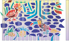
Figure 17-5: Transparency blends work like color lenses, tinting affected objects.
Many of the blending modes are determined by calculations based on hue, saturation, or brightness values. This tends to produce somewhat unintuitive results. You can look up color hue, saturation, or brightness values by choosing the HSB palette from the Color palette menu. As you experiment with different blending modes, you ll develop your ability to anticipate the effect they will have when used as filters.
| Caution | If your output is destined for hardcopy that will use spot color printing, avoid the Difference, Exclusion, Hue, Saturation, Color, and Luminosity blending modes. They're not supported by spot colors. For more on spot color printing, see Chapter 22. |
EAN: 2147483647
Pages: 175