17.9 LAYOUT MANAGEMENT IN AWTSWING
|
17.9 LAYOUT MANAGEMENT IN AWT/SWING
AWT/Swing provides the following layout managers:
BorderLayout FlowLayout BoxLayout CardLayout GridLayout GridBagLayout
Each layout manager embodies a different layout approach that we will illustrate with the help of simple examples below. Before getting into the examples, we want to say here that every container comes with a default layout manager. For example, the content pane, which, as mentioned previously, is the main container used in Swing frames, applets, and dialogs, uses Border-Layout as its default layout manager, the panels use FlowLayout by default, and so on.
It is, of course, possible to position components inside a container without using a layout manager class-by absolute positioning. But then one has to pay the price that the placement of the components could look awkward if the top-level window is resized.
17.9.1 Border Layout
The BorderLayout class recognizes five different areas-north, south, east, west, and center-for placing a component. These areas are designated, naturally, by the integer constants NORTH, SOUTH, EAST, WEST, and CENTER of the BorderLayout class. The following example shows how the space inside a content pane is allocated to these five areas.[14] The program places four JLabel objects in the north, south, east, and west portions of the top-level window and another JLabel object in the center, all with the help of BorderLayout. Each of the first four labels consists of an image icon and a text string. The JLabel object in the center consists of just a text string. The east, west, and center labels have been given borders to separate them visually from the other displayed objects.
//BorderLayoutTest.java //additional files needed: snlowflake.gif, zwthr14.gif, //thunderstormanim.gif, sunanim.gif import java.awt.*; // for Container, BorderLayout import java.awt.event.*; // for WindowAdapter import javax.swing.*; import javax.swing.border.*; // Border, BorderFactory public class BorderLayoutTest { public static void main( String[] args ) { JFrame f = new JFrame( "BorderLayoutTest" ); f.addWindowListener(new WindowAdapter() { public void windowClosing(WindowEvent e) { System.exit(0); } }); Container contentPane = f.getContentPane(); //the following is unnecessary since BorderLayout is default: // contentPane.setLayout( new BorderLayout() ); //NORTH: ImageIcon northIcon = new Imagelon( "image/snowflake.gif" ); JLabel northLabel = new JLabel( "Frigid in the North", northIcon, JLabel.CENTER ); northLabel.setVerticalTextPosition( JLabel.BOTTOM ); northLabel.setHorizontalTextPosition( JLabel.CENTER ); contentPane.add( northLabel , BorderLayout.NORTH ); //SOUTH: ImageIcon southIcon = new ImageIcon( "image/zwthr14.gif" ); JLabel southLabel = new JLabel( "Balmy in the South", southIcon, JLabel.CENTER ); southLabel.setVerticalTextPosition( JLabel.BOTTOM ); southLabel.setHorizontalTextPosition( JLabel.CENTER ); contentPane.add( southLabel, BorderLayout.SOUTH ); //EAST: ImageIcon eastIcon = new ImageIcon( "image/thunderstormanim.gif" ); JLabel eastLabel = new JLabel( "Stormy In the East", eastIcon, JLabel.CENTER ); eastLabel.setVerticalTextPosition( JLabel.BOTTOM ); eastLabel.setHorizontalTextPosition( JLabel.CENTER ); Border borderEastLabel = BorderFactory.createLineBorder( Color.blue ); eastLabel.setBorder( borderEastLabel ); contentPane.add( eastLabel, BorderLayout.EAST ); //WEST: ImageIcon iconWest = new ImageIcon( "image/sunanim.gif" ); JLabel westLabel = new JLabel( "Sunny in the West", iconWest, JLabel.CENTER ); westLabel.setVerticalTextPosition( JLabel.BOTTOM ); westLabel.setHorizontalTextPosition( JLabel.CENTER ); Border borderWestLabel = BorderFactory.createLineBorder( Color.black ); westLabel.setBorder( borderWestLabel ); contentPane.add( westLabel, BorderLayout.WEST ); //CENTER: JLabel centerLabel = new JLabel( "The Weather Compass", JLabel.CENTER ); Border borderCenterLabel = BorderFactory.createLineBorder( Color.red ); centerLabel.setBorder( borderCenterLabel ); contentPane.add( centerLabel , BorderLayout.CENTER ); f.pack(); f.setLocation( 200, 300 ); f.setVisible( true ); } }
The window produced by the above program is shown in Figure 17.9.
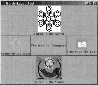
Figure 17.9
17.9.2 Flow Layout
FlowLayout arranges the components from left to right and from top to bottom, displaying each component at its preferred size. The first component that the manager is given is displayed in the middle of the first row at the top. When it is given a second component, the layout manager arranges for the two components to appear symmetrically with respect to the middle in the top row. When it is given a third component, the manager tries to arrange all three symmetrically in the top row. As more components are added, at some point the manager will run out of room in the top row. Then it starts the same process of arranging the components in the second row, and so on. When a window is resized, the layout manager automatically rearranges the components symmetrically even if that means shifting a component from one row to another.
Shown below is the FlowLayout version of the program we showed previously. Now that we do not want to use the default layout manager specified for a content pane, we use the following set invocation:
Container contentPane = f.getContentPane(); contentPane.setLayout( new FlowLayout() );
in lines (A) and (B) of the program. Since the cardinal directions do not carry any meaning for FlowLayout, we have also changed the names of the labels and the icons accordingly.
//FlowLayoutTest.java import java.awt.*; // for Container, BorderLayout import java.awt.even.*; // for WindowAdapter import javax.swing.*; import javax.swing.border.*; // for Border, BorderFactory public class FlowLayoutTest { public static void main( String[] args ) { JFrame f = new JFrame( "FlowLayoutTest" ); f.addWindowListener(new WindowAdapter() { public void windowClosing (WindowEvent e) { System. exit (0); } }); Container contentPane = f.getContentPane(); //(A) contentPane.setLayout( new FlowLayout() ); //(B) //ITEM 1: ImageIcon firstIcon = new ImageIcon( "snowflake.gif" ); JLabel firstLabel = new JLabel( "Frigid in the North", firstIcon, JLabel. CENTER ); firstLabel. setVerticalTextPosition( JLabel.BOTTOM ); firstLabel. setHorizontalTextPosition( JLabel.CENTER ); contentPane.add( firstLabel ); //ITEM 2: ImageIcon secondIcon = new ImageIcon( "zwthr14.gif" ); JLabel secondLabel = new JLabel( "Balmy in the South", secondIcon, JLabel. CENTER ); secondLabel.setVerticalTextPosition( JLabel.BOTTOM ); secondLabel.setHorizontalTextPosition( JLabel.CENTER ); // secondLabel.setPreferredSize(new Dimension(50, 50)); //(C) contentPane.add( secondLabel ); //ITEM 3: ImageIcon thirdIcon = new ImageIcon( "thunderstormanim.gif" ); JLabel thirdLabel = new JLabel( "Stormy In the East", thirdIcon, JLabel.CENTER ); thirdLabel.setVerticalTextPosition( JLabel.BOTTOM ); thirdLabel.setHorizontalTextPosition( JLabel.CENTER ); Border borderThirdLabel = BorderFactory.createLineBorder( Color.blue ); thirdLabel.setBorder( borderThirdLabel ); contentPane.add( thirdLabel ); //ITEM 4: ImageIcon fourthIcon = new ImageIcon( "sunanim.gif" ); JLabel fourthLabel = new JLabel( "Sunny in the West", fourthIcon, JLabel.CENTER ); fourthLabel.setVerticalTextPosition( JLabel.BOTTOM ); fourthLabel.setHorizontalTextPosition( JLabel.CENTER ); Border borderFourthLabel = BorderFactory.createLineBorder( Color.black ); fourthLabel.setBorder( borderFourthLabel ); contentPane.add( fourthLabel ); //ITEM 5: JLabel fifthLabel = new JLabel( "The Weather Compass", JLabel.CENTER ); Border borderFifthLabel = BorderFactory.createLineBorder( Color.red ); fifthLabel.setBorder( borderFifthLabel ); contentPane.add( fifthLabel ); f.pack(); f.setLocation( 200, 300 ); f.setVisible( true ); } } If you run this program, all five JLabel object may appear in a single row. If you resize the window to make it smaller, one or more of the rightmost entries will "float" down to the second row, while remaining symmetrical with respect to the middle of the window.
A noteworthy aspect of FlowLayout is that it respects any hints you provide for the preferred size of a component (whereas BorderLayout ignores such hints). For example, if in the above program, we uncomment the following statement in line (C):
secondLabel.setPreferredSize( new Dimension( 50, 50 ) );
then the size used for this component will be 50 × 50 pixels. This size remains fixed if you enlarge or shrink the top-level window.[15] In general, layout managers can also be provided with recommendations for the minimum and the maximum sizes to use for a component by invoking
component.setMinimumSize( size ); component.setMaximumSize( size );
While you are free to provide such hints, a layout manager may or may not pay attention to them. For example, only the BoxLayout to be presented next respects the maximum size hint.
The GUI produced by the above program is shown in Figure 17.10.
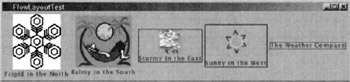
Figure 17.10
17.9.3 Box Layout
BoxLayout can create either a horizontal or a vertical arrangement of its components. The horizontal option arranges the components in a left-to-right order and the vertical option in a top-to-bottom order. The BoxLayout class also comes with the means to create empty spaces in a spatial layout to bring about a desired visual effect. There are three types of empty spaces:
-
Rigid area, created by invoking
Box.createRigidArea( size )
As its name implies, a rigid area gives you a fixed number of pixels as empty space. Say you are using BoxLayout for creating a horizontal arrangement of components and you want a space of 10 pixels between a pair of adjacent components, you can say:
container.add( firstComponent ); container.add( Box.createRigidArea( new Dimension( 10, 0 ) ) ); container.add( secondComponent );
The same goes for vertical spacing in a vertical arrangement of components. For vertical spacing, the argument supplied to createRigidArea would be like new Dimension( 0, 10 ).
-
Glue, created by invoking either
Box.createHorizontalGlue()
or
Box.createVerticalGlue()
Glue gives you expandable empty space. Suppose you want a couple of buttons to show up at the right end of a row that is constrained by the rest of the layout to be longer than what is needed to hold the two buttons. You could do so by
rowContainer.add( Box.createHorizontalGlue() ); rowContainer.add( firstButton ); rowContainer.add( secondButton );
Without the glue, both buttons would end up at the left end of the row.
-
Invisible component, created by invoking
new Box.Filler( minSize, prefSize, maxSize )
By incorporating an invisible component with appropriate size hints, you can force the layout manager to create an empty space that varies in size like the glue but that will not violate the min-size and the max-size constraints.
The example below uses BoxLayout to create the GUI whose outline is shown in Figure 17.11. The BoxLayout is used specifically in this example in the intermediate containers named listPanel and buttonPanel, both of type JPanel that are created in lines (E) and (I) of the program below. The container listPanel uses BoxLayout in the vertical mode to arrange a JLabel and a JScrollPane vertically. On the other hand, the container buttonPanel uses BoxLayout in the horizontal mode to arrange the two buttons as shown. The container buttonPanel also uses glue left of the buttons to push the buttons to the right end of the container.
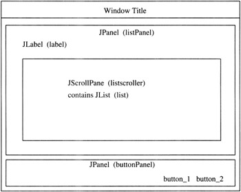
Figure 17.11
The JScrollPane object, called listScroller in the program, that resides inside the listPanel displays a JList object consisting of the data declared in line (B). A JList allows a user to select one or more items from a list. Since a JList does not support scrolling directly, if scrolling is needed you need to construct a JScrollPane object from a JList, as we have done in line (D), and thus make the JList object the viewport view of the JScrollPane object.
The two JPanel components, listPanel and buttonPanel, are inserted into the top-level window with BorderLayout in lines (H) and (J). Note how the listPanel component includes a a 10-pixel vertical space-in the form of a rigid area-between the JLabel and the JScrollPane in line (F). The component listPanel is also given a 10-pixel empty border all around in line (G).
//BoxLayoutTest.java import java.awt.*; // for Container, BorderLayout import java.awt.event.*; // for WindowAdapter import javax.swing.*; public class BoxLayoutTest { public static void main( String[] args ) { JFrame f = new JFrame( "BoxLayoutTest" ); f.addWindowListener(new WindowAdapter() { public void windowClosing(WindowEvent e) { System.exit(0); } }); Container contentPane = f.getContentPane(); //(A) String[] data = { "sunny", "hot", "stormy", "balmy" //(B) "cold", "frigid", "rainy", "windy", "snowy", "blistery", "blizzardy"}; JList list = new JList( data ); //(C) //this makes list the viewport of listscroller: JScrollPane listScroller = new JScrollPane( list ); //(D) listScroller.setPreferredSize( new Dimension( 300, 100 ) ); listScroller.setMinimumSize( new Dimension(300, 100 ) ); listScroller.setAlignmentX( Component.LEFT_ALIGNMENT ); JPanel listPanel = new JPanel(); //(E) listPanel.setLayout( new BoxLayout( listPanel, BoxLayout.Y_AXIS ) ); JLabel label = new JLabe( "Select today's weather:" ); listPanel.add( label ); listPanel.add( Box.createRigidArea( new Dimension( 0, 10 ) ) ); //(F) listPanel.add( listScroller ); listPanel.setBorder( BorderFactory.createEmptyBorder( 10, 10, 10, 10 ) ); //(G) contentPane.add( listPanel, BorderLayout.CENTER ); //(H) JButton cancelButton = new JButton( "Cancel" ); JButton selectButton = new JButton( "Select" ); JPanel buttonPanel = new JPanel(); //(I) buttonPanel.setLayout( new BoxLayout( buttonPanel, BoxLayout.X_AXIS ) ); buttonPanel.setBorder( BorderFactory.createEmptyBorder(0, 10, 10, 10 ) ); buttonPanel.add( Box.createHorizontalGlue() ); buttonPanel.add( cancelButton ); buttonPanel.add( Box.createRigidArea( new Dimension( 10, 0 ) ) ); buttonPanel.add( selectButton ); contentPane.add( buttonPanel, BorderLayout.SOUTH ); //(J) f.pack(); f.setLocation( 200, 300 ); f.setVisible( true ); } }
The window produced by this program looks like what is shown in Figure 17.12.
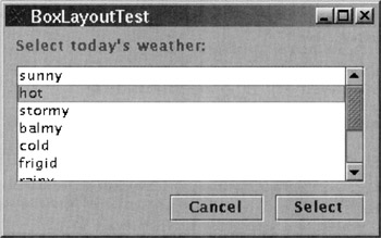
Figure 17.12
17.9.4 Grid Layout
GridLayout divides the container into a grid of equal-sized cells. Each component is assigned a cell in a left-to-right and top-to-bottom fashion. The components may be enlarged by padding them with empty space so as to fill each cell. For this reason, GridLayout, like BorderLayout, usually ignores any size hints you may provide.
The GridLayout constructor can be invoked either with two arguments or with four arguments:
public GridLayout( int rows, int columns )
and
public GridLayout( int rows, int columns, int horizontalGap, int verticalGap )
In both these constructor calls, either the rows or the columns arguments must be nonzero. A zero value for rows means that any number of rows is allowed in the grid. Similarly, when columns is set to zero, any number of columns is permissible. Ordinarily, the adjacent cells abut each other. However, nonzero values given to the arguments horizontalGap and/or verticalGap create that much space in pixels between the cells.
It is educational to compare the GUI constructed by the following program with that for FlowLayoutTest.Java. The reader will notice that while FlowLayout produces unequal sized components, the GridLayout makes them all equal-sized. This is especially evident for the components with borders.
//GridLayoutTest.java import java.awt.*; // for Container, BorderLayout import java.awt.event.*; // for WindowAdapter import javax.swing.*; import javax.swing.border.*; // for Border, BorderFactory public class GridLayoutTest { public static void main( String[] args ) { JFrame f = new JFrame( "GridLayoutTest" ); f.addWindowListener(new WindowAdapter() { public void windowClosing(WindowEvent e) { System. exit(0); } }); Container contentPane = f.getContentPane(); contentPane.setLayout( new GridLayout( 0, 2 ) ); //ITEM 1: ImageIcon firstIcon = new ImageIcon( "snowflake.gif" ); JLabel firstLabel = new JLabel( "Frigid in the North", firstIcon, JLabel.CENTER ); firstLabel.setVerticalTextPosition( JLabel.BOTTOM ); firstLabel.setHorizontalTextPosition( JLabel.CENTER ); contentPane.add( firstLabel ); //ITEM 2: ImageIcon secondIcon = new ImageIcon( "zwthr14.gif" ); JLabel secondLabel = new JLabel( "Balmy in the South", secondIcon, JLabel.CENTER ); secondLabel.setVerticalTextPosition( JLabel.BOTTOM ); secondLabel.setHorizontalTextPosition( JLabel.CENTER ); contentPane.add( secondLabel ); //ITEM 3: ImageIcon thirdIcon = new ImageIcon( "thunderstormanim.gif" ); JLabel thirdLabel = new JLabel ( "Stormy In the East", thirdIcon, JLabel.CENTER ); thirdLabel. setVerticalTextPosition( JLabel.BOTTOM ); thirdLabel. setHorizontalTextPosition( JLabel.CENTER ); Border borderThirdLabel = BorderFactory.createLineBorder( Color.blue ); thirdLabel.setBorder( borderThirdLabel ); contentPane.add( thirdLabel ); //ITEM 4: ImageIcon fourthIcon = new ImageIcon( "sunanim.gif" ); JLabel fourthLabel = new JLabe( "Sunny in the West", fourthIcon, JLabel.CENTER ); fourthLabel.setVerticalTextPosition( JLabel.BOTTOM ); fourthLabel.setHorizontalTextPosition( JLabel.CENTER ); Border borderFourthLabel = BorderFactory.createLineBorder( Color.black ); fourthLabel.setBorder(borderFourthLabel ); contentPane.add( fourthLabel ); //ITEM 5: JLabel fifthLabel = new JLabel( "The Weather Compass", JLabel.CENTER ); Border borderFifthLabel = BorderFactory.createLineBorder( Color.red ); fifthLabel.setBorder( borderFifthLabel ); contentPane.add( fifthLabel ); f.pack(); f.setLocation( 200, 300 ); f.setVisible( true ); } }
Figure 17.13 shows the layout produced by the above program.
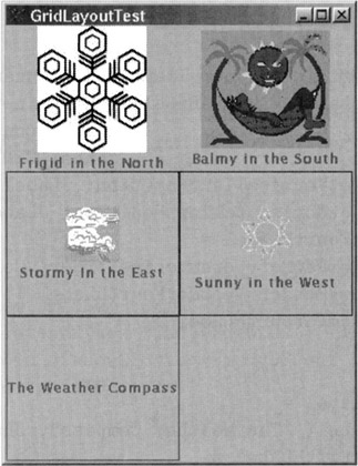
Figure 17.13
17.9.5 Card Layout
CardLayout is useful for displaying multiple components in the same space. Each component can be thought of as residing on a separate card, as if in a deck of cards. The user gets to see only one card at a time. Therefore, a GUI that uses CardLayout generally includes a selection mechanism for choosing the card for display.[16]
The following program places the four weather JLabel objects you have seen before on four different cards of a CardLayout. The program provides a JComboBox to enable a user to select the card to see.[17] The JComboBox object, created in line (A), is provided with an empty border 20 pixels wide in line (C) and encased in a JPanel in line (D) to create a pleasing visual effect.
The syntax of and the need for addItemListener in line (B) will become clear from our discussion on event processing in Section 17.13. Suffice it to say here that when the user clicks on one of the JComboBox items, this statement enables automatic invocation of the itemStateChanged method in line (F), which causes the selected card to be displayed.
While the part of the program where we create the different cards and add them to the cards panel is self-explanatory, note how we force the cards panel to be of size 200 x 200 pixels in the override definition for the getPreferredSize method in line (E).
//CardLayoutTest.java import java.awt.*; // for Container, BorderLayout import java.awt.event.*; // for WindowAdapter import javax.swing.*; import javax.swing.border.*; // for Border, BorderFactory public class CardLayoutTest extends JFrame implements ItemListener { JPanel cards; final static String[] comboBoxItems = {"frigid","balmy", "stormy", "sunny" }; public CardLayoutTest() { Container contentPane = getContentPane(); JPanel comboPanel = new JPanel(); JComboBox c = new JComboBox( comboBoxItems ); //(A) c.setEditable( false ); c.addItemListener( this ); //(B) c.setBorder( BorderFactory.createEmptyBorder( 20, 20, 20, 20 ) ); //(C) comboPanel.add( c ); //(D) contentPane. add( comboPanel, BorderLayout.NORTH ); cards = new JPanel() { public Dimension getPreferredSize() { //(E) Dimension size = super. getPreferredSize(); size.width = 200; size.height = 200; return size; } }; cards.setLayout( new CardLayout() ); //Card 1: ImageIcon firstIcon = new ImageIcon( "snowflake.gif" ); JLabel firstLabel = new JLabel( "Frigid in the North", firstIcon, JLabel.CENTER ); firstLabel.setVerticalTextPosition( JLabel.BOTTOM ); firstLabel.setHorizontalTextPosition( JLabel.CENTER ); firstLabel.setBorder( BorderFactory.createLineBorder( Color.blue ) ); cards.add( firstLabel, "frigid" ); //Card 2: ImageIcon secondIcon = new ImageIcon( "zwthr14.gif" ); JLabel secondLabel = new JLabel( "Balmy in the South", secondIcon, JLabel. CENTER ); secondLabel.setVerticalTextPosition( JLabel.BOTTOM ); secondLabel.setHorizontalTextPosition( JLabel.CENTER ); secondLabel.setBorder( BorderFactory.createLineBorder( Color.green ) ); cards.add( secondLabel, "balmy" ); //Card 3: ImageIcon thirdIcon = new ImageIcon( "thunderstormanim.gif" ); JLabel thirdLabel = new JLabel( "Stormy In the East", thirdIcon, JLabel. CENTER ); thirdLabel.setVerticalTextPosition( JLabel.BOTTOM ); thirdLabel.setHorizontalTextPosition( JLabel.CENTER ); thirdLabel.setBorder( BorderFactory.createLineBorder( Color. red ) ); cards.add( thirdLabel, "stormy" ); //Card 4: ImageIcon fourthIcon = new ImageIcon( "sunanim.gif" ); JLabel fourthLabel = new JLabel( "Sunny in the West", fourthIcon, JLabel.CENTER ); fourthLabel.setVerticalTextPosition( JLabel.BOTTOM ); fourthLabel.setHorizontalTextPosition( JLabel.CENTER ); fourthLabel.setBorder( BorderFactory.createLineBorder( Color.white ) ); cards. add(fourthLabel, "sunny" ); contentPane.add( cards, BorderLayout.CENTER ); addWindowListener(new WindowAdapter() { public void windowClosing(WindowEvent e) { System.exit(0); } }); } public void itemStateChanged( ItemEvent evt ) { //(F) CardLayout cl = (CardLayout) ( cards.getLayout() ); cl.show( cards, (String) evt.getItem() ); } public static void main( String[] args ) { CardLayoutTest window = new CardLayoutTest(); window.setTitle( "CardLayoutTest" ); window.setLocation(200, 300 ); window.pack(); window.setVisible( true ); } }
Figure 17.14 illustrates the layout produced by the above program.
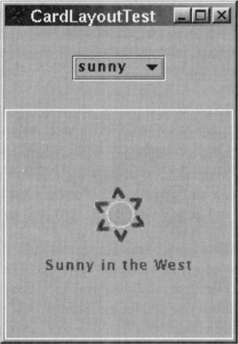
Figure 17.14
17.9.6 Grid-Bag Layout
GridBagLayout is the most versatile of the layout managers that come with the Java platform. Like GridLayout, it divides the display area into an array of cells. But, it accomplishes much more than what GridLayout can do. GridBagLayout gives you the following in a row-column presentation of components:
-
The display area assigned to a component can span multiple rows, multiple columns, or multiple rows and multiple columns simultaneously.
-
Each row can be of a different height, and each column of a different width.
-
As a window is resized, the resizing behavior of the display area allocated to each component in relation to that of the display areas assigned to the other components can be tuned on an individual basis.
-
Within the display area allocated to each component, how the component expands or shrinks as a window is resized can again be controlled on an individual basis. While the previous property was about the resizing behavior of the display area allocated to a component, we are now talking about the resizing behavior of the component itself within its allocated display area.
All of this is done with the help of the GridBagConstraints class whose various data members provide control over the various aspects of the display. One first creates an instance of GridBagConstraints, sets its data members to desired values, and then informs the GridBagLayout manager which component is to be impacted by those constraints. Before we illustrate this process with an example, here is a list of the data members of GridBagConstraints that can be set to provide control over a display:
gridx, gridy These decide which cell in the array a component goes into. You can think of them as the row and column "coordinates" of the top-left corner of the display area assigned to a component. For example, if you wanted the display area assigned to a component to occupy the leftmost cell in the topmost row, you'd set both gridx and gridy to 0. For the next component on the right, gridx would be 1 and gridy would still be 0, and so on.
gridwidth, gridheight These control the number of cells the display area assigned to a component can occupy in width and in height. The default value for each is 1, as you'd expect. Note that the constraints specified by these two variables do not work for the topmost row and for the leftmost column. This is for the simple reason that the column decomposition of a row is not defined until the objects are placed in the first row. Similarly, the row decomposition of a column is not defined until the objects are placed in the left column. After the first row and the first column are fully occupied, the layout manager can make sense of an interior cell occupying a certain number of columns in width and a certain number of rows in height.
weightx, weighty These control the resizing behavior of the display area assigned to a component as the top-level window is resized manually.[18] If you wanted all the components to resize proportionately as the top-level window is resized, you'd set both weightx and weighty equal to 1 at the beginning of constraint specifications, as we do in the example below. However, you can selectively specify a different resizing behavior of the display area for each component by varying the values of these two constraints. The values can be between 0 and 1 and the default is 0, which means that the display area will not expand as the top-level window is made larger; the extra space simply appears as empty space around the component.
fill This controls the resizing behavior of a component within its allocated display area when the top-level window is resized. The four possible values for this variable are NONE, which is the default, HORIZONTAL, VERTICAL, and BOTH. When the value is set to HORIZONTAL, a component expands or shrinks as necessary to horizontally fill the display area assigned to the component. If you want to confine the filling behavior to the vertical direction, you'd use VERTICAL. But if you wanted the fill to take place in both dimensions (which is probably what you would want to see happen in most cases), you'd use BOTH. With the default filling behavior provided by NONE, the component would stay at its preferred size even when its allocated display area expands as the window is made larger.
ipadx, ipady Through these variables, you can make columns of unequal width and rows of unequal height. These, referred to as the padding variables, have a default value of 0. When ipadx is nonzero, the width of that component will be at least its minimum width plus 2* ipadx, since the padding is applied symmetrically at both ends. Similarly for ipady in the vertical direction.
insets This specifies the extent of the empty space between the boundary of the component and the edges of its display area. The default is 0.
anchor If a component is smaller than its allocated display area, this controls where in the display area the component will be placed. The default value is CENTER. Other possible values are NORTH, NORTHEAST, EAST, SOUTHEAST, SOUTH, SOUTHWEST, WEST, and NORTHWEST.
We will now show how GridBagConstraints is actually used in a program. First, we create an instance of the layout manager and an instance of GridBagConstraints, as illustrated by
Container contentPane = frame.getContentPane(); GridBagLayout gridbag = new GridBagLayout(); contentPane.setLayout( gridbag ); GridBagConstraints constraints = new GridBagConstraints();
Now suppose you wanted all your components to fill out their assigned display areas and you also wanted the display areas to expand and shrink proportionately as the top-level window is resized, you could say at the very outset (before getting into the details of constraint specification at the level of individual components):
constraints.fill = GridBagConstraints.BOTH; constraints.weightx = 1.0; constraints.weighty = 1.0;
Now let's say you'd like to add a wider-than-usual JButton at the top-left corner of the display. You would say
JButton button = new JButton( "Button 1" ); constraints.gridx = 0; constraints.gridy = 0; constraints.ipadx = 100; gridbag.setConstraints( button, constraints ); contentPane.add( button );
After using the GridBagConstraints object for one component, you have the option of using the same constraint object for the next component or creating a new constraint object. If you use the same constraint object, you have to remember to reset the values of those constraints that were set previously. The example below uses the following code for the next component in the same row:
button = new JButton( "Button 2" ); constraints.gridx = 1; constraints.gridy = 0; constraints.ipadx = 0; gridbag.setConstraints( button, constraints ); contentPane.add( button );
Since, in relation to the previous button, we want this button to appear at its regular width, we reset ipadx to 0. This process can be continued as we do in the example shown below that creates three rows of buttons. There are three buttons in the first row, two in the second, and one in the last. Of the three buttons in the first row, the leftmost button is wider than the other two, which causes the first column to be wider than the other two columns. By setting ipady, all the buttons in the second row appear taller than the buttons in the other rows.
//GridBagLayoutTest.java import java.awt.*; // for Container, BorderLayout import java.awt.event.*; // for WindowAdapter import javax.swing.*; public class GridBagLayoutTest { public static void main( String[] args ) { JButton button; JFrame f = new JFrame( "GridBagLayoutTest" ); f.addWindowListener(new WindowAdapter() { public void windowClosing(WindowEvent e) { System.exit(0); } }); Container contentPane = f.getContentPane(); GridBagLayout gridbag = new GridBagLayout(); contentPane.setLayout( gridbag ); GridBagConstraints cons = new GridBagConstraints(); cons.fill = GridBagConstraints.BOTH; cons.weightx = 1.0; cons.weighty = 1.0; // ROW 1: button = new JButton( "Button 1" ); cons.gridx = 0; cons.gridy = 0; cons.ipadx = 100; gridbag.setConstraints( button, cons ); contentPane.add( button ); button = new JButton( "Button 2" ); cons.gridx = 1; cons.gridy = 0; cons.ipadx = 0; gridbag.setConstraints( button, cons ); contentPane.add( button ); button = new JButton( "Button 3" ); cons.gridx = 2; cons.gridy = 0; gridbag.setConstraints( button, cons ); contentPane.add( button ); // ROW 2: button = new JButton( "Button 4" ); cons.gridwidth = 2; cons.gridx = 0; cons.gridy = 1; cons.ipady = 50; gridbag.setConstraints( button, cons ); contentPane.add( button ); button = new JButton( "Button 5" ); cons.gridwidth = 1; cons.gridx = 2; cons.gridy = 1; gridbag.setConstraints( button, cons ); contentPane.add( button ); // ROW 3: button = new JButton( "Button 6" ); cons.gridwidth = 3; cons.gridx = 0; cons.gridy = 2; cons.ipady = 0; gridbag.setConstraints( button, cons ); contentPane.add( button ); f.pack(); f.setLocation( 200, 300 ); f.setVisible( true ); } }
Figure 17.15 shows the layout produced by the above program.
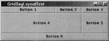
Figure 17.15
As was mentioned earlier, one also has the option of not using a layout manager at all and instead using specific designated positions for the components. Since some components come with default layout managers, in order to not use a layout manager, you must first "de-select" the default layout manager by invoking setLayout (null). The absolute position and size of a component can then be specified by the invocation of setBounds(int x, int y, int size_x, int size_y) where x and y are the absolute coordinates of the new component and size_x and size_y its size. Yet another option is to custom design your own layout manager by implementing the LayoutManager interface.
[14]Since we will not be discussing the JLabel class separately in this chapter, this example will also serve as our introduction to JLabel. A JLabel can be used to show noneditable information in the form of a string and/or an image. In the program shown, please note how a string can be positioned within a JLabel's drawing area. By default, text is centered vertically and positioned to the left side. Also, by default, an image is centered both vertically and horizontally. Note how we get an image in the center and a string below it.
[15]For the example shown, what will be displayed with the preferred-size hint is the central 50 × 50 portion of the component bound to secondLabel. as opposed to a resized version of the original component.
[16]The functionality that we get from CardLayout can sometimes be achieved more easily by using a tabbed pane as provided by the class JTabbedPane.
[17]When space is limited, a JComboBox is a convenient way to give the user a one-of-many selection mechanism. When the user clicks on the component, a drop-down menu of items is made visible. The user can select the item desired by clicking on it. By default, a JComboBox is uneditable. But if made editable, a textfield is also displayed to give the user the option of entering his/her own choice, besides the choices made available through the drop-down menu. When space is not an issue, other mechanisms that can be used for one-of-many selection include JList and JRadioButton.
[18]Note that whereas fill controls the resizing behavior of a component within its own display area as the display area expands or shrinks, weightx and weighty control how the display area assigned to a component expands or shrinks when the top-level window is resized.
|
![Programming With Objects[c] A Comparative Presentation of Object-Oriented Programming With C++ and Java](/icons/6178-small.jpg "Programming With Objects[c] A Comparative Presentation of Object-Oriented Programming With C++ and Java")
EAN: 2147483647
Pages: 273