Choosing the Right Type of Chart
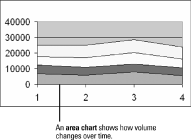
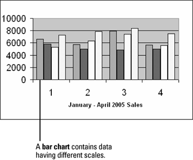
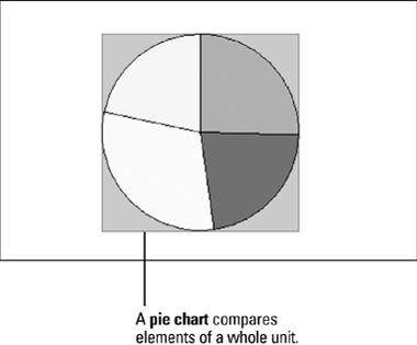
| When you create a chart in Excel, you can choose from a variety of chart types. Each type interprets data in a slightly different way. For example, a pie chart is great for comparing parts of a whole, such as regional percentages of a sales total, while a column chart is better for showing how different sales regions performed throughout a year. Although there is some overlap, each chart type is best suited for conveying a different type of information. When you generate a chart, you need to evaluate whether the chart type suits the data being plotted, and whether the formatting choices clarify or overshadow the information. Sometimes a colorful 3-D chart is just what you need to draw attention to an important shift; other times, special visual effects might be a distraction. |
EAN: 2147483647
Pages: 291