Blooper 10: Pointless Choice
| < Day Day Up > |
Blooper 10: Pointless Choice
Related to redundant requests and asking for data you don't need is the blooper of offering needless or meaningless choices.
Some Web developers might protest, "Hey, but choice is good, isn't it? Offering users more choice makes the site more functional for them, no? How could more choice be bad?" Let's enumerate four ways choice can be unnecessary, meaningless, useless, or otherwise undesirable:
-
No significant difference: The options are not different enough to make a difference.
-
Users don't know: The options are meaningless to users.
-
Obvious answer: There is an obvious choice, but the site ignores it.
-
Site could figure it out: There is no need to ask this; it could be figured out automatically.
I will discuss these in turn .
No Significant Difference
Some websites confront their users with a choice in which the available options to choose from are all the same or at least seem that way from users' point of view. Therefore, choosing between them is pointless ”it is just an annoying waste of time.
Continental Airlines' website commits an example of this blooper (Figure 2.10). If you tell it you want to fly to Detroit, it tells you "More than one airport matches your request. Please select an airport from the list below." Listed are "All airports" and "DTW." It is asking you to choose whether you want to consider flights into the DTW airport or into "all airports," where "all" is exactly one airport: DTW. You get the same flights no matter which of these you choose!
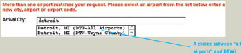
Figure 2.10: www.Continental.com (Sept. 2001)-When destination city is given as "Detroit," site makes users choose between "all airports" and the one Detroit airport that Continental flies to.
A different sort of pointless choice can be seen at zBuyer.com. The site provides two Search functions from which site users can choose (Figure 2.11). However, the lower Search function is functionally equivalent to the upper one when its menu is set to "all products." Furthermore, "all products" is the menu's default value. Therefore, there is no reason to make users choose between these two Search functions. The lower one is all that is needed.
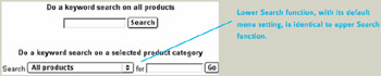
Figure 2.11: www.zBuyer.com (Feb 2002)-Two Search functions to choose from, but the default menu value of the second one makes it the same as the first, so there is no need for two.
Users Don't Know
When the available options are meaningless to users, they have no basis for choosing among them. If the site won't let users ignore the choice, they have to guess.
For example, Sibelius.com allows customers to download software. To expedite downloading, the site lets customers choose from four download locations (Figure 2.12). The trouble is some of the download locations are labeled so cryptically ”UK 1, UK 2, UK 3 ”that customers from the U.K. will have no idea which one to choose. These options probably make sense only to Sibelius employees who manage the download servers.
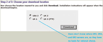
Figure 2.12: www.Sibelius.com (Jan. 2002)-Cryptic download locations, such as "UK 1" and "UK 2" make choosing between them impossible .
Asking users whether a transaction should use "secure" versus " insecure " protocols is a common way to ask users to choose between options they don't understand. ProxyVote.com makes this mistake (Figure 2.13). ProxyVote instructs its users as follows : "To submit your voting instructions over our secure site, click HERE. If your browser cannot support secure transactions via SSL encryption, click HERE" (see also Chapter 7, Blooper 52: "Click Here ": Burying Links in Text). ProxyVote's users are average people who own stock in companies. Few of them are engineers . Many are seniors. Most will have no idea whether their browser can support secure transactions or what SSL encryption is. Forcing nontechnical Web users to make such a choice is ridiculous (see also Chapter 6, Blooper 42: Speaking Geek).
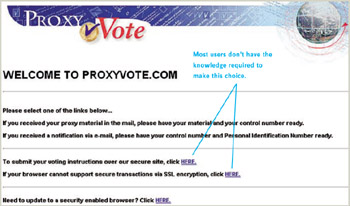
Figure 2.13: www.ProxyVote.com (Oct. 2001)-Choice is incomprehensible to most ProxyVote users.
Obvious Answer
Some sites make their users choose even though it is obvious which option is most likely the right one. The obvious choice can be based on knowing how people use the site, common sense, or previous user input. Unfortunately, many sites ignore the obvious, making users choose needlessly.
A good example of this comes from the website of a company for which I have consulted (Figure 2.14). The site used to have a splash screen offering a choice of three language-specific sites: English, Spanish, and Portuguese. Offering language options is good, but the way this choice is offered is not. An overwhelming majority of people who use this site speak English. Furthermore, the other language sites were not even available when I collected this example; they were both labeled "under construction." The obvious choice is to default to the English site, providing links from there to the Spanish and Portuguese sites. Fortunately, a recent site update fixed this blooper.

Figure 2.14: Client website (Nov. 2000)-Users must select a language to proceed, even though more than 90% of users will choose English, and even though the Spanish and Portuguese sites are "under construction." The site should just go to the English pages, with links from there to the Spanish and Portuguese sites.
As explained in Blooper 8, Redundant Requests, a Web user's previous input can make it obvious what the user wants, eliminating the need for further questions. However, many sites seem to ignore what their users have already told them.
An example of this problem can be found at American Airlines' website, AA.com. Imagine you are planning a flight to New York City and don't care which of New York City's several airports you arrive at. You give "NYC" as your destination and click Go. A message appears: "We are unable to determine your desired airport(s) from your entry. Please select the ... arrival airports(s) from the list below and click on the Go button to continue your flight search." With the message is a menu of airports, with Newark International as the default (Figure 2.15[B]).
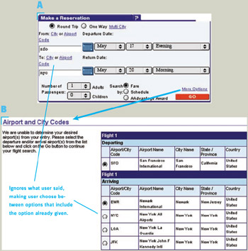
Figure 2.15: www.AA.com (May 2002)- A ” Reservation form, specifying "NYC" as destination. B ” User is told the destination is ambiguous and is asked to choose a destination but is offered one option that is the same as already given.
Remember, we are assuming you don't care which airport you arrive at. You want it to show flights into all New York City airports. You might notice that one of the options in the menu is not a specific airport, but "NYC, New York ”All Airports," exactly what you said you wanted. But now you have to say it again. Worse, it isn't even the default! (See Chapter 4, Blooper 24: No Defaults and Blooper 25: Faulty Defaults.)
Site Could Figure It Out
Finally, some websites and Web-based applications ask users to make choices that the software could figure out on its own. Usually, this occurs when the site needs to know the user's location, browser, plug-ins, computer, or operating system to deliver the correct goods or optimize service, but the developers didn't want to write the code to determine that, so they ask users to tell the site.
The classic form of this is asking Web users to identify their browser. An example can be found at eDesignCorp.com, the website of a design firm. The site has a splash screen that asks visitors "Which browser are you using?," with choices America Online, Netscape, Internet Explorer, and Other (Figure 2.16). This is presumably to allow the site to optimize its presentation for the visitor's browser. We will ignore the fact that the three most popular browsers ”the ones listed in the choice ”are not different enough to warrant optimizing the site for each. With a little work, websites can be coded so they work in all three of these browsers with no browser-specific optimization. We will also ignore the problem that the "Other" category lumps together Web browsers as disparate as Mosaic, Opera, WebTV Mozilla, and Lynx. For now, the point is that the site does not need to ask this question because it can identify the users' browser itself. Most Web browsers, if asked by a site, identify themselves and the operating system on which they are running (for details, see the sidebar Tech Talk: "Sniffing" the User's Browser).
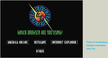
Figure 2.16: www.eDesignCorp.com (Dec. 2001)-Asks visitors to identify their browser, even though the site could determine this itself by "browser sniffing."
The bottom line: If it is important for your site to know which browser a visitor is using, it should be important enough to spend the small amount of extra development time it takes to have the site figure it out without bothering visitors.
Avoiding the Blooper
How to avoid presenting unnecessary choices depends on why the choice is unnecessary.
If the Choice Makes No Difference, Don't Offer It
A website that asks users to choose between options that make no significant difference in what they get is just wasting users' valuable time. Don't do it.
How do you discover that your site presents absurd identical choices? By testing it before it is released. To find this sort of problem, you may be able to get away with using members of your own team as test subjects. Keep in mind, however, that members of a development team, when testing their own software, tend to overlook many annoyances. It is better to observe people who are like the site's intended users. Even if they don't explicitly complain about being required to choose between identical options, you'll be more likely to spot the problem than if you just test on yourself.
If Users Won't Understand the Question or Know the Answer, Don't Ask
Consider whether the choice your site asks visitors to make is understandable to them. Site visitors may seem like the only people you can ask, but that doesn't make them the right people to ask. If they have no idea what you're asking, you won't get useful responses. If you haven't provided a default, you're forcing users to guess. If you have provided a default, as Sibelius.com does, users will probably just leave it as is, whether or not it's right for their situation.
How do you determine whether a choice presented by your website is meaningful to users? The only reliable way is by usability testing. Such tests need not ”and should not ”wait until the site is about to go live. They can be conducted early, cheaply, using paper or simple HTML prototypes , before anything real has been implemented.
Even if you know your site's users will understand a choice, they may not know the answer. Perhaps you're asking the wrong people. To avoid delaying, frustrating, and annoying your site's users, consider whether there is another way to get the answer.
If There Is an Obvious Likely Choice, Choose It
As illustrated already by the unnamed and American Airlines websites, sometimes the correct option is obvious based on common sense, normal usage patterns, or previous user input. Sites that don't use such "knowledge" waste users' valuable time and effort. They are annoying.
Don't annoy your visitors and customers with questions that have obvious answers. Assume the answer, with a way for people to change it if they want to. They usually won't.
If the Site Can Figure It Out, Don't Bother Users
Finally, don't ask users to tell you things that the system can figure out on its own. Appliance makers figured this out: They finally stopped asking consumers to set cameras for film ASA and cassette players for cassette type (Johnson 1990). People couldn't set them correctly, and even if they could, why should they have to? Nowadays, consumer cameras set themselves to the film's ASA, and cassette players set themselves for the type of cassette being used.
The Web needs to be more like consumer appliances: simple, focused in functionality, and as automatic as possible. If a website needs to know something but can figure it out by itself, it should not ask its users for the information.
Although Sibelius.com commits a form of the blooper when it asks users to choose a server to download from (Figure 2.12), it avoids the blooper in another situation. When a customer downloads software, the site determines which version of the software the user probably wants to download ”Windows versus Mac ”by using information supplied by the user's browser. The appropriate version of the software is presented as the default (Figure 2.17).
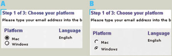
Figure 2.17: www.Sibelius.com (Jan 2002)-Site " knows " what computer and operating system visitor is using. A ” When accessed from a Mac, default platform is correct. B ” The same when accessed from a Windows PC.
Netscape.com's download page shows that a site can determine what browser is being used to view the site (Figure 2.18). The sidebar gives technical details on how to tell what browser a site visitor is using.
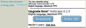
Figure 2.18: www.Netscape.com (June 2002)-Netscape's download page "sniffs" users' browsers.
Finally, NetWorldMap.com shows that sites that need to know a visitor's approximate location can make a good guess based on the visitor's IP address (Figure 2.19). NetWorldMap has a database of IP addresses mapped to locations. The mapping is not perfect, but it is good enough to be useful.
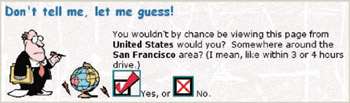
Figure 2.19: www.NetWorldMap.com (June 2002)-Can usually correctly guess a Web visitor's approximate location from the IP address.
| < Day Day Up > |
EAN: 2147483647
Pages: 128