Project: Poster
| We'll be creating a poster in 17 easy steps: STEPS
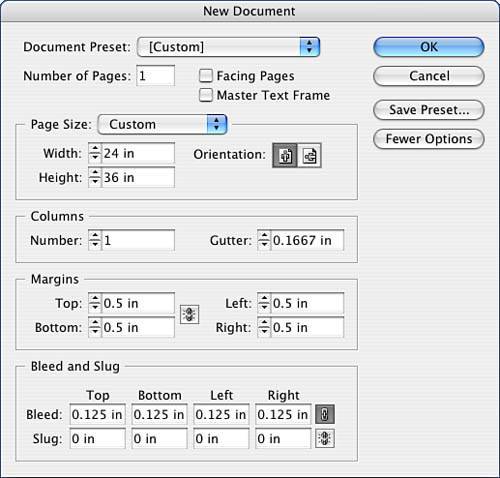
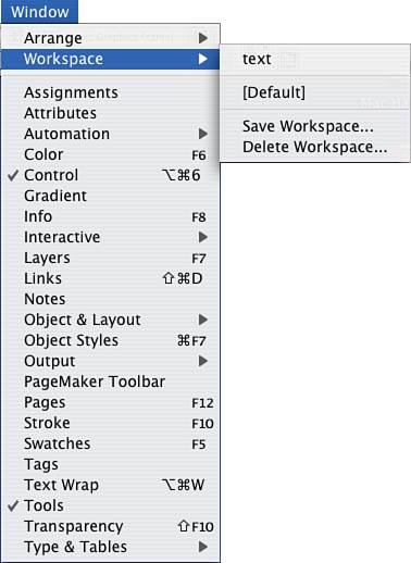
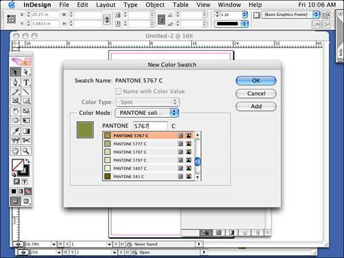
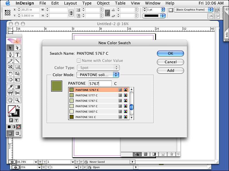
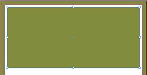
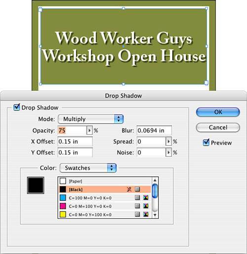
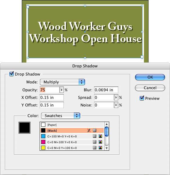
Step 1: Setting Up Your Document FormatLaunch InDesign; go to the File pull-down menu; and select New, Document. Then fill out the New Document dialog box, as indicated in Figure 5.19. Figure 5.19. The New Document setup window. Step 2: Customizing the WorkspaceOrient yourself to your workspace. In fact, customize the workspace just as you would like it. InDesign lets you arrange your interface the way you want it to appear and save the workspace. If you have a couple of different workspaces you would like to use, all the better. Let's say when you work intensively with type, you like all your Text, Paragraph, and Text Wrap palettes open. Arrange these palettes any way you like: as open, floating windows or in the collapsible bays. Now, go to the Window pull-down menu and select Workspace, Save Workspace. Give it a name, such as text, and click OK. Now toggle back and forth between the default workspace and the text workspace. You can have any number of workspacesone for color, one for long document publishing, and so on. Figure 5.20 shows how I've saved my text workspace. Figure 5.20. My custom workspace. Step 3: Adding a SwatchAdd a color to your swatches that will be the predominant color of the poster. You might want it to match your logo, as we did here for our exercise, but it could come from the picture you are going to use or reflect company colors. In any case, for this exercise, I added PANTONE 5767. Feel free to convert this to a process color if that is what you and your print service provider need. You can convert the spot color yourself by double-clicking the swatch and changing the color mode to CMYK and the color type to Process. Or, advise your print service provider that you would like them to convert it for you. Go to the Swatches palette and click the triangle found in either top corner (depending on how you accessed the palette). Select New Swatch, select Spot for the Color Type, select PANTONE Solid Coated for the Color Mode, and then type PANTONE 5767, as shown in Figure 5.21. Click OK. Figure 5.21. Adding a spot color to the Swtches palette. Step 4: Creating a StrokeLet's frame up the poster. Click the Rectangle tool and draw a rectangle. Use the following coordinates and dimensions: x: -.125, y: -.125" (for the bleed), width: 24.25", height: 36.25". Stroke the rectangle with 60 points, and select the align stroke to the inside button in the Stroke palette. Apply the spot color to your stroke, and deselect your item. See Figure 5.22 for how the poster should look so far. Figure 5.22. Creating a border. Draw another rectangle inside the first with the following dimensions: x: 1", y: 1", width: 22", height: 10". Apply the spot color to your fill and deselect this new rectangle. Use Figure 5.23 as a guide. Figure 5.23. The basic framework for your poster. Step 5: Aligning Text Horizontally and VerticallyDraw a text box matching the dimensions for the previous rectangle somewhere out on your pasteboard. With the Type tool, type in a two-line header. I've typed in WoodWorker Guys on the first line and Workshop Open House on the second line. Center the text horizontally, using the Control palette; then center it vertically by selecting Object, Text Frame Options, Vertical Alignment, Centered. Highlight your copy and format it as follows: Adobe Caslon Pro Bold, 156-point type, 166-point leading. With the Selection tool, make sure the text box is selected and add a drop shadow by going to the Object pull-down menu and selecting Drop Shadow; use the coordinates shown in Figure 5.24. Finally, drag this box to the same coordinates as your first rectangle (align the upper-left corner). Figure 5.24. This will require flattening, which is part of the output or export process and is not the same flattening (or merging) you use with Photoshop layers. Note
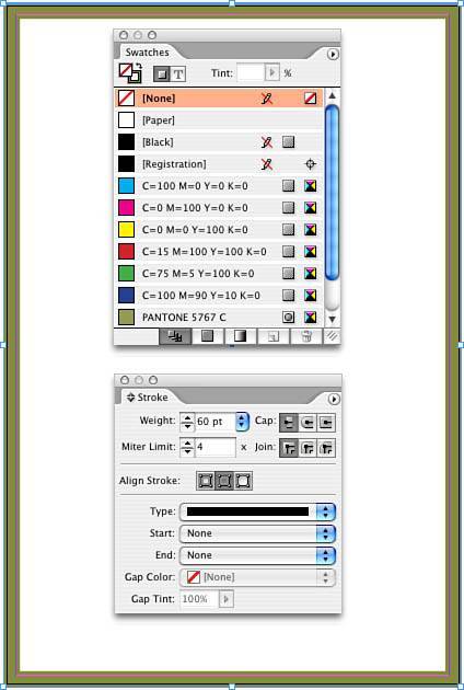
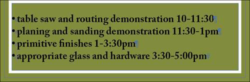
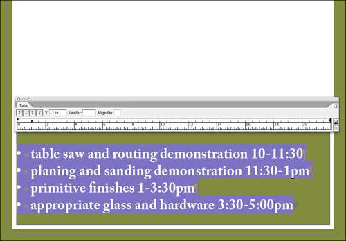
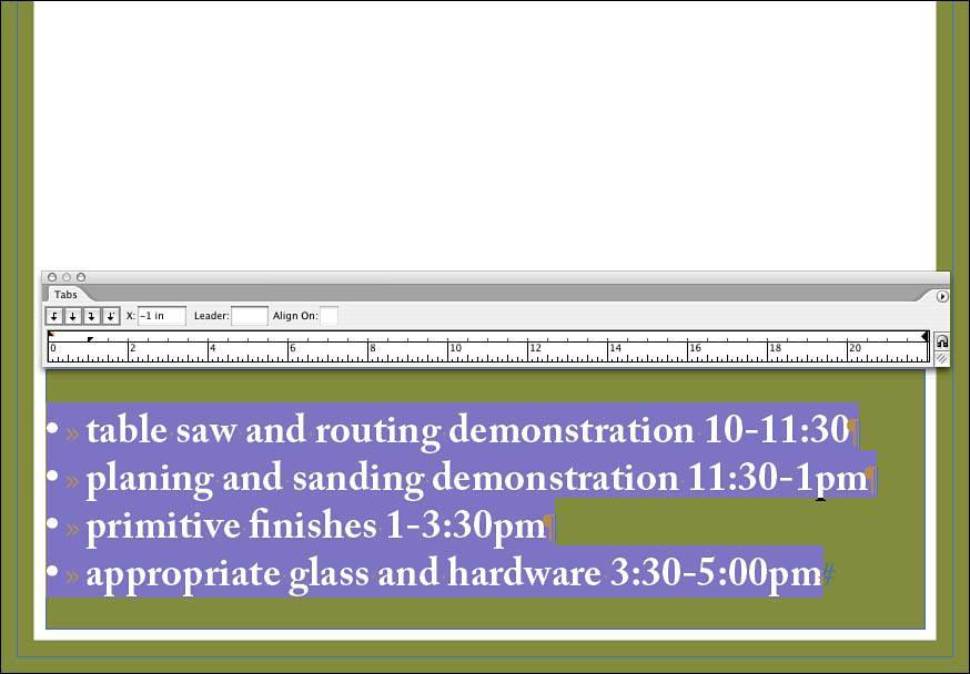
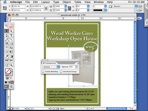
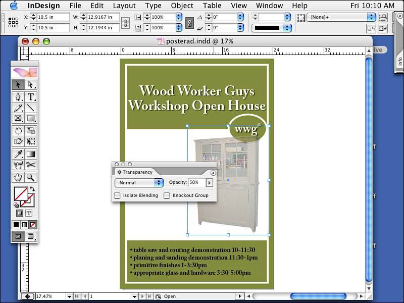
Step 6: Creating a LogoLet's re-create the logo. Make sure nothing is selected on your layout and then draw an oval that has the following dimensions: width: 6", height: 4.5". With the oval selected, set the following coordinates: x: 17", y: 8.675". Color the fill with the spot color and apply a 20-point white stroke on the oval. Now, draw a text box out on the pasteboard and type in wwg and a registration mark (you can find it by selecting Type, Insert Special Character, Registered Trademark Symbol). Highlight this text and format it as follows: Adobe Caslon Pro bold, 138-point type. Center the type horizontally (using the Control palette and the Paragraph button) and vertically (by selecting Object, Text Frame Options, Vertical Justification). Highlight the registration symbol and click the Superscript style in the Control palette. Slowly drag the text box over the oval and visually align the two together. Color the fill of the text white and, with only the text box selected, apply a drop shadow to the text using the same settings as mentioned previously. Use Figure 5.25 as a reference. Figure 5.25. The top of your poster should be completely formatted. Step 7: Creating BulletsLet's add the box at the bottom of the poster. Draw a rectangle with the following coordinates and dimensions: x: 1", y: 28.5", width: 22", height: 6.5". Color the fill of the box with your spot color. Select the Text tool and click inside your rectangle. Watch the I-beam's outer bounding outline bend because you are placing text inside an object. Type a bulleted listyou can find the bullet symbol by selecting Type, Insert Special Character, Bullet Symbol. After you insert the bullet symbol, press Tab. We'll come back and tweak the position of the tab stop later, but it's important to insert that hidden character (the tab) now. Type the description of the events; then highlight the text and format it as follows: Adobe Caslon Pro Bold, 72-point type, 86-point leading (see Figure 5.26). Figure 5.26. The bulleted list with hidden characters turned on; note the tabs. Step 8: Creating IndentationNext, we should create an indentation. Go to the Object pull-down menu and select Text Frame Options, Vertical Justification, Centered. Now, zoom in on the left side of your text box. Then, with your text selected, open the Tab palette, found in the Type pull-down menu. Drag the bottom indent triangle on the left over (this will move the pair) and watch all your lines move to the right. You have set the general left indent value for the paragraph. The top triangle, by the way, is for setting the first line indent. Position your indent at .5" in from the left. Now, select a left tab and insert it at the 2" mark. Watch your text move and line up. Then deselect the text and compare your work to Figure 5.27. Figure 5.27. Our bulleted list, only better. Step 9: Using the Transparency PaletteLet's add some images. Go to the File pull-down menu and select Place. Navigate your way to the Chapter05\05Project_Files folder and select primitivecab3.tif. Position the image at x: 10.5", y: 10.5" and scale it to 200%. Note
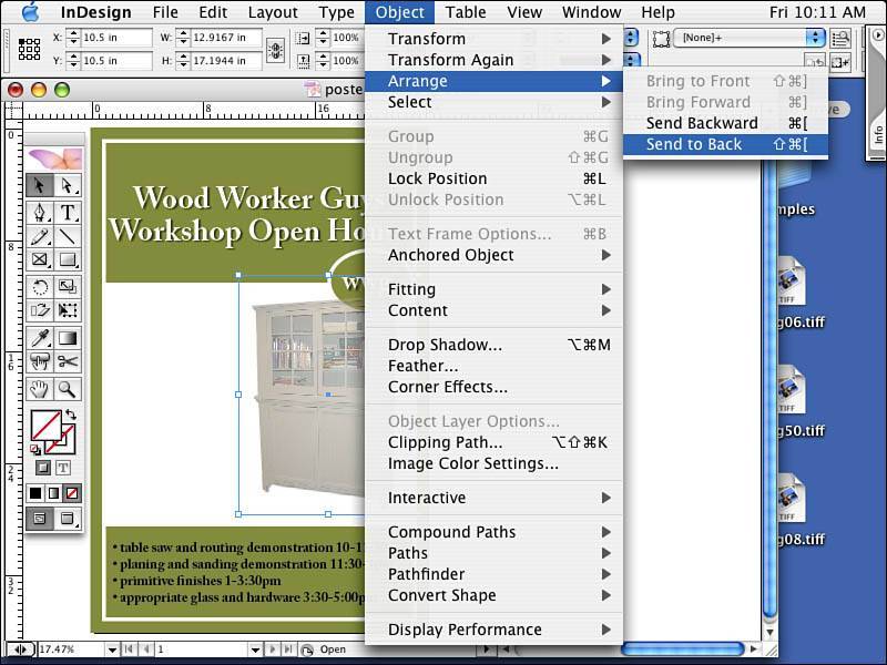
Let's make the image fade a bit by changing its transparency. Open the Transparency palette either under the Window pull-down menu or in one of the collapsible bays. There is an Opacity field that is probably set to 100%. Change that to 50% and watch your image fade. If you like, you can add a drop shadow to the image as well. This image has a clipping path around it; the path outlines the foreground and removes, or clips, the background (see Figure 5.28). Figure 5.28. Note the checkerboard in the Pages palette indicating that transparency is in use by an element on this page. It's the result of the Opacity setting applied to the image, as well as the added drop shadow. Either effect alone triggers the checkboard appearance in the Pages palette. Step 10: Arranging ElementsBy now, you've realized the image is covering up the logo. Select the image with the Selection tool (the black arrow). Go to the Object pull-down menu and select Arrange, Send to Back (see Figure 5.29). Figure 5.29. Sending an object to the bottom of the stack with the Send to Back command. Note
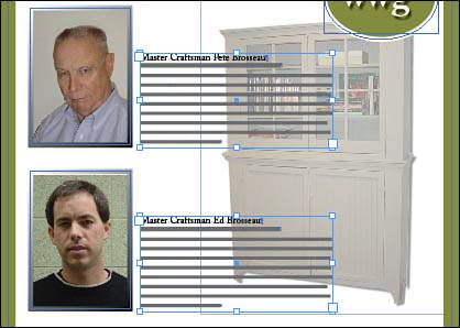
Step 11: Constraining and Copying While in MotionDraw a picture frame on the left side of your poster. The coordinates for the first box will be x: 1.5", y: 11.5", width: 5.25", height 7.25". Apply a stroke to the box of 20 points. With the Selection tool, drag the first picture box down. While dragging, hold down both the Shift key, which constrains, and the Option key (Alt on Windows), which duplicates, at the same time. This constrains the dragging motion straight down (no wiggling) and makes a copy of the box at the same time. Let go of the mouse before you let go of the modifier keys. Tweak the coordinates to x: 1.5", y: 20" (see Figure 5.30). Figure 5.30. The result of our drag copy. Step 12: Placing ImagesSelect the first rectangle frame, go to the File pull-down menu, and select Place. Navigate to the chapter 5 folder, project files and select the image Pete.tif. With the Direct Selection tool, drag the image of Pete into position. Do the same with the other picture box, only this time use the image Ed.tif. See Figure 5.31 to approximate the positions of the images inside the picture frames. Align the left edges of the picture frames by using the Align Left Edges button on the right side of the Control palette. Figure 5.31. Remember that if you drag slowly, you can see the entire image (dimmed) for better placement. Step 13: Creating Gradient StrokesLet's add a gradient to our stroked picture boxes. Open the Gradient palette by going to the Window pull-down menu and selecting Gradient. Notice there is already a black and white gradient (the default gradient) in the palette. Drag that large swatch into the Swatches palette. With the Stroke swatch active at the top of the Swatches palette, click the New Gradient swatch. The stroke of your picture box should change. To move the gradient around inside the stroke, select the Gradient tool and drag it across the selected picture box. I chose to drag from the upper-left corner to the lower-right corner, but feel free to play. Repeat this with the lower picture box selected. See Figure 5.32 for how the strokes should look. Figure 5.32. Try different angles and shift the gradient in the stroke. The final step is to create two text boxes describing the two images. With the Text tool selected, click and drag out a box off on the pasteboarduse my example as a visual guide. With Adobe Caslon Pro Bold, 36-point selected, type in the name of the person. Press Return and enter a brief description in 24-point type. Then fill in the rest with 18-point type and 36-point leading. Fill the box with placeholder text found in the Type pull-down menu. Step 14: Aligning ElementsDrag your box to the right of the picture. Do this by clicking the far-right Alignment button in the Control palette. Repeat these last steps for the second image and text frame (see Figure 5.33). You can also drag the copy with the Shift and Option (Shift and Alt for Windows) keys held down. I suggest you align the left edges of the text frames, just as you did the pictures. Figure 5.33. Your two text boxes should be aligned with their respective images and vertically aligned to each other. Step 15: Reviewing Your WorkReview your work at 100% viewbe sure to turn off hidden characters, guides, and frames. Save the file to your finished projects folder inside the Chapter 5 folder. Figure 5.34 shows the finished project. Figure 5.34. The finished poster. Step 16: Preflighting and PackagingMake sure you have saved your work. Go to the File pull-down menu and select Preflight. The Preflight command checks your file to ensure that it is in acceptable condition to submit to your print service provider. It checks for fonts, links, images, colors and inks, print settings, and any external plug-ins you might have. All this information impacts your print service provider. InDesign uses a yellow caution or warning sign (the same for missing fonts or modified links) to indicate problems. When you are clicking through the Preflight dialog box, look for the yellow signs with exclamation points because they indicate a problem. You might find a problem such as a font used by the document is not turned on in your font management utility, you've moved or modified an image since you placed it in your document, or you have included an RGB image. If you see errors or warnings, you need to cancel out of this dialog box, fix the problem, and run the preflight again. Figure 5.35 shows a successful preflight report. Figure 5.35. Preflighting the poster. At the end of preflight, you can package up your files by clicking the Package button. You can then add a comment about the production of your file to your print service providerbut don't rely on this as your only means of communicating or documenting your instructions. After you've typed any necessary instructions, you move on to the Create Package Folder window, where you tell the program where to put the newly created folder with copies of fonts (with permission from the font developer) and your linked graphics. InDesign will even update the links after the graphics are copied into this folder so that when the recipient of your file opens it, all the images will be linked correctly for her. Step 17: PrintingYou might want to print a copy of this and look at it on paper. Go to the File pull-down menu and select Print. Choose the appropriate settings for the printer that is available to you. Then go to the File pull-down menu and select Print. Again, choose the appropriate settings for the printer available to you. On the General tab, choose one copy. On the Setup tab, if possible, select 11" x 17", Vertical Orientation, and Scale to Fit. On the Marks and Bleed tab, turn on crop marks and bleed marks. On the Output tab, if possible, print a color composite output for your work; if not, select Grayscale. On the Graphics tab, the default settings should work. The remaining tabs can be ignored for now. Print and review your proof. Make any necessary adjustments, save your changes, and print it again. Use Figure 5.36 as a guide for printing options. Figure 5.36. The Print dialog box options. |


EAN: 2147483647
Pages: 148
- Chapter III Two Models of Online Patronage: Why Do Consumers Shop on the Internet?
- Chapter V Consumer Complaint Behavior in the Online Environment
- Chapter XIV Product Catalog and Shopping Cart Effective Design
- Chapter XV Customer Trust in Online Commerce
- Chapter XVI Turning Web Surfers into Loyal Customers: Cognitive Lock-In Through Interface Design and Web Site Usability