Project: Advertisement
| We'll be creating a product sheet in 14 easy steps: STEPS
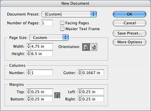
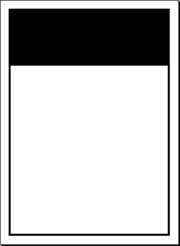
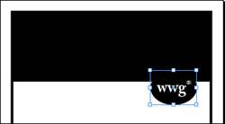
Step 1 : Setting Up Your Document FormatLaunch InDesign and go to the File pull-down menu. Select New, Document and fill out the New Document window as indicated in Figure 5.1. Click OK. Figure 5.1. Fill out the window as indicated for this setup. Step 2 : Applying a StrokeOrient yourself to your workspace. Select your Rectangle tool and create a rectangle to fit your margins. The x,y coordinate should be .25",.25", with a width of 4.25" and a height of 6.0". Apply a 4-point stroke to your rectangle. You can do this by either using the Stroke palette found on the Window pull-down menu or from the collapsible bay on the right side of your workspace. In addition to these choices, you can stroke your objects from the Control palette as well. For now, feel free to color your stoke black, but make sure there is a fill of None in your rectangle. We will change the color later. Now, you are going to draw another rectangle in the same position, .25",.25", but the dimensions will be a width of 4.25" and a height of 1.5". Fill this rectangle with black, with no stroke (see Figure 5.2). Figure 5.2. The wireframe should fit the margin guides. Step 3 : Inserting Special CharactersLet's re-create the logo. Make sure nothing is selected on your layout, and then draw an oval that has the following dimensions: width: 1", height: .75". With the oval selected, type in the following coordinates: 3.2" for the x coordinate and 1.5" for the y coordinate. Fill the oval with black, no stroke. Now, draw a text box out on the pasteboard and type in wwg and a registration mark (you can find it by selecting Type, Insert Special Character, Registered Trademark Symbol). Highlight this text and format it. I've used Adobe Caslon Pro bold, 24-point type, but feel free to make your own type choices. Center the type horizontally (using the Control palette and the Paragraph button) and vertically by going to the Object pull-down menu and selecting Text Frame Options, Vertical Justification. Highlight the registration symbol and click the Superscript style button in the Control palette. Highlight the text wwg. Make sure the Fill swatch is active (on top) in your Swatch palette, and then color your type with the Paper option. This creates a knockout or a hole in your color to let the color of the paper come through. Slowly drag the text box over the oval and visually align the two together. Tip
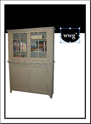
Figure 5.3. The elements of the logo should visually appear centered. Step 4: Placing Raster ElementsLet's bring in your image. Deselect everything on your layout and go to the File pull-down menu and select the Place command. Navigate your way to the Chapter05\05Project_Files folder and select primitivecab3.tif. Click out on the pasteboard somewhere. Note
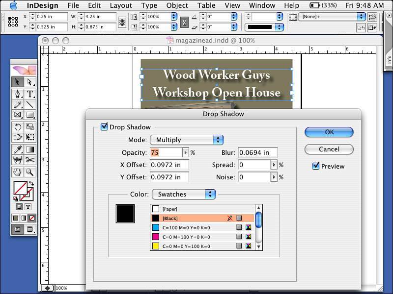
Place the image at .1", 1.05". Scale your image 50%. This image has a clipping path around it. The path outlines the foreground and clips, or removes, the background (see Figure 5.4). Figure 5.4. The image appears to float on the page. Step 5: Creating Drop ShadowsWith the image selected, go to the Object pull-down menu and select Drop Shadow. Fill in the Drop Shadow dialog box as shown in Figure 5.5. Figure 5.5. Watch the drop shadow appear and blend with the background.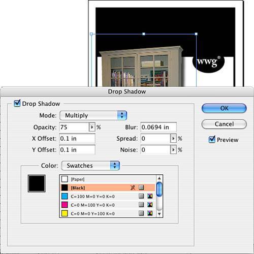
Note
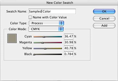
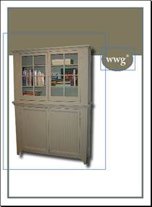
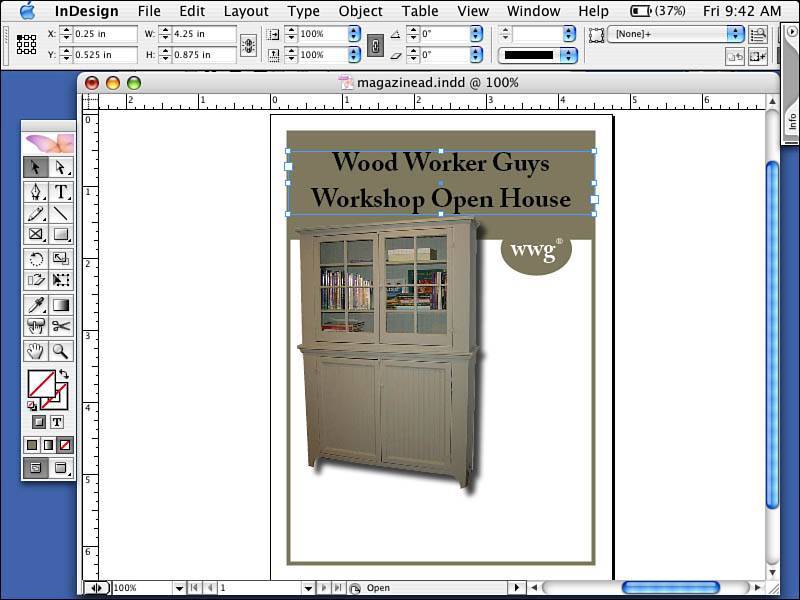
Step 6: Sampling ColorLet's sample a color from the image. Make sure that the fill swatch in the Tool palette is active, or selected. Select the Eye Dropper tool in the Tool palette and click a color in the image. Don't sample a color so dark that you won't be able to see the drop shadows you will make for your text. Notice that the color now appears in your fill swatch. Go to the Swatches palette and pull down the triangle in the upper-left corner of the palette; then select New Swatch Color. Your new color appears. Make sure the color type is process and the color mode is CMYK. Use Figure 5.6 as your guide. Figure 5.6. The swatch name is Sampled Color, and the Color Type should be process with a Color Mode of CMYK. If it is not, change the settings to match. Select the large rectangle you created. With the Stroke swatch active in your Swatches palette, select your new color. Select the smaller rectangle and make the Fill swatch active. Then click the new color. Now your framed ad and header box match the logo. Select the oval for the logo and with the Fill swatch active, click the new color. There should be no stroke on the oval (see Figure 5.7). Figure 5.7. This is the advertisement thus far. Step 7: Formatting TextSelect the Text tool and create a text box on the pasteboard. Type in your ad headline. In the ad for this exercise, I typed Wood Worker Guys, clicked a carriage return, and typed Workshop Open House on the second line. Format the text as follows: Adobe Caslon Pro bold, 26-point type, 36-point leading, paragraph centered alignment. Your box should be placed with the following coordinates: x: .25", y: .525", width: 4.25", height: .875" (see Figure 5.8). Figure 5.8. Your formatted ad headline. Step 8: Applying a Drop Shadow to TypeNow let's change the type a little. First, select your text with the Text tool and go to the Swatches palette. With the Fill swatch active in the upper-left corner of the palette, select Paper. Deselect your text and select the text box itself with your selection tool. Then go to the Object pull-down menu and select Drop Shadow. Fill in the dialog box as shown in Figure 5.9. Click OK. Figure 5.9. Another shadow should appear to the right and below your type. Feel free to experiment with other positions, modes, and blurs. Note
Tip
Repeat the procedure for the text in the oval. Note
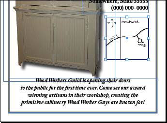
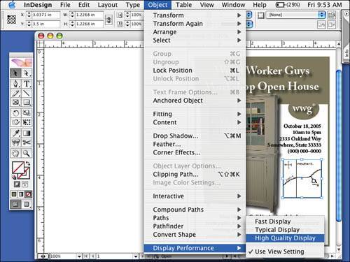
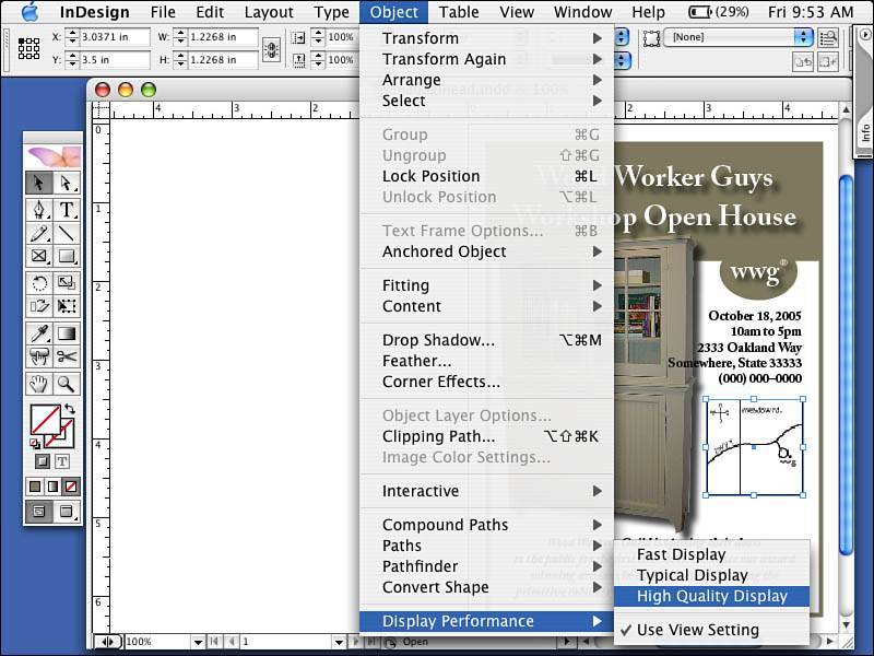
Step 9: Changing Paragraph AlignmentAll that's left now is your copy. Select the Type tool in the Tool palette and draw a box with the following dimensions: x: 2.375", y: 2.375", width: 1.875", height: 1". Type in the date, time, address, and phone number of the event with a carriage return after each item. Select the text and format it as follows: Adobe Caslon Pro Bold, 12-point, auto lead, paragraph right alignment (which can be accessed from the Control palette or the Type and Paragraph palettes found on the Type pull-down menu, the Window pull-down menu, or the collapsible bays (the InDesign dock located down the right side of your desktop). See Figure 5.10 for an example. Figure 5.10. The event time and location. Create another text box at the bottom of the page by drawing it from the left margin all the way to the right margin. The coordinates should be as follows: x: .25", y: 5.25", width: 4.25", height: 1". Type in the description of the event and format as follows: Adobe Caslon Pro, bold italic, 12-point type, 15-point leading, paragraph centered alignment (see Figure 5.11). Figure 5.11. The event description. Step 10: Scaling Vector ElementsDeselect everything on the page, go to the File pull-down menu, and select Place. Navigate to the Chapter 5 project files folder and select map.eps. Place the map below the text block containing the address. Place the map at the following coordinates: x: 3.25", y: 3.5" (see Figure 5.12). Figure 5.12. See the following tips to tweak the map's appearance. If you don't like the way a graphic looks (line art can look a little jagged because it's often a low-resolution preview) with the map selected, go to the Object pull-down menu and select Display Performance. Select High Quality and you should see the image improve (see Figure 5.13). Your other options include View Setting (however, your View menu is set for the entire layout), Optimized Setting (which sets your graphic to a gray box and speeds up onscreen display), and Typical (the default setting for all incoming images). If you scale the image again, the display performance resets to Use View Setting. Figure 5.13. The Object, Display Performance, High Quality Display command renders a more pleasing preview. Note
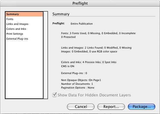
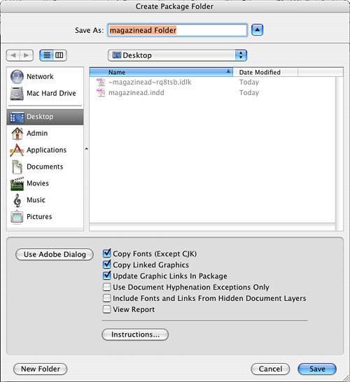
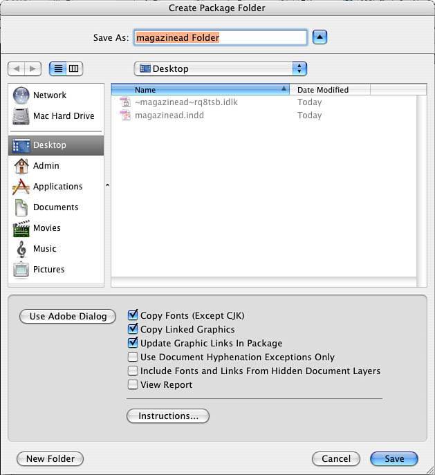
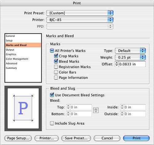
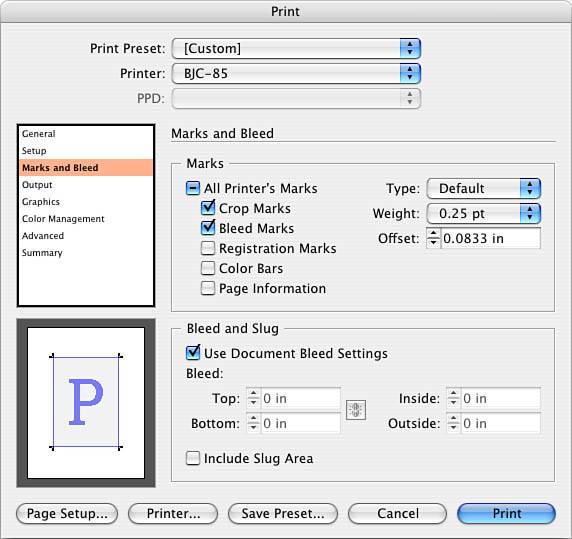
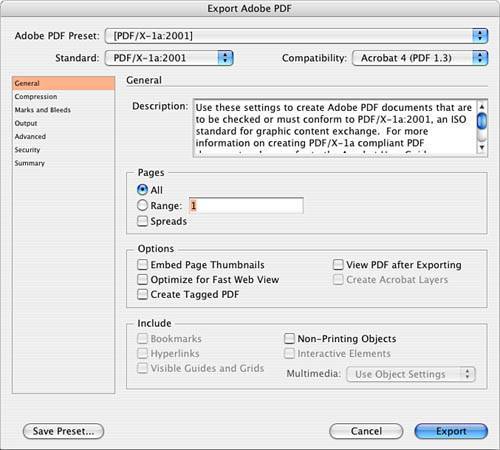
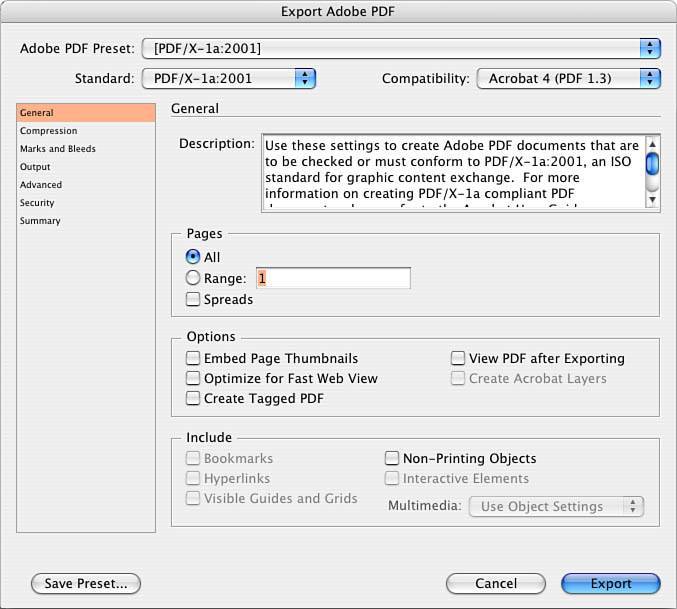
Step 11: Reviewing Your WorkReview your work at 100% view. Turn off hidden characters, guides, and frames. Then save your file to the Chapter05/05Finished_ Projects folder. The finished ad should look like Figure 5.14. Figure 5.14. The finished project. Step 12: Preflighting and PackagingMake sure you have saved your work. Go to the File pull-down menu and select Preflight. The preflight process checks your file to ensure that it is in acceptable condition to submit to your print service provider. It checks for fonts, links, images, colors and inks, print settings, and any external plug-ins you might have used. All this information impacts your print service provider (see the sample in Figure 5.15). Figure 5.15. Images, colors, and fonts are the primary culprits of production problems, so these are checked by the Preflight command. InDesgon uses a yellow caution or warning sign (the same for missing fonts or modified links) to indicate problems. When you are clicking through the Preflight dialog box, look for the yellow signs with exclamation points becasue they indicate a problem. You might find a problem such as a font used by the document is not turned on in your font management utility, you've moved or modified an image since you placed it in your document, or you have included an RGB image. If you see errors or warnings, you need to cancel out of this dialog box, fix the problem, and run the preflight again. At the end of preflight, you can package up your files by clicking the Package button. You can then comment about the production of your file to your print service providerdon't rely on this as your only means of communicating or documenting your instructions, however. After you've typed any necessary instructions, you move on to the Create Package Folder window. Here you tell the program where to put the newly created folder with copies of fonts (with permission from the font developer) and your linked graphics. InDesign will even update the links after the graphics are copied into this folder so that when the recipient of your file opens it, all the images will be linked correctly for him. Click Save and you have a copy of your layout and all the supporting resource files (see Figure 5.16). Figure 5.16. The package dialog boxes and the options to include support files. Step 13: PrintingYou might want to print a copy of this and look at it on paper. Go to the File pull-down menu and select Print. Choose the appropriate settings for the printer that is available to you. Then go to the File pull-down menu and select Print. Again, choose the appropriate settings for the printer available to you. On the General tab, choose one copy. On the Setup tab, select 8.5" x 11", Vertical Orientation, and a page positioning of Centered. Leave the Scale setting as is. On the Marks and Bleed tab, turn on crop marks. On the Output tab, if possible, print a color composite output for your work; if not, select Grayscale. On the Graphics tab, the default settings should work. The remaining tabs can be ignored for now. Print and review your proof. Make any necessary adjustments, save your changes, and print it again. Figure 5.17 shows potential print settings. Figure 5.17. The Print dialog box settings. Step 14: Exporting PDF/X-1aWith your document open and already proofed, go to the File pull-down menu and select Export. Navigate your way to your chapter05\05finished_projects folder and name your PDF. At the bottom of your window, make sure the format is Adobe PDF. Click Save. At the top of the Export PDF dialog box is a Preset drop-down box; select the preset called PDF/X-1a (see Figure 5.18). All the settings necessary to make this PDF compliant with the /X-1a standard for publishing are already turned on, but let's take a tour. Note that the compatibility is automatically set to version 1.3, and the standard is set to PDF/X-1a. Notice that on the Compression tab, the images are set to 300ppi (twice the line screen of a typical 150lpi publication). InDesign can't make an image's resolution more than it is, but if you have images that exceed 450dpi, InDesign removes some of the resolution to comply with this setting. On the Advanced tab, the PDF/X setting uses a profile called U.S. Web Coated (SWOP) v2most large circulation publications are printed on a web press using coated stock (SWOP stands for Standard Web Offset Press). See Figure 5.18 regarding the settings for PDF/X-1a. Figure 5.18. PDF/X settings. Click Export. Note
To check your PDF, double-click your file and your PDF should open in either Adobe Reader or (if you own a full version of Acrobat) Acrobat. Newer versions of Acrobat can actually verify and validate your PDF as a PDF/X-1a file, as well. Inspect your PDF and, if it looks correct, you can distribute it electronically. If it requires adjustment, go back to your InDesign document, make your corrections, save your document, and export it again. |


EAN: 2147483647
Pages: 148