| Dreamweaver has so many tools and features it's unlikely that you'll use all of them for every site. Some you might not ever need at all, particularly if you're an advanced Web developer. However, knowing what's available in Dreamweaver will help you customize your workspace to put frequently used tools within easy reach as you remove extraneous toolbars and panels from view. After you know what features are available and how they work, you can then begin adding content to pages and putting those tools to work for you. Workspace Layouts If you're using Windows , your first decision is choosing a workspace layout. When you installed Dreamweaver, you were prompted to select an initial Workspace Setup (see Figure 5.1). Regardless of whether you chose the Designer or Coder workspace, Dreamweaver allows you to change your workspace at any time to meet the development style of the project you are working on. Figure 5.1. The Workspace Setup dialog box appears when you first install Dreamweaver on a Windows system. You can also access Workspace Setup from the Preferences dialog box. 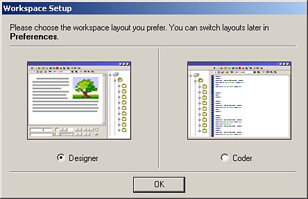
To change the workspace, do the following: - Select Edit, Preferences.
- In the General category, click the Change Workspace button.
- Select a workspace from the Workspace Setup dialog box.
- Click OK to return to the Preferences dialog box.
- Click OK to close out of the Preferences dialog box.
The changes you made to the workspace won't take effect until you exit and restart Dreamweaver. The workspace layouts are -
Designer Workspace ” All windows, panels, and inspectors are contained within one application window, in the same manner as in Fireworks and other Macromedia applications (see Figure 5.2). All panels are docked on the right side of the application window. Documents are opened in Design view by default, and multiple documents are tabbed at the top of the Document window. Figure 5.2. The Designer workspace contains all documents, panels, and inspectors in one application window. 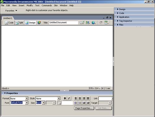
-
Coder Workspace ” All panels are docked on the left in the same manner as in HomeSite and ColdFusion Studio (see Figure 5.3). This workspace opens all documents in Code view by default. Figure 5.3. The Coder workspace is similar to that of the Designer workspace, but the panel groups are positioned on the left side of the window. 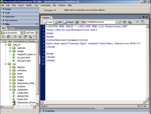
NOTE Mac users have only the floating layout available.
No matter which workspace you choose, you can customize it to meet your needs by moving and changing Dreamweaver's various panels. Panels that are regrouped or undocked from the panel group remain in that new state even in future Dreamweaver sessions. The Property inspector is initially collapsed , showing only the most common options. If you expand the Property inspector, it remains expanded in future sessions unless you manually collapse it. Exploring the Document Window The Document window is where most of the action takes place. The Document window contains a title bar, menus , toolbars, and a status bar. All the other panels, inspectors, and toolbars exist to add to or modify the contents of the Document window. The Document window is capable of displaying a visual representation of the site in Design view (see Figure 5.4), the HTML code for the site in Code view (see Figure 5.5), or a split window containing both the design and the code (see Figure 5.6). Figure 5.4. Design view enables you to work in a what-you-see-is-what-you-get (WYSIWYG) atmosphere. 
Figure 5.5. Code view enables you to develop or edit the markup directly. 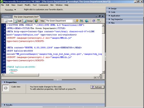
Figure 5.6. Code and Design view enables you to make changes to either pane and see how changes in one affect the other. 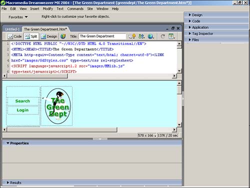
Regardless of your preference, it's likely that you will use all three views at some point or other. Even with the advancements of WYSIWYG development environments, it's still good to understand and be able to modify and write code by hand. TIP In Code and Design view, changes you make to the code aren't reflected in the Design pane unless you refresh the view. You can do this by clicking the Refresh button on either the Property inspector or the Document toolbar, or simply by pressing F5.
Title Bar The Title bar displays the title and filename of the open document. Aside from being a reminder of the name of the page on which you're currently working, it can also serve as a reminder that you haven't yet given the page a title. As you work, an asterisk is appended to the filename, signifying that you've made unsaved changes to the document. Use the Save keyboard shortcut (Command-S) [Ctrl+S] or select File, Save to save your file. Menu Bar The Menu bar contains nearly all the commands and features of Dreamweaver. Most of these commands are also accessible from panels or the Property inspector, as well as context menus that pop up when you (Control-click) [right-click] your mouse. Toolbars Three toolbars are available in the Document window. To toggle these toolbars from view, select View, Toolbars, and select from the three options. All the toolbars can be visible at the same time, but they will cut down on your workspace. The Standard toolbar contains the usual File, Save, Copy/Cut, and Paste commands (see Figure 5.7). If you already know the keyboard shortcuts for these common commands ”they're the same as those for most Windows or Mac applications ”this toolbar simply takes up valuable real estate. Figure 5.7. The Standard toolbar is useful for novices, but it takes up valuable screen real estate. 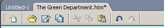
The Document toolbar, shown in Figure 5.8, also contains options available elsewhere in Dreamweaver, such as switching views or titling the document. Although you can access these features from the menu bar as well, it's usually convenient to have them at your fingertips through keyboard shortcuts. Figure 5.8. The Document toolbar makes it easy to switch views, title the page, and preview the document in a browser. 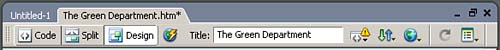
The Insert toolbar, shown in Figure 5.9, enables you to easily insert elements into your pages. The available elements are divided into logical categories, which can be selected from the dropdown menu at the far left of the Insert bar. When selected, each category displays a unique set of buttons that allow you to add any specific element to your page with the click of your mouse. Figure 5.9. The Insert toolbar allows you to easily add elements to your pages. 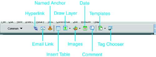
The Insert bar contains 8 categories, each containing icons for the most frequently used options in that category (see Table 5.1). Table 5.1. Insert Bar Categories | Category | Function | | Common | Contains image, table, link, layer, third-party code (Fireworks), comment, and other commonly used objects. | | Layout | Enables toggling of standard and layout views for creating tables and provides the tools to use Layout view to draw tables and cells . | | Forms | Inserts form containers and elements. | | Text | Adds text formatting, such as bold and italic, and paragraph formatting, such as headings and lists. It can also be used to access the Font Tag Editor to set multiple attributes at once. | | HTML | Adds HTML elements, such as horizontal rules or frames , to your page. | | Application | Enables you to build recordsets containing data from your database connections and display content from those recordsets on your pages. | | Flash Elements | Enables you to control Flash elements stored within your pages. | | Favorites | Enables you to create your own toolbar with buttons for your favorite elements. |
To insert an element from one of the Insert bar categories, position the cursor in the page and then click the object button in the Insert bar (or drag the object button to the insertion point). In the case of inserting images or creating links, among others, a dialog box appears to help you complete the insertion, in which you can perform such actions as selecting an image file or defining the link parameters. To insert placeholders for these elements, when available (such as for images), press the (Option) [Ctrl] key while clicking the Object button. You can then select a final image or fill in other required attributes later in the development process. Status Bar The Status bar is located at the bottom of the Document window (see Figure 5.10). It provides information about the file size and download time for the document. Dreamweaver calculates an approximate download time based on the Connection Speed setting in the Status Bar category of the Preferences dialog box (Edit, Preferences). By default, Dreamweaver calculates page load times at 56 kilobits per second, but you can change these settings to calculate download time for faster or slower means of connection. Figure 5.10. The Status bar displays the Tag selector, Window Size selector, and Download size/speed indicator. 
Window Size Selector You can change the dimensions of your default screen size to match those of your typical site visitor. This enables you to design for a wide range of browser dimensions or to test the general appearance of the document in a specific configuration. Choosing the Right Viewing Size More and more Web visitors are using upgraded monitors , enabling them to view pages in a broader array of colors and at a higher resolution. As a result, many designers are now developing based on an 800x600 screen size or higher. For the most part, this is acceptable, but keep in mind that there are always those who are still satisfied with 640x480 displays. WebTV owners have a display size of only 560x384 (and an equally limited range of colors and other limitations). |
Tag Selector The Tag Selector combines the best of working in Design view with the need to occasionally ”and sometimes frequently ”make changes to the underlying code by hand. The Tag Selector shows the HTML tags (see Figure 5.11) relative to the position of the cursor in Design view. Figure 5.11. The Tag Selector gives you quick access to tags used in your document. 
This feature is often overlooked because there are so many methods for accessing and editing code. But when you're working on nested tables or have multiple layers on the page, the Tag Selector can help you find your place in the code. Just click a tag in the Tag Selector to highlight the contents of the tag in Design view. You can then make modifications to that element in the Property inspector or by using the menus and panels. You can also select a tag from the Tag Selector, switch to Code view, and the element and its contents will be highlighted. The Tag Selector also makes deleting blocks of content easy. You can delete tables or blocks of text easily by choosing their container tag in the Tag Selector and then pressing the (Backspace) [Delete] key to erase it.  | All your document content disappears upon deleting a tag? Find out why, and how to avoid this problem, in "Deleting Content" in the "Troubleshooting" section later in this chapter. |
Finally, the Tag Selector can be used to edit tags. Select a tag, and then bring up the context menu (Ctrl-click) [right-click]. The context menu provides one of many methods for setting the class of a tag, used extensively with Cascading Style Sheets. You can also use the context menu to access the Quick Tag Editor by choosing Edit Tag. NOTE The Tag Selector isn't visible in Code view because other code tools are more useful in this environment. Thus, if you're using the Coder workspace, the Tag Selector doesn't appear at the bottom of the Document window.
Using the Property Inspector The Property inspector is arguably the most important tool in Dreamweaver (see Figure 5.12). Whereas other panels place objects on the page, the Property inspector modifies the attributes of those objects. The context of the Property inspector changes depending on the selected element or view. As with all panels, the Property inspector can be moved. It can be docked either above or below the Document window or undocked to become a floating panel. Figure 5.12. The Property inspector changes with the context of the selection. 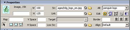
The Property inspector is initially in a minimal state, containing only the most popular attributes for an element. In many cases, however, additional attributes are available in the expanded Property inspector. To expand the panel, click the arrow in the bottom-right corner. In addition to the standard text fields and buttons, the Property inspector contains several other features. The color picker is used to select a color for text, table borders, and other objects. The Point-to-File and Folder icons are used to locate files to insert images or links; the Quick Tag Editor, signified by a pencil-and-paper icon on the right side of the Property inspector, enables you to add element attributes not found on the Inspector. Selecting the question mark icon launches the Using Dreamweaver help system. Working with Panels Unless you've changed the default workspace to remove all the panels and inspectors from view, you'll see that the Document window is surrounded by groupings of additional options and site information. Some of these panels are critical to Dreamweaver's ease of use, whereas others can be removed without worry. Panels are grouped by default in logical panel groups. Of course, this logic might or might not apply to your workflow, so the arrangement of panels into groups can be modified to meet your needs. To open a panel group, click the arrow to the left of the panel group name or click the panel group name itself. (See Figure 5.13.) Figure 5.13. Click the arrow next to panel groups to open and close panels. Here, you see the Design, Code, Application, Tag Inspector, and Files panels, with the Code and Application panel groups open. 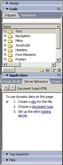
Arranging Panel Groups Each panel group has several controls (see Figure 5.14). The icon to the right of the panel group name activates a drop-down options menu containing several commands within the context of the panels contained in the group. At the bottom of each menu is also a series of panel group commands. Figure 5.14. The panel group controls include a gripper and a drop-down menu with group commands. 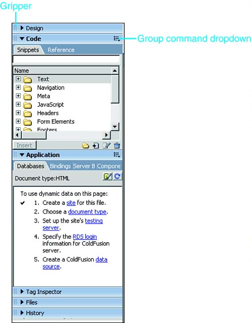
To the left of the group name is a tool called the gripper . Clicking and dragging the gripper for a group enables you to undock that panel group. These floating panels can then be moved around the workspace. To dock a floating panel group, drag it by its gripper until the insert indicator is positioned where you want in the panel dock. Thus, you can use the gripper to rearrange the order of the panel groups in the panel dock. Panels can be moved into other existing or new panel groups. To do this, follow these steps: - Select the tab for the panel you want to relocate.
- Open the options menu for the panel group in which the panel is currently located.
- Select the Group [ panel name ] With command.
- Select an existing panel group, or select New Panel Group to create a new panel group.
The moved panel immediately appears in its new group. Or, if you created a new panel group, open the Options menu in the new group and select Rename Panel Group to give it an appropriate name. You can then add other panels to the new group. Panel groups can be sized to take up more or less space in the panel dock. When you position the mouse between panel groups, the cursor changes into a double-headed arrow, which can be clicked and dragged up or down to modify the size of expanded panel groups. To maximize a panel group to take up as much space in the panel dock as possible, select Maximize Panel Group from the Panel menu. This minimizes other open panel groups to give the select group full use of the vertical space. Some panels ”particularly the Reference panel, located in the Code panel group ”benefit from additional horizontal space as well as vertical. Position the mouse cursor between the panel dock and the Document window until it becomes a double-headed arrow; then click and drag horizontally to give additional space to the panel dock. Keep in mind, however, that this decreases the size of the Document window. TIP If you're making extensive use of the Reference panel, move it into its own panel group and then undock that group. You can then expand the size of the panel without resizing the Document window. As an added benefit, the floating panel remains on top of the Document window even as you work on a page, eliminating the need to switch between viewing the panel and your document.
If you're not using a panel group at all, you can close it by selecting Close Panel Group from the Options menu for that group. To reopen a closed panel group, select it from the Window menu in the Document window. Design Panels The Design panel group contains panels that control the styles and behaviors of the elements on the page. The two panels in this group are CSS Styles (see Figure 5.15), and Layers (see Figure 5.16). Figure 5.15. The CSS Styles panel is used to define and modify Cascading Style Sheets, which is the preferred method for establishing the presentation of elements. 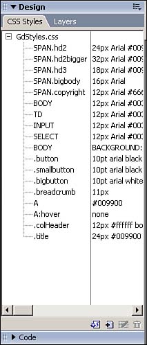
Figure 5.16. The Layers panel is used to control any layers that exist within the document. 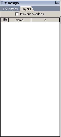
Code Panels The Code panels can be used in either Design or Code view and enable you to control code snippets and seek reference information about your code. The Snippets panel contains predefined code snippets, grouped in related folders (see Figure 5.17). You can also add your own snippets and folders in this panel. Figure 5.17. The Snippets panel contains small, reusable portions of code, which can be inserted into a page. 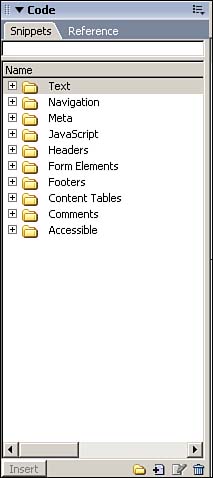
The Reference panel provides reference material for HTML, CSS, JavaScript, dynamic server technologies, and accessibility issues (see Figure 5.18). Figure 5.18. The Reference panel is a tremendous resource for Web development information. 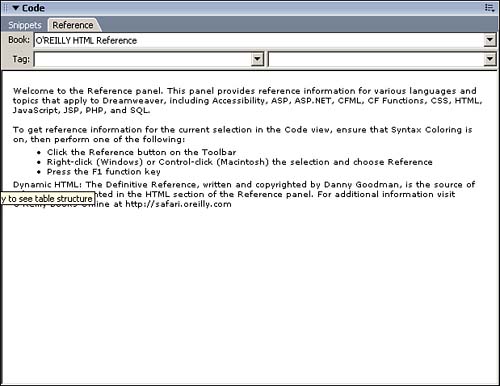
Application Panels When you're using databases and advanced server technologies to create dynamic pages, you'll want to open the Application panel. Initially, each of the panels in this group prompts you to configure the test server and other requirements (if you haven't already done so in the Site Definition). Using the Databases panel (see Figure 5.19), you can easily create a connection to a database containing content for your site. Figure 5.19. The Databases panel controls database connections. 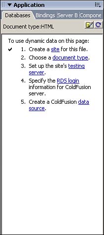
The Bindings panel, shown in Figure 5.20, is used to create recordsets or datasets (depending on your platform) and allows you to drag and drop dynamic content into your pages. Figure 5.20. The Bindings panel allows you to easily add dynamic text and elements to your pages. 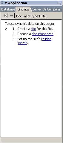
The Server Behaviors panel (see Figure 5.21) gives you access to a broad range of dynamic server behaviors ranging from restricting access to your pages to repeating regions . Figure 5.21. The Server Behaviors panel provides access to database-driven server behaviors. 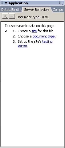
Finally, the Components panel (see Figure 5.22) enables you to easily add Web Services or ColdFusion components to your page. Figure 5.22. The Components panel provides access to ColdFusion components and Web Services. 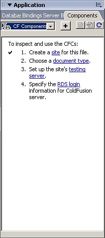
NOTE If you don't design dynamic pages, you can close this panel group entirely to save space.
Tag Inspector Panels The Tag Inspector panel enables you to visualize how tags are nested within other tags within the document and what attributes are associated with each tag. By selecting an element within the page or choosing a tag from the Tag Selector and then choosing the Attributes panel (see Figure 5.23), you can view information about the tag, such as general attributes, any styles that are associated with it, the language in which the code is styled, and any uncategorized attributes associated with the tag. Figure 5.23. The Attributes panel allows you to visualize attributes of specific code tags. 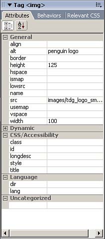
The Behaviors panel, shown in Figure 5.24, provides you with access to commonly used JavaScript behaviors that can be associated with tags within your document. For instance, after you create a hyperlink from text and select the <a> tag, the Behaviors panel provides access to numerous behaviors that are unavailable to non-linked text. Figure 5.24. The Behaviors panel gives you access to JavaScript behaviors that can be applied to specific elements. 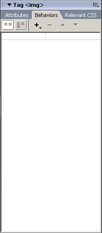
Similarly, the Relevant CSS panel displays information regarding Cascading Style Sheets that are linked to a particular tag. Files Panels The Files panel, shown in Figure 5.25, enables you to view and manipulate the files and folders located within your local site. The Files panel also allows you to create, edit, and delete Dreamweaver sites (which are covered in Chapter 6). Figure 5.25. The Files panel enables you to manage the files and folders contained within your site. 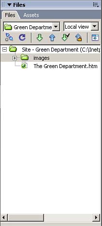
The Assets panel allows you to easily organize elements located within your site, such as images, movies, rich content, and hyperlinks . Using the Assets panel can save you time because you simply drag and drop elements right into your page (see Figure 5.26). Figure 5.26. The Assets panel organizes many of the elements contained within your site. 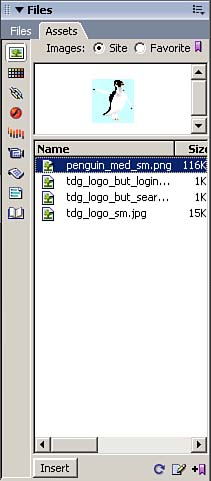
History Panel The History panel maintains a list of all your actions in the current document (see Figure 5.27). You can use this list to create new commands for repetitive, time-consuming actions. You can also use the History panel to undo multiple steps at once or to replay steps. Figure 5.27. The History panel tracks every action you've performed on the current document since you opened it last. 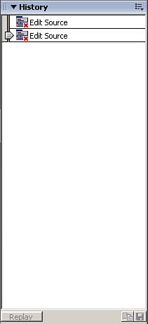
The last item on the list is the most recent, and the panel scrolls upward. To undo the last several actions, drag the slider that's to the left of the steps upward to select the steps you want to undo. After you've made your selection, continue editing. The selected steps are not undone until you take another action that overwrites those steps in the history. To repeat steps, use the slider to select them and then click the Copy Steps button. NOTE After you've undone multiple items and overwritten them with other steps, you cannot redo the original steps.
To create a command, select a series of steps with the slider and then click the Save Selected Steps as a Command button. You'll be prompted to give the command a name, and the new command will appear on the Commands menu. NOTE The History panel tracks only a limited number of steps per session. You can increase or decrease this number in the Maximum Number of History Steps field of the General Preferences settings.
Results Panel The Results panel automatically appears to display the results of searches, validation checks, and various reports . Search Panel The Search panel is displayed at the bottom of the workspace whenever you issue a Find command (see Figure 5.28) that reaches beyond the active document (such as if you're conducting a site-wide search). This panel displays the results of a search and allows you to click the results to edit them in the Document window. Buttons on the left side of the panel enable you to initiate or cancel Find commands. Figure 5.28. The Search panel lists the results of searches in a document or site. 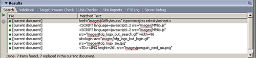
Validation Panel The Validation panel, shown in Figure 5.29, lists any coding errors in the site or document when you validate the site (by selecting File, Check Page, Validate Markup/Validate As XML). This validation can also be initiated directly from the panel, and corrections can be located from it. Figure 5.29. The Validation panel lists coding errors. 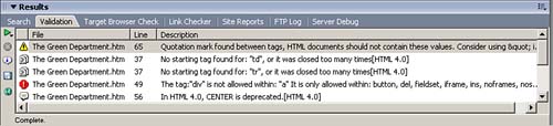
Target Browser Check Panel The Target Browser Check panel, shown in Figure 5.30, lists browser compatibility issues that have emerged in a running of the Check Target Browsers report (File, Check Page, Check Target Browsers or directly from the Target Browser Check panel). The panel provides options to save the report for future reference. By highlighting an item in the report and clicking the More Info button, you can view a dialog box explaining exactly why an item is marked . If you double-click an entry, it opens in the Document window in Code and Design view with the offending code highlighted. Figure 5.30. The Target Browser Check panel lists elements that can't be viewed properly in the target browser. 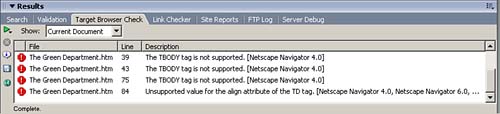
Link Checker Panel The Link Checker panel, shown in Figure 5.31, lists the results of the Check Links report (File, Check Page, Check Links, or run from within the Link Checker panel). This report lists broken links, orphaned files within the site, and all external links. Figure 5.31. The Link Checker panel enables you to fix broken links, eliminate orphaned files, and manually validate external links. 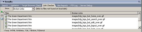
Site Reports Panel The Site Reports panel, shown in Figure 5.32, displays the results of the Site Report (Site, Reports from either the Document window or Site panel menus). The Site Report can be quite extensive, depending on the options you choose when initiating the report. As with the other Results panels, you can use this report to get more information on the items listed and use the items to locate the specific code in question to make modifications. Figure 5.32. The Site Reports panel lists problems found with accessibility, incomplete tags, or missing alt attributes. 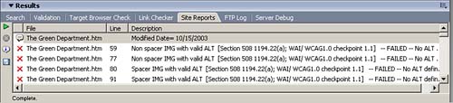
FTP Log Panel The FTP Log panel tracks communication with the remote server. You can also enter commands directly to the server from this panel, which is useful to experienced developers. Server Debug Panel The Server Debug panel is used with dynamic pages to locate errors in the code. To use this feature, select View, Server Debug from the menu. The Server Debug panel displays the results of this command, including the server variables and values, execution time, and SQL queries on the page. If you didn't configure your testing server correctly, this panel prompts you through the required steps. Code Inspector The Code Inspector contains all the same features as the Code view, but is located on a floating panel (see Figure 5.33). The Code view was new in Dreamweaver 4, and the Code Inspector remains primarily for long- term Dreamweaver developers who were used to accessing their code in this manner. The Code Inspector can either be activated by choosing Window, Code Inspector or by pressing the F10 key. Figure 5.33. The Code Inspector duplicates the functionality of the Code view in the Document window. The only advantage of the Code Inspector is its capability to be positioned elsewhere on the screen because it's a floating panel. 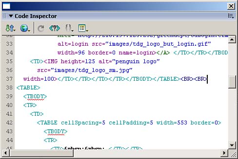
| 