Accelerating Application Development with Components You can easily use symbols to create interactive buttons and movie clips. In addition, Flash MX 2004 introduces a new generation of prebuilt components: movie clips with predefined parameters for standard elements such as buttons , form elements, and display elements.  Components are introduced in "More and Better Components," page 325 in Chapter 14, "What's New in Flash MX 2004?" Components are introduced in "More and Better Components," page 325 in Chapter 14, "What's New in Flash MX 2004?"
You can use components to quickly create buttons, forms that gather user input, progress bars, or display windows . For an example that uses a button component, see "Turning Off Sound," page 417 , earlier in this chapter.
If you have Flash Professional, you also have a rich set of Data components to assist you in retrieving and displaying data. Two Data components, WebServiceConnector and DataGrid, are used extensively in Chapter 23. See "Databinding and Components," page 664 , "Using and Modifying the DataGrid Component," page 668 , and "Web Services," page 672 .
Flash Professional also includes Media Components, used to display streaming .flv and .mp3 files. Media components are introduced in "A Tale of Two Versions, page 324 , in Chapter 14.
Accelerating Help Development with RoboHelp While we're on the subject of accelerating development, if you want to create a help feature patterned after popular desktop applications such as Microsoft Word, check out eHelp's RoboHelp. RoboHelp has a FlashHelp feature that enables you to create help systems entirely in Flash. (You can also use RoboHelp to create help systems using just HTML and JavaScript.) Macromedia liked it so much, they bought the company! RoboHelp isn't cheap (just under US$1000 suggested retail, not including a support contract), but it does enable you to create a richer, more robust help feature in a fraction of the time you'd otherwise require. See http://www.ehelp.com, and http://www.ehelp.com/products/robohelp/flashhelpsamples.asp. |
Table 18.6 lists the 13 components that come with both versions of Flash MX 2004. Many more components are available for download from Macromedia. You can also create custom components. For an introduction to creating custom components, see "Building Your Own Components," page 612 in Chapter 21, "Advanced ActionScript."
Table 18.6. User interface (UI) Components in Both Versions of Flash MX 2004 | Component | Description | | Button | Triggers a one-time action. Can also be configured to act as an on/off toggle. | | CheckBox | Registers a yes/no choice. | | ComboBox | Registers a one-among-many choice. Choices appear in a scrolling list. Can have a blank text field at the top, into which the user can type a new choice. | | Label | Displays a single line of non-editable text. | | List | Registers a choice of one or more options from a scrolling list. | | Loader | Contains a loaded SWF or JPEG file. | | NumericStepper | Uses two clickable arrows to increment and decrement a number. | | ProgressBar | Displays the progress of a process, such as loading a file. | | RadioButton | Registers a choice among two or more mutually exclusive options. Each radio button represents one choice. Used in groups of two or more radio buttons. | | ScrollPane | Displays movies, bitmaps, and SWF files in a box that can have scroll bars. | | TextArea | Displays one or more lines of optionally editable text. Multi-line text input. | | TextInput | Displays one line of optionally editable text. Single-line text input. | | Window | Displays content, such as an SWF or JPEG. Has a title bar and optional Close button. Draggable. |
Components are housed in the Components panel, which is part of the default Flash MX 2004 layout. To open the Components panel, choose Window, Development Panels, Components, or press Cmd-F7 (Mac) or Ctrl+F7 (Windows). Simply drag and drop the component into your movie. Typically, the most important parameters determining component behavior and appearance appear in the Property inspector. The Component Inspector has a complete list of parameters. Often, you select component parameters from drop-down menus , so that you don't have to know what the options are in advance, and you can't choose an invalid option. There are some components that do not require any ActionScript to be useful. For example, you can display an SWF or JPEG in a Window or ScrollPane, or text in a Label or TextArea, without needing any ActionScript. On the other hand, several components require either databinding or some ActionScript to be useful. Databinding is the process of using a component to either receive data from or supply data to another component. For more on databinding, see "Databinding and Components," page 664 , in Chapter 23.
The basic ActionScript required is a listener , a function that fires automatically when the user changes the component. The listener receives an event object that gives you the key information that the user provided through the component. For example, if the user makes a selection from a ComboBox, the event object tells you what that selection was. If the user checks or unchecks a CheckBox, the event object will tell you whether the CheckBox is checked or unchecked. If the user selects a RadioButton, you can find out which one it was. For more on listeners, see "Using Event Handlers to Trigger Action," page 500 , in Chapter 20.
After you have the information, you still have to do something with it. That also requires ActionScript. You put the actions that you want to perform within the body of the listener function. For example, suppose you create a calendar application, and you want to use a ComboBox to enable the user to select the month to display. You put each month's calendar on a different frame of the Timeline, with appropriate frame labels, such as jan , feb and so on. The listener receives an event object containing the month. You put a gotoAndStop() action in the listener body to go to the appropriate frame. The next section gives step-by-step instructions for setting up such an application, and you can see a finished example in calendar.fla on the CD. Working with Components To add a component, you simply drag and drop it onto the Stage. Or you can double-click a component in the Components panel, and an instance of the component is placed on the Stage, where you can reposition it as needed. Follow these steps to add a ComboBox component: - Click to select the ComboBox component in the Components panel. Drag an instance to the Stage. The Property inspector displays the ComboBox component parameters, as shown in Figure 18.37.
Figure 18.37. Component attributes are displayed in the Property inspector. 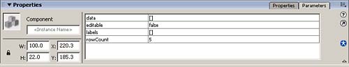
- Assign an instance name of myComboBox to the ComboBox.
- The Editable parameter is set to false by default, meaning that the contents of the ComboBox list are static. When this parameter is set to true , the user can enter an item that does not appear in the predefined list. Leave Editable set to false .
- Double-click in the column next to Labels to launch the Values dialog box. Click the plus sign 12 times to create 12 values for the 12 months, as shown in Figure 18.38. Click each defaultValue and enter a month, until you've entered the months January through December . These labels define what will be displayed in the ComboBox.
Figure 18.38. Enter list items for the ComboBox component in the Values dialog box. 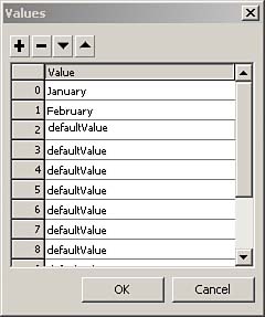
- Double-click in the column next to Data to launch the Values dialog box. Click the plus sign 12 times to create 12 values for the 12 months. Click each defaultValue and type in a list item for each month, jan through dec .
These data items are received by the event object, but (unlike the labels entered in step 4) are not displayed to the user. Therefore, you can use any convenient abbreviations for the months in this step. It is often handy to have one item (the label) that you display to the user, but a different item that you use with ActionScript. Data items allow you to do that.
- Insert a layer (Insert, Timeline, Layer). Name it labels . In each of 12 consecutive frames on the labels layer, insert a keyframe (F6) and create a frame label corresponding to a data item, jan through dec .
The event object receives both the labels and the data. In this case, either one could do. Adding these data items allows us to use shorter labels on the Timeline.
- Insert another layer. Name it calendar . In 12 consecutive frames on the calendar layer, place the calendar for that month. In calendar.fla, this is represented by an empty Window component titled with the appropriate month.
- Insert a layer and name it actions . Type in the following ActionScript:
form = new Object(); form.change = function (eventObject){ var frameLabel:String = eventObject.target.selectedItem.data; _root.gotoAndStop(frameLabel); } myComboBox.addEventListener("change", form); stop();
- Save your movie, and test it by choosing Control, Test Movie. The values you added to the ComboBox component are displayed in a drop-down list, as shown in Figure 18.39. When you select a value from the ComboBox, the movie goes to the appropriate frame.
Figure 18.39. The ComboBox component produces a scrollable drop-down list in your exported movie. 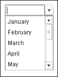
To find out which events (such as change in this example) the component will broadcast, go to the Actions toolbox on the left side of the Actions panel. All the components are listed in the Components category. Expand the component you're interested in, and click on Events. As one of the properties of the event object, every component listener will receive target , which represents the component instance. To find out what attributes target will have (such as selectedItem in this example), look in the Actions panel under Properties for that component. You do not have to create a new form object for each component. The form object represents the entire form, and you should use it for all components in the form. For example, if you were to add a CheckBox component to this form, you would add only the code for implementing the listener, like this: myCheckBox.addEventListener("click", form); form.click = function (eventObject){ trace(eventObject.target); trace(eventObject.target.selected); }
There is a check box in calendar.fla, so you can see how this works. Skinning Components Skins are graphic symbols or movieclips that determine how components look. Most skins contain visual elements, though a few contain only ActionScript code to draw the component. With the previous generation of components, you changed their appearance by working in the Library. The new V2 components are compiled clips, so you cannot work with them in the Library. Instead, you have to work with FLA files containing the components' skins. These FLA files are called themes . They differ in appearance and behavior, but use the same symbol names and linkage identifiers for the skins. So, when you bring a theme into a document, the new symbols with their new linkage identifiers replace the previous symbols of the same name. Presto! All the components in your document that use that skin now look different. Here's a simple example illustrating one way to apply a theme: - Create or open an FLA with a ComboBox component in it. I use the calendar that was created in the previous section. Save the file under a new name. I'll use calendar2.fla here.
- Go to the First Run\ComponentFLA directory. For example, in a typical English-language Windows installation, this is C:\Program Files\Macromedia\Flash MX 2004\en\First Run\ComponentFLA
- Open SampleTheme.fla and save it under a new name. I'll use theme1.fla.
- Drag a ComboBox component onto the Stage in theme1.fla.
- In the theme1.fla Library, open the following hierarchy of folders: Flash UI Components 2, Themes, MMDefault, ComboBox Assets, States. Here you can find the movieclips for the arrow that you click to expand the ComboBox.
- Double-click on ComboDownArrowDown to edit it. This movieclip is the skin.
- On the Stage, double-click on the arrow to open the SymDownArrow movieclip for editing.
- Use the Paint Bucket tool to change the color of the down arrow and save theme1.fla.
- Drag the Flash UI Components 2 folder from the theme1.fla Library to the calendar2.fla Library.
- Test calendar2.fla. Any ComboBox in calendar2.fla displays the new color that you assigned in theme1.fla.
Dragging the Flash UI Components 2 folder into your Library makes the calendar2.fla much bigger. However, Flash uses only what it needs for the SWF, so there is not a comparable increase in the size of the SWF. Note that some components share skins, so changing one skin can affect multiple component types. |