| Buttons are a more "visible" form of interactivity than click boxes. They are also a classic form of navigation. Users instinctively understand the purpose of a button. In Captivate, buttons are used for a number of activities ranging from navigation to opening URLs and sending email. Captivate actually employs two types of buttons. The first type (discussed in Chapter 2, "Creating Captivate Movies") is used to create the elements of a movie playback controller. In this instance, there are only two possible states for the button: Up and Down. The second type of button, which is the subject of this section of this chapter, is the button as an object. In this case, the button has the traditional states of Up, Over, and Down to indicate it is live. When creating a button as an object, you choose from among three button types: Text button With this type of button, the text you enter becomes live. Transparent button This button acts like a classic hot spot. Yet where it differs from a hot spot is that you can assign a fill color and transparency to the color. In this way, the viewer's attention is drawn to the area of the slide covered by the button. Image button This classic button type uses three separate imagesUp, Over, and Downfor the button states.
To add a button 1. | Open the target slide in the Edit View panel.
| 2. | Select Insert > Button, press Control-Shift-B, or click the Button button on the Object toolbar.
The "New button" dialog box (Figure 7.15) opens.
Figure 7.15. The Button dialog box. 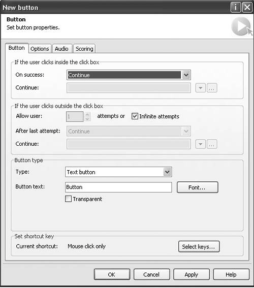
| 3. | Select the Button tab.
This window functions in exactly the same manner as the "New click box" dialog box from the previous section.
| 4. | Make your interactivity choices.
| 5. | In the Type drop-down list (Figure 7.16), select one of the three button typestext, transparent, or image.
Figure 7.16. Three button types are available. 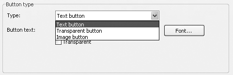
| 6. | Click OK.
The button appears in the slide (Figure 7.17).
Figure 7.17. A button on the slide. Click the button in the Edit View panel to see any captions associated with it. 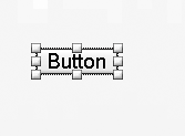
|
 Tips Tips
The Scoring tab on the "New button" dialog box (Figure 7.15) is discussed in Chapter 12. If you need to change a button's properties or interactivity options, double-click the button in the slide to open the Button dialog box. This is simply the "New button" dialog box with its name changed. If the button text is a bit too long, click the button and drag a handle outward to resize the button.
To create a text button 1. | In the "New button" dialog box's Type drop-down list, select "Text button."
| 2. | In the "Button text" text box, enter the text to be used on the button (Figure 7.18).
Figure 7.18. You can use text as a button. Selecting Transparent will make the text's background color invisible. 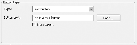
| 3. | Click the Font button.
The Font dialog box opens (Figure 7.19).
Figure 7.19. To format text, click the Font button. 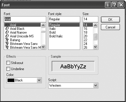
| 4. | Select a font, style, and point size for the button text.
| 5. | In the Effects area, select the text color from the Color drop-down list.
Don't bother selecting Strikethrough or Underline. These are redundant.
| 6. | If the style shown in the Sample box is acceptable, click OK.
You are returned to the Button Type area of the dialog box.
| 7. | If you simply want the text to function as a button, select Transparent.
| 8. | Click OK to close the "New button" dialog box.
|
Tip
To create a transparent button 1. | In the "New button" dialog box's Type drop-down list, select "Transparent button" (Figure 7.20).
Figure 7.20. Think of a transparent button as being a hot spot. Add a color and a transparency value, and the hot spot becomes visible. 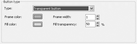
The options for a transparent button appear in the "Button type" area.
| 2. | Click the "Frame color" chip.
The color picker opens.
| 3. | Choose a color for the border and click OK.
| 4. | Click the "Frame width" arrows to set the size of the border.
Your choices range from 0 to 20 pixels. You can also enter your own value between 1 and 20.
| 5. | Click the "Fill color" chip.
The color picker opens.
| 6. | Select a fill color and click OK.
| 7. | Click the "Fill transparency" arrows to set the fill's transparency percentage.
Your choices range from 0% (solid fill) to 100% (full transparency, or an invisible fill).
| 8. | Click OK.
The dialog box closes, and the button is placed in the slide.
|
Tip
To create an image button 1. | In the "New button" dialog box's Type drop-down list, select "Image button."
The options for an image button appear in the "Button type" area (Figure 7.21).
Figure 7.21. You can use graphic buttons from Captivate or that were created elsewhere. 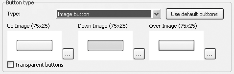
| 2. | In the Up Image section, click the Browse button.
The Open dialog box appears. A rather extensive button collection is available in C:\Program Files\Captivate\Gallery\ Buttons.
| 3. | Navigate to the folder containing the button's Up state.
| 4. | Select the image and click OK.
The image appears in the button preview.
| 5. | In the Down Image section, click the Browse button.
The Open dialog box appears
| 6. | Navigate to the folder containing the button's Down state.
| 7. | Select the image and click Open.
The image appears in the button preview.
| 8. | In the Over Image section, click the Browse button.
The Open dialog box appears.
Tip Selecting "Transparent button" in the Image Button area of the Button dialog box does not make a button's fill color invisible. In this case, it treats the pixels outside of the button's border as being transparent. This is determined by the application sampling the color of the pixel in the upper left edge of the button's bitmap. The color value chosen from the "Transparency Pixel" will result in that color being made transparent throughout the entire image.
| 9. | Navigate to the folder containing the button's Over state.
| 10. | Select the image and click Open.
The image appears in the button preview.
| 11. | If you have chosen the wrong buttons, click "Use default buttons."
The blank button replaces your choices.
| 12. | Click OK.
The dialog box closes, and the button's Up state appears in the slide.
|
Rolling Your Own Buttons You aren't limited to using the button collection that ships with Captivate. You can create your own buttons using an imaging application such as Adobe Photoshop or Fireworks MX 2004. If you do create your own buttons, keep the following in mind: Create individual images for the Up, Over, and Down states of the button. Buttons can be saved in the .gif, .jpg, and .bmp formats. Build the buttons over a solid background color and select "Transparency color" in the Image Button area to remove that. Ensure the background color is unique to the image. For example, if you build a white button with beveled edges and black text over a black background, the text will disappear if you select the "Transparent buttons" check box for the button in Captivate. If you create the buttons in Fireworks MX 2004, create the button as a button symbol and then select Images Only in the Export Special dialog box. This will automatically create the three images for you. When naming the buttons, include the state in the button name. "Black_Marble_Up" is more intuitive than "Black_Marble_First." Buttons don't have to be massive. A button width of 100 pixels and a height of between 20 and 25 pixels is common. If you create the button in Fireworks MX 2004 and the button uses square corners, don't trim the canvas by clicking the Fit Canvas button in the Property Inspector. This will fit the canvas to the exact dimensions of the button, and the "Transparency Pixel" will be the one in the upper left corner of the button's border. Before saving your images in your imaging application, select the Crop tool and crop the image, being sure to leave an area of 10 to 15 pixels of the background or canvas color visible (Figure 7.22). Figure 7.22. When creating a button in an imaging application, leave a 15-pixel canvas area visible around the button. Select Transparent in the Button Type area of the Button dialog box, and it will be removed in Captivate. 
|
|