Using Data-Bound Controls
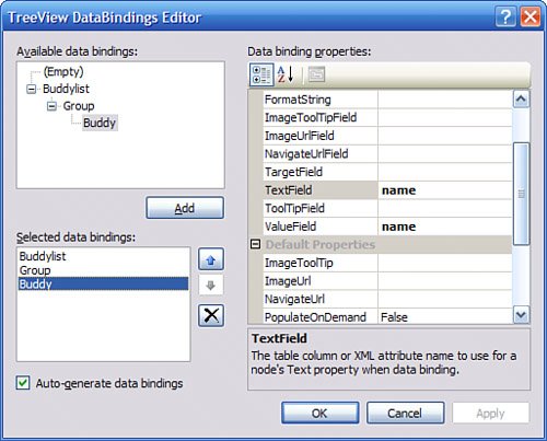
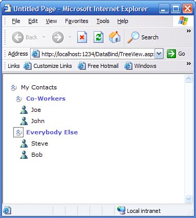
| Many controls support binding, but thanks to the use of the data source model, many of the simpler controls are self-explanatory and easy to work with, such as the CheckBoxList and the ListBox. This section covers some of the more powerful controls and gives you an introduction to their use. For a more thorough examination of all ASP.NET 2.0 controls, you should consider reading one of the books that are specific to ASP.NET 2.0, such as ASP 2005 Unleashed, from Sams Publishing (ISBN: 0672328232). Using the GridView ControlEarlier in this chapter you saw a brief introduction to the GridView control. This control is responsible for rendering a list of items in a grid format, and can be configured to allow for inline editing and deleting of existing rows if the data source to which the control is connected has a DeleteCommand and an UpdateCommand defined. If you set the AutoGenerateDeleteButton, AutoGenerateEditButton, and AutoGenerateSelectButton properties, the manual tasks previously required of the DataGrid in ASP.NET 1.1 will be taken care of. In fact, you won't have to write any of your own update code because the data source will perform the update (or delete) at the request of the GridView. Using the DetailsView ControlThe DetailsView control is used for displaying the details for a single row of data. Most often when a user interface calls for the display of multiple rows of data in a grid format, the same interface requires that a row's details eventually be displayed, either on the same page or on a different page. If you've been following along, drag a DetailsView control onto the form and set its data source to the same as the GridView, AccessDatasource1. Make sure to set the EnablePaging property to true. The one thing to keep in mind that is to the DetailsView control, one row is equivalent to one page. Therefore, to set the row being viewed or edited, you simply set the PageIndex property. With both a GridView and a DetailsView on the same page, you might assume that if you click the Select button on the GridView (this button appears when your GridView allows row selection), the DetailsView will automatically move to the selected row. This would be true if the data source supported the notion of currency (maintaining current row in state), but ASP.NET 2.0 data sources do not support currency, with good reason. To make a GridView and a DetailsView sync up when the user selects a row in the GridView, all you have to do is add the following line of code to the GridView's SelectedIndexChanged event handler: DetailsView1.PageIndex= GridView1.SelectedIndex; If you're familiar with ASP.NET 1.1 programming, you are probably wondering where the call to DataBind() is for the DetailsView. There is no need because all new ASP.NET 2.0 controls that support data binding indicate to the ASP.NET framework whether or not something has changed with the control that requires it to rebind. This facet of ASP.NET saves a lot of time and effort on behalf of the programmer, who no longer has to write complicated code to determine whether binding needs to take place or create convoluted workarounds to avoid double-binding the same data. Using the FormView ControlThe FormView control is similar to the DetailsView control. The main difference between the two is that the DetailsView is preconfigured to work in tabular data fashion, whereas the FormView requires the developer to define the templates for items in read-only and edit mode. To see the FormView in action, create a new Web Form and copy the AccessDataSource1 data source from the previous page onto the new page. Then, drag a FormView onto the page and make sure to enable paging (remember that one page on a detail/form control is the same as one row in a grid control). Set the control up so that the form view control looks as follows: <asp:FormView runat="server" BackColor="LightGoldenrodYellow" BorderColor="Tan" BorderWidth="1px" CellPadding="2" DataSource ForeColor="Black" AllowPaging="True"> <FooterStyle BackColor="Tan" /> <PagerStyle BackColor="PaleGoldenrod" ForeColor="DarkSlateBlue" HorizontalAlign="Center" /> <HeaderStyle BackColor="Tan" Font-Bold="True" /> <EditRowStyle BackColor="DarkSlateBlue" ForeColor="GhostWhite" /> <ItemTemplate> <table width="100%" border=1 cellspacing=0 cellpadding=0 bordercolor=black> <tr> <td width="100"> Company Name </td> <td> <%# Eval("CompanyName")%> </td> </tr> <tr> <td> Contact Name </td> <td> <%# Eval("ContactName")%> </td> </tr> </table> </ItemTemplate> <PagerSettings Mode="NextPreviousFirstLast" /> </asp:FormView> The really important piece to remember in the preceding code is the Eval method. This method is a part of the Page class itself and, as such, is available through partial class technology to the code on the .aspx page. It is far easier syntax to use than the DataBinder.Eval() method that was required by ASP.NET 1.1 and earlier. In short, it will evaluate the property indicated on whatever data context is applicable for the template. In the case of the preceding code, it is evaluating the properties on a single row of the Customers table in the Northwind sample Access database. You can also pass a format string to this method to further control the output. Using the TreeViewThe TReeView control (found in the "Navigation" section of the Toolbox) is a data-bound control that is responsible for rendering data in a hierarchical fashion. Tree-style controls are extremely useful for displaying hierarchies such as the relationship between parent rows and child rows, site navigation trees, and much more. Although you can manually populate the nodes of a TReeView control programmatically, this section will show you how to bind a TReeView to a data source. This control is a hierarchical control and as such must be bound to a hierarchical data source, such as a site map or an XML data source. One of the best features of the treeView control is that you can use a design-time editor to graphically pick out which attributes will supply the node labels and which attributes will supply node values given a certain hierarchy. To see how this all works, create a new page called TReeView.aspx and drag a treeView control onto the page. Now add a new XML file to the App_Data folder in the solution and call it BuddyList.xml. Enter the following XML for the file: <?xml version="1.0" encoding="utf-8" ?> <Buddylist name="My Contacts"> <Group name="Co-Workers"> <Buddy name="Joe"/> <Buddy name="John"/> </Group> <Group name="Everybody Else"> <Buddy name="Steve"/> <Buddy name="Bob"/> </Group> </Buddylist> With the XML file in place, you can create an XML Data source using the BuddyList.xml file as a source. Open up the smart tag menu on the TReeView control and select the XML data source as the data source. Then select the option to configure the treeNode data bindings. A dialog like the one shown in Figure 27.6 will appear, allowing you to select the attributes that populate various nodes of the tree. You can also autoformat the tree view for a specific application, such as a Contact list in this scenario. Figure 27.6. TReeNode data bindings editor. When you run the page you can see how the XML file you created has been mapped onto the hierarchical structure of the TReeView control, as shown in Figure 27.7. Figure 27.7. A treeView autoformatted for Contacts bound to an XML file. |
EAN: 2147483647
Pages: 298