| Before converting your file to a different color mode, it's a good idea to save a "master" version of your photo first. That way, no matter what changes you make to your image, you always have the original, unaltered version. The HSB Color Model The RGB model isn't the only way to translate and interpret color. For some purposes, it's useful to describe color in terms of the HSB model. H represents the color's overall hue (or how you'd characterize it in the color spectrumfor example, is that flower blossom "purple" or "teal"). S stands for saturation, the purity of the color, and B stands for brightness, or how light or dark the color is. Although you can't convert an image to HSB mode, you can make color selections and changes using either RGB or HSB from within the Color Picker (Figure 3.4) and with many of the color-adjustment tools covered later in this chapter. Say, for example, you want to color something bluish-green. How do you describe that in terms of red, green, and blue? If you're working in the HSB model, it's relatively easy. In the toolbox, click the foreground or background color selection box to access the Color Picker. Using the Color Picker, just click the H button, find the basic color on the Hue slider, and then choose the specific shade from the large square on the left, which shows all the variations of saturation and brightness within that hue. Figure 3.4. The Color Picker includes access to the hue, saturation, and brightness (HSB) of your image. 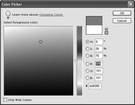
|
To convert an image to grayscale 1. | From the Image menu, select Mode > Grayscale (Figure 3.5).
Figure 3.5. Choose Image > Mode > Grayscale to convert an RGB image to grayscale. A grayscale image is only about 1/3 the size of an RGB image. 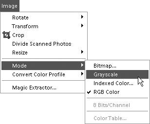
A message appears asking "Discard color information?"
| 2. | Click OK (Figure 3.6).
Figure 3.6. To convert from RGB to grayscale, you will discard the color information. Before you convert an image to grayscale, you may want to save a separate version to preserve the colors in the original image file. 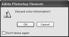
The conversion discards all color information, resulting in an image with up to 256 shades of gray. (See the color plate section of this book for a full-color example.)
|
 Tip Tip
To convert an image to bitmap 1. | From the Image menu, select Mode > Bitmap (Figure 3.7).
Figure 3.7. Choose Image > Mode > Bitmap to convert an image to Bitmap (black and white) mode. 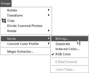
| 2. | Click OK in the message box that appears, to first convert the image to grayscale (Figure 3.8).
Figure 3.8. Before converting to Bitmap mode, your image is converted to grayscale. 
The Bitmap dialog box appears (Figure 3.9).
Figure 3.9. The Bitmap dialog box. 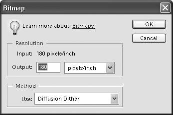
| 3. | If desired, enter a value for the output resolution.
The default value is the current resolution of the image, which is usually fine for most purposes, and need not be changed during this conversion.
| 4. | From the Use drop-down menu, choose from one of the following three conversion methods to complete the bitmap conversion:
- 50% Threshold converts pixels above medium gray to white and below medium gray to black, resulting in a high-contrast image (Figure 3.10).
Figure 3.10. 50% Threshold results in a high-contrast image. 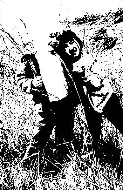
- Pattern Dither converts areas of gray into geometric patterns (Figure 3.11).
Figure 3.11. Pattern Dither creates geometric patterns based on areas of gray. 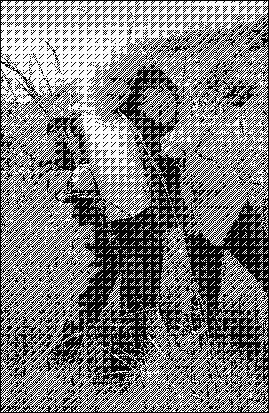
- Diffusion Dither results in a grainy, graphic look (Figure 3.12).
Figure 3.12. Diffusion Dither results in a grainy, posterized look. 
| 5. | Click OK to convert the image to Bitmap mode.
|
To convert an image to indexed color 1. | From the Image menu, select Mode > Indexed Color (Figure 3.13).
Figure 3.13. Choose Image > Mode > Indexed Color to convert an RGB image to indexed color. 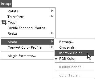
The Indexed Color dialog box appears.
| 2. | Choose Palette, Dither, and other options displayed in the dialog box (Figure 3.14).
Figure 3.14. The Indexed Color dialog box includes options for choosing colors, palettes, and dithering. This figure shows the dialog box on a Macintosh. 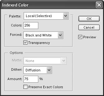
Palette options allow you to choose the best color palette, taking into account where the image will ultimately be viewed. See the sidebar "Indexed Color Palette Options" for a summary of the different Palette options.
The Forced option lets you lock in specific colors so that they are not changed in the conversion process. You can choose to lock in Black and White, which is particularly useful if you have a large area of white or black in the background, as well as Primaries (white, red, green, blue, cyan, magenta, yellow, and black). Choosing the Forced Web option protects all 216 "Web-safe" colors in the palette from being altered.
| 3. | Click OK to confirm your choices.
|
Tip If all you want to do is convert your images for posting on the Web, you don't have to mess around with the Indexed Color dialog box. Instead, try using Photoshop Elements' Save for Web command, which takes a lot of guesswork out of the process. See Chapter 11, "Saving and Printing Images," for more information.
Indexed Color Palette Options Exact Choosing this option means that Photoshop Elements uses the exact same colors in your image to construct the color table. But this option appears only if your image contains fewer than 256 colors (such as an image in Grayscale mode). System (Mac OS or Windows) Choose one of these options if you know that a majority of your users will be viewing your images on a specific computer system. (Macintosh and Windows monitors display the same colors slightly differently.) This is also a useful option if you just want to see how your image will look when viewed on a computer system different from your own. Web When you choose the Web palette, your image is limited to the 216 colors recognized by most Web browsers. Your image's colors will stay consistent, no matter whether it's viewed using Internet Explorer, Netscape Communicator, AOL, or any other Web browsers. Uniform The Uniform color palette relies on its own even (uniform) sampling of 216 colors to make up its color palette. Unlike other color palettes, it doesn't look to your original image to try to approximate those colors. Adaptive (Local and Master) This palette creates a color table based on the most frequently occurring colors in your image. For example, if your image contains mostly red and orange colors, the adaptive color palette will be composed of mostly reds and oranges. Use the Local setting if you're working on a single image. You'll rarely have to use the Master setting unless you're working on multiple open images that all share the same color palette. Perceptual (Local and Master) This palette relies on color to which the human eye has the most sensitivity. Just as with the Adaptive palette, use the Local setting when working on a single image; use the Master setting when working on multiple open images that all share the same color palette. Selective (Local and Master) Places selective emphasis on Web-safe colors, which results in images with the best color integrity. This is the best choice for most images, and you'll find that this palette often appears as the default choice on the Palette drop-down menu. As with the Adaptive and Perceptual palettes, use the Local setting when working on a single image; use the Master setting when working on multiple open images that all share the same color palette. Custom Use this choice if you want to create your own custom color palette. |
Managing color You've learned some color basics, but before going any further, you may want to take a couple of steps to ensure that the color you see on your monitor will be reasonably accurate when you decide to print or send images to the Web. Fortunately, color management in Photoshop Elements is very simple and doesn't require any labor-intensive chores on your part. You should first make sure that the colors you see on the monitor are reasonably accurate, and represent what others will see on their monitors. Calibrating your monitor is a particularly good idea if you have an older monitor or have inherited it from a friend or relative (you don't know what they might have done to the monitor settings). If you have a newer monitor, it probably came with an accurate calibration from the factory. In that case, as you go through the following steps, you may find that no changes are needed. About Color Profiles The choices that you make in the Color Settings dialog box affect only the display of an image onscreen and won't affect how an image is printed. The Always Optimize for Printing option, for instance, will simulate the AdobeRGB color spectrum on your monitor, but will not assign the AdobeRGB color profile to an image. A color profile is information embedded in an image and stored in the background until it's required (usually by a printer). The color profile helps to interpret the RGB color information in an image and convert it to a color language that a printer can understand, and so reproduce the most accurate color possible. You can assign a color profile to an image at anytime regardless of the option that you've set in the Color Settings dialog box. With an image open, simply choose Convert Color Mode from the Image menu. From the Convert Color Profile submenu, you can Remove an unwanted profile (sRGB, for example) and apply the profile more suitable for printing: AdobeRGB. |
If you prefer, you can also choose color settings optimized for either Web graphics or color printing. To calibrate your monitor with Adobe Gamma 1. | Start Adobe Gamma, which you'll find in the Control Panel options window (Figure 3.15).
Figure 3.15. The Adobe Gamma control panel is located with the other control panel options. 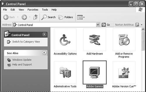
The Adobe Gamma start screen appears. If you've calibrated your monitor before, you may be launched to the Gamma control panel directly. If so, go to step 3.
The History of Web-Safe Color If you're familiar with the creation of graphics or images specifically for the Web, you may already know about Web-safe or browser-safe colors. For those of you new to this buzzword, Web-safe colors are the 216 colors that can be accurately displayed on all color computer monitors regardless of age or platform. Here's the background. Back in the pioneer days of the Webin the mid-1990sa lot of computer systems still used 256-color cards (also known as 8-bit color). This meant that the monitors on these systems could display only 256 colors at any given time. You (or your kids) may even still have a few CD-ROM games designed around this limitation; you'll know them because they ask you to change the display to 256 colorsin other words, to use the Web-safe palette. But even though the palette consists of 256 colors, only 216 of those colors are considered Web safe. That's because Windows and Macintosh computers share only 216 colors, each reserving the remaining colors for system use. Thus, you're left with 216 colors that are guaranteed to appear with absolute accuracy regardless of platform. Surprisingly, even using just these 216 colors, your images can come out looking pretty good. Today, even the most basic PCs come out of the box with the capability of displaying thousandsor, more often, millionsof colors, and there are very few 8-bit systems still in use. However, because Windows and Macintosh computers still display some colors a little bit differently, using the Web-safe palette is the only way to ensure that your colors look exactly the same on both systems. Bottom line? If you're not concerned about folks running older computer systems, or with the slight color differences in PC and Macintosh systems, use all of the colors your system came with. But if you want to make sure that absolutely all viewers can see your images in the exact colors you intended, stick to the Web-safe color palette. |
| 2. | From the Adobe Gamma start screen (Figure 3.16), do one of the following:
- Click Step by Step (Wizard) to adjust your color settings using the onscreen instructions.
- Choose Control Panel, click Next, and follow steps 3, 4, and 5.
Figure 3.16. The Adobe Gamma utility is used to calibrate your monitor for Windows XP. It includes a Step by Step mode that guides you through the monitor calibration process. 
| 3. | When you come to the gamma settings screen, uncheck the View Single Gamma Only check box (Figure 3.17).
Figure 3.17. Setting up Adobe Gamma ensures that the color images on your screen are represented accurately. In this dialog box, unchecking View Single Gamma Only lets you adjust the red, green, and blue values on your monitor. 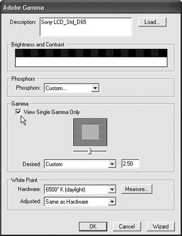
Three color boxes appear, representing the red, green, and blue colors displayed by your monitor (Figure 3.18).
Figure 3.18. To make adjustments to the red, green, and blue values, move the color slider back and forth until the inside and outside boxes match as closely as possible. Usually, the colors will match closest around the midpoint of the sliders' range. 
| 4. | Using the sliders, match the inner colors to the outer colors in the boxes.
| 5. | Click OK, then in the Save As dialog box, click Save to save your changes.
The monitor profile is saved in the profiles folder.
|
Tips It's very possible that your monitor settings will be correct. In that case, choose Cancel to exit the Adobe Gamma dialog box. The default White Point settings in the lower portion of the dialog box are usually fine for most monitors and environments. But light sources and even the color of surrounding walls can affect how color is displayed on your monitor. If there is a marked difference between the image on your display and your printed output, you may want to experiment with different White Point settings. To ensure accurate calibration of your monitor, make sure that it's been on for at least 30 minutes. The colors may display slightly differently until the monitor is completely "warmed up."
Color Management Is an Imperfect Science As you start selecting and adjusting colors in Photoshop Elements, it's important to understand that the term color management can be a little misleading. Color management operates under the assumption that we're creating artwork at our calibrated monitors under specific, controlled lighting conditions, and that our desktop printers work at peak performance at all times. In other words, it assumes controlled, uncompromised perfection. At the time of this writing, the late afternoon sun is casting some lovely warm reflections off the blinds of the window and onto the wall directly behind my computer monitor, and is competing for attention with the glow from the 40-watt, soft-white bulb in my desk lamp. Therein lies the problem: the vast majority of Photoshop Elements users are working in similarly imperfect conditions. In addition to trying to make a perfect science out of a host of imperfect variables, color management all but ignores one of the most imperfect sciences of all: our very human, very subjective perception. I may print out an image I find perfectly acceptable, whereas you may look at the same image and decide to push the color one way or another to try to create a different mood or atmosphere. That's what makes everything we create so different. That's what makes it art. And that's (at least in part) what makes color management an imperfect science. So, as you read through this chapter, keep in mind that your images will never look precisely the same when viewed by different users on different monitors. And that's perfectly all right. |
To choose color settings - From the Edit menu, choose Color Settings (Figure 3.19).
Figure 3.19. Choose Edit > Color Settings to bring up the Color Settings dialog box. 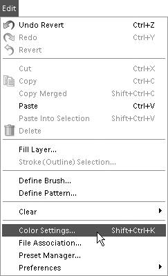
The Color Settings dialog box appears with three color management options plus the option to choose No Color Management (Figure 3.20).
Always Optimize Colors for Computer Screens displays images based on the sRGB color profile and is the default setting. It's a good all around solution, particularly if you are creating images to be viewed primarily onscreen. Always Optimize for Printing displays color based on the AdobeRGB profile. Although the image you see onscreen may display with only subtle color differences (as compared to sRGB), you will generally get truer, more accurate color when you send the image to print. Allow Me to Choose will default to sRGB, but if the image contains no color profile, you'll have the option of choosing AdobeRGB.
Figure 3.20. Choose a color management option best suited to the final output of your image. 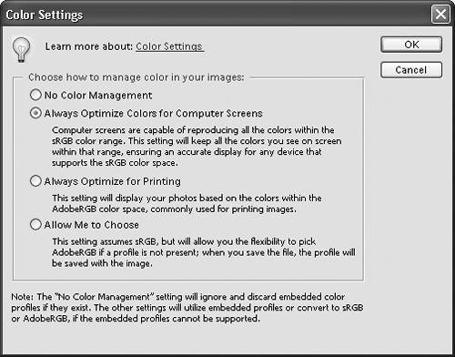
|