Create Forgiving Software
| At a deeper level than the need to prevent and detect errors is the need to create software that is forgiving to users as errors occur. Applications should allow users to play around and see what they can do without serious consequences. A site-builder tool I used recently featured the ability to create forms, such as contact or reservation forms, for a Web site. It wasn't easy to do this, however; it took several minutes just to figure out how to create a new form, add the appropriate form elements (such as text fields and check boxes with labels), and set properties for them (such as their default values and whether or not the fields were required). After a while of muddling through this grueling process, I attempted to select a text field and delete it. Instead of deleting the single form element, the entire form was removed from the screen. My hard work disappeared forever. I would have stopped using the application immediately and never looked back, but it was my job at the moment to do an expert review of the application to tell the people who built it how I thought it could be improved. You can probably guess what I reported as my number one recommendation. An application should never allow users to mess things up so badly that they lose lots of work. Not without some sort of warning. And if a warning cannot be provided in an appealing, non-modal fashion, an undo feature should be provided so that users can quickly backtrack and get moving again. This bit from Apple's Human Interface Guidelines really says it all:
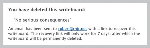
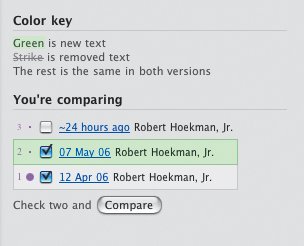
Writeboard, another application from 37signals, enables groups of people to collaboratively contribute to a single piece of copy (such as that for the About Us page of a Web site, or a research paper). This application has a rather unique way of allowing users to undo the most serious thing they can do to a Write-board page: delete it. When a Writeboard is deleted, the user is shown a message indicating an email has been sent to the Writeboard creator that contains a link to recover the page. The link continues to work for seven days. If a user deletes a Writeboard accidentally, he can simply check his email, click the link provided, and be back in good shape in just a few seconds. Or seven days. I have seven whole days to recover my Writeboard once it's deleted. Writeboard also offers version tracking and comparison. Each time a Write-board is edited, it can be saved as a new version. Writeboard's version tracking makes it easy for users to see what has been done. Users can at any time compare two versions of the same document by check-marking the two versions they'd like to see from the list in the sidebar and clicking the Compare button (which, incidentally, remains disabled until two document versions are checkmarkedanother nice example of a poka-yoke device). Good software promotes good practicesThis topic is a bit fuzzy. It's quite subjective and can only be dealt with on a case-by-case basis, so it requires regular reexamination as we develop new applications. Promoting good practices, in a nutshell, means that our applications need to make it difficult to produce bad work, and easy to produce good work. Remember the Web-based site-creation tool? Aside from the disappearing form issue, I found it quite taxing to do anything really well with that tool. The simple act of creating navigation took many steps and involved at least one pop-up window. It was difficult to format text and links, and the end result was a navigation bar that looked almost nothing like I intended. Continuing, I replaced the default background image for the page's title area with my own, and somehow ended up with two copies of my image, one on top of the other. After a while, I figured out how to get rid of the second one, but the title text itself didn't look quite right. So I accessed the pop-up window required to format text and was very surprised to find none of the text tools applied to the title text. (It turns out the title text wasn't text at all. It was an image, which is why I couldn't edit it. It looked like text. How was I to know?) Ultimately, I left the title text the way it was and gave up. The whole experience was pretty frustrating and left me with a Web page I didn't like that took a lot of time to create. For all the work I had done, I wasn't at all satisfied with the results. I blamed myself for this, as most users do. I assumed I just didn't get it. I didn't understand some crucial piece of information that would make the whole process make sense. I had missed the basic workflow out of sheer stupidity, and thereby created a page I wouldn't show to my dog. I realized I was blaming myself and stopped, because how could I, an experienced Web designer, have messed this up so badly if it hadn't been for poor interaction design and weak task flow? And if I was messing things up, how much harder was this application to use for people without Web design experience? This tool made it really easy to produce bad work. I don't ever want to use it again. Here's the flip side: Google Page Creator, as previously described, has quite a few good defaults in place. First, it offers a default page template for the user. Second, it offers a default page layout. And when the user enters text into a page she's creating, it relies on default font sizes and colors for body text, headings, and subheadings. This is all very nice and groovy of Google, because it helps users get moving right out of the gate so they can become intermediate users as quickly as possible. But the real key to success for users is that the defaults offered by Google Page Creator promote good practices. The default template contains an area at the top of the page for a page title, another area in the center for the main content of the page, a space at the bottom for footer information such as a contact link and a copyright disclaimer, and usually some sort of sidebar to be used for persistent navigation. These are all elements typically found in a well-designed Web page. The default template is also void of annoying tiled background images. It doesn't contain superfluous animations, ad banners, blinking text, or anything else that is known to annoy users. The default font styles are appropriate for the template as well. A page with a dark background uses a light-colored font. Body text is a standard size and font (10-point Arial). Headings are noticeably larger so visual hierarchy is established. The fonts used for headings and body text complement each other so they look good on the same page. All of these settings can be changed by the user, but Google Page Creator, by default, guides her toward a page that looks good and adheres to typical design standards for the Web. Since most users stick to the default settings in Web applications, Google Page Creator makes it likely that the user will create a decent page every time. It increases the chances users will produce good work. Users, again, will probably never notice this fact and will attribute success to their own common sense and design savvy. But once again, this is exactly the right thing to do. Google doesn't need the credit. Google only needs users to really like Google applications so that they keep coming back to use them. And users will keep coming back. They'll feel so confident after creating a good Web page in just a few minutes that they'll revisit the application to create new pages, to share baby photos and wedding portraits with their families, news from the road while on vacation, and anything else they can think of creating. When Web pages are this easy to build, they'll wonder why all the geeks out there get so wrapped up in programming languages when all you need is Google Page Creator! It pays to create applications that help users do good work themselves. If your application is meant to help users produce things that will be seen by other people, follow Google's lead and helpyour users look good to their users. If you can meet this goal, your users will love yours application and will keep coming back. |
EAN: 2147483647
Pages: 81