Write Error Messages That Help Instead of Hurt
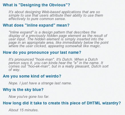
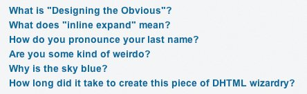
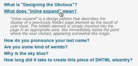
| Jillions of error messages on the Web are written in cryptic developer-speak. Jillions. If you're responsible for writing even one error message in an application, now's the time to pay close attention. Error messages need to be written by someone who knows how to write. If this is not you, step away from the keyboard and consider taking a writing class. If you do write well enough that other people can read your email messages to them without crossing their eyes, then stick around. You might be a good person to write error messages. It's not glamorous, but it's necessary. So what's so hard about writing an error message? Well, it's hard because it needs to be done in a way that avoids demeaning people. Developers tend to write error messages during the development phase of any application so it can be debugged more efficiently. But these types of error messages, unfortunately, often make their way into the released product where they confuse and alienate users on a daily basis. Instead of writing an error that says "[object] is null" (as though that means anything to a non-developer), for example, explain what's happened in plain English and how to deal with it. Say something that makes sense. Say, "Unfortunately, your request could not be handled. Please try again. If the problem persists, please log out and log back in." Yes, this message has a lot more words, but it also means a lot more to a user. It tells him something has gone wrong and explains what can be done to move forward. Error messages that do not provide useful information do not help users. They hurt users. A poorly written error message is one that explains what is wrong in terms not likely to be understood by the user. Here's an example from a fictitious calendar application, in which a user is trying to schedule an event: "Operation failed." Users cannot be expected to understand what this means. They will understand that something went wrong, but many users will not know from a message like this how to react, nor will they understand that they were performing an "operation." Some will try the "operation" again. Some will just give up. Improving the message is a simple matter of using language more likely to be understood. "We're sorry, but we could not schedule this event. Please try again." This version of the message tells the user what to do to get back on track, but still doesn't explain what went wrong in a way that prevents the user from repeating the same mistake. An effective error message might look like this: "We're sorry, but this event cannot be saved without a date. Please select a date and save it again." In this version, the error tells the user what went wrong in plain English and offers instructions about how to remedy the error. Simple changes like these convert error messages from rude bits of useless information into helpful, explanatory bits of useful information. Interface Surgery: Using the inline-expand design patternThis episode of Interface Surgery is a simple one, but it covers a little DHTML trick that can be used in any application in about a billion ways. I frequently use it to display error messages in Web applications. The inline-expand design pattern is made possible by a simple DIV in an HTML page that is displayed and/or hidden on demand, via JavaScript, based on user interaction. The first time I ever saw this in action was in Macromedia's Weblog aggregator, prior to Adobe Systems' acquisition of Macromedia. The FAQ (Frequently Asked Questions) section of the site contained the usual, long list of questions. But each one was a simple link; no answers appeared on the page. Wondering what would happen when I clicked, I was happy to see the answer presented inline, right where I needed it. No waiting for a page refresh. No pop-up windows. That's a lot of text. I don't really want to read all that. A typical FAQ page looks rather crowded. It contains a ton of questions, each separated by an answer. All the blocks of text for the answers make the questions harder to pick out. Sure, the questions are somehow visually distinct from the answers, with either a bold font or a different font color, but this isn't usually enough to make the page as clear as it needs to be. Users are forced to scan long pages full of text to find the particular question they need answered. To clean up this page, the answers must be stripped out of it. A short list of links. Much easier to read. A single JavaScript function (which toggles the answer between visible and hidden), the conversion of each question into a link, and the addition of an ID attribute to each link in the HTML are all it takes to turn the list of remaining questions into links that display answers "automagically." One chunk of information at a time, please. Thank you. The much shorter list of questions is significantly easier for users to scan. Spotting the right question is a simple matter of a quick glance down the page. Upon finding the question the user needs answered, he clicks the link and is shown the answer. I started using the inline-expand pattern to avoid the use of application-modal error messages and document-modal faux JavaScript alerts, like the one described earlier. Using inline expand, when something goes wrong that I can't otherwise prevent with a poka-yoke device, I show the error message like anyone else, but I do it nicely: I show it in a prominent location on the page, but in a modeless fashion so users can deal with it when they want, not when I want. There is usually no compelling reason to prevent a user from interacting with other parts of an interface while displaying an error message. That is, nothing about the error is so important that the application thinks, You absolutely must handle this right now or I'll just die! There's certainly no reason to stop a user from interacting with the browser until he's been notified of the error. That's just . . . crazy. Instead of relying on rude, implementation-model error notifications, we can be polite. We can go modeless and show users something that lets them continue working, and incidentally maintain their self-esteem. The inline-expand pattern lets us do just that. |

EAN: 2147483647
Pages: 81
- Chapter II Information Search on the Internet: A Causal Model
- Chapter XIII Shopping Agent Web Sites: A Comparative Shopping Environment
- Chapter XIV Product Catalog and Shopping Cart Effective Design
- Chapter XVI Turning Web Surfers into Loyal Customers: Cognitive Lock-In Through Interface Design and Web Site Usability
- Chapter XVII Internet Markets and E-Loyalty