Use Up-to-Speed Aids
| Getting users up to speed in Web applications is something that needs to be handled on a case-by-case basis. There isn't one best way to do it. But there are plenty of ways we can get it done via the use of "up-to-speed" aids. For example, we can provide a Getting Started guide to new users and display a link to it when a user logs in for the first time. We can offer a video tour that shows new users a quick overview of the product's main feature set. In an application where users collectively contribute to a large base of information, like a wiki, we can point users to examples of content created by other users so they can see the end result of the work they're being asked to perform. Getting Started guides and video tours, however, are used out of context. Users can't read information about how an application works at the same time they're using the application because the two usually appear in different windows. In an application where examples of content can be shown to new users, the examples generally don't offer insight into how the content was created, so users still need information about how to get going and how to complete basic tasks. And this is a prime moment for us as application developers, because if a user is looking around for a way to get started, it means we've already convinced her that our application is worth trying out. Now is the time to pounce and show the user what we've got. Many applications resort to walking new users through wizards, which are step-by-step sequences of screens designed to get a user to configure the initial settings for an application. The least objectionable of these offer insight into how to use the application along the way. The most objectionable have a few common bad habits. First, wizards tend to ask questions about how a user wishes to use the application right off the bat. The problem is that the user has never previously used the application, so answering such questions, while not impossible, is purely speculative on the user's part. The next problem is that wizards rarely assure users that they can change their decisions later on. But worse than this is that the presence of a wizard is a clear sign the application designers haven't made good decisions for users in the first place. Users may not catch on to this, but they will catch on to the fact that the wizard is keeping them from playing around with the application. If we manage to convince a user to check out an application, the next logical step is to get them moving forward. Quickly. Marketing master Seth Godin recognized this challenge when approaching the design of Squidoo (www.squidoo.com). He recently told me:
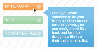
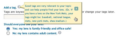
Squidoo is an information-sharing application with which users tie together disparate bits of information to create a lens (a Squidoo content page) to make it findable via Squidoo's LensRank search engine. Someone interested in insects, for example, who has a blog about bugs and has spent some time collecting links to various resources on the topic, could create a lens that links to each resource and displays the page creator's most recent blog posts. Anyone interested in insects could do a search on the subject in Squidoo, find the insect lens, and learn a bunch of information in one place. Great idea, Seth. Squidoo does an excellent job of getting users up to speed, constantly providing helpful hints about how to do things, and it even branches off to a second Web site that offers tips and tricks for improving lenses and marketing them. There's also a simple FAQ section that explains most of what you need to know to get going in Squidoo, complete with suggestions about how it can help promote your new book, nonprofit organization, or weekly podcast. (If this isn't enough to convince you to start using Squidoo, by the way, the FAQ section also explains how to get paid for building lenses.) Squidoo provides a page to title and tag your lens. 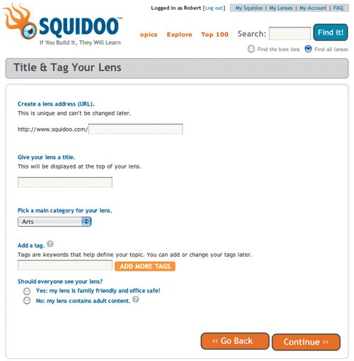 When adding modules to a new lens (RSS and Links List sections, for example), you see a screen listing loads of module types organized by what's new, what's most popular, and which ones help you make money. There is also an index of all module types so you can find what you need even if it's not in the main categories. There's also a Search box so you can find a module type without hunting through the index. Choosing module types to add to your new lens builds a list farther down on the page so you can keep track of what you've added. Clicking the Save button creates your new lens and presents all the modules you added so you can begin editing them. Squidoo's Module Picker is chock full of "up-to-speed" goodness. 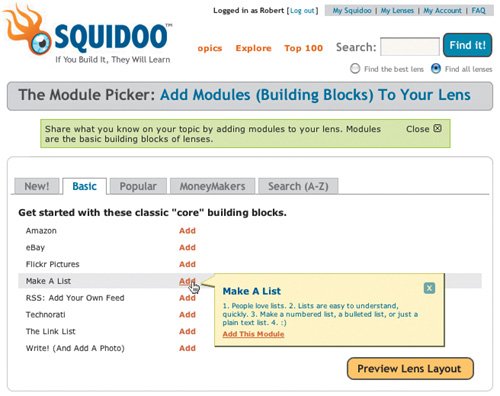 Each module features a large Edit button, prompting you to start filling the modules with content. When you click Edit, the form used to edit the module magically appears just below the Edit button via the use of Dynamic HTML. Everything in the Create Custom Lens page guides the user toward the successful creation of a new lens, and everything in the lens-editing screen guides the user toward filling it up with content. There are large, easy-to-spot buttons, on-demand editing features that can be accessed without leaving the page, and bits of instructive text throughout the page to alleviate confusion about anything not completely clear. Large, clearly labeled buttons tell users exactly what to do and how. 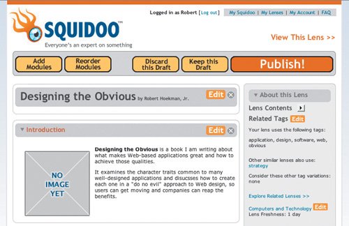 These and other elements like them help users get up to speed quickly and start building Squidoo lenses. Provide a Welcome ScreenMany desktop-installed applicationsAdobe Dreamweaver and Flash, for exampleprovide welcome screens to new users. These screens often offer links to a quick tour of a tool's feature set and tutorials to get started. That's awfully nice of them, but again, these types of aids are used out of context from the application and end up not being as helpful as they could be. Yes, people can learn in one window and apply new knowledge in other windows, but users can only focus on one window at a time. And a window containing a tutorial is not an application window, so users are focusing in the wrong place. It's better to train users by having them actually use the application. To build a better welcome screen, we need to Know The Best Ways To Implement It. Instead of offering tours and tutorials out of context, a welcome screen should be integrated into the application screens themselves and remain contextual. For example, we can designate an area at the top of an application screen to display information about what to do on that page and perhaps what to do next. We can also reveal new information whenever a user switches screens. Keeping it contextual like this means each and every screen in the application can teach users how to perform tasks without preventing them from using it at the same time. An integrated welcome screen informs users of what they can do on the My Account page. 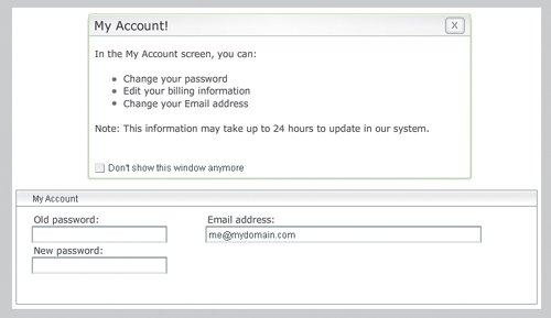 Welcome screens implemented like this should, of course, offer an obvious way for users to disable the screen so it doesn't appear on repeat visits. A simple check box lets users close the welcome screen easily and be on their way. Offer TipsWe can also offer a method to display tips. These can appear whenever users come across a new feature, just in case other instructive design elements (covered later in this chapter) aren't enough for the user to start being productive. Users who feel more comfortable with Web applications, of course, can choose to turn the tips off and proceed at their own risk, but new users who might benefit from the tips have a simple way to get help whenever they need it the first few times they use the application. Fly-out tip balloons like this one from Box.net offer users assistance right when they need it. Box (www.box.net), an online file-storage application, offers both a welcome screen and an inline tips feature. With tips enabled, rolling over particular areas of the application screen displays callouts containing explanations of what feature is offered in that area and how to use it. Tips should be kept short and to the point. The object is to help users, not interfere with their workflow by asking them to read long blocks of text that keep them from moving forward. Concise and vigorous writing is definitely the way to go. Users gain access to Squidoo's inline help via question mark icons. Squidoo is also quite good at providing inline help. Question mark icons appear next to each element on the Create Lens screen that requires further explanation. For example, an inline tip is offered to help new users understand the purpose of tags in Squidoo and how to leverage them. Tips presented like this stay out of everyone's way while still providing quick access to useful information for users who want to learn to improve their pages. Fill the Blank Slate with Something UsefulA blank slate can be a scary thing. It's a big empty space where there will eventually be content you create yourself. It's a blank sheet of sketch paper. In a Web application, it's often a page with no content that the user is supposed to fill. Some people are inspired by spaces like these. I'm one of them. When I look at a blank slate, I "see" all the things I want to put in it. Many designers can do this. But for users just getting to know a Web application, a blank slate can be a barrier in the learning process. Instead of knowing exactly what to do first, users can become stalled when faced with the empty canvas. To eliminate these moments of "stuckness," it's good to fill the blank slate with something useful. In addition to helping users get up to speed, it can be a great way to compel users to jump in and start using the application, which can be the hardest thing to do. The first few moments users spend with a new application can be intimidating. Again, the goal is to get them moving forward quickly. When asked how 37signals gets users going in new applications, Jason Fried told me:
37signals makes the act of jumping in very simple. In applications like Basecamp and Backpack, it's easy to know exactly what to do as soon as you log in for the first time, because there is no blank slate. Instead, there is a very noticeable block of text or an image that explains what to do, like a help document that appears exactly when and where you need it. Basecamp's blank slate features a giant red text link that guides users toward adding content. 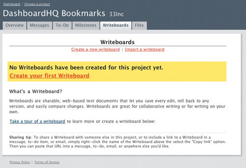 Yahoo! offers something similar the first time a user visits My Yahoo (my.yahoo.com), one of the many start-page applications on the Web designed to give users an at-a-glance view of news, weather, RSS feeds, and other things. Some default content has been added to the page, but since the new My Yahoo user hasn't yet selected the content he wants to see, the sample page is disabled and a large preview graphic is positioned in the upper-left corner of the washed-out sample content so he knows exactly what his page will eventually contain. My Yahoo shows users what their page could look like after just a few minutes of playing around with the application. 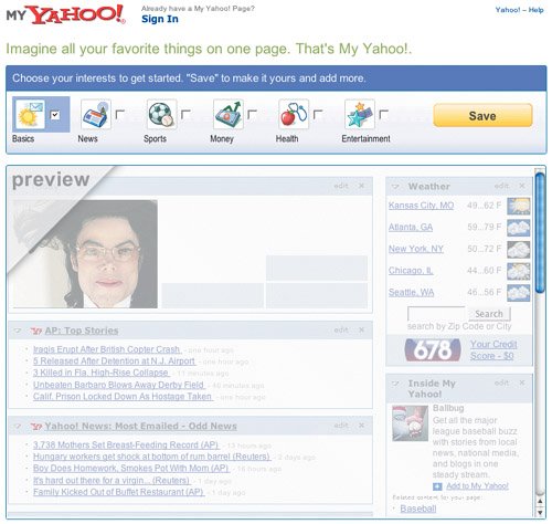 First impressions are vital, especially on the Web, where the competition is just a click away and we have only a few seconds to convince users that our applications are worth using. Showing users ahead of time exactly what they get when they invest a few minutes in our applications can make them comfortable, eager to dive in, and immediately knowledgeable. These are all good things. Not only do users get to feel productive and smart, we get to keep another customer. Give Instructive HintsAnother effective way to help users get moving, now and later, is to apply a little instructive design. Instructive text, for example, can be used in form elements and interfaces in general to guide the user within the context of her current task without being intrusive. A text field that accepts only a numerical value can display a sample value of 0. The sample value is displayed so users can clearly see what type of information is required and enter the right type of data without having to think about it or guess. This small bit of instructive design helps guide users toward completing a task or through the use of an interaction without interfering with workflow. It simply eliminates questions in the user's mind before they come up. Instructive text can also be used as an inline tip about how to perform a certain action or what happens as a result of performing an action. When providing tips in an interface (for example, a line of instruction about what will happen when the user interacts with the page element), instructive text should be set to a small font sizesmaller than the default font size for the text in the rest of the pageand simply positioned near enough to the interaction to which it applies that the connection is obvious. The goal, ultimately, is to get rid of the little thought bubbles that appear over users' heads that say things like, "Um, what's this button do?" Instructive text can be used in these cases:
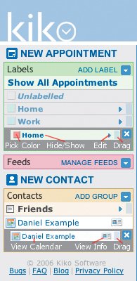
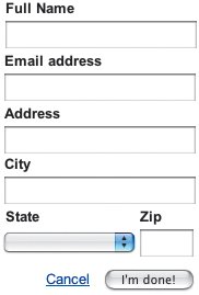
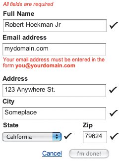
When a default value is offered within a form field, the dummy text should be shown in a midtone gray font instead of the default black so the user knows the text is only there as a guide. But when this text is instructive (that is, it tells the user what to do instead of showing a default value), it's not usually necessary to change the font color. And when the field gains focuswhen a user clicks or tabs into the fieldthe instructive text should disappear immediately so the user can begin typing. 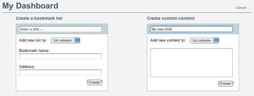 Dashboard HQ, a simple bookmark manager (produced by my partnership, 33Inc), uses instructional text inside form elements to let users know what new content needs to be entered. Kiko, an application for managing a personal calendar, does a good job of using instructive text to help users understand some of the less obvious components in the tool. Kiko includes a legend in its sidebar that explains exactly what each element means. To explain what clicking on various appointment labels does, for example, Kiko uses inline tips. Ironically, these tips appear as thought bubbles. In this case, however, the thought bubbles are on the page instead of in the user's head. JotSpot Live does a good job here as well. JotSpot Live is a collaborative note-taking tool designed to allow groups of users to contribute notes from meetings and such to one common Web page that can be accessed later on and used to maintain an archive of the notes. 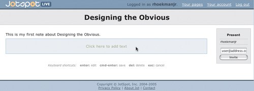 The "Click here to add text" statement positioned in the center of new text blocks on a JotSpot Live page serves to tell new users exactly what needs to be done to add a new note, and gives experienced users a visual clue to where the next text block begins. This text block also uses a different background color than others in the page to make it stand out even more. A quick glance at the page reveals exactly where to add the next note. JotSpot Live also offers icons that are quite helpful on their own, and these are another good example of instructive design elements. Clicking into a text block to create a new note presents several text-formatting options, each of which is represented by an icon that explains what it does. Leveraging a user's experience with text-editing tools like Microsoft Word, the application offers icon-style buttons to apply various styles to the text, such as bold, italic, underline, and strikethrough, as well as hyperlinks. 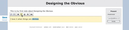 A quick click of the Save link saves the new note, restores the page to its original state, and produces a new editable text block. Instructive hints come in many forms, but all of them show up just in time and keep users on track, alleviating confusion and frustration. Interface Surgery: Applying Instructive DesignUsers expect feedback when they interact with computers. In fact, they gener-ally expect the same level of feedback from computers as they would get from real people in real situations. If a user is supposed to answer a set of questions, for example, she'll expect some feedback that the system can use the answers as she provided them and that she's moving forward in the process. Forms don't usually supply this feedback. Instead, users often complete a form in its entirety without getting any feedback at all until the end, when users are told they've entered data in a way the system can't handle. When it comes to forms, typically users only get feedback if they mess something up. This happens often when users enter email addresses and phone numbers, among other things. A user can get all the way through a page-long form and click the Submit button feeling pretty confident she's going to see a positive result. Instead, she sees a JavaScript alert message telling her the phone number she entered is in an incorrect format, or the page refreshes and displays a list of the errors that must be addressed before she can move on. This is not a good way to reinforce positive behavior on the user's part. And it can be rather insulting to have a computer tell you that you're not conforming to its rules. Isn't the computer a tool that helps you instead of the other way around? Lots of companies have heeded the call to make their applications more usable and have leapt into action, but sadly, many of them are just redesigning bad behavior. One of my favorite examples is the registration form on Odeo.com, a podcast aggregation and creation service. Odeo's registration form is definitely simple. It doesn't ask for any information it doesn't actually need. It asks for only three pieces of information: name, email address, and password (though they ask you to confirm the password you're setting, so you have to enter it twice). But the problem isn't with the simplicity, it's with the size. 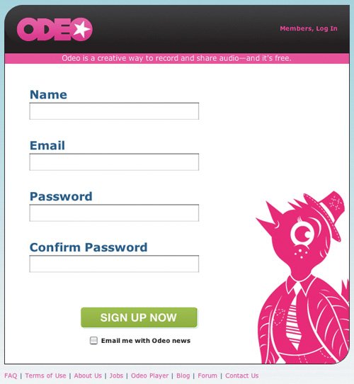 The image shown here may not do it justice. The important thing to notice is that the four form fields are huge. Maybe Odeo's designers thought they were improving the usability of the form by making it readable from across the room. Maybe they just wanted to fill up the space. Who knows. Whatever the case, they didn't do any of the things we can do as application designers and developers to make the form truly more effective, so their apparent intention to improve usability ends up looking like an insult. It's as though they're saying to all the less computer-savvy users out there, which they appear to be rather tired of, "Go ahead. Just try to screw this up!" Most users won't have problems seeing the form. Making it big won't help. Let's take a look at what will help. First take a look at this rather typical form used to store contact information. One generic form, served up fresh. Nothing special here. Looks like 1,000 other forms we've all seen (and probably created). The form is one of the most common interactions on the Web, used for everything from purchasing airlines tickets to signing up for an Amazon account. And while they're usually simple enough to get through, they tend to exhibit some weaknesses. The problems with the form above are as follows:
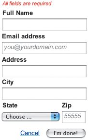
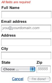
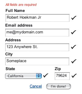
Time to apply some instructive design. To fix the first issuethat many users are likely to enter something other than a valid email addresswe can provide a default value in the text field. The most useful instructive text in this case is a fake email address because it shows users all the elements of an email address that must be entered. Again, the font color should be a midtone gray instead of the default black. Another way to hint that the displayed data is instructive rather than already completed is to italicize it. We can do this in the Zip field as well, so users know exactly what version of a zip code can or should be entered. We can also add a simple disclaimer to the form to indicate that all fields are required. And just for good measure, we can add a default value to the State menu to prompt users to choose an item. Applying instructive text to the form clears up a few questions. Finally, to prevent users from attempting to submit an incomplete form, we can disable the I'm Done button until all required fields are complete. A disabled button means users can't even attempt to submit form data until everything is just right. Believe it or not, this is a good thing. This is a vast improvement to the original form, but we can take it much further. To provide real-time feedback to the user that the form is being completed correctly or incorrectly, we can add visual cues to let him know what's going on by performing inline validation on each form element. To do this, we can display icons when the user clicks or tabs to a new field to let him know the previous field has been correctly completed, and inline error messages to indicate when the field contains data the system can't use. Inline validation and well-written error messages tell me I've messed up my email address. It also tells me how to enter it correctly. Here, check-mark icons are shown to let the user know a field has been completed in a way that agrees with the system. As soon as the user leaves a field that is correctly completed, the check-mark icon appears. In the code for the page, JavaScript is used to verify that the Full Name field, for example, has had a string of characters entered into it. If not, an error message is displayed immediately. Errors are shown in the right place and at the right time: the very second the user makes the mistake and tries to move on. When the user tabs away from the Email address field having entered an invalid email address, a red text message appears directly beneath the form field, so he knows not only that there has been an error, but also which field contains the error. The key to an effective error message in a form like this is to avoid leaving the user wondering how to fix the problem. Many error messages simply inform the user an error exists. In the image above, however, the error message tells the user what needs to be entered in the field. This prompts him to fix the entry and tells him how to fix it. Finally, once all required fields in the form have been completed correctly, the I'm Done button is enabled, letting the user know he has done all he needs to do and can move forward. Check marks offer immediate feedback every time I complete a field correctly, motivating me to continue. When all is well, the I'm Done button lights up and I'm on my way. No mistakes. No mess. No questions. Yes, this version of the form is more visually complex than before, and yes, the form is more difficult to build than the original (building a form this way requires DHTML), but inline validation and instructive text help keep the user confident that he will complete the interaction correctly and continue being productive. Incidentally, since the I'm Done button is disabled until the required fields are completed, it's actually now impossible to submit the form data until it's correct, so the user will never find himself in a situation where he feels false hope that the form is complete, and he will not see a refreshed page with error messages displayed. (We'll talk at length about handling errors in Chapter 6.) Instructive design, applied in forms or otherwise, helps beginners learn how to complete an interaction and simply serves as a reminder to intermediate and expert users without getting in their way. |
EAN: 2147483647
Pages: 81
- Assessing Business-IT Alignment Maturity
- Linking the IT Balanced Scorecard to the Business Objectives at a Major Canadian Financial Group
- Measuring and Managing E-Business Initiatives Through the Balanced Scorecard
- The Evolution of IT Governance at NB Power
- Governance Structures for IT in the Health Care Industry