Formatting a Chart
If you're content to use Excel's default formatting for your chart, you're all finished— just tidy up your chart and print it. If you're like most people, however, you probably can't resist adding a label here or changing the point size there. In this section, you'll learn how to format charts by changing the chart type, editing titles and gridlines, adjusting the legend, adding text, and controlling character formatting. What you learn will apply both to embedded charts and to stand-alone chart sheets in the workbook.
Exploring the Chart Menu
When you created the pie chart in the first example in this chapter, you might not have noticed that the Data menu was replaced by a Chart menu on the menu bar, and that several commands on the remaining menus changed. Excel's Chart menu includes commands that are specifically designed for charting, as shown in Figure 21-3. (Note that your Chart menu might be customized differently.)
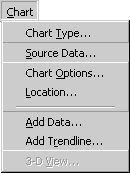
Figure 21-3. Excel's Chart menu contains commands specifically designed for charting
Using the Charting Toolbar
The Chart toolbar shown in Figure 21-4 contains several buttons designed to help you format your chart. This toolbar also contains the Chart Objects list box, which you can use to select different components of your chart for editing (such as the chart title, legend, and plot areas). Many of the buttons on the Chart toolbar correspond to commands on the Chart menu, as you'll see in the following sections. Display the Chart toolbar by choosing it from the Toolbars submenu of the View menu.
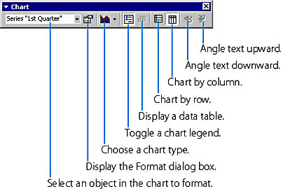
Figure 21-4. The Chart toolbar appears when a chart is active in the workbook. To remove it, click the Close button.
Changing the Chart Type
Even after you create a chart, you're not locked in to one particular chart type. If your data supports it, you can reformat your chart to use any of Excel's 14 chart types. (For example, you can change your pie chart into a column chart.) To switch between chart types, click the Chart Type button on the Chart toolbar or choose Chart Type from the Chart menu.
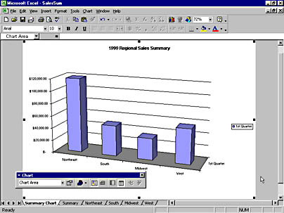
To change the pie chart you created earlier into a column chart by using the Chart toolbar, follow these steps:
- If the chart is embedded, click it to select it, and click the Chart toolbar. If the chart appears in its own worksheet, simply display the worksheet.
- Click the arrow on the Chart Type button on the Chart toolbar to display pictures of the various chart types.
- Click the 3-D Column Chart button. (When you move the pointer over each chart type, its name will appear.)
Your chart will change shape to match the selected chart type. The following screen shows how your pie chart will look when it's changed into a 3-D column chart.
TIP
Choose Additional Chart Sub-TypesFor a wider selection of chart types (for example, to change from 3-D view to 2-D view), select the chart, and choose Chart Type from the Chart menu. Here you can pick from over 70 choices in the Chart Sub-Type list boxes for each chart type.
Changing Titles and Labels
You can edit the text in your chart's titles and labels as well as modify the font, alignment, and background pattern. If you select a data label, you can change its numeric formatting.
To edit title or label text, follow these steps:
- Display the chart that you want to modify. If the chart is embedded in a worksheet, click the chart to activate it and to display Excel's charting commands and tools.
CAUTION
Check that you have selected the part of the chart you want to edit by making sure the selection handles indicate the specific object and not the entire chart.
TIP
You can check the spelling of the text in a chart by selecting the text object and choosing Spelling from the Tools menu.
Changing Character Formatting
SEE ALSO
To learn more about formatting text, see Chapter 17, "Formatting a Worksheet"
To change a title or label's font, alignment, or pattern, follow these steps:
- Click the chart title or a label. Selection handles will appear around the text.
- From the Format menu, choose Selected Chart Title (for a title) or Selected Data Labels (for a label). Only one of the commands will be available. You'll see a dialog box similar to the one shown in Figure 21-5.
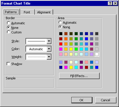
Figure 21-5. You can format chart titles and labels in the same way as regular worksheet text.
NOTE
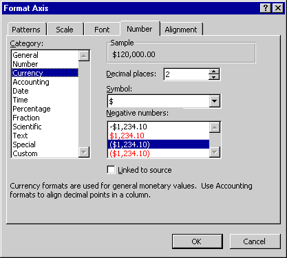
If you're formatting a label, the dialog box will also have a Number tab. We'll discuss this tab in the next example.