How to Use Borders
| < Day Day Up > |
| Every JComponent can have one or more borders. Borders are incredibly useful objects. While not themselves components, they know how to paint the edges of Swing components. They are useful not only for painting lines and fancy edges but also for providing titles and empty space around components . Note: Our examples set borders on JPanels , JLabels , and custom subclasses of JComponent . Although technically you can set the border on any object that inherits from JComponent , the look-and-feel implementation of many standard Swing components doesn't work well with user -set borders. In general, when you want to set a border on a standard Swing component other than JPanel or JLabel , put the component in a JPanel and set the border on the JPanel . The GTK+ look and feel handles borders differently than do other look and feels. Please refer to the v1.4.2 release notes for details: http://java.sun.com/j2se/1.4.2/relnotes.html. To put a border around a JComponent , use its setBorder method. You can use the BorderFactory [15] class to create most of the borders that Swing provides. If you need a reference to a border ”say because you want to use it in multiple components ”save it in a variable of type Border . [16] Here's an example of code that creates a bordered container:
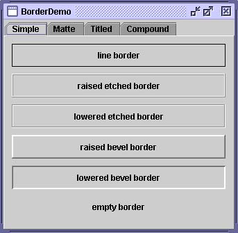
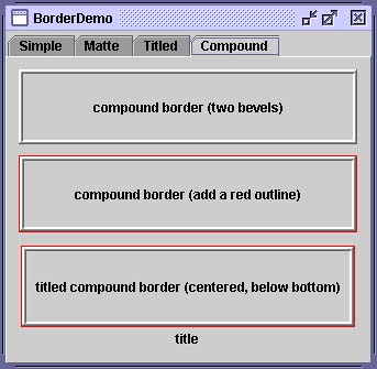
JPanel pane = new JPanel(); pane.setBorder(BorderFactory.createLineBorder(Color.black)); Figure 8 is a picture of the container that contains a label component. The black line drawn by the border marks the edge of the container. Figure 8. A simple line border on a label. The BorderDemo ExampleFigures 9 through 12 show an application called BorderDemo that displays the borders Swing provides. Figure 9 illustrates the simple border types. The code for creating these borders is provided in Using the Borders Provided by Swing (page 539). Figure 9. A screenshot of several simple borders shown on the Simple tab of BorderDemo . Figure 12. A screenshot of several compound borders shown on the Compound tab of BorderDemo .
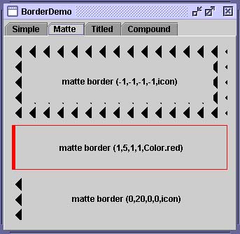
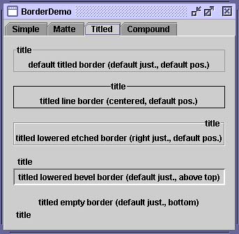
Figure 10 shows some matte borders. When creating a matte border, you specify how many pixels it occupies at the top, left, bottom, and right of a component. You then specify either a color or an icon for the border to paint. Be careful when choosing the icon and determining your component's size ; otherwise , the icon might get chopped off or be mismatched at the component's corners. Figure 10. A screenshot of several matte borders shown on the Matte tab of BorderDemo . Figure 11 shows titled borders.A titled border displays a text description. If you don't specify a border, a look-and-feel-specific border is used. For example, the default titled border in the Java look and feel is a gray line whereas the default titled border in the Windows look and feel is etched. By default, the title straddles the upper left of the border, as shown at the top of Figure 11. Figure 11. A screenshot of several titled borders shown on the Titled tab of BorderDemo . Figure 12 shows compound borders. With these, you can combine any two borders, which can themselves be compound borders. Using the Borders Provided by SwingThe code that follows shows how to create and set the borders that you saw in the preceding figures. //Keep references to the next few borders, //for use in titles and compound borders. Border blackline, raisedetched, loweredetched, raisedbevel, loweredbevel, empty; blackline = BorderFactory.createLineBorder(Color.black); raisedetched = BorderFactory.createEtchedBorder(EtchedBorder.RAISED); loweredetched = BorderFactory.createEtchedBorder(EtchedBorder.LOWERED); raisedbevel = BorderFactory.createRaisedBevelBorder(); loweredbevel = BorderFactory.createLoweredBevelBorder(); empty = BorderFactory.createEmptyBorder(); //Simple borders jComp1.setBorder(blackline); jComp2.setBorder(raisedbevel); jComp3.setBorder(loweredbevel); jComp4.setBorder(empty); //Matte borders ImageIcon icon = createImageIcon("images/wavy.gif", "wavy-line border icon"); //20x22 jComp5.setBorder(BorderFactory.createMatteBorder( -1, -1, -1, -1, icon)); jComp6.setBorder(BorderFactory.createMatteBorder( 1, 5, 1, 1, Color.red)); jComp7.setBorder(BorderFactory.createMatteBorder( 0, 20, 0, 0, icon)); //Titled borders TitledBorder title; title = BorderFactory.createTitledBorder("title"); jComp8.setBorder(title); title = BorderFactory.createTitledBorder(blackline, "title"); title.setTitleJustification(TitledBorder.CENTER); jComp9.setBorder(title); title = BorderFactory.createTitledBorder(loweredetched, "title"); title.setTitleJustification(TitledBorder.RIGHT); jComp10.setBorder(title); title = BorderFactory.createTitledBorder(loweredbevel, "title"); title.setTitlePosition(TitledBorder.ABOVE_TOP); jComp11.setBorder(title); title = BorderFactory.createTitledBorder(empty, "title"); title.setTitlePosition(TitledBorder.BOTTOM); jComp12.setBorder(title); //Compound borders Border compound; Border redline = BorderFactory.createLineBorder(Color.red); //This creates a nice frame. compound = BorderFactory.createCompoundBorder(raisedbevel, loweredbevel); jComp13.setBorder(compound); //Add a red outline to the frame. compound = BorderFactory.createCompoundBorder( redline, compound); jComp14.setBorder(compound); //Add a title to the red-outlined frame. compound = BorderFactory.createTitledBorder( compound, "title", TitledBorder.CENTER, TitledBorder.BELOW_BOTTOM); jComp15.setBorder(compound); As you probably noticed, the code uses the BorderFactory class to create each border. BorderFactory , which is in the javax.swing package, returns objects that implement the Border interface. The Border interface, as well as its Swing-provided implementations , is in the package javax.swing.border . [18] You often don't need to directly use anything in the border package, except when specifying constants specific to a particular border class or when referring to the Border type.
Creating Custom BordersIf BorderFactory doesn't offer you enough control over a border's form, you might need to use the API in the border package ”or even define your own border. In addition to containing the Border interface, the border package contains the classes that implement the borders in Figures 9 through 12: LineBorder , EtchedBorder , BevelBorder , EmptyBorder , MatteBorder , TitledBorder , and CompoundBorder . It also contains a class named SoftBevelBorder , which produces a result similar to BevelBorder , but with softer edges. If none of the Swing borders is suitable, you can implement your own, generally by creating a subclass of the AbstractBorder [19] class. In your subclass, you must implement at least one constructor and the following two methods :
For examples of implementing borders, see the source code for the classes in the javax.swing.border package. The Border APITables 7 and 8 list the commonly used border methods. BorderFactory API documentation is at: http://java.sun.com/j2se/1.4.2/docs/api/javax/swing/BorderFactory.html. The rest of the border- related classes and interfaces are in the border package, which is documented at: http://java.sun.com/j2se/1.4.2/docs/api/javax/swing/border/package-summary.html. Table 7. Creating a Border with BorderFactory
Examples That Use BordersMany examples in this book use borders. The following table lists a few interesting cases.
|
| < Day Day Up > |
EAN: 2147483647
Pages: 171


