Appropriate Image Formats for Print
| How you should save your raster images is governed largely by how you intend to use them. Often, you will be placing images in a page-layout or illustration program, so you're limited to the formats supported by those applications. The application may be willing to let you place a wide variety of file formats, but the most commonly used image formats have traditionally been TIFF and EPS. However, native Photoshop files (PSD) and Photoshop PDF files are also frequently used. (We'll discuss vector artwork formats in the next Chapter.) TIFFTIFF (tagged image file format) is perhaps the most widely supported image file format. It's happy being imported into QuarkXPress, InDesign, Adobe PageMaker, Microsoft Word, some text editorsalmost any application that accepts images. The TIFF image format supports multiple layers as well as RGB and CMYK color spaces, and even allows an image to contain spot-color channels. Photoshop EPSWhile many people equate EPS with vector artwork, the encapsulated part of the format's name gives a hint about the flexibility of the format. It's a container for artwork. An EPS can contain vectors, rasters, or a combination of raster and vector content. EPS (encapsulated PostScript) is, as the name implies, PostScript in a bag (see sidebar, "EPS: Raster or Vector?"). The historic reason for saving an image as a Photoshop EPS was to preserve the special function of a PostScript-based vector clipping path used to silhouette an image. As applications and RIPs have progressed, it's no longer strictly required to save such images as Photoshop EPS. Pixel for pixel, a TIFF is a smaller file than an equivalent EPS, so if disk size is important, stick with TIFF, with one exception. If you are creating a duotone imageusually an image consisting of black and a spot colorit should be saved as a Photoshop EPS. The TIFF format does not support duotone images, even though it allows spot-color channels. This may seem contradictory, but duotones (and tritones, quadtones, and so on) are special creatures. Under the hood, they are still grayscale images, but they contain special information saying, in effect, "When you output me, use my special recipe for generating spot plates." The TIFF file format doesn't know how to contain that special recipe, but the EPS format does.
Photoshop Native (PSD)Historically, the native PSD (Photoshop document) format has been used solely for working files in Photoshop. Copies of those working files were flattened and saved in TIFF or EPS formats for placement in a page-layout program. While PageMaker allowed placement of native Photoshop files (although it did not honor transparency), QuarkXPress required TIFF or EPS instead. And since QuarkXPress has been a prominent page-layout application for nearly 15 years, TIFF and EPS have been the standard of the industry. However, InDesign can take advantage of the layers and transparency in Photoshop native files, eliminating the need to go back through two generations of an image to make corrections to an original file. The working image and the finished file are the same file. QuarkXPress 6.5 allows the placement of native PSDs but does not recognize transparency. QuarkXPress 7.0, however, honors transparency in layered, native Photoshop files. Transparency Tip Although InDesign accepts and correctly handles opacity settings in a placed Photoshop native file, it does not correctly handle blending modes in a Photoshop file. The most common example is a drop shadow created in Photoshop. While the shadow will correctly darken image content beneath it in Photoshop, it will knock out of content beneath it in InDesign. The result is an anemic and unrealistic gray shadownot what you want. There are some workarounds detailed in Chapter 12, "InDesign Production Tips," but a simple solution is to omit the shadow in Photoshop, and generate it instead in InDesign. InDesign's own shadows behave correctly, darkening content beneath the shadow as you intended. Photoshop PDFA Photoshop PDF (Portable Document Format) contains the same pixels as a garden-variety PSD, but those pixels are encased in a PDF wrapper. There's usually no reason to use a Photoshop PDF when a TIFF, EPS, or PSD will suffice, but a Photoshop PDF has special features. It can contain vector and type elements without converting the vector content to pixels, a process called rasterizing. And a Photoshop PDF allows round-trip editing in Photoshop. While a Photoshop EPS can contain vectors and text, the vector content will be converted to pixels if the file is reopened in Photoshop, thus losing the crisp vector edge. As a result, you lose the ability to edit text or vector content, since it's been converted to pixels. A native Photoshop PSD can contain vector components, but page-layout programs rasterize the content. However, Photoshop PDFs maintain vector content when placed in other applications. For vector content, Photoshop PDF is the solution, because it is able to hold both transparency and vector components (see Table 4.1 for a feature comparison of common image formats).
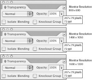
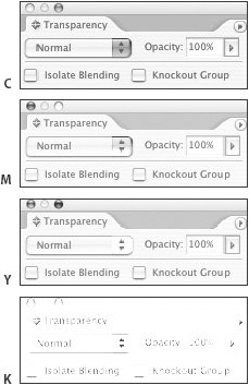
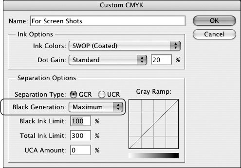
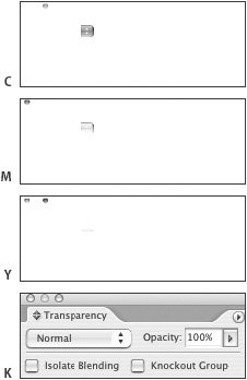
Moving to Native PSD and PDFAs the major page-layout applications increasingly support native PSDs and PDFs, is there any compelling reason to continue using old-fashioned TIFFs and EPSs? It may seem adventurous to use such new-fangled files, but workflow is changing. The demarcation between photo-compositing and page layout is blurring, and designers demand more power and flexibility from software. RIPs are more robust than ever, networks are faster, and hard drives are huge. It's still important to know the imaging challenges posed by using native files (such as transparency), and wise to communicate with your print service provider before you embark on the all-native path. You're still at the mercy of their equipment and processes, and if they're lagging a bit behind the latest software developments, you'll have to be governed by their capabilities. Special Case: Screen CapturesIf you're creating software documentation for print, or you want to show an image of a Web page in your project, you may need to include screen captures in your page layouts. Screen captures are easy to make using a system utility or special screen-capture software, but they require some special handling to print clearly. Especially when they're part of software documentation or instructional materials, it's important that the details are as sharply rendered as possible. Funny thing about screen captures: Whether you take them by using your system's built-in screen-capture functionality or a third-party screen-capture application, you are merely intercepting information that eventually becomes pixels on your monitor. Whatever your current monitor resolution, there is a one-to-one relationship between the fixed number of pixels that the system generates and the number of pixels you see on your screen. The size of the image you see is just a function of your current monitor resolution (Figure 4.5). Figure 4.5. The resolution setting of your monitor has no effect on the number of pixels captured in a screen capture. Although this palette was captured at three different monitor resolutions, the three captures are identical, each consisting of exactly the same number of pixels. An application palette that measures 208 pixels by 80 pixels may appear larger when your screen resolution is set to 800 by 600, and it appears almost unreadably small when your monitor is set to 1600 by 1200. However, the palette itself is made of exactly the same number of pixels in both instances. So it doesn't matter at what resolution your monitor is set, or how large the palettes may appear on screen. You'll capture the same image regardless of monitor setting, and the resulting image will be 72 ppi. Since it's been drilled into you that 300 ppi is the Holy Grail of image resolution, it's tempting to try to improve screen captures by increasing the resolution. Unfortunately, this usually makes them look worse by softening small details during interpolation. If you plan to use a screen capture at 100-percent enlargement, just leave it at 72 ppi. Yes, the print service provider's prepress department will raise a flag, but the examples below show why screen captures are not improved by increasing their resolution. As you can see in Figure 4.6A, the original 72-ppi screen capture seems a bit coarse, but it's readable. Increasing the resolution to 300 ppi in Photoshop may sound like a good idea, but as shown in Figure 4.6B, the interpolation will soften detail in the image. Figure 4.6. Increasing the resolution of a 72-ppi screen shot (A) to 300 ppi in the traditional way does not improve its appearance (B). However, using 288 ppi (72 ppi multiplied by 4) and the Nearest Neighbor resampling method increases resolution while avoiding the softening effects of interpolation (C). The resampling controls are in the Photoshop image resizing dialog box (Image > Image Size). If you do feel compelled to increase the resolution of a screen capture, there is an approach that may yield better results than resampling up to 300 ppi. In Photoshop, choose Image > Image Size, and then set the resolution to an even multiple of 72, such as 288 ppi. In that same dialog, set the Resample Image option to Nearest Neighbor (Figure 4.6C). This avoids interpolation by simply repeating pixels rather than attempting to create pixels. It's not an appropriate approach when scaling images of a photographic nature, but it's a helpful solution for screen captures, because of their special nature. Converting Screen Captures to CMYKSince screen captures are generated as RGB images, they must be converted to CMYK for print. When performing that conversion, a special approach is recommended to maintain the best rendering of black type. The default conversion of RGB to CMYK in Photoshop will render black as a four-color mix (Figure 4.7), with the possibility that slight misregistration on press will turn tiny details to mush. Figure 4.7. A conventional conversion from RGB to CMYK produces four-color equivalents of the gray and black parts of a screen capture. Press misregistration will turn text and other black or gray elements to an out-of-focus rainbow. Festive, but hard to read. To simplify printing of screen captures, use a color-separation recipe that ensures that all neutral black or gray areas of the image will print only in black ink during the RGB-to-CMYK conversion. Neutral areas in an RGB image are those areas in which the RGB values are equal; for example, R128G128B128 would constitute a midtone gray. To create this custom, screen-capture conversion recipe in Photoshop, choose Edit > Color Settings to access the color-separation controls. Under Working Spaces, choose Custom for the CMYK setting. In the Custom CMYK dialog box, select Maximum Black Generation (Figure 4.8). The curve you see may seem odd, but it merely indicates that all equivalent RGB values are being replaced with black. The appearance of color elements won't be compromised. Figure 4.8. Use the Custom CMYK option in Photoshop to access the Maximum Black Generation option. Color elements will be composed of four colors in the final CMYK image. But black and gray elements will be rendered only in black (Figure 4.9). While this may look odd, it results in cleaner printing of the screen capture, since there aren't four colors gumming up the works in most of the image. Figure 4.9. By setting the Black Generation option (on the Custom CMYK dialog) to Maximum, all gray and black content images only on the black plate. RGB versus CMYKSince the dawn of desktop scanning, it's been unquestioned that Thou Shalt Convert to CMYK. Those who submitted RGB files were considered uninformed, even uncivilized. But here's a secret: Scanners and digital cameras see in RGB. High-end production scanners such as those from Fujifilm/Enovation and Kodak produce CMYK files only because they utilize software to perform the conversion from RGB to CMYK on the fly. As shown in Chapter 2, "Ink on Paper," the RGB gamut is larger than that of CMYK. Consequently, it's often preferable to perform color corrections and compositing with RGB files, converting to CMYK as late in the process as possible. If you are participating in a fully color-managed workflow, you will likely keep your images as RGB with ICC profiles. The International Color Consortium (ICC) was formed by a group of graphic arts industry vendors, with the goal of promoting the use and standardization of color management tools. ICC profiles are methods of describing the characteristics of devices such as scanners, presses, and printers for optimal results. Conversion will not take place until the job is imaged. Much of today's software offers sophisticated support of color management. For example, when exporting a PDF or printing, InDesign will perform the same conversion of RGB to CMYK that Photoshop would (assuming consistent and correct profiles). Some print service providers and their customers have fully adopted color-managed workflows as part of their regular operation. But many print service providers (especially in North America) expect CMYK when you submit your job, believing that it's what Nature intended. Consult with your printer to see what they prefer. If you're using digital photography or scanning your own artwork, they should be able to provide you with their preferred settings, so you can make appropriate conversions to CMYK. | |||||||||||||||||||||||||||||||||||||||||||||||||||||||||||||||||||||||||||||||||
EAN: 2147483647
Pages: 132


