Styles
To define styles, you can use a Style element containing Setter elements. With the Setter you specify the Property and the Value of the style, for example, the property Button.Background and the value AliceBlue.
To assign the styles to specific elements, you can assign a style to all elements of a type or use a key for the style. To assign a style to all elements of a type, use the TargetType property of the Style and assign it to a Button by specifying the x:Type markup extension {x:Type Button}.
<Window.Resources> <Style TargetType="{x:Type Button}"> <Setter Property="Button.Background" Value="LemonChiffon" /> <Setter Property="Button.FontSize" Value="18" /> </Style> <Style x:Key="ButtonStyle"> <Setter Property="Button.Background" Value="AliceBlue" /> <Setter Property="Button.FontSize" Value="18" /> </Style> </Window.Resources> In the following XAML code, button2, which doesn’t have a style defined with the element properties gets the style that is defined for the Button type. For button3 the Style property is set with the StaticResource markup extension to {StaticResource ButtonStyle}, whereas ButtonStyle specifies the key value of the style resource defined earlier, so button3 has an aliceblue background.
<Button Name="button2" Width="150">Click Me!</Button> <Button Name="button3" Width="150" Style="{StaticResource ButtonStyle}"> Click Me, Too! </Button> Instead of setting the Background of a button to just a single value, you can also do more: set the Background property to a LinearGradientBrush with a gradient color definition as shown:
<Style x:Key="FancyButtonStyle"> <Setter Property="Button.FontSize" Value="22" /> <Setter Property="Button.Foreground" Value="White" /> <Setter Property="Button.Background"> <Setter.Value> <LinearGradientBrush StartPoint="0.5,0" EndPoint="0.5,1"> <GradientStop Offset="0.0" Color="LightCyan" /> <GradientStop Offset="0.14" Color="Cyan" /> <GradientStop Offset="0.7" Color="DarkCyan" /> </LinearGradientBrush> </Setter.Value> </Setter> </Style> button4 has the fancy style with the linear gradient cyan color applied:
<Button Name="button4" Width="200" Style="{StaticResource FancyButtonStyle}"> Fancy! </Button> You can see the results of all these buttons styled with Figure 31-18.
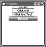
Figure 31-18
Resources
As you’ve seen with the styles sample, usually styles are stored within resources. You can define any element within a resource; for example, the brush created earlier for the background style of the button can itself be defined as a resource, so you can use it everywhere a brush is required.
The following example defines a LinearGradientBrush with the key name MyGradientBrush inside the StackPanel resources. button1 assigns the Background property by using a StaticResource markup extension to the resource MyGradientBrush. Figure 31-19 shows the output from this XAML code:
<Window x: xmlns="http://schemas.microsoft.com/winfx/2006/xaml/presentation" xmlns:x="http://schemas.microsoft.com/winfx/2006/xaml" Title="Resources Sample" Height="100" Width="300" > <Window.Resources> </Window.Resources> <StackPanel> <StackPanel.Resources> <LinearGradientBrush x:Key="MyGradientBrush" StartPoint="0.5,0" EndPoint="0.5,1"> <GradientStop Offset="0.0" Color="LightCyan" /> <GradientStop Offset="0.14" Color="Cyan" /> <GradientStop Offset="0.7" Color="DarkCyan" /> </LinearGradientBrush> </StackPanel.Resources> <Button Name="button1" Width="200" Height="50" Foreground="White" Background="{StaticResource MyGradientBrush}"> Click Me! </Button> </StackPanel> </Window>

Figure 31-19
Here, the resources have been defined with the StackPanel. In the previous example, the resources were defined with the Window element. The base class FrameworkElement defines the property Resources of type ResourceDictionary. That’s why resources can be defined with every class that is derived from the FrameworkElement - any WPF element.
Resources are searched hierarchically. If you define the resource with the window, it applies to every child element of the window. If the Window contains a Grid, and the Grid contains a StackPanel, and if you define the resource with the StackPanel, the resource applies to every control within the StackPanel. If the StackPanel contains a Button, and you define the resource just with the Button, this style is valid just for the button.
| Important | In regard to hierarchies, you need to pay attention if you use the TargetType without a Key for styles. If you define a resource with the Canvas element and set the TargetType for the style to apply to TextBox elements, the style applies to all TextBox elements within the Canvas. The style even applies to TextBox elements that are contained in a ListBox when the ListBox is in the Canvas. |
If you need the same style for more than one Window, you can define the style with the application. In a Visual Studio WPF project, the file App.xaml is created for defining global resources of the application. The application styles are valid for every window of the application; every element can access resources that are defined with the application. If resources are not found with the parent window, the search for resources continues with the Application.
<Application x: xmlns="http://schemas.microsoft.com/winfx/2006/xaml/presentation" xmlns:x="http://schemas.microsoft.com/winfx/2006/xaml" StartupUri="Window1.xaml"> <Application.Resources> </Application.Resources> </Application>
System Resources
There are also some systemwide resources for colors and fonts that are available for all applications. These resources are defined with the classes SystemColors, SystemFonts and SystemParameters:
-
With SystemColors you get the color settings for borders, controls, the desktop, and windows, for example, ActiveBorderColor, ControlBrush, DesktopColor, WindowColor, WindowBrush, and so on.
-
The class SystemFonts returns the settings for the fonts of the menu, status bar, and message box, for example, CaptionFont, DialogFont, MenuFont, MessageBoxFont, StatusFont, and so on.
-
The class SystemParameters gives you settings for sizes of menu buttons, cursors, icons, borders captions, timing information, and keyboard settings, for example, BorderWidth, CaptionHeight, CaptionWidth, MenuButtonWidth, MenuPopupAnimation, MenuShowDelay, SmallIconHeight, SmallIconWidth, and so on.
Figure 31-20 shows the dialog where the user can configure these settings. You can find the Appearance dialog with the Personalization settings in the Control Panel.
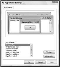
Figure 31-20
Accessing Resources from Code
To access resources from code behind, the base class FrameworkElement implements the method FindResource(), so you can invoke the FindResource() method with every WPF object.
To do this, button2 doesn’t have a background specified, but the Click event is assigned to the method OnApplyResource.
<StackPanel Name="MyContainer"> <StackPanel.Resources> <LinearGradientBrush x:Key="MyGradientBrush" StartPoint="0.5,0" EndPoint="0.5,1"> <GradientStop Offset="0.0" Color="LightCyan" /> <GradientStop Offset="0.14" Color="Cyan" /> <GradientStop Offset="0.7" Color="DarkCyan" /> </LinearGradientBrush> </StackPanel.Resources> <Button Name="button2" Width="200" Height="50" Click="OnApplyResource"> Apply Resource Programmatically </Button> With the implementation of OnApplyResource(), the FindResource() method is used on the Button that was clicked, a search for the resource MyGradientBrush happens hierarchically, and the brush is applied to the Background property of the control.
public void OnApplyResource(object sender, RoutedEventArgs e) { Control ctrl = sender as Control; ctrl.Background = ctrl.FindResource("MyGradientBrush") as Brush; } | Important | If FindResource() does not find the resource key, an exception is thrown. If you don’t know for sure if the resource is available, you can use the method TryFindResource() instead. TryFindResource() returns null if the resource is not found. |
Dynamic Resources
With the StaticResource markup extension, resources are searched at load time. If the resource changes while the program is running, you should use the DynamicResource markup extension instead.
The example is extended by adding two buttons. button3 is used to change the resource programmatically. It has the Click event handler method OnChangeResource assigned. With button4 the Background property is set by using the DynamicResource markup extension to the resource key MyGradientBrush (the same resource that was applied to button1 with the StaticResource markup extension):
<Button Name="button3" Width="200" Height="50" Click="OnChangeResource"> Change Resource </Button> <Button Name="button4" Width="200" Height="50" Background="{DynamicResource MyGradientBrush}"> Dynamic Resource </Button> The implementation of OnChangeResource() clears the resources of the StackPanel and adds a new resource with the same name, MyGradientBrush. This new resource is very similar to the resource that is defined in XAML code; it just defines different colors.
public void OnChangeResource(object sender, RoutedEventArgs e) { MyContainer.Resources.Clear(); LinearGradientBrush brush = new LinearGradientBrush(); brush.StartPoint = new Point(0.5, 0); brush.EndPoint = new Point(0.5, 1); GradientStopCollection stops = new GradientStopCollection(); stops.Add(new GradientStop(Colors.White, 0.0)); stops.Add(new GradientStop(Colors.Yellow, 0.14)); stops.Add(new GradientStop(Colors.YellowGreen, 0.7)); brush.GradientStops = stops; MyContainer.Resources.Add("MyGradientBrush", brush); } If you run the application and change the resource dynamically by clicking the third button, button4 immediately gets the new resource. button1, which was defined with the StaticResource, keeps the old resource that was loaded.
| Important | The DynamicResource requires more performance than the StaticResource, as the resource is always loaded when needed. Use DynamicResource only with resources where you expect changes during runtime. |
Triggers
With triggers you can change the look and feel of your controls dynamically because of some events or some property value changes. For example, when the user moves with the mouse over a button, the button can change its look. Usually, you have had to do this with the C# code; with WPF you can also do this with XAML as long as only the UI is influenced.
The Style class has a Triggers property where you can assign property triggers. The following example includes two TextBox elements inside a Canvas panel. With the Window resources a style TextBoxStyle is defined that is referenced by the TextBox elements using the Style property. The TextBoxStyle specifies that the Background is set to LightBlue and the FontSize to 17. This is the style of the TextBox elements when the application is started. Using triggers the style of the controls change. The triggers are defined within the Style.Triggers element, using the Trigger element. One trigger is assigned to the property IsMouseOver, the other trigger is assigned to the property IsKeyboardFocused. Both of these properties are defined with the TextBox class that the style applies to. If IsMouseOver has a value of true, the trigger fires and sets the Background property to Red and the FontSize property to 22. If the TextBox has a keyboard focus, the property IsKeyboardFocused is true, and the second trigger fires and sets the Background property of the TextBox to Yellow.
<Window x: xmlns="http://schemas.microsoft.com/winfx/2006/xaml/presentation" xmlns:x="http://schemas.microsoft.com/winfx/2006/xaml" Title="TriggerSample" Height="200" Width="400" > <Window.Resources> <Style x:Key="TextBoxStyle" TargetType="{x:Type TextBox}"> <Setter Property="Background" Value="LightBlue" /> <Setter Property="FontSize" Value="17" /> <Style.Triggers> <Trigger Property="IsMouseOver" Value="True"> <Setter Property="Background" Value="Red" /> <Setter Property="FontSize" Value="22" /> </Trigger> <Trigger Property="IsKeyboardFocused" Value="True"> <Setter Property="Background" Value="Yellow" /> <Setter Property="FontSize" Value="22" /> </Trigger> </Style.Triggers> </Style> </Window.Resources> <Canvas> <TextBox Canvas.Top="80" Canvas.Left="30" Width="300" Style="{StaticResource TextBoxStyle}" /> <TextBox Canvas.Top="120" Canvas.Left="30" Width="300" Style="{StaticResource TextBoxStyle}" /> </Canvas> </Window>
You don’t have to reset the property values to the original values when the reason for the trigger is not valid anymore; for example, you don’t have to define a trigger for IsMouseOver=true and IsMouseOver=false. As soon as the reason for the trigger is no longer valid, the changes made by the trigger action are reset to the original values automatically.
Figure 31-21 shows the trigger sample application, where the first text box has the keyboard focus and the second text box has the default values of the style for the background and font size.

Figure 31-21
| Important | When using property triggers, it is extremely easy to change the look of controls, fonts, colors, opacity, and the like; when the mouse moves over them, the keyboard sets the focus … not a single line of programming code is required. |
The Trigger class defines the following properties to specify the trigger action.
| Trigger Property | Description |
|---|---|
| Property Value | With property triggers, the Property and Value properties are used to specify when the trigger should fire, for example, Property=”IsMouseOver” Value=”True”. |
| Setters | As soon as the trigger fires, you can use Setters to define a collection of Setter elements to change values for properties. The Setter class defines the properties Property, TargetName, and Value for the object properties to change. |
| EnterActions ExitActions | Instead of defining setters, you can define EnterActions and ExitActions. With both of these properties, you can define a collection of TriggerAction elements. EnterActions fires when the trigger starts (with a property trigger, when the Property/Value combination applies), ExitActions fires before it ends (just at the moment when the Property/Value combination does not apply anymore). Trigger actions that you can specify with these actions are derived from the base class TriggerAction, for example, SoundPlayerAction and BeginStoryboard. With SoundPlayerAction, you can start the playing of sound; BeginStoryboard is used with animation, which will be shown later in this chapter. |
| Tip | Property triggers are just one type of trigger possible in WPF. Another trigger type is event triggers. Event triggers are discussed later in this chapter along with animations. |
Templates
In this chapter, you’ve already seen that a Button control can have any content. The content can be a simple text, but you can also add a Canvas element to the button; the Canvas element can contain shapes. You can add a Grid to the button, or a video. There’s more than that you can do with a button!
The functionality and look and feel of controls is completely separated in WPF. A button has a default look, but you can change that as you like. A button has functionality - you can click it, add event handlers to Click and mouse events, associate it with a command, assign defaults, and cancel buttons. In short, it behaves like a button. How the button looks can be completely customized with templates.
The next sample shows several buttons, and later list boxes are customized step by step, so you can see the intermediate results of the changes. First, start with two very simple buttons, where the first button doesn’t have a style at all, and the second button references the style ButtonStyle1 with changes to the Background and the FontSize. You can see this first result in Figure 31-22.
<Window x: xmlns="http://schemas.microsoft.com/winfx/2006/xaml/presentation" xmlns:x="http://schemas.microsoft.com/winfx/2006/xaml" Title="Template Sample" Height="300" Width="300"> <Window.Resources> <Style x:Key="ButtonStyle1" TargetType="{x:Type Button}"> <Setter Property="Background" Value="Yellow" /> <Setter Property="FontSize" Value="18" /> </Style> </Window.Resources> <StackPanel> <Button Name="button1" Height="50" Width="150">Default Button</Button> <Button Name="button2" Height="50" Width="150" Style="{StaticResource ButtonStyle1}">Styled Button </Button> </StackPanel> </Window> 
Figure 31-22
Now, add the new style ButtonStyle2 to the resources. This style again sets the TargetType to the Button type. The Setter now specifies the Template property. By specifying the Template property, you can replace the look of the button completely. The value for the Template property is defined by a ControlTemplate element. A ControlTemplate defines the content of a control and allows the accessing of content from the control itself, as you will see soon. Here, the ControlTemplate defines a Grid with two rows. The rows use star sizing where the height of the first row is twice the height of the second row. Then two Rectangle elements are defined. The first rectangle spans both rows, sets the Stroke property to Green for a green outline, and RadiusX and RadiusY values for rounded corners. The second rectangle, which is only within the first row, has its Fill property set to a linear gradient brush. button3, with the content Tempate Button, references style ButtonStyle2. Figure 31-23 shows button3 with the new style, but the content is missing.
<Window x: xmlns="http://schemas.microsoft.com/winfx/2006/xaml/presentation" xmlns:x="http://schemas.microsoft.com/winfx/2006/xaml" Title="Template Sample" Height="300" Width="300" > <Window.Resources> <!-- other styles --> <Style x:Key="ButtonStyle2" TargetType="{x:Type Button}"> <Setter Property="Template"> <Setter.Value> <ControlTemplate> <Grid> <Grid.RowDefinitions> <RowDefinition Height="2*" /> <RowDefinition Height="*" /> </Grid.RowDefinitions> <Rectangle Grid.RowSpan="2" RadiusX="4" RadiusY="8" Stroke="Green" /> <Rectangle RadiusX="4" RadiusY="8" Margin="2"> <Rectangle.Fill> <LinearGradientBrush StartPoint="0,0" EndPoint="0,1"> <GradientStop Offset="0" Color="LightBlue" /> <GradientStop Offset="0.5" Color="#afff" /> <GradientStop Offset="1" Color="#6faa" /> </LinearGradientBrush> </Rectangle.Fill> </Rectangle> </Grid> </ControlTemplate> </Setter.Value> </Setter> </Style> </Window.Resources> <StackPanel> <!-- other buttons --> <Button Name="button3" Background="Yellow" Height="100" Width="220" FontSize="24" Style="{StaticResource ButtonStyle2}">Template Button </Button> </StackPanel> </Window>
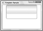
Figure 31-23
The button now has a completely different look, but the content that is defined with the button itself is missing in Figure 31-23. The template created previously must be extended. The first rectangle in the template now has its Fill property set to {TemplateBinding Background}. The TemplateBinding markup extension enables a control template to use content from the templated control. Here, the rectangle is filled with the background that is defined with the button. button3 defines a yellow background, so this background is combined with the background from the second rectangle of the control template. After the definition of the second rectangle, the element ContentPresenter is used. The element ContentPresenter takes the content from the templated control and places it as defined - here on both rows, as Grid.RowSpan is set to 2. If a ContentPresenter is defined, the TargetType with the ControlTemplate must also be set. The content is positioned by setting the HorizontalAlignment, VerticalAlignment, and Margin properties to values defined by the button itself by using TemplateBinding markup extensions. With the ControlTemplate you can also define triggers as previously shown within resources. Figure 31-24 shows the new outcome of the button, including the content and the background combined with the template.
<Style x:Key="ButtonStyle2" TargetType="{x:Type Button}"> <Setter Property="Template"> <Setter.Value> <ControlTemplate TargetType="{x:Type Button}" > <Grid> <Grid.RowDefinitions> <RowDefinition Height="2*" /> <RowDefinition Height="*" /> </Grid.RowDefinitions> <Rectangle Grid.RowSpan="2" RadiusX="4" RadiusY="8" Stroke="Green" Fill="{TemplateBinding Background}" /> <Rectangle RadiusX="4" RadiusY="8" Margin="2"> <Rectangle.Fill> <LinearGradientBrush StartPoint="0,0" EndPoint="0,1"> <GradientStop Offset="0" Color="LightBlue" /> <GradientStop Offset="0.5" Color="#afff" /> <GradientStop Offset="1" Color="#6faa" /> </LinearGradientBrush> </Rectangle.Fill> </Rectangle> <ContentPresenter Grid.RowSpan="2" HorizontalAlignment="{TemplateBinding HorizontalContentAlignment}" VerticalAlignment="{TemplateBinding VerticalContentAlignment}" Margin="{TemplateBinding Padding}" /> </Grid> <ControlTemplate.Triggers> <Trigger Property="IsMouseOver" Value="True"> <Setter Property="Foreground" Value="Aqua" /> </Trigger> <Trigger Property="IsPressed" Value="True"> <Setter Property="Foreground" Value="Black" /> </Trigger> </ControlTemplate.Triggers> </ControlTemplate> </Setter.Value> </Setter> </Style> </Window.Resources> 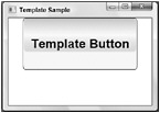
Figure 31-24
Let’s make an even fancier button: you can also use transparent features. The style GelButton sets the properties Background, Height, Foreground and Margin, and the Template. The template is the most interesting aspect with this style. The template specifies a Grid with just one row and one column.
Inside this cell, you can find a rectangle with the name GelBackground. This rectangle has rounded corners because of the RadiusX and RadiusY settings, a very thin surrounding with a linear gradient color because the StrokeThickness is set to 0.35, and the linear gradient brush for the type of stroke.
The second rectangle, GelShine, is just a small rectangle with a height of 15 pixels, and because of the Margin settings, it is visible within the first rectangle. The stroke is transparent, so there is no line surrounding the rectangle. This rectangle just uses a linear gradient fill brush, which goes from a light, partly transparent color to full transparency. This gives the rectangle a shimmering effect.
After the two rectangles, there’s a ContentPresenter element that defines alignment for the content and takes the content from the button to display.
Such a styled button now looks very fancy on the screen. However, there’s no action if the mouse is clicked or the mouse moves over the button. With a template-styled button, you must have triggers for the button to appear differently in response to mouse clicks. The property trigger IsMouseOver defines a new value for the Rectangle.Fill property with a different color for the radial gradient brush. The rectangle that gets the new fill is referenced with the TargetName property. The property trigger IsPressed is very similar; here, simply other radial gradient brush colors are used to fill the rectangle. You can see a button that references the style GelButton in Figure 31-25. Figure 31-26 shows the same button while the mouse moved over it where you can see the effect of the radial gradient brush.
<Style x:Key="GelButton" TargetType="{x:Type Button}"> <Setter Property="Background" Value="Black" /> <Setter Property="Height" Value="40" /> <Setter Property="Foreground" Value="White" /> <Setter Property="Margin" Value="3" /> <Setter Property="Template"> <Setter.Value> <ControlTemplate TargetType="{x:Type Button}"> <Grid> <Rectangle Name="GelBackground" RadiusX="9" RadiusY="9" Fill="{TemplateBinding Background}" StrokeThickness="0.35"> <Rectangle.Stroke> <LinearGradientBrush StartPoint="0,0" EndPoint="0,1"> <GradientStop Offset="0" Color="White" /> <GradientStop Offset="1" Color="#666666" /> </LinearGradientBrush> </Rectangle.Stroke> </Rectangle> <Rectangle Name="GelShine" Margin="2,2,2,0" VerticalAlignment="Top" RadiusX="6" RadiusY="6" Stroke="Transparent" Height="15px"> <Rectangle.Fill> <LinearGradientBrush StartPoint="0,0" EndPoint="0,1"> <GradientStop Offset="0" Color="#ccffffff" /> <GradientStop Offset="1" Color="Transparent" /> </LinearGradientBrush> </Rectangle.Fill> </Rectangle> <ContentPresenter Name="GelButtonContent" VerticalAlignment="Center" HorizontalAlignment="Center" Content="{TemplateBinding Content}" /> </Grid> <ControlTemplate.Triggers> <Trigger Property="IsMouseOver" Value="True"> <Setter Property="Rectangle.Fill" TargetName="GelBackground"> <Setter.Value> <RadialGradientBrush> <GradientStop Offset="0" Color="Lime" /> <GradientStop Offset="1" Color="DarkGreen" /> </RadialGradientBrush> </Setter.Value> </Setter> <Setter Property="Foreground" Value="Black" /> </Trigger> <Trigger Property="IsPressed" Value="True"> <Setter Property="Rectangle.Fill" TargetName="GelBackground"> <Setter.Value> <RadialGradientBrush> <GradientStop Offset="0" Color="#ffcc00" /> <GradientStop Offset="1" Color="#cc9900" /> </RadialGradientBrush> </Setter.Value> </Setter> </Trigger> </ControlTemplate.Triggers> </ControlTemplate> </Setter.Value> </Setter> </Style> 
Figure 31-25

Figure 31-26
Instead of having a rectangular button, an ellipse can be used as a button. In the next example, you can also see how one style can be based on another style.
The style RoundedGelButton can be based on the style GelButton by setting the BasedOn property with the Style element. If one style is based on another style, the new style gets all settings from the base style unless the settings are redefined. For example, the RoundedGelButtonStyle gets the Foreground and Margin settings from the GelButton because these settings are not redefined. If you change a setting in a base style, all styles that are based on the style automatically get the new values.
The Height and Template properties are redefined with the new style. Here, the template defines two Ellipse elements instead of rectangles. The outer ellipse GelBackground defines a black ellipse with a gradient stroke around it. The second ellipse is smaller with a small margin (5) at the top and a large margin (50) at the bottom. This ellipse again has a linear gradient brush that goes from a light color to transparent and specifies the shine effect. Again, there are triggers for IsMouseOver and IsPressed that change the value of the Fill property for the first ellipse.
You can see the new button based on the RoundedGelButton style - and it is still a button - in Figure 31-27.
<Style x:Key="RoundedGelButton" BasedOn="{StaticResource GelButton}" TargetType="Button"> <Setter Property="Width" Value="100" /> <Setter Property="Height" Value="100" /> <Setter Property="Grid.Row" Value="2" /> <Setter Property="Template"> <Setter.Value> <ControlTemplate TargetType="{x:Type Button}"> <Grid> <Ellipse Name="GelBackground" StrokeThickness="0.5" Fill="Black"> <Ellipse.Stroke> <LinearGradientBrush StartPoint="0,0" EndPoint="0,1"> <GradientStop Offset="0" Color="#ff7e7e7e" /> <GradientStop Offset="1" Color="Black" /> </LinearGradientBrush> </Ellipse.Stroke> </Ellipse> <Ellipse Margin="15,5,15,50"> <Ellipse.Fill> <LinearGradientBrush StartPoint="0,0" EndPoint="0,1"> <GradientStop Offset="0" Color="#aaffffff" /> <GradientStop Offset="1" Color="Transparent" /> </LinearGradientBrush> </Ellipse.Fill> </Ellipse> <ContentPresenter Name="GelButtonContent" VerticalAlignment="Center" HorizontalAlignment="Center" Content="{TemplateBinding Content}" /> </Grid> <ControlTemplate.Triggers> <Trigger Property="IsMouseOver" Value="True"> <Setter Property="Rectangle.Fill" TargetName="GelBackground"> <Setter.Value> <RadialGradientBrush> <GradientStop Offset="0" Color="Lime" /> <GradientStop Offset="1" Color="DarkGreen" /> </RadialGradientBrush> </Setter.Value> </Setter> <Setter Property="Foreground" Value="Black" /> </Trigger> <Trigger Property="IsPressed" Value="True"> <Setter Property="Rectangle.Fill" TargetName="GelBackground"> <Setter.Value> <RadialGradientBrush> <GradientStop Offset="0" Color="#ffcc00" /> <GradientStop Offset="1" Color="#cc9900" /> </RadialGradientBrush> </Setter.Value> </Setter> <Setter Property="Foreground" Value="Black" /> </Trigger> </ControlTemplate.Triggers> </ControlTemplate> </Setter.Value> </Setter> </Style> 
Figure 31-27
Styling a ListBox
Changing a style of a button or a label is a simple task. How about changing the style of an element that contains a list of elements, for example, a ListBox? Again, a list box has behavior and a look. A list box can display a list of elements; you can select one or more elements from the list. For the behavior the ListBox class defines methods, properties and events. The look of the ListBox is separate from its behavior. The ListBox element has a default look, but you can change this look by creating a template.
To display some items in the list, the Country class has been created to represent the name and flag with a path to an image. The class Country defines the Name and ImagePath properties and has an overridden ToString() method for a default string representation:
public class Country { public Country(string name) : this(name, null) { } public Country(string name, string imagePath) { this.name = name; this.imagePath = imagePath; } private string name; public string Name { get { return name; } set { name = value; } } private string imagePath; public string ImagePath { get { return imagePath; } set { imagePath = value; } } public override string ToString() { return name; } } The static class Countries returns a list of a few countries that will be displayed:
public static class Countries { public static Country[] GetCountries() { List<Country> countries = new List<Country>(); countries.Add(new Country("Austria", "Images/Austria.bmp")); countries.Add(new Country("Germany", "Images/Germany.bmp")); countries.Add(new Country("Norway", "Images/Norway.bmp")); countries.Add(new Country("USA", "Images/USA.bmp")); return countries.ToArray(); } } Inside the code-behind file in the constructor of the Window1 class, the DataContext property of the Window1 instance is set to the list of countries that is returned from the method Countries.GetCountries().
| Tip | The DataContext property is a feature for data binding that is discussed in the next section. |
public partial class Window1 : System.Windows.Window { public Window1() { InitializeComponent(); this.DataContext = Countries.GetCountries(); } } Within the XAML code the ListBox named countryList1 is defined. countryList1 doesn’t have a different style; it uses the default look from the ListBox element. The property ItemsSource is set to the Binding markup extension, which is used by data binding, and from the code behind you’ve seen that the binding is done to an array of Country objects. Figure 31-28 shows the default look of the ListBox. By default, just the names of the countries returned by the ToString() method are displayed in a simple list.
<Window x: xmlns="http://schemas.microsoft.com/winfx/2006/xaml/presentation" xmlns:x="http://schemas.microsoft.com/winfx/2006/xaml" Title="Listbox Styling" Height="300" Width="300"> <StackPanel> <ListBox Name="countryList1" ItemsSource="{Binding}" /> </StackPanel> </Window> 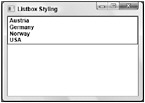
Figure 31-28
The Country objects do have both the name and the flag in the object. Of course, you can also display both values in the list box. To do this you have to define a template.
The ListBox element contains ListBoxItem elements. You can define the content for an item with the ItemTemplate. The style listBoxStyle1 defines an ItemTemplate with a value of a DataTemplate. A DataTemplate is used to bind data to elements. You can use the Binding markup extension with DataTemplate elements.
The DataTemplate contains a grid with three columns. The first column contains the string Country:; the second column, the name of the country; and the third column, the flag for the country. Because the country names have different lengths, but the view should be the same size for every country name; the SharedSizeGroup property is set with the second column definition. This shared size information for the column is only used because the property Grid.IsSharedSizeScope is also set.
After the column and row definitions, you can see two TextBlock elements. The first TextBlock element contains the text Country:; the second TextBlock element binds to the Name property that is defined in the Country class.
The content for the third column is a Border element containing a Grid. The Grid contains a Rectangle with a linear ambient brush and an Image element that is bound to the ImagePath property of the Country class. Figure 31-29 shows the countries in a ListBox with completely different output than before.
<Window.Resources> <Style x:Key="listBoxStyle1" TargetType="{x:Type ListBox}" > <Setter Property="ItemTemplate"> <Setter.Value> <DataTemplate> <Grid> <Grid.ColumnDefinitions> <ColumnDefinition Width="Auto" /> <ColumnDefinition Width="*" SharedSizeGroup="MiddleColumn" /> <ColumnDefinition Width="Auto" /> </Grid.ColumnDefinitions> <Grid.RowDefinitions> <RowDefinition Height="60" /> </Grid.RowDefinitions> <TextBlock FontSize="16" VerticalAlignment="Center" Margin="5" FontStyle="Italic" Grid.Column="0">Country:</TextBlock> <TextBlock FontSize="16" VerticalAlignment="Center" Margin="5" Text="{Binding Name}" FontWeight="Bold" Grid.Column="1" /> <Border Margin="4,0" Grid.Column="2" BorderThickness="2" CornerRadius="4"> <Border.BorderBrush> <LinearGradientBrush StartPoint="0,0" EndPoint="0,1"> <GradientStop Offset="0" Color="#aaa" /> <GradientStop Offset="1" Color="#222" /> </LinearGradientBrush> </Border.BorderBrush> <Grid> <Rectangle> <Rectangle.Fill> <LinearGradientBrush StartPoint="0,0" EndPoint="0,1"> <GradientStop Offset="0" Color="#444" /> <GradientStop Offset="1" Color="#fff" /> </LinearGradientBrush> </Rectangle.Fill> </Rectangle> <Image Width="48" Margin="2,2,2,1" Source="{Binding ImagePath}" /> </Grid> </Border> </Grid> </DataTemplate> </Setter.Value> </Setter> <Setter Property="Grid.IsSharedSizeScope" Value="True" /> </Style> </Window.Resources> 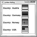
Figure 31-29
It is not necessary that a ListBox have items that follow vertically one after the other. You can give the user a different view with the same functionality. The next style, listBoxStyle2, defines a template where the items are shown horizontally with a scroll bar.
In the previous example only an ItemTemplate was created to define how the items should look like in the default ListBox. Now, a template is created to define a different ListBox. The template contains a ControlTemplate element to define the elements of the ListBox. The element is now a ScrollViewer - a view with a scroll bar - that contains a StackPanel. As the items should now be listed horizontally, the Orientation of the StackPanel is set to Horizontal. The stack panel will contain the items that are defined with the ItemsTemplate, so the IsItemsHost of the StackPanel element is set to true. IsItemsHost is a property that is available with every Panel element that can contain a list of items.
The ItemTemplate defines the look for the items in the stack panel. Here a grid with two rows is created, the first row contains Image elements that are bound to the ImagePath property, and the second row contains TextBlock elements that are bound to the Name property.
Figure 31-30 shows the ListBox styled with listBoxStyle2 where the scroll bar appears automatically when the view is too small to display all items in the list.
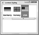
Figure 31-30
<Style x:Key="listBoxStyle2" TargetType="{x:Type ListBox}"> <Setter Property="Template"> <Setter.Value> <ControlTemplate TargetType="{x:Type ListBox}"> <ScrollViewer HorizontalScrollBarVisibility="Auto"> <StackPanel Name="StackPanel1" IsItemsHost="True" Orientation="Horizontal" /> </ScrollViewer> </ControlTemplate> </Setter.Value> </Setter> <Setter Property="VerticalAlignment" Value="Center" /> <Setter Property="ItemTemplate"> <Setter.Value> <DataTemplate> <Grid> <Grid.ColumnDefinitions> <ColumnDefinition Width="Auto" /> </Grid.ColumnDefinitions> <Grid.RowDefinitions> <RowDefinition Height="60" /> <RowDefinition Height="30" /> </Grid.RowDefinitions> <Image Grid.Row="0" Width="48" Margin="2,2,2,1" Source="{Binding ImagePath}" /> <TextBlock Grid.Row="1" FontSize="14" HorizontalAlignment="Center" Margin="5" Text="{Binding Name}" FontWeight="Bold" /> </Grid> </DataTemplate> </Setter.Value> </Setter> </Style> Certainly you see the advantages of separating the look of the controls from their behavior. Maybe you already have a lot of ideas about how you can display your items in a list that best fits your application’s requirements. Maybe you just want to display as many items as fit in the window, position them horizontally, and then continue to the next line vertically. That’s where a WrapPanel comes in. And, of course, you can have a WrapPanel inside a template for a ListBox, as shown in listBoxStyle3. Figure 31-31 shows the result of using the WrapPanel.
<Style x:Key="listBoxStyle3" TargetType="{x:Type ListBox}"> <Setter Property="Template"> <Setter.Value> <ControlTemplate TargetType="{x:Type ListBox}"> <ScrollViewer VerticalScrollBarVisibility="Auto" HorizontalScrollBarVisibility="Disabled"> <WrapPanel IsItemsHost="True" /> </ScrollViewer> </ControlTemplate> </Setter.Value> </Setter> <Setter Property="ItemTemplate"> <Setter.Value> <DataTemplate> <Grid> <Grid.ColumnDefinitions> <ColumnDefinition Width="140" /> </Grid.ColumnDefinitions> <Grid.RowDefinitions> <RowDefinition Height="60" /> <RowDefinition Height="30" /> </Grid.RowDefinitions> <Image Grid.Row="0" Width="48" Margin="2,2,2,1" Source="{Binding ImagePath}" /> <TextBlock Grid.Row="1" FontSize="14" HorizontalAlignment="Center" Margin="5" Text="{Binding Name}" /> </Grid> </DataTemplate> </Setter.Value> </Setter> </Style>
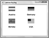
Figure 31-31