Design Corner: Enlivening Your Organization Charts
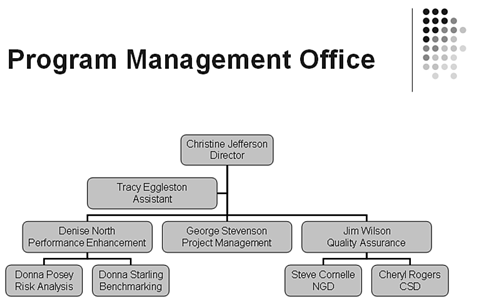
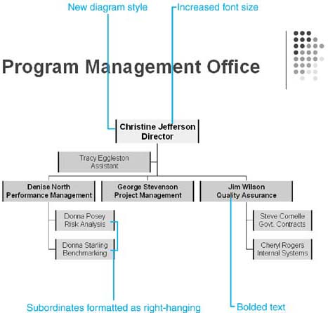
Design Corner: Enlivening Your Organization ChartsYou can use PowerPoint's organization chart to create all kinds of hierarchical charts and then use the style gallery and other formatting features to enliven your chart and make it coordinate with the rest of your presentation. For example, let's say that you created a basic organization chart for your department using the default options, showing you as the department manager with an assistant and three staffers reporting to you. It conveys the basic information you want, but lacks pizzazz (see Figure 12.8). You decide that you want to apply a different style, bold the names and titles to make them easier to read, and increase the font size in the shape that contains your name and title. (You are the boss, after all.) To quickly do this, follow these steps:
Figure 12.8. Figure 12.9 illustrates the improved organization chart. If you wanted, you could make other changes as wellrevising font colors, italicizing job titles, modifying the options in the Format Organization Chart dialog box (right-click and choose Format Organization Chart to open), and so forth. Just be careful not to go overboard and make your organization chart harder to read. Figure 12.9. BeforeAfter |
EAN: 2147483647
Pages: 261