Formatting a Chart
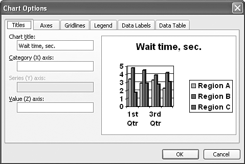
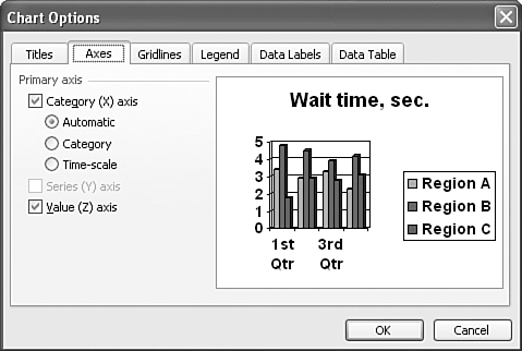
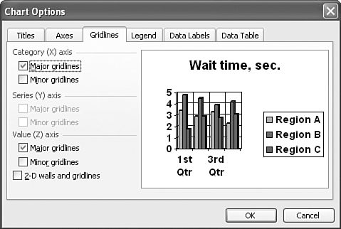
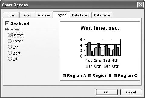
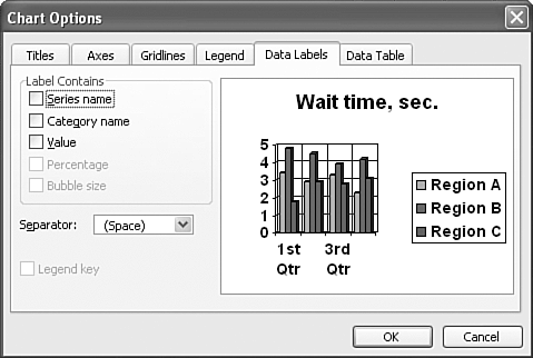
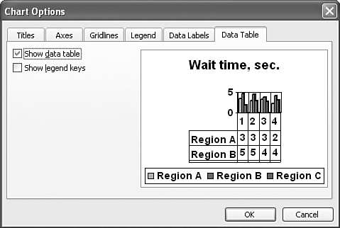
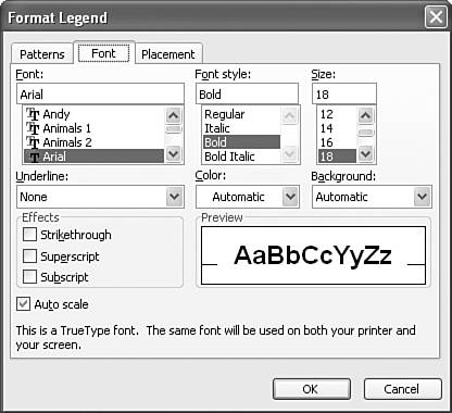
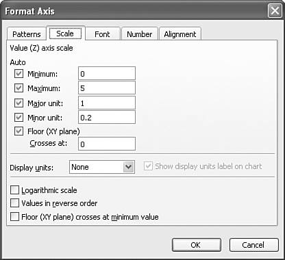
| Microsoft Graph offers detailed precision in chart creation and the opportunity to make numerous formatting changes. You can set overall chart options or format specific chart objects. Before making major changes to the chart's default settings, be sure to carefully consider your reason for customizing. Different is better only when it adds value or clarity to your chart. NOTE If the chart isn't active, you won't see the chart menu and toolbar options. Double-click the chart to select it and display chart options. Setting Overall Chart OptionsUse the Chart Options dialog box to set overall chart options for the chart type you selected. In Microsoft Graph, choose Chart, Chart Options to display this dialog box, shown in Figure 11.17. Figure 11.17. Set a variety of chart-formatting options in this dialog box. We'll use the clustered 3D column chart type as an example as we explore the tabs of this dialog box. If you select a different chart type (such as a pie), the options and tabs might differ slightly. Make any necessary changes within the tabs of this dialog box, and then click OK to apply them to your presentation. Entering Chart TitlesOn the Titles tab, you can enter titles for the overall chart and the available axes such as category, value, or series. The example to the right previews these changes in your chart. CAUTION The chart title isn't the same as a slide title. If you create a chart title, your chart will have two titlesone for the slide and one for the chart. Formatting AxesOn the Axes tab, shown in Figure 11.18, you can choose whether to display category, series, and value axes. If a particular axis isn't available, you won't be able to choose it. In this example, the category axis displays the data you entered in the first row of cells in your datasheet. The value axis displays a numerical series based on the values you entered in the datasheet. Figure 11.18. Specify whether to display a particular axis. Formatting GridlinesOn the Gridlines tab (see Figure 11.19), you can choose whether to display major or minor gridlines for all available axes. Figure 11.19. Major gridlines, selected by default, can make values easier to read. NOTE Pie and doughnut charts don't have gridlines. Displaying a LegendOn the Legend tab, shown in Figure 11.20, you can choose to display a legend by selecting the Show Legend check box. Figure 11.20. A legend makes a chart easier to understand. Placement options include placing your legend at the bottom, corner, top, right, or left of your chart. NOTE After you place a legend on your chart, you can select and drag it to a new location. Displaying Data LabelsA data label makes data in your chart easier to identify. You can display a value, percent, text label, text label and percent, a bubble size, or no label at all. Figure 11.21 shows the Data Labels tab. Figure 11.21. Data labels are optional means of identifying chart information. NOTE Depending on the chart type you select, not all data label options are available. If you do choose to display a data label, the Legend Key check box appears. Check this box if you want to display a color -coded box next to the data label to associate it with the legend. Displaying a Data TableIf you want to include a table with all your datasheet data in your chart, you can choose the Show Data Table check box in the Data Table tab (see Figure 11.22). Figure 11.22. If your chart contains complex numerical data, a data table can make this information more meaningful. If you select this option, you also have the choice to Show Legend Keys if you want to display a color-coded box in the table columns to associate them with the legend. Formatting Chart ObjectsYou can format individual chart objects, such as the chart area, axes, series, legend, and gridlines. To format a specific chart object, select it from the Chart Objects drop-down list on the Standard toolbar, and then click the Format button to the right of the drop-down list. A Format dialog box customized for the type of object you select appears. For example, you might see the Format Axis dialog box or the Format Data Series dialog box, depending on the selected chart object. If the Format button isn't available, no formatting options exist for the selected chart object. You can modify many formatting options from the Format dialog box, including pattern, font, placement, scale, alignment, and shape. Remember, though, that numerous changes don't always enhance a chart. Go easy. Some things you might want to consider changing include the following:
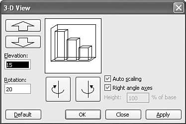
Formatting 3D ViewIf you choose a 3D chart type, you can format 3D viewing options such as elevation, rotation, height, and perspective. Table 11.3 explains each of these options. Table 11.3. 3D View Options
To format these options, follow these steps:
|
 To learn more about the available options in this dialog box,
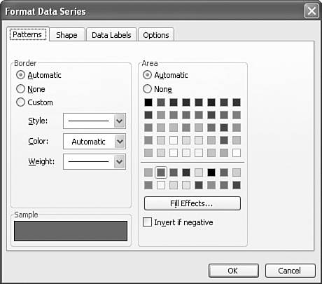
EAN: 2147483647
Pages: 261