| PowerPoint offers plenty of chart types and sub-types for almost every kind of graphic representation you could want to create. Sub-types are variations on a basic chart type, such as 3D options. PowerPoint includes these basic chart types: -
Column Creates vertical columns to compare the values of categories of data. Column, bar, and line charts work well if you want to compare values over time periods such as months or quarters . Figure 11.7 illustrates a sample column chart. Figure 11.7. A column chart makes it easy to compare series of data. 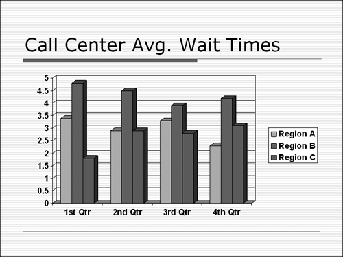 -
Bar Creates horizontal bars to compare the values of categories of data. -
Line Creates a line with markers for each data value. -
Pie Creates a pie that analyzes percentages of a total number. Use a pie chart to see how items contribute to a total. For example, you might want to compare the year's expenses for each department in your company. Figure 11.8 shows a pie chart. Figure 11.8. Use pie charts to show percentages of a total amount. 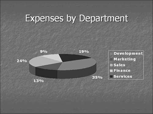 -
XY (Scatter) Creates a chart that compares sets of values. -
Area Creates a chart that shows the trend of values in a single solid area. -
Doughnut Creates a pie chart that can contain more than one series. -
Radar Assigns a value axis (radiating from the center) for each category, and draws lines to connect all values in the same series. The chart compares the collected values of several data series. -
Surface Creates a single 3D surface that helps you finding the best combinations between two sets of data. Colors and patterns indicate areas that are in the same range of values. -
Bubble Compares three sets of values displayed as bubbles . -
Stock Shows a stock's high, low, and close figures. -
Cylinder Creates columns shaped like cylinders . -
Cone Creates columns shaped like cones. -
Pyramid Creates columns shaped like pyramids . If you already know that you want to create a 3D clustered column chart, which is the PowerPoint default, you don't need to do anything to select a chart type. However, if you want to use a different chart type, you should select it before you enter any data or make any other modifications. There are two ways to change the chart type in PowerPoint. You can click the down arrow next to the Chart Type button on the Standard toolbar and select the chart type you want to apply from the palette that appears. Place the mouse over a specific chart type to view a chart tip that tells you the chart type's name . PowerPoint applies the chart type to your chart, which reformats itself in the new type. Not all chart types are available through the Chart Type button, however. If you can't find what you need on the palette that appears, try the Chart Type dialog box (Chart, Chart Type). In either case, if you don't like the new chart type you applied, click the Undo button on the Standard toolbar to return to your original selection. To apply a new chart type using the Chart Type dialog box, follow these steps: -
In Microsoft Graph, choose Chart, Chart Type from the menu. The Chart Type dialog box appears, as shown in Figure 11.9. Figure 11.9. PowerPoint offers many different chart types. 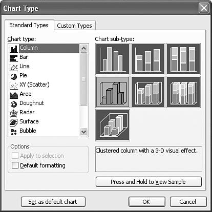 -
On the Standard Types tab, select the type of chart you want from the Chart Type list. A variety of sub-types appears in the Chart sub-type area. -
Click the sub-type you want. The text box below provides detailed information about this sub-type. -
To preview what an actual chart of this type looks like, click the Press and Hold to View Sample button. A sample chart temporarily replaces the Chart Sub-Type box, as shown in Figure 11.10. Figure 11.10. You can preview changes before making them. 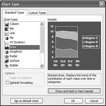 -
If you want to change this to your default, select the Set as Default Chart button. -
If none of the chart types in the Standard Types tab suits your needs, click the Custom Types tab to view more options. Figure 11.11 illustrates this tab. Figure 11.11. Custom charts provide variety and options. 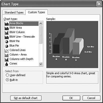 NOTE Custom charts include detailed formatting, and some are customized specifically for a certain kind of output, such as onscreen presentations. The text box beneath the example indicates these details. -
Click the Built-In option button to display PowerPoint's ready-made custom charts. NOTE You can also add an active chart in your current presentation to the list of chart types. Simply select the User-Defined option button on the Custom Types tab, click the Add button, and enter details about this active chart to the Add Custom Chart Type dialog box that appears. Microsoft Graph adds this chart to its list of custom chart types. -
Select the chart type you want to use from the Chart Type list. An example displays in the Sample box. -
Click OK to apply the chart type and return to your presentation.  |