Typography 101
If you are going to create type on any software program, it s essential to understand the nature and terminology of type. Type has been around ever since humans decided to record their experiences as symbols. The conventions of typography have evolved over the centuries. Type is more than just words. It is a powerful visual element, capable of expressing ideas. Your eye perceives the character forms, and your brain freely associates what it sees with what it knows ”it translates the unique visual relationships of the text symbols into a silent voice. The voice can have a gender; it can convey a particular time in history. It might have an accent from another language or culture. It can be humorous , serious, fluid, mechanical, or any other description. It can have a specific tempo and pitch.
Figure 8.1 identifies the traditional names for the key type features and dimensions that help define your type s voice. These characteristics, and many others, are explained in the following sections.
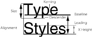
Figure 8.1: Anatomy of type characters
Font
Font is the name for the style or appearance of a complete set of characters. Your choice of font can greatly influence the appearance of a publication, as Figure 8.2 illustrates.
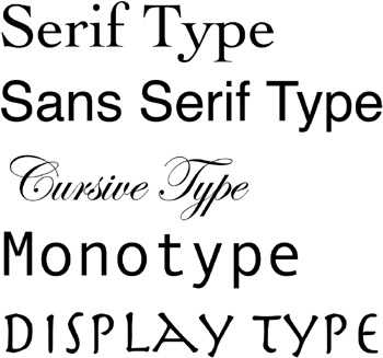
Figure 8.2: The five main categories of fonts
The five main categories of fonts include the following:
-
Serif fonts have a horizontal linear element on their extremities that guides the eye across the page.
-
Sans Serif fonts don t have the horizontal linear element.
-
Cursive (or Script) fonts are typographic versions of handwritten script.
-
Monotype characters are always evenly spaced , producing a mechanical appearance.
-
Display Letterforms are usually embellished with shapes or ornaments that endow them with a unique illustrative character.
Size
In traditional typography, the type size of a character is determined by the distance from the top of a capital letter to the bottom of a descender. Size is traditionally measured in points , with 72 points in an inch.
Style
By controlling the style of a character, you place a visual emphasis on its meaning. In Photoshop, style is chiefly a function of font weight ( thickness or heaviness) and obliqueness (whether it leans). You can specify either of these two type characteristics by choosing a bold or italic typeface from a type family on your system or by applying faux styles from the Character palette. The weight or obliqueness of type creates emphasis or meaning when used in headlines, subheads, and character-based logos. A bold character headline, for example, might be used to indicate power or to simply ensure that it is the first thing seen by a viewer.
Alignment
Aligning text is an important step in maintaining readability. The alignment choices in traditional page layout are flush left, flush right, centered, and justified. Photoshop lets you apply these alignment options to horizontally or vertically oriented type. Alignment of text within an image reacts directly with the composition. It is a way to stabilize the viewer s eye movement by creating visible margins around the text blocks that establish clean, fluid lines and spaces. Aligning text to other visual elements frames the contents of the page so that there is ample, consistent space between the edge of the page and the content.
Leading
Leading is the typographic term that describes vertical spacing between lines; the word originates from the time when typesetters hand-set wooden or metal type. The space between lines was filled with lead slugs of specific sizes that controlled the vertical spacing. This term has been adopted throughout the industry as a way to describe the distance, in points from baseline to baseline, of rows of type characters. Software with a typography component (such as Photoshop) usually, by default, applies autoleading for body copy at 120% of the type s size.
Tracking and Kerning
These terms refer to the space between characters. Tracking is the global space between selected groups of characters, and kerning is the space between two individual characters. Because each letterform has specific visual characteristics, characters are optically spaced. For example, in the top line of type in Figure 8.3, the capital T next to the lowercase y needs less space than the capital H next to the lowercase i to appear the same distance apart. Sometimes Photoshop-generated text needs manual kerning.
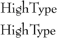
Figure 8.3: The characters in the top row are set by using Photoshop s default tracking. They seem to isolate the capital T. The text in the bottom row has been manually kerned to accommodate the optical spacing and to connect the capital T with the rest of the word.
Horizontal and Vertical Scale
The horizontal and vertical scale of type can radically change its appearance, as seen in Figure 8.4. When you reduce the horizontal scale of a letterform (as in the second row of the example), you squeeze it from side to side. When you scale it up horizontally (to a percentage higher than 100), all of the vertical strokes appear fatter and the characters appear extended, as in the third row of type in the figure.
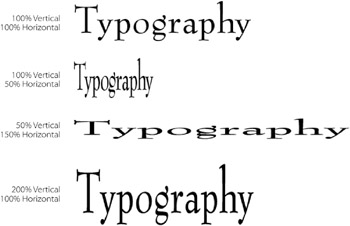
Figure 8.4: Horizontal and vertical scale
When you vertically scale a letterform (as in the fourth row of Figure 8.4), you stretch it from top to bottom. With scaling greater than 100%, the vertical strokes appear thinner and elongated relative to their size. The character appears condensed, even though it s at the normal horizontal width.
Baseline Shift
Shifting the baseline of a character, as in Figure 8.5, moves it horizontally or vertically from its default starting position, or baseline. Unlike leading, which affects all the characters in a paragraph, baseline shift can target individual characters or a group of selected characters and move them up or down.

Figure 8.5: The effect of baseline shift on a single character
Type Conventions
Typography is an art that has evolved over thousands of years and, like any art form, it has common-sense rules of thumb. Type conventions act as guides to help the artist or designer achieve readable, well- emphasized character combinations. The conventions emphasize certain visual elements so that the viewer s eye is gently guided through the text.
For the sake of continuity and clarity, I mention these conventions here, because when designing with type, they are a good place to begin. Remember, however, that you can ignore the conventions, break the rules, and get wild and crazy in the anything-goes world of graphic design, providing you don t lose sight of your goal: to visually communicate your ideas clearly and efficiently .
Less Is More Don t use more than two fonts, three sizes, or three styles in a design field. As a complicated example, a headline might be 36-point Gill Sans Bold, the subhead might be 20-point Gill Sans Demi, and the body text might be 12-point Garamond Medium.
Stick with Standard Leading Normal leading equals 120% of the type size, so if a character is 10 points, for example, its normal leading is 12 points. If your leading is too tight and the lines are too close together, you lose readability; if your leading is too loose and the lines are too far apart, the reader s eye will wander instead of flowing smoothly from the end of one line to the beginning of the next.
No Faux Styles Whenever possible, avoid using faux styles ”that is, styles applied by a software program to the text. If you want to use a boldface style, use the bold style from that font s family, because there are subtle differences in the characters.
Kern and Track Your Text Pay attention to the kerning and tracking of type. This is an area that is painfully neglected by many desktop publishers. Be sure the spacing looks natural. Although Photoshop auto-kerns its characters, it s wise to tweak the character spacing, especially when you apply warping or styles to the type. Look for consistent spacing of text by squinting your eyes. Correct gaps where the characters are too far apart or bunching where they are too close together.
Use Ligatures A ligature is a set of two characters that is designed to replace certain character combinations, such as fl and fi , to avoid spacing conflicts. Use ligatures whenever possible.
EAN: 2147483647
Pages: 355