Section 3.2. Fixed Versus Liquid Web Pages
3.2. Fixed Versus Liquid Web PagesClosely related to the issue of varying monitor resolutions is the question of whether web pages should be designed to be liquid (resizing and adapting to various window sizes, also called "fluid" design) or fixed at a particular size (giving the designer more control of the page's dimensions). There are very strong opinions on both sides, and there are good reasons for and against each approach, naturally. You may find that you choose a fixed structure for some sites and allow others to be liquid, or you may have strong convictions that one or the other approach is the only way to go. Either way, it is useful to be familiar with the whole picture and the current opinions of professional web designers (see "The Layout Debate" sidebar). This section attempts to present a balanced overview of the possibilities and the pitfalls.
3.2.1. Liquid LayoutsWeb pages are fluid by default. The behavior of the "normal flow" of a web document is to flow into the browser window, filling all available space in the canvas area. When the browser window is resized, the elements reflow to adapt to the new dimensions. Many designers make a conscious decision to construct pages that adapt to the stretching and shrinking of browser windows. This approach comes with advantages and disadvantages. 3.2.1.1. Advantages and disadvantages of fluid web pagesThe advantages of a flexible design include:
Keep in mind, though, these potential pitfalls of a flexible design:
3.2.1.2. Creating flexible pagesThe key to creating web pages that resize proportionally to fill the browser is using relative measurements, such as percentages) in your style sheets, tables, or frames or not specifying measurements at all and allowing elements to size automatically. As an example, let's consider a web page that is divided into two sections: a main content column and a links column (Figure 3-1). By using percentage values for the divs, table cells, or frame measurements, the columns and elements will remain proportional to one another. In this example, the main content column takes up 75% of the screen regardless of the size of the browser window. Note that the content of that column reflows to fill the available width. Figure 3-1. A flexible web page with proportional columns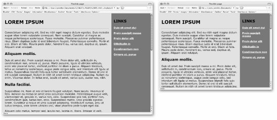 Using style sheets, you can also set the contents of the page to flex based on the user's text size preference by setting measurements in ems, a unit used in printing to refer to the width of one capital letter M. In CSS, an em is equal to the font size; in other words, an em unit in 12-point text is 12 points square. Using em measurements for element dimensions, margins, line-height, and so on ensures that page elements scale proportionally with the user's chosen text preference. 3.2.2. Fixed-Width DesignIf you want more control over the layout of a page, you may opt to design a web page with a fixed width that stays the same for all users, regardless of monitor resolution or browser window size. This approach to web design is based on design principles learned in print, such as a constant grid, the relationship of page elements, and comfortable line lengths. It is a popular approach among the standards-based design crowd as of this writing, but that may only indicate a trend, not that it is the superior approach to web page layout. 3.2.2.1. Advantages and disadvantages of fixed-width designThese are the advantages of fixed-width design:
Consider also these disadvantages:
3.2.2.2. Creating fixed pagesFixed web page designs are created by using exact pixel measurements for all the elements on the page. Figure 3-2 shows a two-column web page similar to the one in Figure 3-1; however, this one has been sized to exactly 900 pixels wide, with the two columns set to 700 and 200 pixels, respectively. Figure 3-2. A fixed-width web page with exact pixel measurements viewed on large (left) and small (right) monitors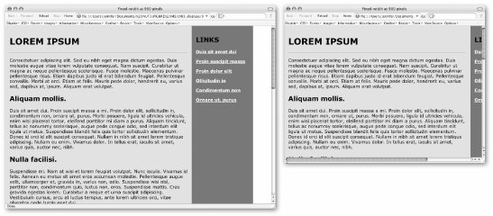 Style sheets offer the best set of tools for fixed-measurement layouts. In the past, designers resorted to tricks such as sized transparent graphics to hold "whitespace" on the page and multiple nested tables to control spacing around elements. Thankfully, these workarounds are no longer necessary. Style sheets allow you to set specific pixel measurements for the page, columns, margins, indents, and so on. You can also specify the font size in pixels, ensuring the text will wrap similarly for most users.[*] The CSS Level 2 specification provides tools for the precise positioning of elements on the page, right down to the pixel. For designers looking for control over layout, style sheets are great news.
Some visual HTML authoring tools make it easy to create fixed-width designs . Adobe GoLive (www.adobe.com/products/golive/main.html) has an option for designing your page on a grid as though it were a page-layout program. GoLive then automatically generates the corresponding (and often complicated) table. Macromedia Dreamweaver (www.macromedia.com/software/dreamweaver/) also includes a layout mode with the option of generating your design using tables or style sheets with absolute positioning . 3.2.2.3. Left-aligned or centered?When you set your content to a specific width, you need to consider where it should appear in the browser window. By default, it will be aligned on the left margin, with the extra space in the browser window on the right. Some designers opt to center the page, splitting the extra space over the left and right margins. Centering the page may make it feel as though the page better fills the browser window. Figure 3-3 provides examples of each approach. Neither of these approaches is necessarily better than the other; it's just a design decision you'll need to make. Figure 3-3. Positioning fixed-width content on the page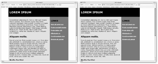
3.2.2.4. Pop-up and resized windowsFor the ultimate in control-freak, fixed-width page design, you can specify not only the size of your web page, but also the size of the browser window itself. One way to get the browser window "just so" is to open a new browser window automatically (known as a pop-up window) set to specific pixel dimensions. The drawback to this technique is that pop-up windows have become associated with annoying, force-fed advertising banners. Many users have learned to close a pop-up window before the content even has time to load. The seriously annoyed folks may have taken the time to install a pop-up window blocker on their browser. Others may simply have JavaScript turned off for security or whatever reasons. The lesson here is not to put critical content in a pop-up window, and if you do, label the link accordingly to let people know what to expect. Another, more drastic, approach is to run a JavaScript that resizes the user's current browser window to accommodate your design. In my opinion, this is just bad mannerslike visiting a stranger's house and rearranging their furniture without asking. But I will qualify this statement by saying that no technique is entirely off limits. Sometimes an otherwise bad practice may be the appropriate solution. In this case, automatically resizing the browser window might be a good backup technique to make sure a web-based kiosk window is always sized appropriately. 3.2.3. Combination PagesOf course, web pages need not be all-fixed or all-flexible. It is certainly possible to create pages that are a combination of the two by setting a specific pixel size for one critical element and allowing the rest of the page to resize to fill the browser window. In Figure 3-4, the right column has been set to stay at 200 pixels so the list of links is always visible, but the main content column is allowed to resize to fill the available browser window space. Figure 3-4. A web page with a liquid left column and a fixed-width right column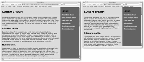 3.2.4. Choosing a Page SizeObviously, if you decide to design a web page at a fixed size, you need to make a decision regarding how big to make it. If the page is too wide, you run the risk of users with lower resolution monitors missing some of your content as shown in Figure 3-2. It makes sense to design the page to fit comfortably in the smallest monitors and eliminate the need for horizontal scrolling. This is where web traffic statistics come in handy. 3.2.4.1. The statisticsTable 3-2 shows the breakdown of users browsing the Web with various monitor resolutions in late 2005, according to TheCounter (www.thecounter.com).
Of course, this is only an approximation based on traffic to a limited set of web sites. The only worthwhile statistics are those culled from your own server logs. You can install software to check browser resolution yourself, or sign up for a tracking service such as TheCounter (free in exchange for ad placement). 3.2.4.2. Current practiceBased on these statistics, the only definitive conclusion is that it is finally time not to worry about how your page will appear in 640 x 480 monitors (unless, of course, you know the target audience for your site is likely to have outdated hardware setups). As of this writing, professional web developers tend to design pages that fit in 800 x 600 monitors. Although the percentage of people with this monitor resolution is steadily shrinking, with just a fifth of all traffic, it is still too large a population to risk alienating. For this reason, you will find that most fixed-width consumer- or business-oriented web sites are designed to be approximately 750 pixels wide. If you know that the majority of your visitors will have a higher monitor resolution (such as graphic designers), or if the right edge of your design does not contain critical content, then it may be safe to design to fill the live space of a 1024 x 768 monitor. Very few sites today are designed to fill 1280 x 1024. I suspect as 800 x 600 monitors go the way of 640 x 480, we'll be seeing larger and larger web pages. For now, however, consider 800 x 600 the lowest common denominator monitor resolution.
|
EAN: 2147483647
Pages: 325