Section 13.7. Responsible Layout Tables
13.7. Responsible Layout TablesYou've surely heard (throughout this book and elsewhere) that table-based layout has been replaced by CSS for positioning elements on the page. However, during this time of transition, as browser developers work out the kinks in CSS support, some authors still choose to use tables to establish the basic grid of the page. It is possible to rely on a table for layout, but be in line with the current trends of standards compliance and accessibility in contemporary web design. Layout tables are not inherently evil (or even inaccessible), as long as they are handled the right way. This section recommends ways to use layout tables that do the least harm. 13.7.1. Stick to Basic Table ElementsWhen using a table strictly for layout, use only the minimal table elements:
Captions, table headers, row groups, and all features for improving table accessibility as listed in the previous section should be avoided. They will only serve to confuse or slow down readers with assistive devices. 13.7.2. Keep It Simple and LightweightThe problem with most layout tables in terms of accessibility is complexity. It is not uncommon for tables aiming to achieve pixel-precise layouts to use techniques such as:
These typically result in overly complicated table structures and bloated markup. Non-sighted users may become disoriented trying to navigate from cell to cell in an attempt to make sense of the content. The complexity and size of the source document isn't doing any favors for visual browsers either. An example of a typically convoluted table-based layout is shown in Figure 13-13 (another one of my own old-school designs). The borders have been enhanced to reveal the complexity of the table structure. By contrast, responsible layout tables are simple and lightweight. The table in Figure 13-14 contains similar content to the example in Figure 13-13, but a single Figure 13-13. An overly complex nested table layout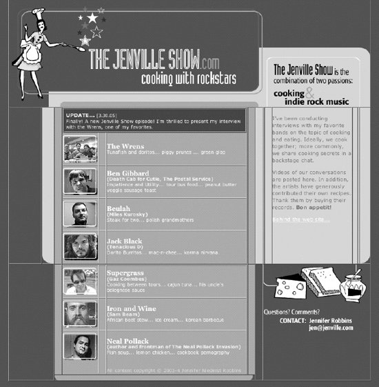 stripped-down layout table is used to establish the basic grid structure of the page. The borders have been turned on to reveal the table structure. There are no nested tables, and every table cell is filled with real content. All matters of visual formatting are handled with style sheets (as discussed in the next section). Figure 13-14. A lightweight table used for layout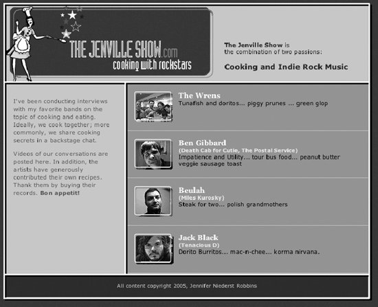 The markup for the table in Figure 13-14 is shown here. It has been simplified to reveal the structure of the table markup. <table> <tr> <td colspan="2" > <div >The Jenville Show is ...</div> </td> </tr> <tr> <td > <p>I've been conducting interviews...</p> </td> <td > <ul> <li >...</li> <li >...</li> <li >...</li> <li >...</li> </ul> </td> </tr> <tr> <td colspan="2"><p >All content...</p></td> </tr> </table> 13.7.3. Use Style Sheets for PresentationThe secret to keeping a layout table simple and streamlined is to use it only to establish a basic layout grid and to use Cascading Style Sheets for everything else related to presentation. The good news is with style sheets, the need for most of the layout table hacks listed earlier is eliminated. For example, one of the main reasons for nesting tables was to get different amounts of cell padding in different parts of the table. With CSS, padding can be applied on a cell-by-cell basis. Similarly, where once it was necessary to put text in a single-celled table to display it in a colored box, style sheets now allow any element to be presented in that fashion by setting dimensions and a background color. In the complicated layout in Figure 13-13, the list of artists is held together in a two-part nested table. In the lightweight example in Figure 13-14, the bands are now marked up semantically as an unordered list. The one-pixel rules that had been created with table cells filled with one-pixel transparent GIFs and background colors are now created simply by applying borders to the bottom of list item (li) elements. Using the background images, image replacement, and rounded-corner techniques listed in Chapter 24, this single-table layout could be made to approximate the look and feel of the original even further. These are just a few examples of how style sheets could be used in tandem with a minimal layout table. The table takes care of the structure, and style sheets handle the presentation of all the content in a way that alleviates the need for additional tables and table cells. Once you've weaned yourself this far, it's not a big leap to CSS positioning and table-free design. 13.7.4. Check for LinearizationWhen creating a layout table, it is important to be aware of how well your table will linearize when presented in a non-visual browser. Linearization refers to the order of the content when all the table formatting is removed. Screen readers read content in the order in which it appears in the source document, as though there were no markup there at all. Tables are said to linearize well when their contents appear in a logical order in the source document. In general, it is preferable to get readers to the main content as quickly as possible. Unfortunately, the way many layout tables are constructed leads to the side column content (long lists of links and other sidebar-like information) appearing before the main content. The table in Figure 13-15 shows a typical (albeit simple) three-column layout table with a masthead. Figure 13-15. A typical layout table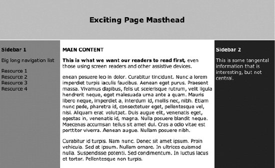 While it is perfectly clear what to read first when rendered visually, a look at the source reveals that users with screen readers will need to listen to the big long navigation list in "Sidebar 1" before they hear the main feature. This is a simplified example of a table that does not linearize well. Complex layout tables that are typical in everyday practice have far more egregious linearization problems. <table width="700" border="0" cellpadding="4"> <tr> <td colspan="3"> <h2>Exciting Page Masthead </h2> </td> </tr> <tr> <td><p><strong>Sidebar 1</strong></p> <p>Big long navigation list</p> ... </td> <td><p><strong>MAIN CONTENT</strong></p> <p><strong>This is what we want our readers to read first,</strong> even those using screen readers and other assistive devices.</p>... </td> <td><p><strong>Sidebar 2</strong></p> <p>This is some tangental information ... </p> </td> </tr> </table> Layout tables can be designed to linearize in a logical order, but it takes some careful planning, and at times, a little finagling. One technique that works for the three-column layout shown in the example is to put the main content cell in a new row just after the masthead and use the rowspan attribute to present it side by side with the sidebar cells, as shown in this example. The resulting table is shown in Figure 13-16. <table> <tr> <td colspan="3"><div align="center"> <h2>Exciting Page Masthead </h2> </div></td> </tr> <tr> <td></td> <td rowspan="2"><p><strong>MAIN CONTENT</strong></p> <p><strong>This is what we want our readers to read first....</p> </td> <td></td> </tr> <tr> <td><p><strong>Sidebar 1</strong></p> <p>Big long navigation list</p>... </td> <td><p><strong>Sidebar 2</strong></p> <p >This is some tangental information...</p></td> </tr> </table> The empty table cells in the second row have been left unstyled in this example to reveal the table's structure, but obviously, they could be minimized by tinkering with styles. The important thing to notice is that the main content is now the first thing users read after the masthead when the table is linearized. Figure 13-16. A table with preferred linearization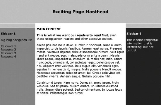 Creating tables that linearize logically can be a tricky business and may require rethinking the design. As an alternative, using CSS with absolute positioning allows you to start with markup that is in the preferred order and then place each element wherever you want on the page. This may be another motivation for cutting the tether to table-based design. |
EAN: 2147483647
Pages: 325