Section 13.2. Basic Table Structure
13.2. Basic Table StructurePut simply, web tables are made up of cells (which is where the content goes), arranged into rows. The HTML table model is said to be "row primary" because rows are identified explicitly in the document structure, while columns are just implied. The following examples illustrate the basic structure of an HTML table. 13.2.1. Rows and CellsThe minimum elements for defining a table are table, for establishing the table itself, tr for declaring a table row, and td for creating table cells within the row. Explanations and examples of how these elements fit together follow these element and attribute listings.
<table>...</table> Attributes
Deprecated attributes
Nonstandard attributes
<tr>...</tr> Attributes
Deprecated attributes
<td>...</td> Attributes
Deprecated attributes
To see how the basic table elements are applied, consider a simple table with two rows and two columns (four content or "data" cells). The diagram on the left in Figure 13-3 shows the table with its cells and rows labeled in the way they are recognized in HTML. The diagram on the right shows the HTML elements that correspond with each component. Figure 13-3. Basic table structure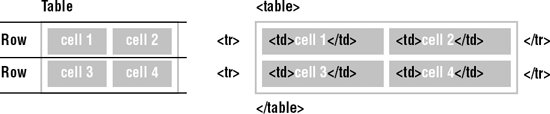 Written out in an HTML source document, the markup for the table in Figure 13-3 would look more like this: <table> <tr> <td>cell 1</td><td>cell 2</td> </tr> <tr> <td>cell 3</td><td>cell 4</td> </tr> </table> The entire table is indicated by the table element, which has no content of its own, but acts as a containing element for one or more of table row elements (tr). The table in the example contains two rows. Each tr element, in turn, contains two data cells, which are indicated by the td elements. The cells are the elements that contain real content; the table and tr elements are purely for table structure. A table cell may contain any data that can be displayed in a document, including formatted text, images, multimedia elements, and even other tables. As mentioned earlier, the table system in HTML is row-primary. Rows are labeled explicitly, but the number of columns is just implied by the number of cells in the longest row. In other words, if all the rows have three cells (three td elements), then the table has three columns. If one row contains four td elements and all the others contain two, the browser displays the table with four columns, adding blank cells to the shorter rows. HTML 4.01 introduced an advanced standard system for describing table structure that includes explicit column elements. This system is discussed in the "Columns and Column Groups" section of this chapter. 13.2.2. Spanning Rows and ColumnsData cells in a table can occupy more than one space in the grid created by the rows and columns. You expand a td element horizontally or vertically using the colspan and rowspan attributes, respectively. 13.2.2.1. Column spanIn Figure 13-4, <td colspan="2"> tells the browser to make "cell 1" occupy the same horizontal space as two cellsto make it "span" over two columns. The resulting spanned cell is indicated in Figure 13-4. Note that the row containing the spanned cell now only has one TD element instead of two. <table> <tr> <td colspan="2">Cell 1</td> </tr> <tr> <td>Cell 3</td><td>Cell 4</td> </tr> </table> Figure 13-4. The colspan attribute expands cells horizontally to the right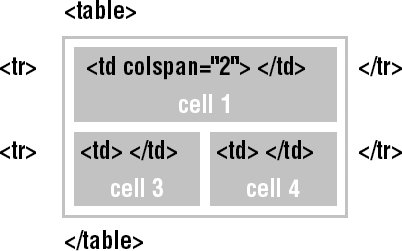 Setting the colspan to a number greater than the actual number of columns (such as colspan="4" for the example) may cause some browsers to add empty columns to the table , possibly throwing your elements out of alignment. 13.2.2.2. Row spanSimilar to colspan, the rowspan attribute stretches a cell to occupy the space of cells in rows below. Include the rowspan attribute in the row where you want the cell to begin and set its value equal to the number of rows you want it to span downward. In Figure 13-5, note that the bottom row now contains only one cell. The other has been incorporated into the vertical spanned cell. Browsers ignore overextended rowspan values. There can never be more rows than explicitly stated tr elements. <table> <tr> <td rowspan="2">Cell 1</td><td>Cell 2</td> </tr> <tr> <td>Cell 4</td> </tr> </table> Figure 13-5. The rowspan attribute expands cells vertically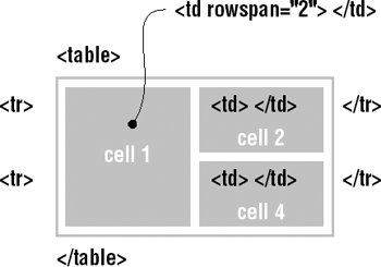
13.2.3. Descriptive ElementsThe basic table model also includes two elements that provide descriptions of the table's contents. Table header cells (th) are used to describe the cells in the row or column that they precede. The caption element gives a title to the whole table. 13.2.3.1. Table headersTable header cells (indicated by the th element) are used to provide important information or context about the cells in the row or column that they precede. The th element accepts the same list of attributes as td.
<th>...</th> Attributes
Deprecated attributes
In terms of markup and table structure, headers are placed in the tr element, the same as a td, as shown in this example. <table> <tr><th>Planet</th><th>Distance from Earth</th></tr> <tr><td>Venus</td><td>pretty darn far</td></tr> <tr><td>Neptune</td><td>ridiculously far</td></tr> </table> User agents usually render the contents of table headers slightly differently than regular table cells (most often in bold, centered text); however, their appearance may easily be changed with style sheets. The difference between th and td elements is not merely presentational, however. Table headers perform an important function in binding descriptive labels to table cells for non-visual browsers. They are discussed in more detail in the "Accessible Tables" section later in this chapter. Table header elements should not be used in layout tables. 13.2.3.2. CaptionsThe caption element provides a title or brief description of the table.
<caption>...</caption> Attributes
Deprecated attributes
The caption element must immediately follow the opening table tag and precede all other table elements, as shown in this example and Figure 13-6. <table> <caption>Planetary Distances</caption> <tr><th>Planet</th><th>Distance from Earth</th></tr> <tr><td>Venus</td><td>pretty darn far</td></tr> <tr><td>Neptune</td><td>ridiculously far</td></tr> </table> Figure 13-6. A table with a caption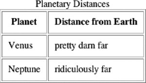 By default, the caption appears at the top of the table. Its width is determined by the width of the table. You can use the caption-side style property to move the caption below the table. There is also a deprecated align attribute that does the same thing. The left and right values are not well supported, so authors generally have the option of putting the caption above or below the table. Captions are a useful tool for table accessibility and will be addressed again briefly in the "Accessible Tables" section later in this chapter. |

EAN: 2147483647
Pages: 325