Controlling Color: Properties vs. Filters
The Adjust Color filter included in the Flash 8 Filter panel loads a new set of controls for making color adjustment to Movie Clips, Button symbols, and text fields. The best way to explain these new controls is to compare them to standard Flash color settings. Some of these controls are unique and some replicate settings available in the Color Mixer panel (for primitive shapes and Drawing Objects) and/or in the Properties panel Color menu. These three different color control areas are shown in Figure 12-10, with an additional diagram to call out the features of the Color Mixer panel that overlap with slider settings for the Adjust Color filter.
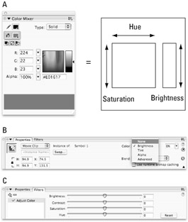
Figure 12-10: The options for adjusting color in Flash 8 include the Color Mixer panel (A), the Properties Color menu (B), and the new Adjust Color filter (C) — which enables instance-level color transformations similar to the raw color edits supported in the Color Mixer panel.
The controls shown in Figure 12-10 enable various workflows for setting and adjusting color in the Flash authoring environment. In most cases, you will start with the Color Mixer panel (or Swatches panel) to choose and/or modify fill and stroke colors for initial primitive shapes or Drawing Objects. After the raw graphics are converted into reusable symbols, the Color controls available in the Property inspector and/or the Adjust Color filter can be applied to modify symbol instances without changing the original fill and stroke colors. The sliders and value fields for adjusting color with either of these options are easy to use and you will most likely achieve the result you want with just a little experimentation. However, there are important differences between the Color Properties settings and the new Adjust Color filter settings, and the interaction of the different settings can become quite complex. To clarify the functions (and the advantages or limitations) of the various settings available with these two options, we have included a brief section for each.
| Web Resource | If you'd like to learn more about various color models and the differences between HSV/HSB (hue, saturation, value; or hue, saturation, brightness) and HSL (hue, saturation, lightness) color spaces, a good place to start is Wikipedia: http://en.wikipedia.org/wiki/HSB_color_space. |
Adjust Color Filter
The most broadly useful tool introduced to Flash 8 with the new filters feature is the Adjust Color filter. Figure 12-11 shows a sample of the range of color transformations that can be achieved with the sliders that load into the Filters panel when you apply the Adjust Color filter to Movie Clip instances, Button instances, or text fields.
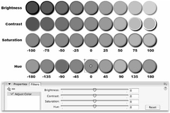
Figure 12-11: The color controls loaded in the Filters panel when the Adjust Color filter is applied enable subtle color transformations of symbol instances and text fields.
| Cross-Reference | The grayscale version of the sample color transformations shown in Figure 12-11 gives you a hint of what is possible with the Adjust Color filter, but the color version of this figure included in the color insert in this book is much more informative. |
| On the CD-ROM | We have included the source file with the various transformed Movie Clip instances shown in Figure 12-11 on the CD-ROM. Open AdjustColorFilter.fla from the ch12 folder on the CD-ROM to see the samples in the Flash authoring environment. To see these same transformations applied to a sample bitmap, open AdjustColorFilter_bitmaps.fla from the same location. |
Finally, you can make subtle adjustments (on an instance level) to Movie Clips, Button symbols, and text fields, without having to go back to the Color Mixer panel and change the stroke and fill colors of the original symbol. Unlike the Color control options in the Properties panel, the Adjust Color option in the Filters panel makes it easy to combine different types of color transformation without manually adjusting individual RGB values. By default, all settings are loaded as "neutral" — sliders are set to 0 so that no color transformation is visible on the selected item when the filter is first applied. Color transformations are applied for instant visual feedback as the slider controls or text values are adjusted. Filters apply on an instance level, and settings can be modified at any time by selecting an instance and choosing Adjust Color from the live filter list in the Filters panel. The following values can be applied individually or in combination to Movie Clips, Button symbols, and text fields:
-
Brightness: Alters the RGB values for the original color to make it appear lighter or darker without changing the hue. The range for filter Brightness is -100 to +100. The default or no change value is 0. The numeric value that appears in the Brightness field is added to the RGB values of the original color to create a new shade, within the minimum and maximum values of 0 and 255, respectively. For example, a red fill (255, 0, 0) set to +50 brightness will be transformed into light red (255, 50, 50). The same red fill (255, 0, 0) set to -50 brightness will be transformed into dark red (205, 0, 0). As shown in Figure 12-12, the results of adjusting Brightness in the Filters panel are different than the results of adjusting Brightness in the Properties panel.
Note Although the range for the Brightness filter and the Brightness option in the Color menu might seem the same at first glance, the significantly different results that these two options achieve are due to one being a relative (or percentage-based) setting and the other being an absolute (or decimal-based) setting. The Brightness filter is applied as an absolute numeric value while the Color property Brightness setting is applied as a relative percentage-based value. Regardless of the original color, setting Color property Brightness to 100% shifts the RGB values to white (255, 255, 255) and -100% Brightness shifts the RGB values to black (0,0,0). Any other Brightness setting is calculated as the percentage between these two extremes, and the RGB values are transformed accordingly.
-
Contrast: At the minimum contrast setting of -100, all RGB values are forced to 64, 64, 64, making everything medium gray. The RGB values at the maximum contrast setting of 100 will vary depending on the original colors, but they will be forced closer to 0 or 255. The default or no change value is 0. The greater the numeric difference between RGB values, the greater the amount of contrast. In visual terms, light colors get lighter and dark colors get darker as contrast is increased, whereas all colors are brought closer to medium gray as contrast is decreased.
-
Saturation: Saturation can also be thought of as the intensity or purity of color. At the minimum saturation setting of -100, the image will be rendered in grayscale with no color intensity — similar to the hues found closer to the bottom of the color selection field in the Color Mixer. At the maximum saturation setting of 100, the colors will be as intense or as close to pure color as possible — similar to the hues found closer to the top of the color selection field in the Color Mixer panel.
-
Hue: The Hue slider has a different range than the other Adjust Color filter sliders. To span the full range of the 360-degree color wheel, the slider values are from — 180 to 180. The default or no change value is 0. If you were looking at a real color wheel, reducing the hue value would be equivalent to moving counterclockwise around the wheel, while increasing the hue value would be equivalent to moving clockwise around the wheel. At either extreme (- 180 or 180), the resulting color would be directly opposite the original color on the color wheel. The relationship of colors directly opposite on the color wheel is known as complementary.
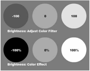
Figure 12-12: Numeric settings applied with the Adjust Color filter Brightness result in less extreme value changes than Percentage settings applied with the Color property Brightness.
| Web Resource | There are many books and online resources dedicated to color theory and there are many different versions of the color wheel. A good explanation and an illustration of an RBG color wheel can be found at www.color-wheel-pro.com/color-theory-basics.html. Color Wheel Pro is one of many software programs available to help designers create successful color schemes using color wheel relationships as a guideline. |
| Caution | The new Flash 8 filters (including the Adjust Color settings) are only compatible with Flash Player 8 (and only available in Flash Professional 8). If you plan to publish content for older versions of the Flash Player (or you are working with Flash Basic 8), you are limited to using the Color controls in the Property inspector to make adjustments to the appearance of symbol instances, or using the Color Mixer panel to modify the original stroke and fill colors in primitive shapes. |
Color Properties
As we introduced in Chapter 6, "Symbols, Instances, and the Library," the Color menu in the Property inspector provides some options for modifying the appearance of symbol instances without changing the original symbol stored in the Library. After a Color adjustment type is selected from the Color drop-down menu, the controls needed to apply the color adjustment appear in the Property inspector. By default, "neutral" settings (0-percent change) are loaded as a starting point. After the values for a property are modified, they will be stored and loaded as the default when you select another instance. The settings loaded in the Property inspector for the items in the Color menu are simple and intuitive and enable you to make basic color adjustments using familiar controls:
-
Brightness: The Brightness Color property has the same range as the Brightness slider in the Adjust Color filter (-100 to 100); however, as we described previously, the Brightness property creates more drastic color transformations because it is applied as a relative or percentage-based value. At the minimum Brightness setting (-100), all RGB values are forced to black (0,0,0), and at the maximum Brightness setting (100), all RGB values are forced to white (255,255,255).
-
Tint: The color theory definition of a tint is a color produced by adding white to a pure color. The Tint property in Flash enables you to select any color (not just white) to "mix" with the original color. You can also select how much of the new color you want to mix with your original colors — from the lowest setting of 0 percent to the maximum setting of 100 percent. At the minimum setting, the original colors will be unchanged. At the maximum setting, the new tint color will completely replace all of the original colors. At the default setting of 50 percent, the rendered color values will be an even mix of the original colors and the selected tint color.
-
Alpha: This setting controls how opaque the selected instance will be. The values that control alpha are counterintuitive (as they are in the Color Mixer). At the minimum alpha level of 0 percent, the item will be transparent. At the maximum alpha level of 100 percent, the item will be fully opaque or "solid."
Using Advanced Color Effects: Understanding Relative and Absolute Color Settings
The Advanced Effect dialog box shown in Figure 12-13 includes two columns of settings for Red, Green, and Blue color channels, plus the setting for Alpha. This dialog box is invoked when a symbol instance is selected on the Stage by selecting Advanced from the Color drop-down menu on the Property inspector, and then clicking the Settings button. Although these columns may seem redundant at first, they actually provide very different options for controlling the appearance of instance color. The important difference between these two types of controls is that the first column creates relative changes by applying percentage-based adjustments, while the second column creates absolute change by adding or subtracting integer values.
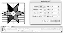
Figure 12-13: The Advanced Effect dialog box shown with the symbol instance testStar, with no effect applied
| Tip | The most recent transformation that was applied to an item using the simple Color controls will be preserved if you decide to switch to the Advanced option from one of the other options in the Color menu. The equivalent values will be transferred to the RGB or Alpha value fields in the Advanced Color Effects dialog box. This is a helpful way to get started with more complex transformations rather than starting from scratch. For example, you could select a Tint setting and then switch to the Advanced Color option to add an alpha setting that would be combined with the RGB values carried over from the original tint. |
Other than playing with these settings, the easiest way to understand what some of the possible combinations produce is to dig out your calculator and find a chart of RGB color swatches (with decimal values rather than Hex values). By taking the RGB values in your original instance, multiplying them by the percentage entered in the relative value field, and adding the value shown in the absolute color field, you will arrive at the new RGB value that will appear in the symbol instance when the effect is applied. If this sounds confusing, read on.
| On the CD-ROM | Because color examples are not very helpful illustrated in black and white, we have included the relevant graphics in a Flash file that you can open for reference. Compare the AdvancedColor Effect (relative) layer with the Advanced Color Effect (absolute) layer in colorEdits.fla in the ColorEffectsVsFilters folder in the ch12 folder on the CD-ROM. |
Relative Color Control
The first column of values adjusts the color of the instance relative to the percentages of color (or alpha) present in the original with a range of -100 percent to 100 percent. The default, or "no effect," setting is 100 percent. With these controls, 100 percent red does not change everything to pure red or 255 red, but rather it displays 100 percent of the current percentage of red in the existing colors. For example, yellow (255, 255, 0) cannot be made more orange by increasing the amount of red because 255 x 100 percent is still 255 — the maximum amount of red. However, if you reduce the percentage of green to 45 percent of the original value, the ratio of red will be increased, making the visible color shift to orange (255, [255 x 45 percent], 0 or 255, 102, 0).
This process of reducing the amount of the opposite (or complementary) color to alter the ratio of colors is called subtractive color adjustment, and it can be helpful to remember some basic color theory to predict how it will alter the appearance of your symbol instance. Because the color value changes that you make are applied to all the colors in your symbol, the overall effect can be more complex than just shifting one color in your palette. You will find, for example, that reducing the percentage of red and green to 0 for the testStar symbol instance (see the colorEdits.fla file on the CD-ROM) will cause the gray and white areas to shift to blue, whereas the red and green areas will shift to black, and the originally black areas will remain unaltered.
Because the maximum value for relative Alpha is also 100 percent, this control cannot be used to increase the alpha setting of an instance. For example, a symbol that has an alpha fill of 50 percent cannot be made to appear more solid because 100 percent of 50 percent is still only 50 percent alpha.
Absolute Color Control
The settings in the right column are referred to as absolute color controls because they add or subtract color in concrete amounts regardless of the color values in the symbol instance. The scale of absolute color is from -255 to 255 and the default or "no effect" setting is 0. When absolute color is applied to a symbol instance, it is possible to make more drastic global color changes than you can make with relative color adjustments.
The effect of absolute color value changes made in the Advanced Effect dialog box is similar to the effect of using the Tint option of the Color menu. What makes these controls more advanced is that not only can you add a tint by increasing the value of certain colors, but you can also add an inverse tint by using negative values. So, for example, you could add a red tint to all the colors present in the testStar symbol instance, with the exception of white and pure red (which already contain 255 red), by entering a value of 255 Red, or you could add a yellow tint to all colors containing blue by entering a value of -255 Blue; this would make pure blue (0, 0, 255) turn to black (0, 0, 0), and white (255, 255, 255) turn to pure yellow (255, 255, 0).
| On the CD-ROM | You can see the original testStar symbol instance and several modified examples, including those described in this section, in the Advanced Color Effect (absolute) layer of colorEdit.fla in the ColorEffectsVsFilters folder in the ch12 folder on the CD-ROM. |
Perhaps one of the most unique feats that absolute values can perform is to make a symbol instance that contains alpha fills or strokes appear less transparent. Because the alpha settings are absolute, it is possible to shift an item with an original alpha setting of less than 100 percent to any opacity level between invisible (-255) and completely solid (255).
If you've entered negative values in the relative alpha setting, it is even possible to make an area with an alpha fill visible while solid areas are made invisible. Consider a shape that has an area of solid fill (100 percent or 255 alpha) and an area of transparent color (40 percent or 102 alpha). If this shape is converted into a symbol and then modified using the Advanced Effect options, you could enter a relative alpha value of -100 percent and an absolute alpha value of 255. When these effect settings are applied, the solid fill in the symbol instance would be invisible with 0 percent alpha (255 -100 percent + 255 = 0), whereas the originally transparent fill would be visible with 60 percent alpha (102 -100 percent + 255 = 153). Compare the modified testStar instance shown in Figure 12-14 with the original instance shown in Figure 12-13.
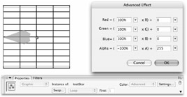
Figure 12-14: Using a combination of relative and absolute Alpha values, the transparency levels in the original testStar instance can be inverted.
The confusion that these settings sometimes cause has created debate about whether negative alpha settings can really be applied. As long as you can remember that outside of the absolute settings in the Advanced Effect dialog box, 0 percent alpha is invisible, whereas inside the Advanced Effect dialog box, a 0 alpha setting is equal to no effect, you will be able to prove as we just did, that negative alpha effects can be used to invert alpha values, similar to the way that negative color effects can be used to invert color values.
EAN: 2147483647
Pages: 395
- Beyond the Basics: The Five Laws of Lean Six Sigma
- When Companies Start Using Lean Six Sigma
- Making Improvements That Last: An Illustrated Guide to DMAIC and the Lean Six Sigma Toolkit
- The Experience of Making Improvements: What Its Like to Work on Lean Six Sigma Projects
- Six Things Managers Must Do: How to Support Lean Six Sigma