Controls
XAML has all the controls you ve come to expect from Windows ”buttons, check boxes, radio buttons , list boxes, combo boxes, menus , scroll bars, sliders, and so on. This sample demonstrates some of the common controls provided in Longhorn. You can see the results in Figure 3-10.
 <Border
 xmlns="http://schemas.microsoft.com/2003/xaml"
 xmlns:def="Definition"
 Background="BlanchedAlmond"
 >
 <DockPanel>
 <Menu DockPanel.Dock="Top">
 <MenuItem Header="File">
 <MenuItem Header="New" />
 <MenuItem Header="Open" />
 </MenuItem>

 <MenuItem Header="Edit">
 <MenuItem Header="Cut"/>
 <MenuItem Header="Copy"/>
 <MenuItem Header="Paste"/>
 </MenuItem>
 </Menu>

 <FlowPanel>

 <Button> Button </Button>
 <Border Width="15"/>

 <CheckBox Checked="true"> CheckBox </CheckBox>
 <Border Width="15"/>

 <RadioButtonList>
 <RadioButton> RadioButton 1 </RadioButton>
 <RadioButton Checked="true"> RadioButton 2 </RadioButton>
 <RadioButton> RadioButton 3 </RadioButton>
 </RadioButtonList>
 <Border Width="15"/>

 <ListBox>
 <ListItem> ListItem 1 </ListItem>
 <ListItem> ListItem 2 </ListItem>
 <ListItem> ListItem 3 </ListItem>
 </ListBox>
 <Border Width="15"/>

 <ComboBox>
 <ListItem> ListItem 1 </ListItem>
 <ListItem> ListItem 2 </ListItem>
 <ListItem> ListItem 3 </ListItem>
 </ComboBox>
 <Border Width="15"/>

 <DockPanel>
 <VerticalSlider DockPanel.Dock="Top"  Height="200"
 Minimum="0" Maximum="255" Value="75"
 SmallChange="1" LargeChange="16"/>
 <Text DockPanel.Dock="Bottom">Slider</Text>
 </DockPanel>
 <Border Width="15"/>

 <DockPanel>
 <VerticalScrollBar DockPanel.Dock="Top"
 Minimum="0" Maximum="255" Value="125" Height="200"
 SmallChange="1" LargeChange="16"/>
 <Text DockPanel.Dock="bottom">ScrollBar</Text>
 </DockPanel>
 <Border Width="15"/>

 <TextBox> TextBox </TextBox>

 </FlowPanel>
 </DockPanel>
 </Border>
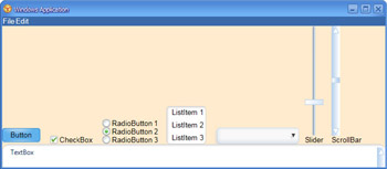
Figure 3-10: An example of XAML controls
XAML also allows you to combine elements and controls to create rich effects. We call this combining of elements control composition , and it is one of the most powerful aspects of Longhorn. For instance, to create a button with an image, you put an Image element inside Button :
 <Button>
 <Image Source="tulip.jpg"/>
 </Button>
To have both an image and text in the Button , as you can see in Figure 3-11, we use our old friend DockPanel :
 <Button>
 <DockPanel>
 <Image Source="tulip.jpg"/>
 <Text DockPanel.Dock="fill" VerticalAlignment="center"> Button
 <Italic>with Image!</Italic>
 </Text>
 </DockPanel>
 </Button>
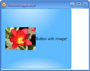
Figure 3-11: A button with an image and text
You can put pretty much anything inside anything, including this strange example of a CheckBox inside a Button :
 <Button>
 <CheckBox Checked="true"> CheckBox </CheckBox>
 </Button>
Composition is powerful enough that many of the Longhorn controls are actually defined using composition. For instance, a ScrollBar is actually two buttons and a slider, plus some event handler logic to hook them together.
XAML also includes some control primitives, which are primarily used with control composition to build larger effects. For instance, ScrollViewer takes one child (typically a panel) and adds scroll bars to it. This example places a very large list of CheckBox elements inside a ScrollViewer , something which prior to Longhorn required a separate control such as Windows Forms CheckedListBox :
 <Border BorderThickness="1" BorderBrush="black">
 <ScrollViewer Height="100" Width="200">
 <GridPanel Columns="1">
 <CheckBox Checked="true"> CheckBox 1</CheckBox>
 <CheckBox Checked="true"> CheckBox 2</CheckBox>
 <CheckBox Checked="true"> CheckBox 3</CheckBox>
 <CheckBox Checked="true"> CheckBox </CheckBox>
 <CheckBox Checked="true"> CheckBox </CheckBox>
 <CheckBox Checked="true"> CheckBox </CheckBox>
 <CheckBox Checked="true"> CheckBox </CheckBox>
 <CheckBox Checked="true"> CheckBox </CheckBox>
 </GridPanel>
 </ScrollViewer>
 </Border>
EAN: 2147483647
Pages: 83