XAML Panels
A XAML page typically begins with a panel element. The panel is a container for a page s content and controls the positioning and rendering of that content. In fact, when you display anything using XAML, a panel is always involved, although sometimes it is implicit rather than one you describe explicitly. A panel can contain other panels, allowing you to partition the display surface into regions , each controlled by its panel.
There are six built-in Panel classes in the Longhorn platform:
-
A Canvas positions each child element explicitly using coordinates relative to the Canvas area.
-
A DockPanel puts its children in the top, bottom, left, right, or center of the panel. When you assign multiple children to the same area, a DockPanel arranges them either horizontally or vertically within that area.
-
A FlowPanel arranges its child elements according to its line-breaking and alignment properties. When content exceeds the length of a single line, the panel will break lines, wrap lines, and align content appropriately.
-
A TextPanel renders multiple lines of text in multiple text formats. You will typically use it only when you need complex text layout. For most cases, you ll use the lightweight Text element for basic text support.
-
A GridPanel is a lightweight element that arranges its child elements in rows and columns forming a grid. It is useful for creating simple tables but has limited features. You would use the Table control for complex table layout.
-
A FixedPanel positions its child elements on a fixed layout page. Elements on fixed layout pages always have the same positioning and pagination regardless of device resolution or window size .
Generally, these panels will provide sufficient functionality for most developers. However, you can also create your own panel classes that position and displays content in a specialized manner.
Canvas
The Canvas panel provides considerable flexibility regarding positioning and arranging elements on the screen. It allows you to specify the location for each child element and, when elements overlap, you can specify the order in which the canvas draws the overlapping elements by changing the order the elements appear in markup.
The following markup produces three overlapping graphics, as you see in Figure 3-3: a green rectangle with an orange border, a translucent yellow ellipse with a blue border, and some text centered in the rectangle. [1] The framework draws the shapes in the order presented, so the text appears over the rectangle.
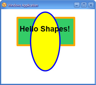
Figure 3-3: An example using the Canvas panel
 <Canvas xmlns="http://schemas.microsoft.com/2003/xaml" >
 <Rectangle
 Fill="#33CC66"
 Width="2in"       Height="1in"
 Canvas.Top="25"          Canvas.Left="50"
 StrokeThickness="6px" Stroke="Orange" />

 <Ellipse
 Fill="yellow"
 CenterX="1.5in"    CenterY="1.1in"
 RadiusX=".5in"     RadiusY="1in"
 StrokeThickness="4px"  Stroke="Blue" />

 <Text
 Canvas.Top="50" Canvas.Left="60" Foreground="#000000"
 FontWeight="Bold" FontFamily="Arial"
 FontStyle="Normal" FontSize="25">Hello Shapes!</Text>

 </Canvas>
DockPanel
The DockPanel panel arranges child elements horizontally or vertically, relative to each other. The DockPanel class examines the Dock property of each child element to determine how to align the element along the edges of the panel. You can set the Dock property to one of five values: Top , Bottom , Left , Right , or Fill .
For example, a panel aligns the first child element with its Dock property equal to Top against the top edge of the panel. The panel then aligns the next child element with its Dock property equal to Top just below the prior element. The panel similarly aligns child elements with their Dock property set to Bottom , Left, or Right . Setting the Dock property of the last child element to Fill causes it to occupy all remaining space in the DockPanel . Never follow a Dock="Fill" element with other elements because the subsequent elements will not be visible. The default value of the Dock property is Left , so when you do not set the Dock property for an element, it stacks horizontally to the left.
The Dock property is an attached property ”it s defined by the DockPanel class, but you set it on a child element like this:
<child DockPanel.Dock=Top/>
Or in code:
DockPanel.SetDock(child, Dock.Top)
The following markup uses a DockPanel and five Canvas panels to create a commonly seen user interface. The DockPanel aligns the first two canvases against the top of the DockPanel . It aligns the third canvas against the bottom edge of the DockPanel , the fourth against the left edge, and the fifth canvas fills the remaining space. You might put a menu in the top panel and a toolbar in the panel just below the menu. This decision leaves the left panel for a tree view, the bottom panel for a status bar, and the remaining panel for the detailed selected item view, as you can see in Figure 3-4.
 <Border xmlns="http://schemas.microsoft.com/2003/xaml" Background="White">
 <DockPanel>
 <Border Width="500" DockPanel.Dock="Top" BorderThickness="2,2,2,2" BorderBrush="Black" Background="#87ceeb" >
 <Text>Dock = "Top"</Text>
 </Border>
 <Border Width="500" DockPanel.Dock="Top" BorderThickness="2,2,2,2" BorderBrush="Black" Background="#87ceeb" >
 <Text>Dock = "Top"</Text>
 </Border>
 <Border Width="500" DockPanel.Dock="Bottom" BorderThickness="2,2,2,2"
 BorderBrush="Black" Background="#ffff99" >
 <Text>Dock = "Bottom"</Text>
 </Border>
 <Border Width="200" DockPanel.Dock="Left" BorderThickness="2,2,2,2" BorderBrush="Black" Background="#98fb98" >
 <Text>Dock = "Left"</Text>
 </Border>
 <Border Width="300" DockPanel.Dock="Fill" BorderThickness="2,2,2,2" BorderBrush="Black" Background="White" >
 <Text>Dock = "Fill"</Text>
 </Border>
 </DockPanel>
 </Border>
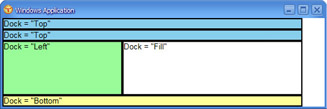
Figure 3-4: An example using the DockPanel panel
FlowPanel
The FlowPanel panel provides a number of automatic layout features and allows for complex presentations of text and graphics. You define the size of the panel using its Width and Height properties. The panel then displays its child elements in a way that best uses the panel s space, wrapping and aligning the elements as necessary. The default flow direction for a FlowPanel is from left to right and top to bottom.
The following markup example demonstrates how the FlowPanel breaks and wraps content. The FlowPanel contains four one-inch square canvases. The FlowPanel attempts to display its child elements left to right and top to bottom.
 <Border xmlns="http://schemas.microsoft.com/2003/xaml" Background="White">
 <FlowPanel>
 <Border Background="Red" Width="1in" Height="1in"/>
 <Border Background="Green" Width="1in" Height="1in"/>
 <Border Background="Blue" Width="1in" Height="1in"/>
 <Border Background="Yellow" Width="1in" Height="1in"/>
 </FlowPanel>
 </Border>
Figure 3-3 shows the output when the FlowPanel can fit all elements on a single line. Figure 3-4 demonstrates the FlowPanel wrapping the last element to a new line. Figure 3-5 shows the worst case where the FlowPanel must place each element on its own line. Figure 3-6 shows the last element wrapping to a new line, and Figure 3-7 shows every element wrapping to a new line.
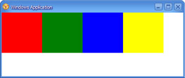
Figure 3-5: The FlowPanel breaks lines only when necessary.
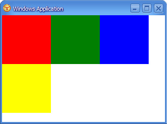
Figure 3-6: The FlowPanel panel wrapping the last element to a new line
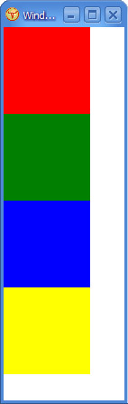
Figure 3-7: The FlowPanel panel wrapping each element to a new line
TextPanel
The TextPanel panel formats, sizes, and draws text. This panel class supports multiple lines of text as well as multiple text formats. You will typically use the TextPanel class when you need complex layout support. However, when you require only simple text display, it s better to use the Text element instead.
The following markup example demonstrates how the TextPanel breaks and wraps content. The TextPanel adjusts the number of columns and the height of each column as you resize the window.
 <Border xmlns="http://schemas.microsoft.com/2003/xaml" Background="White">
 <TextPanel
 ColumnCount="3"
 ColumnWidth="200px"
 ColumnGap="25px"
 ColumnRuleWidth="5px"
 ColumnRuleBrush="blue">

 <Block Background="LightGray">
 <Inline FontFamily="Arial" FontWeight="Bold"
 FontSize="16pt">Transcript of the
 <Italic>Nicolay Draft</Italic>
 of the Gettysburg Address.
 </Inline>
 </Block>

 </TextPanel>
 </Border>
Figure 3-8 shows the resulting output.
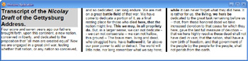
Figure 3-8: The TextPanel with multiple font characteristics, columns, and formatting
GridPanel
The GridPanel panel displays tabular data. The GridPanel supports many properties that you can use to customize the layout of the tabular data. For example, you can set the Columns and Rows properties to control the number of columns and rows in the grid. Similarly, the ColumnStyles and RowStyles properties allow you to set a collection of properties that the GridPanel applies to the rows and columns, respectively.
GridPanel arranges its children in order, starting with the upper left cell and moving to the right until the end of the row. A child can take more than one column if you set the GridPanel.ColumnSpan property on the child. Similarly, GridPanel.RowSpan allows a child to span multiple rows.
The following markup displays a Calculator user interface that looks quite similar to the Windows Calculator utility.
 <Border xmlns="http://schemas.microsoft.com/2003/xaml" Background="#DEE7F7">
 <DockPanel Dock="Left">
 <Border  BorderThickness="0,0,0,0">
 <!-- Padding="10, 10, 10, 10"  -->
 <GridPanel Columns="7">
 <GridPanel.ColumnStyles>
 <Column Width="16%"/>
 <Column Width="4%"/>
 <Column Width="16%"/>
 <Column Width="16%"/>
 <Column Width="16%"/>
 <Column Width="16%"/>
 <Column Width="16%"/>
 </GridPanel.ColumnStyles>

 <GridPanel.RowStyles>
 <Row Height="25"/>
 <Row Height="10"/>
 <Row Height="35"/>
 <Row Height="7"/>
 <Row Height="35"/>
 <Row Height="35"/>
 <Row Height="35"/>
 <Row Height="35"/>
 </GridPanel.RowStyles>

 <Border GridPanel.ColumnSpan="7" BorderBrush="#DEE7F7"
 BorderThickness="2,2,2,2" Background="White">
 <Text HorizontalAlignment="right"
 ID="CalcText">0.</Text>
 </Border>

 <Text GridPanel.ColumnSpan="7"/>

 <Border BorderThickness="0,0,0,0">
 <GridPanel>
 <Border BorderBrush="#DEE7F7" BorderThickness="2,2,2,2">
 <Text Width="16%"
 HorizontalAlignment="center"></Text>
 </Border>
 </GridPanel>
 </Border>

 <Text Width="4%"/>
 <DockPanel GridPanel.ColumnSpan="5" Dock="Left">
 <Button Width="33.33%" Foreground="Red">Backspace</Button>
 <Button Width="33.33%" Foreground="Red">CE</Button>
 <Button Width="33.33%" Foreground="Red">C</Button>
 </DockPanel>

 <Text GridPanel.ColumnSpan="7"/>

 <Button Foreground="Red">MC</Button>
 <Text/>
 <Button Foreground="Blue">7</Button>
 <Button Foreground="Blue">8</Button>
 <Button Foreground="Blue">9</Button>
 <Button Foreground="Red">/</Button>
 <Button Foreground="Blue">sqrt</Button>

 <Button Foreground="Red">MR</Button>
 <Text/>
 <Button Foreground="Blue">4</Button>
 <Button Foreground="Blue">5</Button>
 <Button Foreground="Blue">6</Button>
 <Button Foreground="Red">*</Button>
 <Button Foreground="Blue">%</Button>

 <Button Foreground="Red">MS</Button>
 <Text/>
 <Button Foreground="Blue">1</Button>
 <Button Foreground="Blue">2</Button>
 <Button Foreground="Blue">3</Button>
 <Button Foreground="Red">-</Button>
 <Button Foreground="Blue">1/x</Button>

 <Button Foreground="Red">M+</Button>
 <Text/>
 <Button Foreground="Blue">0</Button>
 <Button Foreground="Blue">+/-</Button>
 <Button Foreground="Blue">.</Button>
 <Button Foreground="Red">+</Button>
 <Button Foreground="Red">=</Button>

 </GridPanel>
 </Border>
 </DockPanel>
 </Border>
Figure 3-9 shows the resulting output.
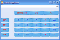
Figure 3-9: The GridPanel as a calculator
FixedPanel
The FixedPanel panel allows you to specify the exact locations and sizes of every element. Elements on a FixedPanel will always display in the same location and size on all devices. I ll discuss the FixedPanel panel later in this chapter in the Document Layout Services section.
[1] The thought of never again writing a WM_PAINT handler to draw things like this brings tears to my eyes tears of joy I hasten to add!
EAN: 2147483647
Pages: 83