| As you design an interface, you should have the palette of possibilities arrayed in your mind, much as a painter has his colors organized. The spectrum of elementary actions that a user can perform is remarkably limited. From this set of elementary actions, all user interaction is built. With a keyboard, you can tap keys or press and hold them while you perform other actions. With a GID, you can move a cursor within the bounds of the display (or displays) on your system, and you can signal the computer, using the speed, direction, and acceleration of the GID, although you usually use GID speed and acceleration only as an aid to pointing. With a GID button, you can signal display locations to which you are pointing with the cursor. These elementary actions have widely varying semantics, depending on the application being run. Pressure-sensitive graphic tablets can detect the angle at which the pen is held, which results in one or two additional numerical values being associated with each location to which the user points. Except when the user is doing freehand drawing, these parameters are rarely used. Musical keyboards may provide, as inputs to the computer, both the velocity with which the key is pressed and the pressure with which the key is being held down after being pressed. There are also joysticks and three-dimensional input devices. Nonetheless, most interaction is accomplished with a keyboard and a standard, two-dimensional GID. This section will address primarily the standard input and output devices. In many cases, it will be clear how the principles extend to more exotic physical or, eventually, mental interfaces. Having an explicit taxonomy and vocabulary of elementary actions and the elementary operations built from them is, I find, a great aid in discussing and designing interfaces. The user performs the elementary actions in various combinations to a set of elementary operations. The elementary operations are performed on content and are used in nearly every interface. We first note that content can be These elementary operations can and should be fundamental to the computer or appliance itself; that is, they should be part of the internal hardware or software rather than being reimplemented in multiple software packages, and each of them should always be invoked in the same way, regardless of on what objects they are operated. For the most part, the cognitive differences among applications lie in how selections are presented and how the user can operate on them. In a spreadsheet, values are presented in tabular form, and an operation might consist of changing a column without a sum underneath into a column with its sum underneath. In a word processor, text and illustrations are presented in page-layout form, and a typical operation is to change text from a roman typeface to an italic typeface. In a web page program, a word processor page might be changed into HTML. In a photo-processing program, an image with low contrast might be modified into one of higher contrast. Most operations performed on content can be described in terms of these elementary operations. For example, in many systems, an object can be queried about its properties. (In systems equipped with two-button GIDs, the user usually performs this function by a click of the right button when the cursor is on the object and the system is in an appropriate state.) To query is to bring up further information or options on the item, but it also can be thought of as an operation on one object that brings into view another, related object. From the user's point of view, there should not be, and there is no need for there to be, any distinction between operating-system operations and applications operations. That the interfaces of all applications arise from a small set of elementary operations confirms that the applications themselves, as rich and varied as they are from a task-oriented point of view, are not all that different from one another from an interface-oriented point of view. This fundamental similarity can be exploited to create powerful computer systems of unprecedented simplicity and productivity. First, we need to define several methods for choosing and marking content on which we want to operate. Those methods are discussed in Section 5-2-1. 5-2-1 Highlighting, Indication, and Selection Highlighting is adding, by any means, a recognizable distinction to a displayed object. The function of the highlight is to allow the user to determine, by passive observation, that the system has recognized a particular object as having a special status. The semantics of that status are dependent on the nature of the object and on the commands that the user can apply to it. For sighted users, the highlight is usually visual. Examples of visual highlighting mechanisms include brightness reversal, color change, change of contrast, underlining, blinking or other periodic change, and applying a stationary or animated border to an object. Nonvisual highlighting can be shown, for example, by different choice of voices or spoken inflection. As the user moves the cursor over objects, the object to which the cursor is pointing should be highlighted. In text, the object typically would be an individual character. Highlighting the single object pointed to as a cursor is moved, without any other user action such as clicking, is indication. With indication, the user knows at all times to what object the system thinks she is pointing. In too many present systems, the user must guess at what will be selected or activated when she clicks the GID button; if her guess is incorrect, she will have to try again, wasting time and energy. Indication can be especially valuable when the objects that the user would like to select are small and close together, when they overlap, or when their limits are unclear. Indication is necessary if an interface is designed in accord with the principle of visibility. The highlighting used for indication must not exhibit too much contrast or be overly dramatic, lest the flickering of objects become annoying as the cursor moves over them; in some situations, it may be helpful not to indicate objects when the cursor is moving faster than a threshold velocity. Note that a smaller object, as measured by the visual angle the indicated object subtends, requires higher visual contrast of the indication, but this is an ergonomic issue. Indication is underused in present systems. If you use indication aggressively in your interface design, you can eliminate a good deal of clicking inherent in present designs. In fact, indication can often replace clicking, and clicking can be used, as when you follow a link in a browser by means of a single click, in place of double clicking. For example, say that a user wants to remove inactive windows from a display. Each window has a Close button. The Macintosh operating system requires that the user first click on a window to make it active and only then click on the Close button to banish the window. This extra click the one that activates a window just so that the user can close it is especially annoying. If, however, merely moving the cursor over a window made it active, a single click on the Close button would close it. Of course, if you design a system that exhibits activation in only certain places and under only certain conditions, you will create a modal inconsistency that will bedevil users. Activation should be systemic. As it becomes more familiar, consumer demand will force its adoption. Selecting is a process by which a user identifies a set of one or more objects as having a special status that can be recognized by the system, thereby creating a selection. Usually, a user creates a selection with the intention of applying a command to it in the near future. Unlike indication's more transient highlight, the highlight that signals selection persists even after the user has moved the cursor away from the selection. The user creates a single-object selection by clicking the GID button while the object is indicated. A user can also create a selection by dragging a rectangle or other shape across a set of contiguous objects: All objects that intersect the area of the shape become selected. Another convenient method of selection is to create a polygon or free-form shape; all objects completely inside the shape are selected when the user closes the boundary of the shape. When a selection is made, the previous selection should become the old selection. (In most present systems, the old selection is simply deselected.) This process can be iterated so that a user can create, in addition to the first old selection, a second old selection, a third old selection, and so on up to an nth old selection. A mathematician would be tempted to call the current selection the zeroth old selection. The highlighting that signals selection should be distinct from and more readily apparent than that used for indication; highlighting for older selections should also make them clearly distinguishable from one another and probably of lower visual contrast than newer ones. An alphanumeric designation may have to accompany old selections so that they can be readily identified. Selection can be of discrete objects or of geometrical regions of the display, or they can be composite, consisting of the union of selections. In much of today's software, the user creates composite possibly discontiguous selections from a set of smaller selections by first making an initial selection. Then, with one common method, she presses and holds Shift and, while in this quasimode, clicks on additional objects to toggle them into or out of the selection. But this method has three drawbacks. First, the command for creating composite selections is invisible. Second, it is easy to make errors when setting up a large composite selection; for example, if the user accidentally releases the Shift key in the middle of the process and clicks on another object, the work in making the complex selection up to that point is lost. Third, the mechanism is a toggle: The same gesture deselects an object if that object was selected and selects an object if that object was not selected. The first problem lack of visibility is easily corrected, by use of an on-screen hint, for example. The second drawback is the high risk the user runs of making a mistake during the composition process. A more comfortable method for making complex selections includes a command that redefines the current selection to be the union of the old selection and the current selection. Given such a command, the user can concentrate on making a selection without any concern for what she has done previously; only after she confirms that the current selection is correct does she add it to the composite selection. Making old selections available and, of course, marked by a special highlight so that they are visible also allows multiargument commands, such as the two arguments to a command that interchanges a pair of selections. Compare your present method of interchanging two pieces of text with the following technique: Make two selections, then apply the interchange command. Most present systems do not apply their Undo and Redo commands to the process of making selections. This omission is unfortunate as errors in making selections are frequent. An essential feature of any humane interface is a universally applicable pair of Undo and Redo commands. Only the amount of available storage should limit the number (also called "levels") of undos permitted. Undo and Redo should be pervasive, applying to any operation where undoing and redoing is logically possible. They should also be again, as far as is logically possible inverse operations. Undo followed by Redo and Redo followed by Undo should cause no change to the content. Obviously, the commands should not apply to themselves. The undo and redo operators are fundamental and are of sufficient importance to deserve their own dedicated key in future systems. Redo should be Shift  , with the key cap clearly marked with the words Redo (Figure 5.1). This key would be a good replacement for the problematic Caps Lock key. , with the key cap clearly marked with the words Redo (Figure 5.1). This key would be a good replacement for the problematic Caps Lock key. Figure 5.1. An Undo/Redo key. 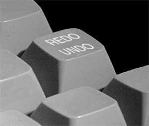
Regarding the third drawback, I described the trouble with toggles in Section 3-2, in which I suggested that toggle should not appear in a humane interface. A simple solution is to use one command or quasimode to add an object to a selection and a different command or quasimode to remove an object from a selection. Trying to add an object already selected will not change the selection, and trying to remove an object not in the selection also will not change the selection. An interface usually has one point at which its designers have interaction take place: the focus. For example, if you are a touch typist and your typing appears on the display, the place where the typing appears is the focus and, often, is colocated with your locus of attention. If you are not a touch typist, your locus of attention will alternate between the keyboard and the display. In interfaces that have a cursor, there is, at any moment, typically only one cursor. Its position is controlled by a GID, cursor-control keys, or commands, such as Find. Just as the locus of attention is always an object physical, mental, or displayed the same can be said for the system's focus. For example, in current word processors, it might seem that the cursor, when it has been clicked into a document a click that should be unnecessary is positioned between two letters, and thus, there is no object to be the focus. In fact, the focus is a pair of characters: the one to the left, which will be deleted if the next command is Delete, and the one to the right, where the next character inserted will appear. When the human is leading the interaction, the focus will usually be the current selection. When the system is responding to a human or external action, the focus will usually be the result of the action. 5-2-2 Commands Me, I have a science fiction writer's conviction that the damn robot is supposed to speak human, not the other way around. ?span>Spider Robinson Some commands, such as Undo, are keyboard commands that are not necessarily related to selections. Other commands act only with respect to the current selection, such as the command that deletes the current selection. Certain of these commands are invoked by keystrokes; however, the number of keys on a keyboard or keypad is small relative to the number of possible commands. Each additional modifier key, such as Shift, Alt, Command, Control, or Option, doubles the number of possible key combinations. A full-chord keyboard, of which the computer can recognize any combination of keys, allows an astronomical number of key combinations; for example, software that uses any three-key double-quasimode combination on a 110-key keyboard can signal any one of more than one million commands with a single gesture. However, extensive use of modifier keys, especially in combination, quickly reaches finger-twisting, mind-numbing complexity. In addition, the combinations are rarely memorable or meaningful. (Do you know what Control-Shift-Option-\tells your computer to do?) Learning arbitrary keyboard combinations is difficult; requiring such learning places an unacceptable burden on the user's memory. In addition, such commands violate the criterion of visibility unless the system displays what their effect will be whenever they can be invoked. Of course, if there are times when one of these gestures cannot be invoked or if the gesture has different meanings at different times, the system is modal with respect to that gesture, giving rise to problems discussed in Chapter 3. If you divide the system into applications such that a particular command can be reused but is given different meanings in different applications, you increase the number of commands that a user can invoke for a given number of key combinations, but reuse of commands by applications that assign those commands different meanings causes the user to make mode errors. Varying the meanings of a gesture can also place an unnecessarily heavy burden on a user's memory. This burden is partially relieved by menus, although she still has to remember in which menu the command she seeks is hidden. (She may have to first recall which application contained the desired command, especially if several applications have similar capabilities.) This process of looking through menus is sometimes trivial, but it can be frustrating, especially if the command the user seeks is a few submenus deep and if what was to the designer the obvious way to organize the menus is not obvious to the user. What is needed for invoking commands is a method that is as fast and physically simple to use as typing a few keystrokes and that also makes the commands easier and faster to find than does a menu system. We do not want to duplicate the dual method used in most popular GUIs, which includes both a slow menu-based system and an inscrutable set of keyboard shortcuts. For example, there is nothing memorable about using Command
for insert, aside from the v key's being adjacent to the slightly mnemonic c key used in Command
for "cut" or "copy." An alternative approach solves many of these problems. Assume, for the moment, that the keyboard has a key labeled Calculate. When this Calculate key is tapped, the current selection is treated as an arithmetic expression and evaluated. In the following discussion, I will use underlining to indicate selection. Suppose that your text was I want to buy 3 + 4 shirts A tap of the Calculate key would yield I want to buy 7 shirts Before using the Calculate key, the 3 + 4 was ordinary text. Except that it was selected, there was still nothing special about it; the five characters, including spaces, of which the selection was composed could have been deleted or moved, or another typical word-processing command could have been applied to it. But in this case, the operation calculate was applied. The user did not need to open a calculator window or to invoke a calculator application. Now consider that there was no dedicated Calculate key on the keyboard. (Although evaluation of mathematical expressions is certainly a candidate for a dedicated key, such a key would certainly be more valuable than many of the keys we do have, such as F9.) What we need is a more general mechanism for commands. Before discussing such a mechanism, consider the requirements for an improved method of invoking commands. They might include that It not be modal It accommodate any number of commands in particular, that it not be limited by the size of the keyboard You be able to invoke a command without taking your hands from the keyboard You be able to invoke a command with the graphical input device It not require a plethora of special keys The system not end up with too many quasimodes
One quite general method can best be introduced by means of an example. (This somewhat trivial arithmetic example is chosen to demonstrate the method; more efficient means of applying the method will be discussed later.) Assume that the text was I want to buy 3 + 4 shirts calculate Select the sum 3 + 4, and then select the word calculate, which makes the sum the old selection. In an alternative method, one that gives the power of a command line interface to the user, a tap of the Command key can be used to invoke the selected command. If the command requires an argument, the old selection is used. In this method, the command itself is deleted, and the result of the evaluation is left selected. I want to buy 7 shirts The idea is that commands need not be restricted to supplied menus but can be part of your text, or, where appropriate, the command can be a graphical object instead of a word or a set of words. It is also important that commands can be provided by the user in the simplest possible way, by merely typing or drawing them anywhere. This use does not conflict with the method in which the command is selected from preexisting text. Menus offer the advantage of making a list of commands visible. However, instead of selecting a command from a menu, the user could as easily select the command from a small document listing commands. It would not matter whether the document was provided for the user or whether she had typed it herself. Further, the document need not be limited to a bald list of commands. For example, each command could be accompanied by a description or even the user's own notes. A document that is used as a menu is an ordinary text document, not something that can be changed only by programmers or by using a special customization facility. This approach has a number of advantages. For example, an online manual automatically contains functioning examples of the commands it is describing. In present systems, a menu command might or might not have a keyboard method. But in this approach, every command described by a sequence of characters in a menu has a keyboard equivalent. This is guaranteed not by the diligence of the designers but by the very nature of the system. If you find a command in a menu, that same spelling is the keyboard equivalent. It is the keyboard equivalent to which most users will habituate. Another advantage is that you can make up a menu comprising only those commands you use, by merely typing a list of the commands in your word processor. Of course, if you continually adjust the arrangement of a list as opposed to, for instance, adding to it, you lose the advantages of habituating to their location. Just as web links in a text are often distinguished by being visually distinct for example, they are often shown in color, typically blue, and are sometimes underlined commands could be shown with some other special marking red, with reverse italics, for instance. With such a distinction, the user would point to a command name so that a letter in the command is indicated, whereupon a tap of the Command key would invoke the command. This eliminates the step of having to select the command name in invoking a command. If there were no special font or color for commands, it would be necessary to have another convention to show that a word or sequence of words was to be considered as a single command. It is wise to avoid some of the present-day conventions that are used to group separate words into a single entity delimited by spaces or other characters. For example, if there were a command that we wanted to call change to JPEG bitmap, present conventions would have us notate it as change.to.JPEG.bitmap, <change to JPEG bitmap>, or change_to_JPEG_bitmap. These notations are "computery," ugly, and discouraging, especially to newcomers to computers. The syntax we choose for commands should not keep us from putting spaces or returns in them. Any restriction in the character set we can use to name a command is likely to bite at a future time; moreover, any such restrictions have to be remembered when naming a command. Another principle to keep in mind is that use of conventions not in accord with our natural-language conventions helps make computers feel unfriendly. We must bend the machine to work the way we do rather than change our language conventions to suit what is easiest to program. Another interaction of typing and selection causes problems in current interfaces. In a humane interface, typing does not replace selected text or cause the current selection to become unselected. This is the opposite of the common convention that typing replaces the current selection, a practice that occasionally causes users considerable grief when the new material unexpectedly overlays text they did not want to delete. The idea that typing should replace a selection was introduced to save a single keystroke: In most editors, when you wish to replace a block of text, you simply select some text and then type. Without this convention, you would select some text, tap Backspace or Delete, and then enter some text. The only keystroke the current convention saves is the backspace. With the usual convention, the text vanishes at your first keystroke, and your typing is inserted. This happens whether the text to be replaced was on screen or not and (usually) whether it was a few characters or three quarters of the novel you were writing; you may be deleting text that is 40 pages away from your locus of attention. To be sure, if you notice the problem in time, you can possibly undo it. However, if you do not notice the deletion and there is nothing that lets you know that text has been deleted you may be out of luck. A humane interface never puts your work at risk; the one saved keystroke in this case is bought at too great a price; if you lose even one character inadvertently, that character might be part of a phone number or part of an e-mail address that is unguessable from the remaining text. The interface should require you to explicitly delete text if you want to delete text and not delete it as a side effect of another action. The concept of locus of attention is useful in defining what, exactly, we mean by a side effect: A side effect is an effect of a command that alters contents or events that are not your locus of attention. In the case just discussed, your locus of attention is the text being inserted, and the side effect is a deletion. The elimination of side effects should be one of the goals of any designer of humane interfaces. Another word processor feature often considered helpful is the ability to drag a selection from one place to another in text. However, this prevents you from being able to create a new selection overlapping the current selection or to create a selection that is a subselection of the current selection. If you try to create either of those selections, the system assumes that you are trying to move the selection. This means that you have to click somewhere outside the selection to deselect the selected text before you can proceed. The dragging gesture has thus been given two different meanings, namely, selection and moving a selection. This can interfere with habit formation. Errors arise because, though the characters in the selection are your locus of attention, the current state of the selection is not your locus of attention, even though it is visually indicated. I have observed users inadvertently dragging a selection when they intended to create a new selection. Another problem arises from dragging in text and also occurs in graphics applications: You will sometimes start to drag a selection only to discover that the destination is not visible on the display, in which case you have to put the selection back or into another place and change to the cut-and-paste method. The principle of monotony suggests that having only one method is preferable. Some systems begin to scroll when you bring the dragged selection to the top or the bottom of the display, but scrolling is much too slow if the destination is more than a few pages away. Scrolling can also be too fast, making it impossible to stop at, or even see, the desired destination. If marketing could be kept from screaming too loudly, I would not design an interface with drag-and-drop in text, at least as it is presently implemented on personal computers. Users accustomed to having drag-and-drop in text would, I think, find sufficient compensation for this "loss" in having a system that causes less frustration and fewer errors. It would be better still to provide separate quasimodes for selection and dragging, because you could then have both selection and drag-and-drop without cognitive interference. For example, if the GID had a button that you pressed to make selections and if it also had a facility, such as a side-mounted button, that allowed you to squeeze the GID with tactile feedback, such as a click, to let you know that the squeeze has been registered to indicate that you've grabbed a selection, there would be little or no confusion between the two functions. After a few seconds of instruction and one or two trials, you would know how to use it ever thereafter. More pedestrian methods for separating the selection and drag gestures would be to use a different mouse button for dragging or to use a quasimode, such as holding down a special duly marked key while using the main mouse button. (See Appendix A for a more detailed rationale.) Another use for a grab feature on a GID is as a replacement for scrolling. You can grab anywhere in the document and start it moving up and down: exclusively up and down for narrow documents; in any direction for wider documents. When the grab cursor cleverly indicated by the image of a hand in some present systems reaches a border of the display, scrolling continues in the present direction until the grab function is released or the cursor is moved back into the window. The customary method of scrolling via scroll bars is confusing. For example, pressing on the down-pointing scroll arrow makes the content of the screen scroll up; designing the arrows the other way around is only slightly more confusing. In addition, scroll-bar arrows are small features and therefore time consuming to use; being able to grab anywhere on the document is much faster, as a Fitts' law analysis readily shows. The example of the need for a grab function on a mouse incidentally demonstrates that working on software interface design often generates ideas for improved hardware, just as hardware considerations can inspire improvements in the software design. It is always better to design hardware and software together, although opportunities to do so are rare. Trying to shoehorn a pure software interface into hardware designed for another interface is seldom completely satisfactory. Nonetheless, for most projects, that is what we must do. 5-2-3 Display States of Objects A humane-interface feature must be both accessible to the naive and efficient for the expert, and the transition from one to the other should not demand retraining; a good interface should provide the user with one mental model that works for both classes of user recalling, of course, that we are beginners or experts for different parts of a system independently. In the previous section, it was proposed that a key that executes text as commands can be used with selected text, whatever its source, to cause a command to be executed, assuming that the selected text is the name of a command; otherwise, there is no effect on the content. It is convenient to also allow the Command key to be held to create a quasimode during which a command can be typed. The convenience is highly dependent on the ergonomics of the Command keys. This last feature is an improvement on command line systems, which are much loved for their speed and convenience of operation and much hated for the difficulty with which they are learned. The improvements are two: You can issue the commands anywhere and at any time, and the commands are identical to those appearing on menus, so that the transition from menu to direct command is trivial. Because it would be a waste of time and display space to designate a special location for typing commands, a command should be typed wherever the cursor happens to be at the moment the need for the command becomes apparent. The typed command name should be deleted after being executed, so that command names are not left scattered among your content. On the other hand, when you execute a command from a list of commands, you do not want the command to disappear; in effect, the list is a menu. To create such a menu, nothing more is needed than to type a list of commands, select the list, and then use a command, perhaps called Make Menu, that can change them to a distinctive style typically used only for commands and, at the same time, lock the list of items so that it cannot be inadvertently changed. Here are some other commands that change the state of text. One convenience is to be able to simply lock text or other content, with a Lock command. Locked content can be seen, selected, and copied but cannot be changed or moved. The inverse, Unlock, can be applied to selected content and will unlock the selection if the selection was locked. (Otherwise, it has no effect; it must not toggle.) Another command, Lock with Password, locks the old selection, using the current selection as the password. It, too, has an inverse (Unlock with Password). Locked content has a wide range of utility; for example, it can be used to create forms to be filled out. The fixed parts of the form are locked or password locked. Simple locking prevents accidental changes; password locking prevents unauthorized changes. If the online instruction manual to a computer system were included as part of the text that the computer initially came with which is not a bad idea the online manual would probably be password locked at the factory. Screen Lock and Screen Unlock lock and unlock the position of selected objects with respect to the display. With this facility, you can create menus that stay in place on the display as other objects move underneath them: You could simulate today's fixed-position menus. (Whether this is a good use of this facility is a different question.) To use this command, you would place the object as desired with respect to the screen, select it, and use the Screen Lock command. There could be a password-protected version of this as well, for occasions when it is undesirable for the user to redesign the menus. Another useful command is one that controls the transparency of a selection. In some situations, such as when displaying error messages, it is useful to render the selection transparent enough so that underlying material can be seen and operated through (Figure 5.2). Similarly, another command could specify whether an object hides or is hidden by or is viewed through another object. A transparent message box can fade gradually instead of abruptly, giving you time to notice it. A document that stores all messages for later review is essential. Figure 5.2. A transparent error message over background text has an efficiency of 1. 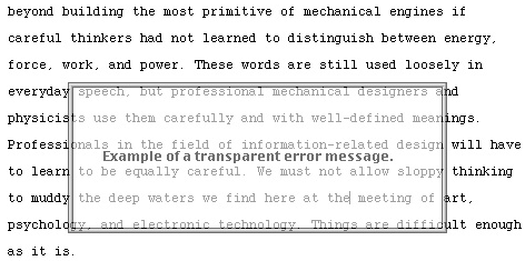
Because you can click through a transparent dialog box, removing it requires no keystrokes; it is modeless and highly efficient, with an efficiency of 1. As with any method, this idea has its limitations and can be overused; a deluge of unnecessary messages is still distracting, even if they disappear when the user proceeds. In accord with the principle of visibility, a visible distinction should be provided to allow a user to determine whether text is locked, screen locked, locked with a password, and so forth. A humane-interface principle is that the system itself should be built out of the same kind of pieces with which you are familiar from your everyday use of the system. This makes your product less forbidding. |
