3.4 Selecting from a Set of Values
| Next to free-form input, user selection based on a set of constraints is perhaps one of the most common facilities provided by user interfaces today. Such selection often manifests itself in a visual interface in the form of pull-down lists or radio buttons . When using smaller sized devices, for example, digital cameras or cell phones, such selections show up as nested menus that progressively guide the user to a specific selection. XForms defines selection controls based on the functionality provided, rather than their appearance in a given environment. This design has the advantage of capturing the underlying intent in a given user interaction rather than its mere visual appearance. Thus, consider a selection control that allows one to specify one's gender by picking from a pair of mutually exclusive values. Rendering such a control as a group of radio buttons may be appropriate for a visual interface; however, designing the user interface markup based on this choice of presentation leads to content that fails to capture sufficient information. For instance, the HTML markup shown in Figure 3.8 does not explicitly capture the underlying intent of the user interaction being authored . An ideal auditory representation of the user interface created by Figure 3.8 might be to produce a spoken prompt of the form Figure 3.8 HTML radio buttons fail to capture the intent underlying the user interface.< fieldset > < input id ="g1" type ="radio" checked ="checked" value ="m" name ="gender"/> < label for ="g1">Male</ label > < input id ="g2" type ="radio" value ="f" name ="gender"/> < label for ="g2">Female</ label ></ fieldset >
As a consequence of the HTML markup in Figure 3.8 failing to capture explicitly the relationship among the radio buttons, providing the desired nonvisual presentation of this control becomes difficult. Capturing the appearance of a user interface, rather than its underlying intent, can make it significantly harder to retarget an application to different modalities and devices. Notice further that the markup in Figure 3.8 uses HTML construct Contrast this with the XForms version of the same user interface shown in Figure 3.9; here, the interface is accessible by design since the user interface labels are a mandatory part of the markup making up the control. Notice further that when working with the HTML markup shown in Figure 3.8, the relationship among the radio buttons needs to be inferred from the fact that both controls have an identical value of gender for attribute name . The XForms markup makes this fact explicit by encapsulating the available choices as child elements of control Figure 3.9 XForms user interface markup for picking from a pair of mutually exclusive values.< select1 xmlns ="http://www.w3.org/2002/xforms" ref ="/person/gender">< label >Gender</ label > < item >< label >Male</ label > < value >m</ value ></ item > < item >< label >Female</ label > < value >f</ value ></ item > </ select1 > Finally, notice that there is no means of explicitly associating a label for the group of radio buttons in the HTML markup. The XForms version of the same control can encapsulate label Gender as an immediate child of element 3.4.1 Types of Selection Controls Presentation and interaction behavior aside, selection controls can be characterized by the atomic or list nature of the data they collect. XForms defines selection control
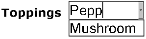
Consider the selection control used in a questionnaire that allows the respondent to specify one of two gender values, M or F . These values are mutually exclusive, that is, the user can pick one and only one of the available values. A typical visual interface might render this control as a group of two radio buttons, and the result of user interaction with such a user interface control is an atomic value. Contrast this with a U.S. tax form that lets users specify the states in which they worked during a given calendar year. Users can pick one or more values from the 50 states; here the selections are not mutually exclusive. This control might be rendered by a typical visual interface as a pull-down list, and the result of user interaction with this control is a list of one or more states. Controls 3.4.2 Open and Closed Selections Selections such as picking a state from a list of available states require the user to pick from the set of choices; such controls are called closed selections. Contrast this with a user interface where the user can pick from a set of predetermined choices, or alternatively specify a conceptual other value, that is, a value that does not appear in the set of predefined values. Such controls are called open selections. XForms selections controls Figure 3.10 Open selections permit selecting from a set as well as free-form input.< select xmlns ="http://www.w3.org/2002/xforms" ref ="/pizza/topping" selection ="open"> < label >Toppings</ label > < item >< label >Mushrooms</ label > < value >mushrooms</ value ></ item > ...</ select > Figure 3.11. Open selections permit selecting from a set as well as free-form input. 3.4.3 Default SelectionSelection controls often come with one or more default choices already selected when appropriate. In the HTML example shown in Figure 3.8, this is achieved by setting attribute checked to the value checked . Notice that the equivalent XForms example shown in Figure 3.9 does not have any of the choices checked . The question therefore arises as to how one specifies default choices when using XForms. The missing checked attribute in the XForms version of the selection controls is a consequence of the separation of the model from the interaction present in the XForms design. The values selected via the selection controls Figure 3.12 XForms model fragment for gender picker.< model xmlns ="http://www.w3.org/2002/xforms" id ="p1"> < instance > < person xmlns ="">... < gender >m</ gender >... </ person ></ instance > </ model > The design shown earlier has numerous advantages over the traditional HTML design of specifying default values within the user interface markup.
3.4.4 Selections Using Static ChoicesThe previous section described how the XForms model is used to provide default values for user interface controls, including the various selection controls. Viewed from the viewpoint of separating the model from the interaction, the selection controls as shown so far do not go all the way with respect to this separation. Notice also that in the examples shown so far, the available choices, including the values that get stored in the model, appear in the user interface markup. This design pattern was adopted intentionally to smooth the transition from traditional HTML forms to XForms. One consequence of authoring the available choices within the user interface controls is that the choices become static , that is, the available choices need to be determined at the time the XML markup is authored. However, this design works well only in cases where the available choices are known at authoring time. The next section describes XForms constructs that allow the author to move the available choices from the user interface markup to the XForms model. This introduces a level of indirection that enables the creation of dynamic selections. Lacking this facility, today's HTML authors resort to browser-specific scripting in order to update dynamically the list of available choices as the user interacts with an application. 3.4.5 Dynamic Selections Dynamic selections in XForms are enabled by having selection controls refer to a portion of the XForms model that contains the choices rather than enumerating these choices directly within the user interface markup. Element Referring to such sets comes naturally to XPath, which has been designed to work with sets of nodes. In fact, XPath locators always evaluate to node-sets . In the examples shown so far in this book, we have used XForms binding expressions that needed to select a single node; we consequently specified such expressions using attribute ref . When attribute ref is used, XForms processors use the first element of the resulting node-set. Binding expressions that wish to operate on an entire node-set use binding attribute nodeset instead of attribute ref . To summarize,
To return to the topic of dynamic selections, element Figure 3.13 Book catalog used to provide available choices.< head xmlns:xf ="http://www.w3.org/2002/xforms"> < xf:model id =" bookshelf "> < xf:instance xmlns =""> < shelf >< books-picked /></ shelf > </ xf:instance > </ xf:model > < xf:model id ="catalog"> < xf:instance xmlns =""> < catalog > < book isbn ="0-2014-8541-9"> < title >Art of Computer Programming</ title > < author >Donald E. Knuth</ author > </ book > < book isbn ="0-7923-9984-6"> < title >Auditory User Interfaces</ title > < author >T. V. Raman</ author > </ book >... </ catalog ></ xf:instance > </ xf:model ></ head > Figure 3.14 Available choices can be updated dynamically.< select xmlns ="http://www.w3.org/2002/xforms" model ="bookshelf" ref ="/shelf/books-picked"> < label >Select books</ label > < itemset model ="catalog" nodeset ="/catalog/book"> < label ref ="title"/>< value ref ="@isbn"/> </ itemset ></ select > Figure 3.15. Visual presentation of the bookstore user interface.
In the case of this example, an XForms processor can dynamically update the available books during user interaction. This is because the choices are not statically authored within the user interface control; instead, like the XForms user interface controls, the choices too are bound to the model. Thus, dynamically updating the available choices in the model results in the user interface being refreshed to display the newly available choices. 3.4.6 Selecting XML StructuresIn the examples shown so far, selection controls have been used to pick atomic data types from a set of choices. When viewing XForms as the means to edit and manipulate XML structures interactively from within a Web browser, it is often useful to select entire XML subtrees as opposed to just selecting atomic data types such as strings and numbers . As an example, we stored the isbn of the book being selected in the example shown in Figure 3.14. Consider an example where the entire book structure is to be stored in the bookshelf model. In this case, the storage value is not a string value as was the case when storing the isbn ; instead, here we are copying the entire book structure to the bookshelf model. XForms enables this via element Element Figure 3.16 Bookshelf stores complete book structure.< head xmlns:xf ="http://www.w3.org/2002/xforms"> < xf:model id ="bookshelf1"> < xf:instance xmlns =""> < shelf > < books-picked /> < book >...</ book > </ shelf > </ xf:instance > </ xf:model > < xf:model id ="catalog"> < xf:instance xmlns =""> < catalog > < book isbn ="0-7923-9984-6"> < title >Auditory User Interfaces</ title > < author >T. V. Raman</ author > </ book >... </ catalog > </ xf:instance > </ xf:model ></ head > Figure 3.17 Element |
| | Use element |
| | Use element |
3.4.7 Grouping Available Choices
Navigating through large lists of choices can become cumbersome when using small-sized displays or nonvisual modalities such as speech. Imposing additional structure on the available choices can help in presenting a more usable interface in such cases. Element  choices
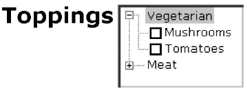
  provides functionality similar to that provided by HTML optgroup ; however it has better support for attaching labels to each group of choices. We demonstrate this with an example in Figure 3.18 along with the corresponding visual presentation in Figure 3.19.
Figure 3.18 Grouping available choices.
< select xmlns ="http://www.w3.org/2002/xforms" ref ="/pizza/topping" selection ="open"> < label >Toppings</ label > < choices >< label >Vegetarian</ label > < item >< label >Mushrooms</ label > < value >mushrooms</ value ></ item > < item >< label >Tomatoes</ label > < value >tomatoes</ value ></ item > </ choices > < choices >< label >Meat</ label > < item >< label >Pepperoni</ label > < value >pepperoni</ value ></ item > < item >< label >Salami</ label > < value >salami</ value ></ item > </ choices > </ select >
Figure 3.19. Visual presentation of a hierarchical selection control.
3.4.8 Rendering Selection Controls
Attribute appearance can be used to influence the concrete representation used for a selection control. XForms 1.0 recommends the interpretation that follows for the predefined values of attribute appearance when used with selection controls.
| minimal | Requests a presentation that takes a minimal amount of display real estate. A visual browser might choose to render selection controls having appearance=minimal as a pop-up list. |
| compact | Requests a presentation that displays some of the available choices with facilities for navigating through the remaining choices. Visual browsers render such controls as scrolling lists. |
| full | Requests that all of the available choices be displayed if possible. Visual interfaces use radio buttons in the case of |