3.5 Selecting from a Range of Values
| Modern user interfaces provide widgets such as sliders and rotary dials, for example, volume controls. Such user interface controls can be viewed as a special case of selection control where the underlying set of choices has additional structure in that the available values are well ordered. XForms defines a generic range control that can be used to pick a value from a set of well-ordered values. Element Figure 3.20 Volume control authored using element |
| start | Optional attribute start specifies the start value to be made available by the control. By default, the start value is the minimum permissible value as defined in the model. |
| end | Optional attribute end specifies the maximum value to be made available by this control. By default, the end value is the maximum permissible value as defined in the model. |
| step | Attribute step determines the offset used when moving through the set of available values. If specified, it should be appropriate for expressing the difference between two valid values from the underlying set of values. As an example, when picking from an ordered set of numbers , for example, when setting the volume, specifying step=5 would change the volume in steps of 5. |
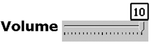
Notice that the volume control shown in Figure 3.20 uses the minimum and maximum permissible values defined in the model rather than further constraining these via attributes start and end . Attribute step specifies that the volume should be changed in steps of 5. Attribute appearance is set to full to request that the control be presented with the full range of available values; as a result, a visual interface might present this control as a slider that shows both the minimum and maximum acceptable values ”see Figure 3.21.
Figure 3.21. Visual rendering of a volume control created using  range
range  .
.
In contrast, specifying a value of minimal for attribute appearance might result in a presentation that takes up less display real estate.
Specialized widgets such as rotary controls or spin dials might be requested by specifying a namespace qualified value such as
appearance="my:dial".
This is similar to requesting a custom date picker as illustrated in Section 3.3. Notice that this design permits the author to create user interfaces that degrade gracefully, that is, the control can be presented as a spin dial on a device that makes such a widget available; however, the interface is still usable on a device that does not contain a spin dial widget. Alternatively, devices that contain a spin dial might choose to use that representation for presenting all range controls; this enables the XForms author to create user interfaces that eventually get delivered in a manner that is optimal for the target device.