Slider, Spin Button, and ToolTip Controls
Now that you're familiar with the general characteristics of the common controls, let's look at specifics for a few of the control types. We'll start with sliders, spin buttons, and ToolTip controls, which are all relatively simple to program and which are also generic enough that they can be put to use in a variety of applications. After we've looked at these controls and the corresponding MFC control classes, we'll write a sample program that uses a slider control and a pair of spin buttons in a dialog box and also uses a ToolTip control to provide context-sensitive help. Rather than use a raw CToolTipCtrl to implement the ToolTip control, we'll use CToolTipCtrl as a base class for a class of our own and add a pair of handy member functions that correct a rather severe deficiency in MFC's ToolTip implementation.
Slider Controls
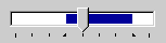
Slider controls, also known as trackbar controls, are similar to the sliding volume controls found on many radios and stereo systems. A slider has a thumb that moves like the thumb in a scroll bar. After you create a slider, you set the minimum and maximum values representing the extremes of the thumb's travel and optionally set the initial thumb position. The user can then reposition the thumb by dragging it with the left mouse button or clicking the channel in which the thumb slides. When a slider has the input focus, its thumb can also be moved with the arrow keys, the Page Up and Page Down keys, and the Home and End keys. A simple function call returns an integer representing the thumb position. If desired, you can respond to positional changes as the thumb is moved by processing control notifications. Figure 16-2 shows what a simple slider control looks like. Tick marks denote the positions the thumb can assume.
Figure 16-2. A horizontal slider with tick marks denoting thumb stops.
The table below shows slider-specific control styles. A slider can be oriented horizontally or vertically. The default orientation if neither TBS_HORZ nor TBS_VERT is specified is horizontal. The TBS_AUTOTICKS style marks thumb stops with tick marks. If the slider's range is 0 through 8, TBS_AUTOTICKS creates nine tick marks—one at each end of the slider and seven in between. TBS_NOTICKS removes the tick marks altogether, and TBS_NOTHUMB creates a slider that has no thumb. If you specify neither TBS_AUTOTICKS nor TBS_NOTICKS, the slider has a tick mark at each end but none in between. By default, tick marks are drawn below a horizontal slider and to the right of a vertical slider. You can move the tick marks to the top or the left by specifying TBS_TOP or TBS_LEFT, or you can use TBS_BOTH to create a slider that has tick marks both above and below or to its right and left.
Slider Control Styles
| Style | Description |
|---|---|
| TBS_HORZ | Orients the slider horizontally. |
| TBS_VERT | Orients the slider vertically. |
| TBS_LEFT | Draws tick marks to the left of a vertical slider. |
| TBS_RIGHT | Draws tick marks to the right of a vertical slider. |
| TBS_TOP | Draws tick marks above a horizontal slider. |
| TBS_BOTTOM | Draws tick marks below a horizontal slider. |
| TBS_BOTH | Draws tick marks both above and below a horizontal slider or to the left and right of a vertical slider. |
| TBS_NOTICKS | Removes tick marks from the slider. |
| TBS_AUTOTICKS | Positions a tick mark at each stop in the slider's range. |
| TBS_FIXEDLENGTH | Allows the thumb size to be modified by sending the control a TBM_SETTHUMBLENGTH message. |
| TBS_NOTHUMB | Removes the thumb from the slider. |
| TBS_ENABLESELRANGE | Widens the slider's channel so that a selection range can be displayed. |
| TBS_TOOLTIPS* | Adds a dynamic ToolTip control that moves with the thumb and displays the thumb position. Use CSliderCtrl::SetToolTips to replace the default ToolTip control with one of your own. |
* Requires Internet Explorer 3.0 or later
MFC represents sliders with the CSliderCtrl class. A slider's range and thumb position are set with CSliderCtrl::SetRange and CSliderCtrl::SetPos. The related CSliderCtrl::GetRange and CSliderCtrl::GetPos functions retrieve range and position information. If m_wndSlider is a CSliderCtrl, the statements
m_wndSlider.SetRange (0, 8); m_wndSlider.SetPos (2); |
set the slider's range to 0 through 8 and its thumb position to 2.
A slider control assigned the style TBS_AUTOTICKS draws tick marks at each incremental thumb position. You can adjust the distance between tick marks with CSliderCtrl::SetTicFreq. The following statement configures a slider control to draw tick marks at every other thumb stop:
m_wndSlider.SetTicFreq (2); |
To create a slider with tick marks at irregular intervals, omit the TBS_AUTOTICKS style and use CSliderCtrl::SetTic to put tick marks where you want them. The statements
m_wndSlider.SetRange (0, 8); m_wndSlider.SetTic (2); m_wndSlider.SetTic (3); m_wndSlider.SetTic (6); m_wndSlider.SetPos (2); |
place tick marks at 2, 3, and 6 in addition to the ones drawn at 0 and 8.
The TBS_ENABLESELRANGE style creates a slider with a wide channel suitable for displaying a selection range. The selection range is set with CSliderCtrl::SetSelection and is represented by a bar drawn in the system color COLOR_HIGHLIGHT. The statements
m_wndSlider.SetRange (0, 8); m_wndSlider.SetSelection (3, 7); |
set the range to 0 through 8 and the selection to 3 through 7, producing the slider seen in Figure 16-3. Setting a selection doesn't limit the thumb's travel; the thumb can still be positioned anywhere in the slider range. If you want to limit the thumb's travel to the selection range or allow the user to alter the selection, you must implement a custom slider control UI. The most practical approach to customizing the UI is to derive a class from CSliderCtrl and add message handlers that change the way the control responds to presses of the Home, End, Page Up, Page Down, and arrow keys and clicks of the left mouse button. To perform default processing on selected messages, simply pass those messages to the base class.
Figure 16-3. A slider with a selection range.
As its thumb is moved, a slider sends its parent WM_HSCROLL or WM_VSCROLL messages as a scroll bar does. An OnHScroll or OnVScroll handler for a slider control receives three parameters: a notification code, an integer specifying the latest thumb position, and a CScrollBar pointer that can be cast to a CSliderCtrl pointer. The table below shows the nine possible notification codes and the actions that generate them. The thumb position passed to OnHScroll or OnVScroll is valid only when the notification code is TB_THUMBPOSITION or TB_THUMBTRACK. Use CSliderCtrl::GetPos to retrieve the thumb position in response to other types of notifications.
Slider Notifications
| Notification | Sent When |
|---|---|
| TB_TOP | The Home key is pressed while the slider has the input focus. |
| TB_BOTTOM | The End key is pressed while the slider has the input focus. |
| TB_LINEDOWN | The down or right arrow key is pressed while the slider has the input focus. |
| TB_LINEUP | The up or left arrow key is pressed while the slider has the input focus. |
| TB_PAGEDOWN | The Page Down key is pressed while the slider has the input focus, or the channel is clicked right of the thumb in a horizontal slider or below the thumb in a vertical slider. |
| TB_PAGEUP | The Page Up key is pressed while the slider has the input focus, or the channel is clicked left of the thumb in a horizontal slider or above the thumb in a vertical slider. |
| TB_THUMBTRACK | The thumb is dragged to a new position with the mouse. |
| TB_THUMBPOSITION | The left mouse button is released after the thumb is dragged. |
| TB_ENDTRACK | The key or mouse button used to move the thumb to a new position is released. |
One use for slider notifications is for dynamically updating an image on the screen in response to positional changes. The Settings page of the system's Display Properties property sheet, which you can display by right-clicking the desktop and selecting Properties from the context menu, processes TB_THUMBTRACK notifications from the slider in the Screen Area box and redraws an image of the computer screen each time the thumb moves to preview the effect the new setting will have on the desktop.
CSliderCtrl provides more than two dozen functions you can use to operate on slider controls. Other useful member functions include SetPageSize, which sets the number of units the thumb moves when the channel is clicked with the mouse or when Page Up or Page Down is pressed; GetTic, GetTicPos, GetTicArray, and GetNumTicks, which return information about tick marks; and ClearSel, which removes a selection range. See the MFC documentation for more information regarding these and other CSliderCtrl function members.
Spin Button Controls
Spin button controls, which are also known as up-down controls, are small windows containing arrows that point up and down or left and right. Like scroll bars and sliders, spin buttons maintain their own ranges and positions. Clicking the up or right arrow increments the current position, and clicking the down or left arrow decrements it. Spin button controls send their parents notification messages before and after each positional change, but often those notifications are ignored because spin buttons are capable of doing some extraordinarily useful things on their own.
You can choose from the styles shown in the following table when you create a spin button control. UDS_SETBUDDYINT creates a spin button control that automatically updates an integer value displayed in a "buddy" control, which is typically an edit control or a static text control. When a UDS_SETBUDDYINT-style spin button control undergoes a positional change, it converts the integer describing the new position into a text string (think _itoa) and uses ::SetWindowText to display the string in its buddy. UDS_SETBUDDYINT makes it trivial to add a set of arrows to an edit control so that the user can enter a number by either typing it at the keyboard or dialing it in with the mouse.
Spin Button Control Styles
| Style | Description |
|---|---|
| UDS_HORZ | Orients the arrows horizontally rather than vertically. |
| UDS_WRAP | Causes the position to wrap around if it's decremented or incremented beyond the minimum or maximum. |
| UDS_ARROWKEYS | Adds a keyboard interface. If a spin button control with this style has the input focus, the up and down arrow keys increment and decrement its position. |
| UDS_NOTHOUSANDS | Removes thousands separators so that 1,234,567 is displayed as 1234567. |
| UDS_SETBUDDYINT | Creates a spin button control that updates the text of a designated buddy control when the position is incremented or decremented. |
| UDS_AUTOBUDDY | Selects the previous control in the z-order as the spin button's buddy. |
| UDS_ALIGNRIGHT | Attaches the spin button control to the right inside border of its buddy. |
| UDS_ALIGNLEFT | Attaches the spin button control to the left inside border of its buddy. |
You can connect a spin button control to its buddy in two ways. You can explicitly link the two by calling CSpinButtonCtrl::SetBuddy with a CWnd pointer identifying the buddy control, or you can specify UDS_AUTOBUDDY when creating the spin button control, which automatically selects the previous control in the z-order as the spin button's buddy. In a dialog template, the statements
EDITTEXT IDC_EDIT, 60, 80, 40, 14, ES_AUTOHSCROLL CONTROL "", IDC_SPIN, "msctls_updown32", UDS_SETBUDDYINT ¦ UDS_AUTOBUDDY ¦ UDS_ALIGNRIGHT, 0, 0, 0, 0 |
create a single-line edit control and attach a spin button control to its right inside border, as shown in Figure 16-4. The edit control is shrunk by the width of the spin button control, and the spin button's height is adjusted to match the height of its buddy. Consequently, the edit control and the spin button control together occupy the same amount of space as the original edit control. Information regarding a spin button control's size and position is ignored when UDS_ALIGNLEFT or UDS_ALIGNRIGHT is specified.
Figure 16-4. A spin button control attached to an edit control.
By default, a UDS_SETBUDDYINT spin button control displays numbers in decimal format and inserts a thousands separator every third digit. You can configure the control to display hexadecimal numbers instead with CSpinButtonCtrl::SetBase:
m_wndSpinButton.SetBase (16); |
Hex numbers are preceded by 0x characters so that it's obvious they are hexadecimal. Calling SetBase with a 10 switches output back to decimal format. You can remove separators from decimal numbers by specifying UDS_NOTHOUSANDS when you create the control; thousands separators are omitted from hex numbers by default.
You set a spin button control's range and position with CSpinButtonCtrl::SetRange and CSpinButtonCtrl::SetPos. Valid minimums and maximums range from 32,767 through 32,767, but the difference between the low and high ends of the range can't exceed 32,767. It's legal to specify a maximum that's less than the minimum. When you do, the actions of the arrows are reversed. On systems with Internet Explorer 4.0 or later installed, spin button controls support 32-bit ranges whose minimums and maximums can be set and retrieved with the aptly named CSliderCtrl functions SetRange32 and GetRange32.
Each discrete click of an arrow in a spin button control (or press of an arrow key if the control's style includes UDS_ARROWKEYS) increments or decrements the position by 1. If you press and hold a button, the increments change to ±5 after 2 seconds and ±20 after 5 seconds. You can alter the number of seconds that elapse before the incremental value changes and also control the magnitude of the changes with CSpinButtonCtrl::SetAccel. SetAccel accepts two parameters: a pointer to an array of UDACCEL structures and the number of structures in the array. The following statements configure a spin button control to increment or decrement the position by 1 for the first 2 seconds, 2 for the next 2 seconds, 10 for the next 2 seconds, and 100 for the remainder of the time a button is held down:
UDACCEL uda[4]; uda[0].nSec = 0; uda[0].nInc = 1; uda[1].nSec = 2; uda[1].nInc = 2; uda[2].nSec = 4; uda[2].nInc = 10; uda[3].nSec = 8; uda[3].nInc = 100; pSpinButton->SetAccel (4, uda); |
Another use for SetAccel is to specify incremental values other than 1. If you'd like each button click to increment or decrement the position by 5, call SetAccel like this:
UDACCEL uda; uda.nSec = 0; uda.nInc = 5; pSpinButton->SetAccel (1, &uda); |
You can retrieve accelerator values by passing the address of an array of UDACCEL structures to CSpinButton::GetAccel. But there's a trick: How do you know how many structures to allocate space for? This fact wasn't documented prior to Visual C++ 6, but calling GetAccel as shown here returns the number of UDACCEL structures in the accelerator array:
UINT nCount = pSpinButton->GetAccel (0, NULL); |
Once the count is known, you can allocate a buffer for the array and retrieve it like this:
UDACCEL* puda = new UDACCEL[nCount]; pSpinButton->GetAccel (nCount, puda); // Do something with the array. delete[] puda; |
See? Nothing to it when you know the secret.
Before its position is incremented or decremented, a spin button control sends its parent a WM_NOTIFY message with a notification code equal to UDN_DELTAPOS and an lParam pointing to an NM_UPDOWN structure. Inside the structure are integers specifying the current position (iPos) and the amount by which the position is about to change (iDelta). A UDN_DELTAPOS handler must set *pResult to FALSE to allow the change to occur. To purposely prevent an increment or decrement operation being carried out, have the handler set *pResult to TRUE, and then return TRUE from OnNotify. UDN_DELTAPOS notifications are followed by WM_HSCROLL or WM_VSCROLL messages (depending on whether the spin button is oriented horizontally or vertically) reporting the new position. Clicking the down arrow when the control's current position is 8 produces the following sequence of messages.
| Message | Notification Code | Parameters |
|---|---|---|
| WM_NOTIFY | UDN_DELTAPOS | iPos=8, iDelta=-1 |
| WM_VSCROLL | SB_THUMBPOSITION | nPos=7 |
| WM_VSCROLL | SB_ENDSCROLL | nPos=7 |
If the button is held down for more than a half second or so, several UDN_DELTAPOS and SB_THUMBPOSITION notifications are sent in sequence.
ToolTip Controls
A ToolTip is a miniature help-text window that appears when the cursor pauses over a "tool" such as a button on a toolbar or a control in a dialog box. A ToolTip control is a control that monitors mouse movements and automatically displays a ToolTip when the cursor remains motionless over a tool for a predetermined period of time. MFC provides a convenient C++ interface to ToolTip controls through the CToolTipCtrl class. With CToolTipCtrl to help out, it's relatively easy to add ToolTips to controls in dialog boxes and implement other forms of interactive help. You simply create a ToolTip control and register the tools for which you'd like ToolTips displayed and the text of the ToolTips. For the most part, the control does the rest.
CToolTipCtrl::Create creates a ToolTip control. (ToolTip controls can also be created from dialog templates, but the more common approach is to add a CToolTipCtrl data member to the dialog class and call Create from OnInitDialog instead.) If m_ctlTT is a CToolTipCtrl data member of a window class, the statement
m_ctlTT.Create (this); |
creates a ToolTip control. CToolTipCtrl::Create accepts an optional second parameter specifying the control's style. The only two styles supported are TTS_ALWAYSTIP and TTS_NOPREFIX. By default, ToolTips appear over active windows only. A TTS_ALWAYSTIP-style ToolTip control displays ToolTips over both active and inactive windows. TTS_NOPREFIX tells the control not to strip ampersands from ToolTip text. The default behavior is to ignore ampersands so that you can use the same text strings for menus and ToolTips.
After you create a ToolTip control, the next step is to add tools to it. A tool is either another window—usually a child window control that belongs to the ToolTip control's parent—or a rectangular area of a window. CToolTipCtrl::AddTool registers a tool and the ToolTip text that goes with it. One ToolTip control can have any number of tools associated with it. The statement
m_ctlTT.AddTool (pWnd, _T ("This is a window"), NULL, 0); |
assigns the ToolTip text "This is a window" to the window identified by pWnd. The second parameter passed to AddTool can be a pointer to a text string or the ID of a string resource, whichever you prefer. Similarly, the statement
m_ctlTT.AddTool (pWnd, _T ("This is a rectangle"), CRect (32, 32, 64, 64), IDT_RECTANGLE); |
creates a tool from the specified rectangle in pWnd's client area. IDT_RECTANGLE is a nonzero integer that identifies the rectangle and is analogous to a child window ID identifying a control.
So far, so good. There's just one problem. A ToolTip control has to be able to see the mouse messages a tool receives so that it can monitor mouse events and know when to display a ToolTip, but Windows sends mouse messages to the window underneath the cursor. In the examples above, it's up to you to forward mouse messages going to pWnd to the ToolTip control. If pWnd corresponds to a top-level window or a dialog box, forwarding mouse messages is no big deal because you can map the relevant mouse messages to handlers in the window class or dialog class and relay them to the ToolTip control with CToolTipCtrl::RelayEvent. But if pWnd points to a child window control or any window other than your own, you have to resort to window subclassing or other devices in order to see mouse messages going to the window and relay them to the ToolTip control. Late in the beta cycle of Windows 95, the operating system architects recognized this problem and gave ToolTip controls the ability to do their own subclassing. Unfortunately, this feature has yet to be folded into CToolTipCtrl. So to make ToolTips truly easy to use, you must customize the CToolTipCtrl class by adding some smarts of your own.
Whenever I use a ToolTip control in an MFC application, I first derive a class from CToolTipCtrl named CMyToolTipCtrl and add a pair of member functions that take advantage of the fact that a ToolTip control can do its own subclassing. Here's what the derived class looks like:
class CMyToolTipCtrl : public CToolTipCtrl { public: BOOL AddWindowTool (CWnd* pWnd, LPCTSTR pszText); BOOL AddRectTool (CWnd* pWnd, LPCTSTR pszText, LPCRECT pRect, UINT nIDTool); }; BOOL CMyToolTipCtrl::AddWindowTool (CWnd* pWnd, LPCTSTR pszText) { TOOLINFO ti; ti.cbSize = sizeof (TOOLINFO); ti.uFlags = TTF_IDISHWND ¦ TTF_SUBCLASS; ti.hwnd = pWnd->GetParent ()->GetSafeHwnd (); ti.uId = (UINT) pWnd->GetSafeHwnd (); ti.hinst = AfxGetInstanceHandle (); ti.lpszText = (LPTSTR) pszText; return (BOOL) SendMessage (TTM_ADDTOOL, 0, (LPARAM) &ti); } BOOL CMyToolTipCtrl::AddRectTool (CWnd* pWnd, LPCTSTR pszText, LPCRECT lpRect, UINT nIDTool) { TOOLINFO ti; ti.cbSize = sizeof (TOOLINFO); ti.uFlags = TTF_SUBCLASS; ti.hwnd = pWnd->GetSafeHwnd (); ti.uId = nIDTool; ti.hinst = AfxGetInstanceHandle (); ti.lpszText = (LPTSTR) pszText; ::CopyRect (&ti.rect, lpRect); return (BOOL) SendMessage (TTM_ADDTOOL, 0, (LPARAM) &ti); } |
With this infrastructure in place, creating a tool from a child window control—subclassing and all—requires just one simple statement:
m_ctlTT.AddWindowTool (pWnd, _T ("This is a window")); |
Creating a tool from a rectangle in a window is equally simple:
m_ctlTT.AddRectTool (pWnd, _T ("This is a rectangle"), CRect (32, 32, 64, 64), IDT_RECTANGLE); |
The pWnd parameter passed to AddWindowTool identifies the window the ToolTip will be applied to. The pWnd parameter passed to AddRectTool references the window whose client area contains the rectangle referenced in the third parameter. Because of the TTF_SUBCLASS flag passed in the uFlags field of the TOOLINFO structure, the ToolTip control will do its own window subclassing and mouse messages don't have to be relayed manually.
Dynamic ToolTips
If you specify LPSTR_TEXTCALLBACK for the ToolTip text when you call AddTool, AddWindowTool, or AddRectTool, the ToolTip control will send a notification to its parent requesting a text string before displaying a ToolTip. You can use LPSTR_TEXTCALLBACK to create dynamic ToolTips whose text varies from one invocation to the next. Text callbacks come in the form of WM_NOTIFY messages with a notification code equal to TTN_NEEDTEXT and lParam pointing to a structure of type TOOLTIPTEXT. TOOLTIPTEXT is defined as follows:
typedef struct { NMHDR hdr; LPTSTR lpszText; char szText[80]; HINSTANCE hinst; UINT uFlags; } TOOLTIPTEXT; |
A ToolTip control's parent responds to TTN_NEEDTEXT notifications in one of three ways: by copying the address of a text string to the TOOLTIPTEXT structure's lpszText field; by copying the text (as many as 80 characters, including the zero terminator) directly to the structure's szText field; or by copying a string resource ID to lpszText and copying the application's instance handle, which an MFC application can obtain with AfxGetInstanceHandle, to hinst. The idFrom field of the NMHDR structure that's nested inside the TOOLTIPTEXT structure contains either a window handle or an application-defined tool ID identifying the tool for which text is needed.
The following example demonstrates how to create a dynamic ToolTip for a rectangular region of a dialog box. The rectangle's application-defined tool ID is IDT_RECTANGLE, and the text displayed in the ToolTip window is the current time:
// In the message map ON_NOTIFY (TTN_NEEDTEXT, NULL, OnNeedText) |
 BOOL CMyDialog::OnInitDialog () { m_ctlTT.Create (this); m_ctlTT.AddRectTool (this, LPSTR_TEXTCALLBACK, CRect (0, 0, 32, 32), IDT_RECTANGLE); return TRUE; } void CMyDialog::OnNeedText (NMHDR* pnmh, LRESULT* pResult) { TOOLTIPTEXT* pttt = (TOOLTIPTEXT*) pnmh; if (pttt->hdr.idFrom == IDT_RECTANGLE) { CString string; CTime time = CTime::GetCurrentTime (); string.Format (_T ("%0.2d:%0.2d:%0.2d"), time.GetHour () % 12, time.GetMinute (), time.GetSecond ()); ::lstrcpy (pttt->szText, (LPCTSTR) string); } }
 Notice the NULL child window ID specified in the second parameter to the ON_NOTIFY macro in CMyDialog's message map. This parameter must be NULL because CToolTipCtrl::Create registers a NULL child window ID for ToolTip controls.
MFC's CToolTipCtrl class includes an assortment of member functions you can use to operate on ToolTip controls. For example, you can use GetText to retrieve the text assigned to a tool, UpdateTipText to change ToolTip text, Activate to activate and deactivate a ToolTip control, and SetDelayTime to change the delay time—the number of milliseconds the cursor must remain motionless before a ToolTip is displayed. The default delay time is 500 milliseconds.
The GridDemo Application
The GridDemo application, whose source code appears in Figure 16-6, provides a practical demonstration of slider controls, spin button controls, and ToolTip controls. GridDemo divides a frame window's client area into a grid by drawing intersecting horizontal and vertical lines. By default, the grid contains 8 rows and 8 columns and grid lines are drawn in a medium shade of gray. You can vary the number of rows and columns as well as the darkness of the grid lines by choosing Grid Settings from the Options menu and entering the new settings in the dialog box shown in Figure 16-5. The slider control selects the line weight, and the values entered into the edit controls control the numbers of rows and columns. Valid values range from 2 through 64; you can type in the numbers or use the arrow buttons. When the cursor pauses over the slider or either of the edit controls, a ToolTip window appears with a short description of the tool underneath.
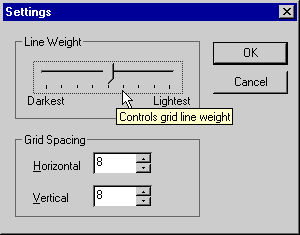
Figure 16-5. GridDemo's Settings dialog box with a ToolTip displayed.
Figure 16-6. The GridDemo application.
ChildView.h // ChildView.h : interface of the CChildView class // /////////////////////////////////////////////////////////////////////////// #if !defined( AFX_CHILDVIEW_H__A4559BAA_ABE5_11D2_8E53_006008A82731__INCLUDED_) #define AFX_CHILDVIEW_H__A4559BAA_ABE5_11D2_8E53_006008A82731__INCLUDED_ #if _MSC_VER > 1000 #pragma once #endif // _MSC_VER > 1000 /////////////////////////////////////////////////////////////////////////// // CChildView window class CChildView : public CWnd { // Construction public: CChildView(); // Attributes public: // Operations public: // Overrides // ClassWizard generated virtual function overrides //{{AFX_VIRTUAL(CChildView) protected: virtual BOOL PreCreateWindow(CREATESTRUCT& cs); //}}AFX_VIRTUAL // Implementation public: virtual ~CChildView(); // Generated message map functions protected: int m_nWeight; int m_cy; int m_cx; //{{AFX_MSG(CChildView) afx_msg void OnPaint(); afx_msg void OnOptionsGridSettings(); //}}AFX_MSG DECLARE_MESSAGE_MAP() }; /////////////////////////////////////////////////////////////////////////// //{{AFX_INSERT_LOCATION}} // Microsoft Visual C++ will insert additional declarations // immediately before the previous line. #endif // !defined( // AFX_CHILDVIEW_H__A4559BAA_ABE5_11D2_8E53_006008A82731__INCLUDED_) |
ChildView.cpp // ChildView.cpp : implementation of the CChildView class // #include "stdafx.h" #include "GridDemo.h" #include "ChildView.h" #include "SettingsDialog.h" #ifdef _DEBUG #define new DEBUG_NEW #undef THIS_FILE static char THIS_FILE[] = __FILE__; #endif /////////////////////////////////////////////////////////////////////////// // CChildView CChildView::CChildView() { m_cx = 8; m_cy = 8; m_nWeight = 4; } CChildView::~CChildView() { } BEGIN_MESSAGE_MAP(CChildView,CWnd ) //{{AFX_MSG_MAP(CChildView) ON_WM_PAINT() ON_COMMAND(ID_OPTIONS_GRID_SETTINGS, OnOptionsGridSettings) //}}AFX_MSG_MAP END_MESSAGE_MAP() /////////////////////////////////////////////////////////////////////////// // CChildView message handlers BOOL CChildView::PreCreateWindow(CREATESTRUCT& cs) { if (!CWnd::PreCreateWindow(cs)) return FALSE; cs.dwExStyle |= WS_EX_CLIENTEDGE; cs.style &= ~WS_BORDER; cs.lpszClass = AfxRegisterWndClass(CS_HREDRAW|CS_VREDRAW|CS_DBLCLKS, ::LoadCursor(NULL, IDC_ARROW), HBRUSH(COLOR_WINDOW+1), NULL); return TRUE; } void CChildView::OnPaint() { CRect rect; GetClientRect (&rect); int nShade = m_nWeight * 32; if (nShade != 0) nShade- -; CPaintDC dc (this); CPen pen (PS_SOLID, 1, RGB (nShade, nShade, nShade)); CPen* pOldPen = dc.SelectObject (&pen); int x; for (int i=1; i<m_cx; i++) { x = (rect.Width () * i) / m_cx; dc.MoveTo (x, 0); dc.LineTo (x, rect.Height ()); } int y; for (i=1; i<m_cy; i++) { y = (rect.Height () * i) / m_cy; dc.MoveTo (0, y); dc.LineTo (rect.Width (), y); } dc.SelectObject (pOldPen); } void CChildView::OnOptionsGridSettings() { CSettingsDialog dlg; dlg.m_cx = m_cx; dlg.m_cy = m_cy; dlg.m_nWeight = m_nWeight; if (dlg.DoModal () == IDOK) { m_cx = dlg.m_cx; m_cy = dlg.m_cy; m_nWeight = dlg.m_nWeight; Invalidate (); } } |
SettingsDialog.h #if !defined( AFX_SETTINGSDIALOG_H__A4559BB0_ABE5_11D2_8E53_006008A82731__INCLUDED_) #define AFX_SETTINGSDIALOG_H__A4559BB0_ABE5_11D2_8E53_006008A82731__INCLUDED_ #include "MyToolTipCtrl.h" // Added by ClassView #if _MSC_VER > 1000 #pragma once #endif // _MSC_VER > 1000 // SettingsDialog.h : header file // /////////////////////////////////////////////////////////////////////////// // CSettingsDialog dialog class CSettingsDialog : public CDialog { // Construction public: int m_nWeight; CSettingsDialog(CWnd* pParent = NULL); // standard constructor // Dialog Data //{{AFX_DATA(CSettingsDialog) enum { IDD = IDD_SETTINGDLG }; CSpinButtonCtrl m_wndSpinVert; CSpinButtonCtrl m_wndSpinHorz; CSliderCtrl m_wndSlider; int m_cx; int m_cy; //}}AFX_DATA // Overrides // ClassWizard generated virtual function overrides //{{AFX_VIRTUAL(CSettingsDialog) protected: virtual void DoDataExchange(CDataExchange* pDX); // DDX/DDV support //}}AFX_VIRTUAL // Implementation protected: CMyToolTipCtrl m_ctlTT; // Generated message map functions //{{AFX_MSG(CSettingsDialog) virtual BOOL OnInitDialog(); virtual void OnOK(); //}}AFX_MSG DECLARE_MESSAGE_MAP() }; //{{AFX_INSERT_LOCATION}} // Microsoft Visual C++ will insert additional declarations // immediately before the previous line. #endif // !defined( // AFX_SETTINGSDIALOG_H__A4559BB0_ABE5_11D2_8E53_006008A82731__INCLUDED_) |
SettingsDialog.cpp // SettingsDialog.cpp : implementation file // #include "stdafx.h" #include "GridDemo.h" #include "MyToolTipCtrl.h" #include "SettingsDialog.h" #ifdef _DEBUG #define new DEBUG_NEW #undef THIS_FILE static char THIS_FILE[] = __FILE__; #endif /////////////////////////////////////////////////////////////////////////// // CSettingsDialog dialog CSettingsDialog::CSettingsDialog(CWnd* pParent /*=NULL*/) : CDialog(CSettingsDialog::IDD, pParent) { //{{AFX_DATA_INIT(CSettingsDialog) m_cx = 0; m_cy = 0; //}}AFX_DATA_INIT } void CSettingsDialog::DoDataExchange(CDataExchange* pDX) { CDialog::DoDataExchange(pDX); //{{AFX_DATA_MAP(CSettingsDialog) DDX_Control(pDX, IDC_SPINVERT, m_wndSpinVert); DDX_Control(pDX, IDC_SPINHORZ, m_wndSpinHorz); DDX_Control(pDX, IDC_SLIDER, m_wndSlider); DDX_Text(pDX, IDC_EDITHORZ, m_cx); DDX_Text(pDX, IDC_EDITVERT, m_cy); //}}AFX_DATA_MAP } BEGIN_MESSAGE_MAP(CSettingsDialog, CDialog) //{{AFX_MSG_MAP(CSettingsDialog) //}}AFX_MSG_MAP END_MESSAGE_MAP() /////////////////////////////////////////////////////////////////////////// // CSettingsDialog message handlers BOOL CSettingsDialog::OnInitDialog() { CDialog::OnInitDialog(); // // Initialize the slider control. // m_wndSlider.SetRange (0, 8); m_wndSlider.SetPos (m_nWeight); // // Initialize the spin button controls. // m_wndSpinHorz.SetRange (2, 64); m_wndSpinVert.SetRange (2, 64); // // Create and initialize a tooltip control. // m_ctlTT.Create (this); m_ctlTT.AddWindowTool (GetDlgItem (IDC_SLIDER), MAKEINTRESOURCE (IDS_SLIDER)); m_ctlTT.AddWindowTool (GetDlgItem (IDC_EDITHORZ), MAKEINTRESOURCE (IDS_EDITHORZ)); m_ctlTT.AddWindowTool (GetDlgItem (IDC_EDITVERT), MAKEINTRESOURCE (IDS_EDITVERT)); return TRUE; } void CSettingsDialog::OnOK() { // // Read the slider control's thumb position // before dismissing the dialog. // m_nWeight = m_wndSlider.GetPos (); CDialog::OnOK(); } |
MyToolTipCtrl.h #if !defined( AFX_MYTOOLTIPCTRL_H__A4559BB1_ABE5_11D2_8E53_006008A82731__INCLUDED_) #define AFX_MYTOOLTIPCTRL_H__A4559BB1_ABE5_11D2_8E53_006008A82731__INCLUDED_ #if _MSC_VER > 1000 #pragma once #endif // _MSC_VER > 1000 // MyToolTipCtrl.h : header file // /////////////////////////////////////////////////////////////////////////// // CMyToolTipCtrl window class CMyToolTipCtrl : public CToolTipCtrl { // Construction public: CMyToolTipCtrl(); // Attributes public: // Operations public: // Overrides // ClassWizard generated virtual function overrides //{{AFX_VIRTUAL(CMyToolTipCtrl) //}}AFX_VIRTUAL // Implementation public: BOOL AddRectTool (CWnd* pWnd, LPCTSTR pszText, LPCRECT pRect, UINT nIDTool); BOOL AddWindowTool (CWnd* pWnd, LPCTSTR pszText); virtual ~CMyToolTipCtrl(); // Generated message map functions protected: //{{AFX_MSG(CMyToolTipCtrl) // NOTE - the ClassWizard will add and remove member functions here. //}}AFX_MSG DECLARE_MESSAGE_MAP() }; /////////////////////////////////////////////////////////////////////////// //{{AFX_INSERT_LOCATION}} // Microsoft Visual C++ will insert additional declarations // immediately before the previous line. #endif // !defined( // AFX_MYTOOLTIPCTRL_H__A4559BB1_ABE5_11D2_8E53_006008A82731__INCLUDED_) |
MyToolTipCtrl.cpp // MyToolTipCtrl.cpp : implementation file // #include "stdafx.h" #include "GridDemo.h" #include "MyToolTipCtrl.h" #ifdef _DEBUG #define new DEBUG_NEW #undef THIS_FILE static char THIS_FILE[] = __FILE__; #endif /////////////////////////////////////////////////////////////////////////// // CMyToolTipCtrl CMyToolTipCtrl::CMyToolTipCtrl() { } CMyToolTipCtrl::~CMyToolTipCtrl() { } BEGIN_MESSAGE_MAP(CMyToolTipCtrl, CToolTipCtrl) //{{AFX_MSG_MAP(CMyToolTipCtrl) // NOTE - the ClassWizard will add and remove mapping macros here. //}}AFX_MSG_MAP END_MESSAGE_MAP() /////////////////////////////////////////////////////////////////////////// // CMyToolTipCtrl message handlers BOOL CMyToolTipCtrl::AddWindowTool(CWnd *pWnd, LPCTSTR pszText) { TOOLINFO ti; ti.cbSize = sizeof (TOOLINFO); ti.uFlags = TTF_IDISHWND | TTF_SUBCLASS; ti.hwnd = pWnd->GetParent ()->GetSafeHwnd (); ti.uId = (UINT) pWnd->GetSafeHwnd (); ti.hinst = AfxGetInstanceHandle (); ti.lpszText = (LPTSTR) pszText; return (BOOL) SendMessage (TTM_ADDTOOL, 0, (LPARAM) &ti); } BOOL CMyToolTipCtrl::AddRectTool(CWnd *pWnd, LPCTSTR pszText, LPCRECT pRect, UINT nIDTool) { TOOLINFO ti; ti.cbSize = sizeof (TOOLINFO); ti.uFlags = TTF_SUBCLASS; ti.hwnd = pWnd->GetSafeHwnd (); ti.uId = nIDTool; ti.hinst = AfxGetInstanceHandle (); ti.lpszText = (LPTSTR) pszText; ::CopyRect (&ti.rect, pRect); return (BOOL) SendMessage (TTM_ADDTOOL, 0, (LPARAM) &ti); } |
The ToolTip control is an instance of CMyToolTipCtrl. Rather than hardcode the ToolTip text into the calls to AddWindowTool, I elected to put the text in the application's string table. String resources are identified by their resource IDs. In the calls to AddWindowTool, IDS_SLIDER, IDS_EDITHORZ, and IDS_EDITVERT are the resource IDs:
m_ctlTT.AddWindowTool (GetDlgItem (IDC_SLIDER), MAKEINTRESOURCE (IDS_SLIDER)); m_ctlTT.AddWindowTool (GetDlgItem (IDC_EDITHORZ), MAKEINTRESOURCE (IDS_EDITHORZ)); m_ctlTT.AddWindowTool (GetDlgItem (IDC_EDITVERT), MAKEINTRESOURCE (IDS_EDITVERT)); |
You can see the text associated with these resource IDs by opening the project, switching to ResourceView, and viewing the string table.
The slider and spin button controls are part of the dialog template and are programmed using CSliderCtrl and CSpinButtonCtrl member functions. The slider's range and initial position are set in OnInitDialog, and the final thumb position is retrieved in OnOK. The spin buttons' ranges are also initialized in OnInitDialog, but their positions don't have to be explicitly set or retrieved because the edit controls that the spin buttons are buddied to are served by Dialog Data Exchange (DDX) and Dialog Data Validation (DDV) routines.
Speaking of DDX and DDV: With few exceptions, MFC doesn't provide DDX routines to move data between common controls and dialog data members or DDV routines to validate input to common controls. When you use only classic controls in a dialog, you frequently don't have to override OnInitDialog and OnOK because you (or ClassWizard) can populate DoDataExchange with statements that transfer data between the dialog's member variables and its controls. When you use common controls, however, it's up to you to initialize the controls and perform data exchanges. That's why CSettingsDialog::OnInitDialog contains these statements:
m_wndSlider.SetRange (0, 8); m_wndSlider.SetPos (m_nWeight); |
And CSettingsDialog::OnOK contains this one:
m_nWeight = m_wndSlider.GetPos (); |
These statements do what DDX would have done had it been supported. (Interestingly enough, MFC 6 includes a DDX_Slider function that performs DDX on slider controls, but it's fatally flawed because it initializes a slider with a position but not a range. Try it and you'll see what I mean.) m_wndSlider is a CSliderCtrl member variable that I added to the dialog class with ClassWizard. m_wndSpinHorz and m_wndSpinVert are CSpinButtonCtrl member variables; I added them with ClassWizard as well. All three are linked to controls in the dialog via DDX_Control statements in DoDataExchange.
Because GridDemo doesn't create a logical palette with shades of gray representing the different line weight settings, the full range of line weights isn't visible on 16-color and 256-color video adapters. As an exercise, you might try adding palette support by adding a CPalette data member to the frame window and using PALETTERGB or PALETTEINDEX colors to draw the grid lines. Refer to Chapter 15 for more information on GDI palettes and MFC's CPalette class.
EAN: 2147483647
Pages: 101