Design Phase Dissected
| < Day Day Up > |
The design or prototyping stage is likely the most fun for Web designers, as it starts to bring form to the project. During this phase, both technical and visual prototypes should be developed. However, before prototypes are built, consider collecting as much content as possible. The content itself will influence the site and help guide its form. If the content is written in a very serious tone but the visuals are fun and carefree, the site will seem very strange to the user . Seeing the content up front will allow the designer to integrate the design and content. Also, consider that content collection can be one of the slowest aspects of site development. Many participants in a Web project are quick to attend brainstorming meetings but are difficult to find once their content contributions are required. Lack of content is by far the biggest problem in Web projects. Deal with this potential problem early.
Wireframes
Like the Web development process itself, visual design for a site should proceed top-down as well. Think first about how the user will enter the site and conclude with how they will leave. In most cases, this means designing the home page first, followed by subsection pages, and finally content pages and subtask pages. First, consider creating page mockups on paper in a block form commonly called a wireframe , as shown in Figure 2-3.
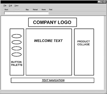
Figure 2-3: Sample wireframe
Wireframes enable designers to focus on the types of objects in the page and their organization without worrying too much about precise placement and detail of the layout itself. The wireframe approach also helps the designer make templates for pages, which makes it easier to implement the pages later on. Make sure to create your wireframe within the constraints of a Web browser window. The browser's borders can be a significant factor. Once the home page wireframe has been built, flesh out the other types of pages in the site in a similar fashion. Once a complete scenario has been detailed in this abstract sense, make sure that the path through the wireframe is logical. If it is, move on to the next phase.
Screen and Paper Comps
The next phase of design is the paper or screen prototyping phase. In this phase, the designer can either sketch or create a digital composite that shows a much more detailed visual example of a typical page in the site. Make sure that, whether you do the composite on paper or screen, a browser window is assumed and that screen dimensions are considered . A piece of paper with a browser window outline as used in the wireframe stage can be used for sketches . Sketch the various buttons , headings, and features within the page. Make sure to provide some indication of text in the page ”either a form of "greeked" text or real content, if possible.
| Note | Many designers use only temporary "lorem ipsum" or greeking text within screen composites. This approach does bring focus to the designed page elements and should certainly be used in initial comps. However, if real content is available you should eventually use it during the design phase. The more closely your composite simulates what the final result will be like, the more likely it will uncover potential problems before implementation. |
The comping stage provides the most room for creativity, but designers are warned to be creative within the constraints of what is possible on the Web and what visual requirements were presented in the design specification. Thinking about file size , color support, and browser capabilities may seem limiting, but doing so usually prevents the designer from coming up with a page that looks visually stunning but is extremely difficult to implement or downloads very slowly. In particular, resist the urge to become so artistic as to reinvent an organization's look in a Web site. Remember, the site plan will have spelled out visual requirements, including marketing constraints. The difficult balance between form, function, purpose, and content should become readily apparent as designers grapple with satisfying their creative urges within the constraints of Web technology, user capabilities, and site requirements. A typical paper comp is shown in Figure 2-4.
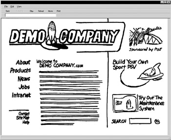
Figure 2-4: Paper comp for Demo Company site home page
In the case of a digital prototype, create a single image that shows the entire intended screen, including all buttons, images, and text. Save the image as a GIF or JPEG and load it into the Web browser to test how it would look within a typical environment. At this stage, resist the urge to fully implement your page design. You may end up having to scrap the design, and it would be wasteful to implement at this stage. Figure 2-5 shows a digital composite of the Demo Company site created in a graphics program.
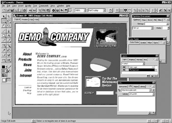
Figure 2-5: Digital composite for Demo Company site home page
Once your paper or digital prototype is complete, it should be tested with users. Ask a few users to indicate which sections on the screen are clickable and what buttons they would select in order to accomplish a particular task. Make sure to show the prototype to more than one user, as individual taste may be a significant factor in prototype acceptance. If the user has too many negative comments about the page, consider starting over from scratch. During prototyping, you can't get too attached to your children, so to speak. If you do, the site will no longer be user-focused, but designer-focused. When you finally come up with an acceptable home page design, continue the process with subpages and content pages. A typical subpage composite is shown in Figure 2-6.
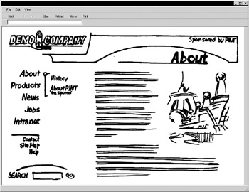
Figure 2-6: Subpage paper composite for Demo Company
In highly interactive sites, you may have to develop prototype pages for each step within a particular task, such as purchasing or download. Prototype pages for the individual steps may have to be more fully fleshed out and include form field labels and other details to be truly useful. A sample paper composite for a more interactive page is shown in Figure 2-7.
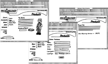
Figure 2-7: E-commerce paper composite
While not all sites will require technical prototypes, developers of highly interactive sites should consider not only interface prototypes but also working proof of concept prototypes, showing how technological aspects work, such as database query, personalization, e-commerce, and so on. Unfortunately, what tends to happen is that technical prototypes are not built until a nearly complete interface is put in place, which may result in a heavy amount of rework .
Creating the Mock Site
After all design prototypes have been finalized, it is time to create what might be called the mock or alpha site. Implementation of the mock site starts by cutting a digital comp into its pieces and assembling the pages using HTML or XHTML and, potentially , cascading style sheets. Try building the site using templates so that the entire site can be quickly assembled . However, do not put the content in place during this phase. Many of today's modern publishing tools aid in the assembly of sample pages from screen composites. For example, consider the digital home page composite of the Demo Company site shown in Figure 2-5. We then can use a tool such as Macromedia Fireworks (www.macromedia.com/software/fireworks) to "slice" the sample layout into its appropriate pieces, as shown in Figure 2-8.
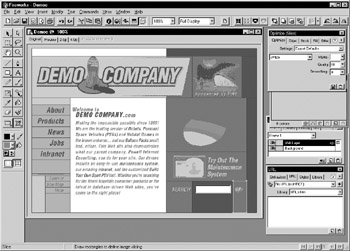
Figure 2-8: Slicing comps to build a template
| Tip | Designers should be cautious when using the HTML produced by slice and save features of applications such as Fireworks or Adobe ImageReady. These applications often produce non-standard, very complex, or difficult-to-maintain markup. |
With the various pieces that make up the home page and the various subpages of a site, a Web designer can use a Web editor to assemble the components into fully working pages lacking real content; greeking text of the form "lorem ipsum dolor sit amet" should be used to give pages form. The fully constructed mock site may lack real content, but can give developers and testers a true flavor of how the site will eventually work.
Producing the HTML
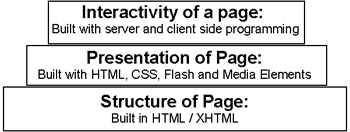
While visuals and technical elements are very important to Web design, the heart of nearly every modern Web page is still markup. Creation of HTML/XHTML should be taken very seriously as it must be a stable foundation upon which we will build presentation and interactivity.
Yet despite its importance as the page's foundation, Web designers often are more concerned with how they create HTML rather than how well they do it, or how appropriate their method of creation is. In truth, there are pros and cons to every method of HTML page creation, from hand editing of markup to the latest WYSIYWG editor. The basic methods and some of their pros and cons are presented in Table 2-2.
| Method | Example | Pros | Cons |
|---|---|---|---|
| By hand | Coding pages with Notepad | + Great deal of control over the markup | “ Slow |
| Translation | Save as HTML from another tool such as Microsoft Word | + Quick | “ Produced markup often |
| Tagging Editor | Using HomeSite | + Great deal of control | “ Can be slow |
| WYSIWYG Editor | Using Frontpage or Dreamweaver | + Works on visual representation of page | “ Often generates incorrect |
The reality of creating HTML documents is that there are occasions to use nearly every approach. For example, making a quick change of a single tag often is fastest in a pure text editor, saving out large existing print documents might make sense using a translator, precision coding of an HTML template might best be performed within a tagging editor, and building a modest site in a visual manner is easily done using a WYSIWYG editor. Always consider the applicability of the tool to the job before marrying it.
The tools change all the time, but at the time of this writing the HTML tools mentioned in Table 2-3 are popular. Certainly many tools exist ”all with their own features and benefits ”but given their use at large-scale Web firms, Dreamweaver or HomeSite is suggested for professional developers.
WYSIWYG Promises
Given the HTML creation approaches previously mentioned, many people will wonder why anyone would bother with anything other than the WYSIWYG (What You See Is What You Get) variety of tool such as FrontPage or Dreamweaver. Consider the difference between direct markup editing and visual editing shown in Figure 2-9.
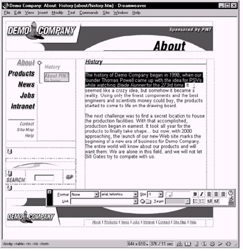
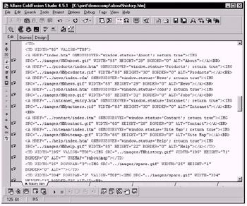
Figure 2-9: WYSIWYG editing versus direct HTML/XHTML editing
| Product | Platform(s) | URL | Comments |
|---|---|---|---|
| Dreamweaver | Windows | www.macromedia.com/software/dreamweaver | A good visual design tool that balances WYSIWYG design capabilities with code editing. Strong CSS and DHTML support. |
| HomeSite | Windows | www.macromedia.com/software/homesite | A top- notch text editor for HTML professionals. Incredible code, CSS and markup handling. The original author of HomeSite has a new product called TopStyle (www.bradsoft.com) that appears to pick up where HomeSite left off and may be more appropriate for CSS. |
| GoLive | Macintosh | www.adobe.com/products/golive | Very popular with Macintosh users, this tool has a visual designer-oriented interface. Some generated markup problems have limited its popularity with some strict standards developers. |
| FrontPage | Windows | www.microsoft.com/frontpage | Popular with the small developer and internal corporate development crowds. It has improved greatly, but still has a public reputation for generating bad or too Microsoft-specific pages. |
At first glance, it would be pretty hard to convince any pragmatic individual that direct editing of HTML markup is the way to go. While WYSIWYG page creation tools certainly hide the complexity of markup from the designer, they also don't always deliver on their promises. The reality is that these tools really are somewhat misnamed and instead ought to be called WYSIWYMG (What You See is What You Might Get) editors. Remember that the browser is the final display environment for HTML, so what a visual editor shows you might not accurately reflect what the eventual presentation might be, as shown in Figure 2-10.
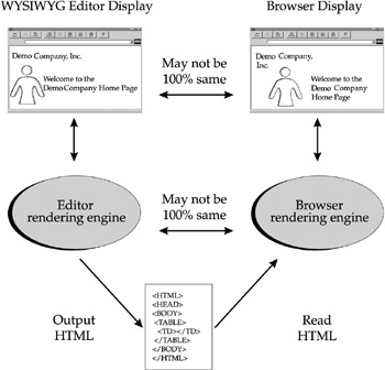
Figure 2-10: WYSIWYG editors do not always offer an accurate visual representation
Even worse than the not-quite WYSIWYG issue, many visual Web page editors have a difficult time dealing with all the various browser quirks . They often seem to introduce their own special ways of using HTML. Often, visual editors simply produce bad or, even when following standards, extremely bulky HTML.
While the ultimate promise of visual Web page editing hasn't quite panned out yet, few pundits would dare suggest that hand production of HTML is the wave of the future. Once HTML becomes more rigorous in the form of XHTML, and CSS becomes better supported, editors will find it far easier to produce quality markup. Hand editing of markup eventually will go the way of mechanical typesetting. For now though, page designers had better know HTML, XHTML, and CSS backward and forward to make sure that pages render correctly.
HTML Production Tips
Regardless of how HTML documents are constructed, special care should be taken when producing markup. Standards should be followed and a style adopted. In this book, it is always suggested to utilize the XHTML rules briefly introduced in Chapter 1 in order to make your markup as future-proof as possible. This section will summarize this approach as well as present some other tips that should lead to better HTML production.
Use Well- Formed Markup
Remember, HTML and XHTML are based on a well-defined specification. Just because a browser lets you get away with bad markup doesn't mean you should. In general, make sure that all markup is well formed ”tags closed, nested, and properly used. Quote all your attributes, lowercase your tags, and always specify a DTD line such as
<!DOCTYPE html PUBLIC "-//W3C//DTD XHTML 1.0 Transitional//EN" "http://www.w3.org/TR/xhtml1/DTD/xhtml1-transitional.dtd">
at the top of your document to indicate what version of HTML or XHTML you are using, and try to follow the rules indicated by that specification. Of course, mistakes do happen ” so make sure to validate, which is discussed next.
Validate
The benefit of validation cannot be overstated. No matter how HTML or XHTML documents are created, they should always be validated . Validation involves checking an HTML or XHTML file to ensure that it meets the appropriate specification and follows the rules previously discussed. Unfortunately, few tools actually create 100 percent correct HTML/XHTML markup and even when building HTML files by hand it is easy to make mistakes. There will be errors. Fortunately, many popular Web editors offer built-in validation. Online validation also is possible using a site such as http://validator.w3.org. The CSE Validator (www.htmlvalidator.com) is probably the best stand-alone HTML validator available. To understand the benefits of validation, consider the HTML shown here. This example has numerous errors including proprietary attribute usage, missing quotes, bad nesting, tags used in inappropriate ways, and tags that aren't closed.
<!DOCTYPE HTML PUBLIC "-//W3C//DTD HTML 4.01 Transitional//EN" "http://www.w3.org/TR/html4/loose.dtd"> <html> <head> <title> Messed <b> Up !</b></title> </head> <body bgproperties="fixed"> <h1 align="center"> Broken HTML <hr> <ul> <p> Is this <b><i> correct </b></i>?<br> <a href=HTTP://WWW.DEMOCOMPANY.COM> Visit DemoCompany </a> <pre> Should we do <b> this? </b> How about entities © ? </pre> </ul> </body> <html>
Running the page through a validator catches all the errors, as shown in Figure 2-11.
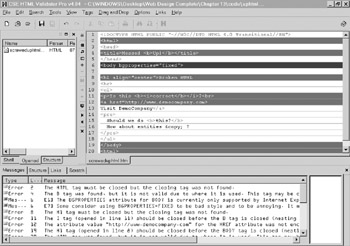
Figure 2-11: Validation catches HTML errors
Don't Mix Script, Style, and Structure
Designers should always try to keep files as simple as possible. With the inclusion of CSS and JavaScript, a web page file can get pretty huge and very complicated. Rather than intermix presentation described in CSS into a page directly, designers should link to an external style using markup such as
<link rel="stylesheet" href="styles/globalstyle.css" />
as discussed in Chapter 10. For JavaScript, files should be linked using syntax such as
<script src="scripts/validate.js" type="text/javascript"></script>
as discussed in Chapter 14 to isolate potentially complex code rather than including it in the HTML directly. By cleanly separating look and interactivity to other files, it is far easier to make changes to a page as well as potentially speed up the site because external scripts and styles are cached by the browser.
Name Well
Naming can be a troubling decision for some designers ”to use an .htm or .html file extension? There is some benefit to using .htm because it is slightly more transportable, but the reality is that it really doesn't matter. The only important thing is to be consistent. It is sad but somewhat amusing to watch developers struggle with files called index.htm and index.html in the same directory and not understand why changes are not showing up. Save yourself the aggravation and be consistent in whatever you choose. Also, make sure to use common, simple directory names in lowercase, such as /about, /products, and so on. Create simple, well-named directories for common site elements. In particular, you should create a directory for images (/images ), style sheets (/styles) , and JavaScripts (/scripts). You also might find it useful to create directories for other media types such as sound, video, and animation files if they are used in the site or even a special directory for all your error pages (/errors). Finally, consider naming graphic elements and other site components in an easy-to-understand manner. Homeheader.gif probably is a better name for an image than r1c1.gif.
Use Comments
Recall that comments can be inserted into an HTML document using <!-- and -->. Use a comment to describe difficult sections and insertions, or simply to leave a note for a future site maintainer. In particular, you might want to put comments at the start of documents indicating important information about the document, the author, and so on. For example, the following document shows how comments could be used in the head to inform document maintainers about the document:
<!DOCTYPE HTML PUBLIC "-//W3C//DTD HTML 4.01 Transitional//EN" "http://www.w3.org/TR/html4/loose.dtd"> <html> <head> <title> Demo Company Announces Butler 4.0 </title> <!-- Document Name: Butler Robot Press Release Description: The press release announcing the newest Robot Butler in the Demo Company family. Author: Thomas A. Powell (tpowell@democompany.com) Creation Date: 9/15/00 Last Updated: 9/25/02 Comments: Used SuperDuperEdit 7.0 to build the page. --> </head> <body> ... </body> </html>
Use Templates
One of the best things to consider when authoring HTML pages is not pages, but templates. Why make ten different press releases when you can create and modify a single press release template? Unfortunately, many tools and design books alike tend to take a one-page-at-a- time approach. Avoid this and create generic templates. Using a template will speed up development and make resulting pages more consistent in style and structure. Some designers are hesitant to use templates thinking that it limits design possibilities. Templates don't take the creativity out of design. In fact, using templates takes much of the tedium out of building sites, leaving the designer more time to design. In most cases, if a designer is following the rules of consistency and usability, there really are no restrictions imposed by templates.
Format for Maintenance, Crunch for Delivery
When producing markup by hand, it is a good idea to format the document in a consistent manner. For example, consider matching tags up on tab stops, using white space to separate sections of a document, and ordering attributes within tags alphabetically . Following simple formatting really can make it easier to come back later on and make changes.
On the opposite end of the spectrum, if you end up using a visual editor of some sort and never plan on looking at or editing the underlying markup, you might want to go all the way and "crunch" the page, as shown in Figure 2-12. The idea of crunching is to remove all spaces and other non-required elements such as comments from the final page. This will make the page smaller and thus faster to deliver to the user. Generally, you should use a tool such as W3Compiler (www.w3compiler.com) to do your crunching as the final step before site delivery. With this approach, you keep the original formatted files for maintenance and use the crunched pages only for delivery.
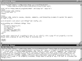
Figure 2-12: Crunch HTML/XHTML for delivery
| Note | Some Web designers may feel that nicely formatted HTML is good for people to learn from through the View Source feature in their browser. However, most of a site's customers will not care about format of the markup and will appreciate faster loading pages so crunching really is a good idea. As a developer who wants to learn by "View Source," don't worry, you can always pretty print crunched markup. |
The previous few sections discussed some of the design and production issues required to build a simple mock or alpha site. The mock or alpha site is like the frame of a house. There is much more to fill in. You still might have to add technical "plumbing" and "wiring" and finally populate your site with real content before you can release it.
| < Day Day Up > |
EAN: 2147483647
Pages: 252