7.1. Setting Up a Title Adding some text to your movie requires several setup steps: -
-
-
Specify the duration and timing . -
-
Specify the size of the lettering . -
Choose an animation direction . -
Turn on the "Over black" checkbox, if desired . -
Choose a color for the lettering . -
Here are these same steps in more detail: 7.1.1. Choose a Title Effect Start by clicking the Editing button, and then the Titles button (see Figure 7-1). The effects list and the other elements of the Titles palette appear.
Tip: If your mouse has a built-in scroll wheel, you can turn it to scroll the list of title effects, even without clicking the clicker, whenever the cursor is in the list area.
When you click an effect's name , the Monitor window springs to life to show you how the finished title will look. (Use the catalog at the end of this chapter to guide you in choosing a text effect.) You can make this preview loop, pause it, or step through it frame by frame, exactly as described in Section 6.3. Incidentally, the items in the list with flippy gray triangles next to their names aren't actually titles. They're title categories . Click a category name to expand the triangle and see what's inside, as shown in Figure 7-1.
Tip: When showing you the preview, iMovie superimposes the text over whatever Movie Track clip is currently showing in the Monitor window. Drag the Playhead anywhere you like to specify which footage you'd like to see behind this preview. (If you haven't put any clips into the Movie Track, your preview displays only a black background, as though you'd turned on the "Over black" checkbox.)
Figure 7-1. Apple has organized the list by clumping related effects into categories. To expand a title category, you don't have to click the little triangle. Instead, you can click the category name, like Bounce Across.
The proposed title text isn't very stimulating (like "My Great Movie"). Fortunately, these are quick enough to change: Click in the text box, press  -A to select all of the dummy text, and then type right over it. -A to select all of the dummy text, and then type right over it. 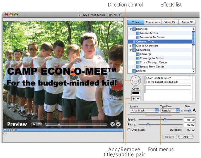
7.1.2. Type the Text Beneath the list of text effects, you'll find a place to type the actual text you want to appear in this credit, caption, or title. Just click the box once to highlight the proposed text and then begin typing. (You don't have to backspace over the factory-installed dummy text first.) The way this text box looks and acts depends on the kind of title you've selected in the list. They fall into three categories (see Figure 7-2): text blocks, title/ subtitle pairs, and pair sequences. 7.1.2.1. Text blocks When you choose the Music Video or Scrolling Block text effects, you get a simple text box, into which you can type any text you want. At the end of each line, you can press Return to create a new line or press Return twice to create a blank line, exactly as you would in a word processor. (You can use the Cut, Copy, and Paste commands in the Edit menu to edit this text, too.) The maximum amount of text you can type or paste here is just under 256 charactersone short paragraph. (See "Music Video" and "Scrolling Block" in the catalog section at the end of this chapter for more details.)
Tip: You don't have to settle for the proposed placement of the text when you choose one of the animation styles described below. By adding spaces before your text, or Returns after it, you get much more flexibility over where the text appears in the frame.For example, if you add enough spaces and Returns to your text in the Music Video effect, you can place your text virtually anywhere on the screen.
7.1.2.2. Title/Subtitle pairs When you click the names of most effects, you're shown only two narrow boxes into which you can type text, as shown in Figure 7-2 at center. Whatever you type into the top box often appears in larger typeface than the one in the bottom box. Such effects as Bounce In to Center, Centered Title, Flying Letters , Flying Words, Scroll with Pause, Stripe Subtitle, Subtitle, Typewriter, and Zoom fall into this category.
Tip: You don't have to type text into both of these boxes. In fact, most of the time you'll probably type into only the top box. The subtitle box underneath is there solely for your convenience, for those occasions when you need a second, usually smaller, line of type underneath the larger credit.
Figure 7-2. The area into which you can type your text depends on the kind of text effect you've selected. You'll be offered either two lines for a title and subtitle (top left), one big text box (middle), or a virtually unlimited number of two-line pairs (bottom right), suitable for credit sequences at the end of your movie. 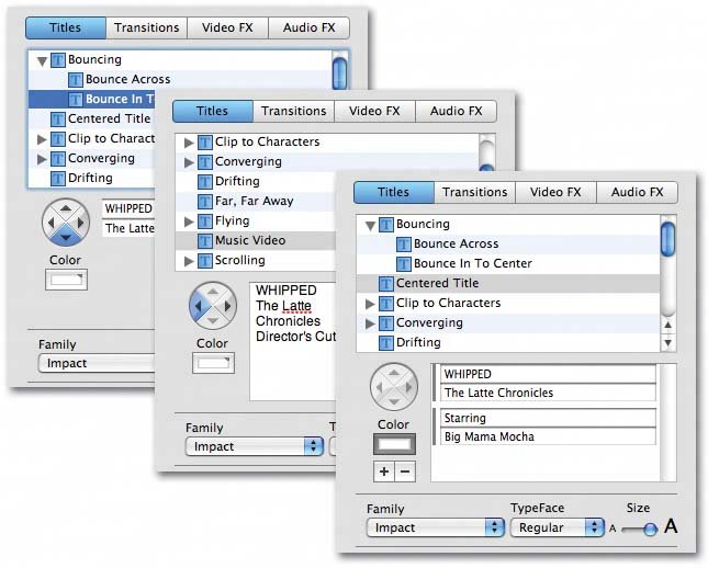
7.1.2.3. Pair sequences When you're creating the credits for the end of a movie, you usually want two columns of text: on the left, the list of roles; on the right, the actors who portrayed them. In these situations, you need iMovie to offer pairs of slotsenough to accommodate the names of everybody who worked on your movie. It's easy to spot the text effects that offer these two-line pairs because they're the ones with the words "Multiple" or "Rolling" in their names. After clicking one of these title effects, you see not one but two different text-box pairs. The window offers a scroll bar, plus a + button, so that you can add more pairs and scroll through them (Figure 7-3). Figure 7-3. You can rearrange the credits in your sequence by dragging the left edge of a credit pair up or down in the list, and waiting patiently as iMovie scrolls the list (arrow). You can also remove a credit by clicking thebutton. 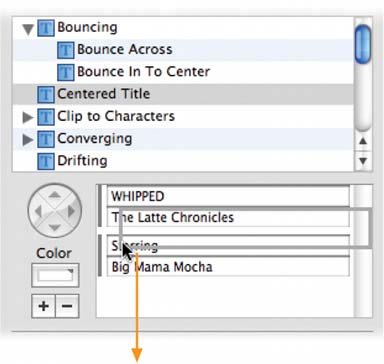
Start by clicking the top box. Drag across the dummy text ("My Great Movie"), or press a quick -A to highlight it, and then type the first character's name ( Raymond , for example). Press Tab to highlight the lower box, and then type the actor's name ( Dustin Hoffman , for example). If there's another empty pair of boxes beneath the one you've just filled, press Tab again, and fill in those boxes, too. Don't worry, you'll know when you've filled up all the available boxes: You'll either discover that you can't scroll down any more, or that when you press Tab, you'll circle around and wind up in the first box you filled in. At that point, click the + button beside the text boxes to add another pair of boxes. Keep going this wayclicking +, typing a pair of names, clicking + againuntil you've typed in the names of everybody you want in the list of credits. 7.1.3. Specify the Timing You have a lot of control over the timing of your titles' animation. Most of the title styles offer two sliders just below the Preview screen: -
The Speed slider has different results with different titles. Setting a faster Speed setting makes the Centered Title fade in/out faster, Flying Words fly faster, Typewriter types faster, and so on. For title styles involving motion, it controls the text speed; for title styles that remain still (such as Centered Title), it controls the total amount of time the text spends onscreen. The catalog of title styles at the end of this chapter identifies the Speed slider's effect for each style. -
The Pause effect depends on the style, too. For titles that fade in and out, it controls the amount of time the text will be fully manifested onscreen, readable and at full size and brightness, between its fade in and fade out segments. For titles whose text flies or rolls into place (such as Typewriter or Flying Words), Pause controls how long the finished title hangs around after it's complete. As you adjust these sliders, the Duration readout below them shows you, in the seconds: frames format, the total time you'll have text on the screen (fade in/fade out plus pause-to-read time).
Tip: When precision counts, don't use the sliders. Instead, edit the numbers in the text boxes to their right (these numbers are in seconds:frames format).
Take into account your viewers ' reading speed. There's only one thing more frustrating than titles that fly by too quickly to read, and that's titles that sit there on screen forever, boring the audience silly. Many video editors use this guideline: Leave the words onscreen long enough for somebody to read them aloud twice.
Note: Not all of the effects offer a Pause slider. Drifting, Music Video, the Rolling Credits effects, and the Subtitle effects, for example, have no motion/pause sequence to speak of. Either they move steadily or they don't move at all.In these cases, the time readout is affected only by the Speed slider and simply means, "Total time onscreen."
7.1.4. Choose a Font Using the Family and TypeFace pop-up menus just below the list of effects, you can choose a font for your text. Consider these guidelines: -
Be consistent . Using the same typeface for all of the titles in your movie lends consistency and professionalism to the project. -
Remember the QuickTime effect . If you plan to distribute your finished movie as a QuickTime filean electronic movie file that you can distribute by email, network, CD, disk, or Web pageuse the biggest, boldest, cleanest fonts you have. Avoid spindly delicate fonts or script fonts. When your movie is compressed down to a 3-inch square, what looks terrific in your Monitor window will be so small it may become completely illegible. (Look at each illustration in the catalog discussion at the end of this chapter. If the text is hard to read there, you won't be able to read it in a small QuickTime movie either.) Come to think of it, you might want to choose big, bold, clean fonts even if you're going to play the finished movie on a TV whose resolution is far lower than that of your computer screen. Be especially careful when using one of the text effects that includes a subtitle, as iMovie subtitles often use an even smaller typeface than the primary title font, and may lose legibility if the font has too much filigree. Finally, favor sans serif fontstypefaces that don't have the tiny serifs , or "hats and feet," at the end of the character strokes. The typeface you're reading now is a serif font, one that's less likely to remain legible in a QuickTime movie. The typeface used in the Tip below is a sans serif font.
Tip: Some of the standard Mac fonts that look especially good as iMovie fonts are Arial Black, Capitals, Charcoal, Chicago, Gadget, Helvetica, Impact, Sand, Techno, and Textile.Some of the fonts whose delicate nature may be harder to read are Monaco, Courier, Old English, Swing, Trebuchet, Times, Palatino, and Verdana.
The beauty of iMovie's titling feature is that the fonts you choose become embedded into the actual digital picture. In other words, when you distribute your movie as a QuickTime file, you don't have to worry that your recipients might not have the same fonts you used to create the file. They'll see on their screens exactly what you see on yours. 7.1.5. Specify the Size of the Lettering iMovie is extremely conservative with its font-size choices. Even with the Size slider (just to the right of the font pop-up menus) all the way to the right, iMovie doesn't let you make titles that fill the screen. (Keeping your text short may help. If the phrase is very long, iMovie further reduces the point size enough to fit the entire line on the screen, even if the type-size slider is at its maximum. In other words, you can make the font for the credit PIGGY much larger than you can ONE HAM'S ADVENTURES IN MANHATTAN .) If you feel hemmed in by the font-size limitations, consider using a still-image "title card" with text as large as you like, as described in Section 9.1. 7.1.6. Choose an Animation Direction Most of iMovie's text effects are animated. They feature words flying across the screen, sliding from one edge of the frame to the other, and so on. Some feature directional arrows (seen in Figure 7-1, for example) that let you control which direction the text flies or slides in. By clicking the appropriate arrow, you can specify which direction the text should fly. (The directional controls are dimmed and unavailable for other text effects.)
Note: In the case of the Music Video effect, the arrow specifies which corner the text block should sit in, motionless.
The catalog of text effects at the end of this chapter identifies those that offer a direction control, and what it does in each case. 7.1.7. The "Over Black" Checkbox Under normal circumstances, the text you've specified gets superimposed over the video picture. Particularly when you're creating opening or closing credits, however, you may want the lettering to appear on a black screena striking and professional looking effect. In those cases, turn on the "Over black" checkbox. It's important to note that when you do so, you add to the total length of your movie. Adding the "Over black" title is like inserting a new clip, in that you force the clips to the right of your text effect to slide further rightward to accommodate the credit you just inserted. (When the "Over black" checkbox isn't turned on, adding a text effect doesn't change the overall length of your movie.) The "Over black" option is attractive for three reasons. First, it looks extremely professional; it's something people who don't have an editing program like iMovie can't even do. Second, the high contrast of white against black makes the text very legible. Third, the audience will read it, instead of being distracted by the video behind it.
Tip: You don't have to limit yourself to adding text over black; you can just as easily superimpose your titles over blue, over red, or over fuschia. The trick is to create a colored clip as described in Section 5.8.1, and add your titles to it . In that case, do not turn on "Over black", since you want your lettering to float on top of the existing video, which happens to be a solid, unchanging color.
Figure 7-4. When you hand-build a title using a graphics program like Photoshop Elements or AppleWorks, you lose the ability to animate the words and letters. The results can be much more interesting than plain white text on a black background, yet less distracting than text superimposed over footage.
Another option is to just add color bars (lower left) to make people think you really work in 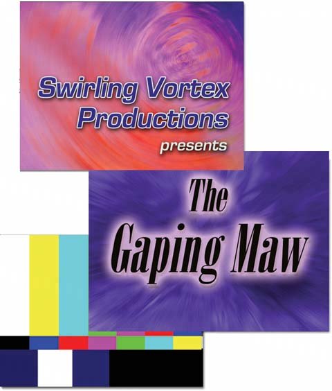
7.1.8. Choose a Color for the Lettering By clicking the tiny square beside the word Color, you get a little dialog box known as the Mac OS X Color Picker. (The box in Section 7.1.9 describes it in detail.) For now, the important thing is to choose a color that contrasts with the footage behind the lettering. Use white against black, black against white, yellow against blue, and so on.
Note: iMovie doesn't limit you to TV-safe colors. But be careful. If colors are too bright ( saturated ), the edges of the letters can smear and tear when played back on a TV.
7.1.9. Add a Backdrop If you left your education to the Apple online help, you might assume that there are only two kinds of images that can underlie your titles: video footage or a solid black frame. Fortunately, there's a third option that greatly expands your creative possibilities: superimposing your text on a still image, such as a photo or some gradient fill you've created in, say, Photoshop Elements.
Tip: One of the still backgrounds you can download from the "Missing CD" page at www.missingmanuals.com is called Color Bars. It lets you begin and end your movie with the standard, broadcast-TV color bar chart like the one shown (in shades of gray) at lower left in Figure 7-4. In professional video work, about 20 seconds of color bars are always recorded at the beginning of a tape. They give the technicians a point of color reference for adjusting their monitors and other reproduction equipment to ensure that the footage looks the same on their gear as it did on yours. Their goal is to adjust the knobs until the white bars look white, not pink, and the black ones don't look gray.If you intend your movie to be used for TV broadcast, the color bars may actually be required by the station. If not, the color bars make your homemade production look and feel as though you edited it in a $600-per- hour New York editing facility.
To use one of these backdrops, import it into your project as you would any graphics file, as described in Section 9.1. That discussion also explains how to control the length of time a still image appears in your movie. From there, you should have little difficulty superimposing titles as described in this chapter. |