| Although Calc can produce professional-looking graphs from your spreadsheet data, you don't need to know a lot about graphing and charting unless you want to create extremely sophisticated graphs. Instead, you'll simply tell Calc what data you want to see in the chart and select the type of chart you want Calc to produce, and Calc does the rest. Before You Begin  50 Fill Cells with Data 50 Fill Cells with Data
See Also  68 Insert Graphics into a Spreadsheet 68 Insert Graphics into a Spreadsheet
Table 9.1 describes each of Calc's chart types. Different charts reflect different kinds of data. If you create one chart and realize it's not the best type of chart to use, you can request that Calc switch to a different type. Table 9.1. Calc Chart Options | Chart Type | Description | | Area | Emphasizes the magnitude of changes over time. | | Bar | Compares data items. A bar chart is a column chart with horizontal lines. | | Column | Shows changes over time and compares values. A column chart is a bar chart with vertical bars. | | Line | Shows trends and projections. | | Net | Puts in each category an axis that radiates from the center of the graph (useful for finding the data series with the most penetration, as needed in market research statistical studies). | | Pie | Compares the proportional size of items against the parts of the whole. | | Stock | Illustrates a stock's (or other investment's) high, low, and closing prices. | | XY (Scatter) | Shows relationships of several values in a series. |
 NOTE  | Calc supplies 3D versions of these chart types for use when you must chart data in multiple time periods or from multiple perspectives. |
KEY TERM  | Data series ” A single group of data that you might select from a column or row to chart. Unlike a range, a data series must be contiguous in a row or column with no empty cells in between. |
-
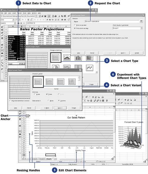
Select Data to Chart
You must first tell Calc exactly what you want to chart. To do this, you must select one or more data series to use in the chart. A data series might consist of a time period such as a week or year. One person's weekly sales totals (from a group of several salespeople's weekly totals) could form a data series. Some charts only graph a single series, such as a pie chart, whereas other charts can graph one or more data series, such as a line chart.
When you select a data series, include labels if available next to the series. Calc can use those labels on the chart itself to label what is being charted.
-
Request the Chart Select Insert, Chart from the menu to display the AutoFormat Chart dialog box. Calc analyzes your selected data and automatically puts that range in the Range text box (using an absolute range reference, including the sheet name ). If you decide to use a different range, either type the range in the Range box or click the Shrink button to select a different range before clicking the Shrink button once again to restore the AutoFormat Chart dialog box and continuing with the chart. TIP  | Calc will display the chart you build next to the data in the current sheet. If you would prefer the chart to appear in a sheet by itself, click the Chart results in worksheet option and select a different sheet. Doing so keeps your data and chart separated into different sheets. | Calc will probably have already checked either the First row as label option or the First column as label option. In doing so, Calc wants to use either the first row or column in your selection for the labels on the data points that will be graphed. If you don't want labels, or if your selected data series doesn't include labels, click to uncheck either of these options. If you selected multiple data series, you still could select the row or column that precedes the series to be used for the labels. Click Next to continue with the chart building so you can select the type of chart you want to build. TIP | | During the chart-building process, you can generate the chart immediately without having to click Next to run through each of the possible steps. Click Create at any point to generate the chart with the options you've selected so far. | -
Select a Chart Type
Scroll through the various charts offered and select the chart you wish to build. The preview area updates as you select different chart types to give you a good idea of what your chart will look like. Use the preview area to determine as early as possible the best chart type for the data series you selected. For example, if you selected only a single data series, such as 12 monthly gross sales figures, you would want to select a simple chart type and most likely a line chart. The line will show the direction and trend of the sales over the year. A chart type that compares multiple data series against others, such as an area chart, would make little sense when charting a single series.
Click the Next button once you've selected a chart type.
-
Select a Chart Variant Each chart type includes several variables . You'll now want to choose one of those variants that displays your selected data the best. You may also want to hide or display grid lines on both axes of the chart, or only on one or the other. As you select from the options and variants, Calc updates the preview to show you what your chart will look like. Click Next to continue building the chart. Calc displays one more dialog box where you enter a title for your chart, indicate if you want a legend to display, and type labels for the two (or three, depending on whether the chart is a regular 2D or a 3D chart) chart axes. KEY TERM | | Legend ” Tells a chart's audience what series each colored line or bar represents. | -
Edit Chart Elements
Once Calc displays your chart (next to the data or in its own sheet, depending on your selection when you built the chart), you are free to edit any and all the elements in the chart. By double-clicking the title, for example, you can change the title. The resizing handles that appear when you click the chart enable you to resize the chart to any proportion you prefer. The chart's anchor appears anytime you select the chart, in case you want to move the chart or delete it (by moving or deleting the anchor).
-
Experiment with Different Chart Types
When first mastering the nuances of Calc's charting capabilities, start with a single data series to get a feel for the charting dialog boxes and to learn the terminology. Then, you can experiment with charting additional data series within the same chart to make data comparisons that sometimes are easier to study in chart form as opposed to lists of numbers inside a large worksheet.
|