Creating a Form by Hand
| Choose Insert, Form to add a form element to a Web page. Forms are made up of the following elements:
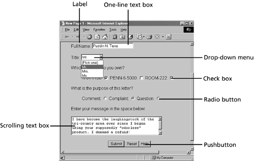
Figure 40.8 shows all of these elements on a Web page, except for pictures. Figure 40.8. Elements of a form. Create a new Web page and add any of these form elements to it. When you add your first form element to the page, FrontPage creates a form border and puts the element within this border. It also adds two extra elements:
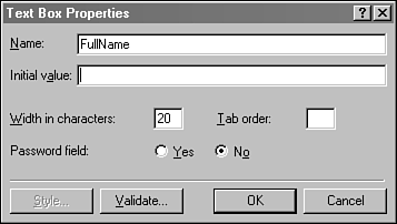
These two buttons are placed at the bottom of a form, but you can move them anywhere within the form's border. All information that is collected on a form must come from elements located within its border in Page view. This border is used only for that purpose, and it does not show up when the page is displayed in a browser. Form elements can be arranged within a border, just like anything else on a Web page. You can put them into tables, add pictures, and other things, as long as the form elements stay within the border. You can add additional forms to a page by dropping form elements outside of a border. FrontPage will automatically border the elements and add Submit and Reset buttons. Add Text BoxesText boxes enable the visitor to enter keyboard input on a Web page ”a single line in a one-line box, and an unlimited number of lines in a scrolling box. Add a text box to a form by choosing Insert, Form, Text Box, and remember to place the text box within the form's border. FrontPage assigns it a default width that approximates the number of characters that can be displayed in the box. More characters can be entered, but they won't all appear within the box. Scrolling text boxes also have a default number of lines that are displayed. FrontPage also gives each box a default name and value, just as is does with all other form elements. To change these things after the element has been added to a page, double-click it to bring up the Text Box Properties dialog box, shown in Figure 40.9. Figure 40.9. Editing a text box. Every form element should be given a descriptive name that explains its purpose. This name will be used when the element's information is transmitted, and it also can be used by a scripting language such as JavaScript to get the element's value. The name given to a form element should contain only alphanumeric characters and the underscore character ( _ ). If you use anything else, such as spaces, FrontPage will warn you that the form might not work correctly in a browser. If you give a text box an initial value, it will appear when the form is first loaded or the Reset button is clicked. This can be used to give the text box a default value. For instance, the Internal Revenue Service could put a default value of 100 in the Percentage of Your Income To Pay This Year in Taxes text box. Taxpayers would have to edit this initial value to pay less than 100 percent of their income in federal tax. Select the password field option to hide all input entered into a one-line text box. Asterisks will appear in place of what's really being typed as a way to protect against snoops . Add a second one-line text box to a form and select the password field option for that element. Although asterisks appear in that box when you type into it, the real text you're typing will be sent when the form is submitted. Add LabelsA label is text that describes the purpose of another form element. Since elements are often used to answer questions, labels are used to actually ask the questions. To add a label to a form, begin by typing the text for the label. This text should be on the same line as the form element it's associated with. Enter the text of a label next to a one-line text box, and then highlight both of the text and the form element and choose Insert, Form, Label. A border will appear around the text to indicate that it's now a label. Turning text into a label makes it easier for people to use a form. In many cases, they can click the label in addition to the form element. Clicking a check box's label is the same as clicking the check box, for instance.
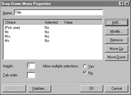
Add Radio Buttons and Check BoxesRadio buttons and check boxes are form elements that have only two possible values: selected or not selected. You can set these elements to either value when the page is first loaded. A check box appears with a check mark if it's selected and appears empty otherwise . Each box is given a name and a value ” ON by default ”that is sent for each selected check box when the form is transmitted. One way to use check boxes would be to ask people what political parties they voted for in the past decade . There could be check boxes for the Republican, Democratic, Libertarian, and Reform parties. Between 0 and 4 boxes could be checked, depending on how often the person jumped across party lines at the ballot box. An appropriate value for these boxes would be YES , because it's only transmitted for boxes that are selected. A radio button is a circle that has a dot in it if it's selected. You group radio buttons together by giving each of them the same name, which should also contain only alphanumeric characters and underscores. Add a check box and a series of radio buttons to a form by choosing Insert, Form, Check Box and Insert, Form, Radio Button, respectively. Only one radio button can be selected in any group, so if you select one of them, the others will all be deselected. This is where the name radio buttons comes from ”buttons on a car radio function the same way, limiting you to one station at any time. The value given to a radio button should describe what selecting the button means. Consider radio buttons with the group name CustomerSatisfaction and the labels Ecstatic , Happy , Undecided , Displeased , and Enraged . These labels could also be used as values for the buttons ”so if someone picks the Enraged button, CustomerSatisfaction will be transmitted with a value of Enraged . Add Drop-Down MenusDrop-down menus serve a similar purpose to radio buttons: They enable the user to choose from several possible responses. However, instead these possible choices being divided into buttons, they're placed in a menu. Drop-down menus also differ in another way ”they can be configured to allow more than one choice to be selected. When you add a drop-down menu to a form, it doesn't have any possible responses. You add these responses by editing the menu. Double-click it to open the Drop-Down Menu Properties dialog shown in Figure 40.10. Figure 40.10. Editing a drop-down menu. The Add button is used to add new responses to the menu. Each response has a Choice value that will appear on the menu, and the Selected value is transmitted with the form unless you specify an alternative. The default behavior of a drop-down menu is to allow one choice to be selected and to display the menu on a single-line when it isn't being used. Both of these things can be changed in the Properties dialog box ”double-click the form element to make these changes. After you've added all possible responses to a drop-down menu, you can rearrange them with the Move Up and Move Down buttons.
Add Pushbuttons and PicturesPushbuttons are form elements that look just like the Submit and Reset buttons incorporated into every FrontPage form. If you delete the Submit or Reset buttons from a form, you can put them back by inserting a pushbutton for each and editing its properties. Otherwise, there isn't a way to use a pushbutton to transmit a value without writing your own interactive programs in a scripting language such as JavaScript. Pushbuttons can be associated with hyperlinks , so you can add them to a form as links to other pages. One possible use: a Help button that loads a page describing how to use the form. Pictures on a form, which are added by choosing Insert, Form, Picture, are used for two purposes:
A picture element is placed on a form as a FrontPage imagemap component. This component, unlike other imagemaps, requires a Web server that includes FrontPage Server Extensions. When the picture is clicked, the form is submitted with some extra information: the exact location on the picture where it was clicked. Neither FrontPage nor its server extensions do anything with this location information. Because of that, the only thing you can do with a picture label is use it as an alternate submit button ”if your server has FrontPage extensions.  |
EAN: 2147483647
Pages: 474