What Makes a Good UI?
| Many software companies spend large amounts of time and money researching the best way to design the user interfaces for their software. They use special usability labs run by ergonomic specialists. The labs are equipped with one-way mirrors and video cameras to record exactly how people use their software. Everything the users (subjects) do from what keys they press, how they use the mouse, what mistakes they make, and what confuses them is analyzed to make improvements to the UI. You may be wondering what a software tester could possibly contribute with such a detailed and scientific process. By the time the software is specified and written, it should have the perfect UI. But, if that's the case, why are there so many VCRs blinking 12:00? First, not every software development team designs their interface so scientifically. Many UIs are just thrown together by the programmerswho may be good at writing code, but aren't necessarily ergonomics experts. Other reasons might be that technological limitations or time constraints caused the UI to be sacrificed. As you learned in Chapter 10, "Foreign-Language Testing," the reason might be that the software wasn't properly localized. In the end, the software tester needs to assume the responsibility of testing the product's usability, and that includes its user interface. You might not feel that you're properly trained to test a UI, but you are. Remember, you don't have to design it. You just have to pretend you're the user and find problems with it. Here's a list of seven important traits common to a good UI. It doesn't matter if the UI is on a digital watch or is the Mac OS X interface, they all still apply.
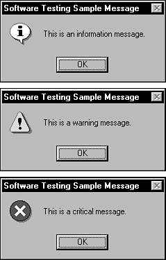
If you read a UI design book, you may also see other traits being listed as important. Most of them are inherent or follow from these seven. For example, "easy to learn" isn't listed above, but if something is intuitive and consistent, it's probably easy to learn. As a tester, if you concentrate on making sure your software's UI meets these criteria, you'll have a darn good interface. Each trait is discussed in detail in the following sections. Follows Standards and GuidelinesThe single most important user interface trait is that your software follows existing standards and guidelinesor has a really good reason not to. If your software is running on an existing platform such as Mac or Windows, the standards are set. Apple's are defined in the book Macintosh Human Interface Guidelines, published by Addison-Wesley, also available online at developer.apple.com/documentation/mac/ HIGuidelines/HIGuidelines-2.html. Microsoft's are in the book Microsoft Windows User Experience, published by Microsoft Press, with the online version at msdn.microsoft.com/library/default.asp?url=/library/en-us/dnwue/html/welcome.asp. Each book goes into meticulous detail about how software that runs on each platform should look and feel to the user. Everything is defined from when to use check boxes instead of an option button (when both states of the choice are clearly opposite and unambiguous) to when it's proper to use the information, warning, and critical messages as shown in Figure 11.1. Figure 11.1. Did you ever notice that there are three different levels of messages in Windows? When and how to use each one is defined in the user interface standards for Windows.
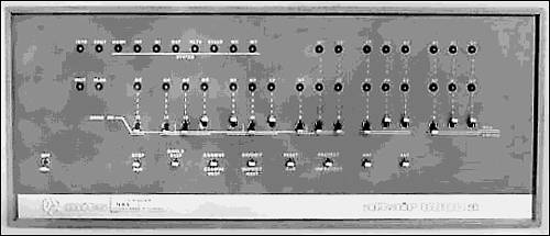
NOTE If you're testing software that runs on a specific platform, you need to treat the standards and guidelines for that platform as an addendum to your product's specification. Create test cases based on it just as you would from the product's spec. These standards and guidelines were developed (hopefully) by experts in software usability. They have accounted for a great deal of formal testing, experience, and trial and error to devise rules that work well for their users. If your software strictly follows the rules, most of the other traits of a good UI will happen automatically. Not all of them will because your team may want to improvise on them a bit, or the rules may not perfectly fit with your software. In those cases, you need to really pay attention to usability issues. It's also possible that your platform doesn't have a standard, or maybe your software is the platform. In those situations, your design team will be the ones creating the usability standards for your software. You won't be able to take for granted the rules that someone else has already figured out, and the remaining traits of a good user interface will be even more important for you to follow. IntuitiveIn 1975 the MITS (Micro Instrumentation Telemetry Systems) Altair 8800 was released as one of the first personal computers. Its user interface (see Figure 11.2) was nothing but switches and lightsnot exactly intuitive to use. Figure 11.2. The MITS Altair 8800 and its less-than-intuitive user interface. (Photo courtesy of the Computer Museum of America, www.computer-museum.org.)
The Altair was designed for computer hobbyists, people who are a lot more forgiving of user interface issues. Today, users want much more out of their software than what the Altair 8800 provided. Everyone from grandmothers to little kids to Ph.D.s are using computers in their daily lives. The computers with the most intuitive UIs are the ones that people don't even realize they're using. When you're testing a user interface, consider the following things and how they might apply to gauging how intuitive your software is:
ConsistentConsistency within your software and with other software is a key attribute. Users develop habits and expect that if they do something a certain way in one program, another will do the same operation the same way. Figure 11.3 shows an example of how two Windows applications, which should be following a standard, aren't consistent. In Notepad, Find is accessed through the Search menu or by pressing F3. In WordPad, a very similar program, it's accessed through the Edit menu or by pressing Ctrl+F. Figure 11.3. Windows Notepad and WordPad are inconsistent in how the Find feature is accessed.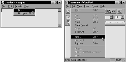 Inconsistencies such as this frustrate users as they move from one program to another. It's even worse if the inconsistency is within the same program. If there's a standard for your software or your platform, follow it. If not, pay particular attention to your software's features to make sure that similar operations are performed similarly. Think about a few basic items as you review your product:
FlexibleUsers like choicesnot too many, but enough to allow them to select what they want to do and how they want to do it. The Windows Calculator (see Figure 11.4) has two views: Standard and Scientific. Users can decide which one they need for their task or the one they're most comfortable using. Figure 11.4. The Windows Calculator shows its flexibility by having two different views.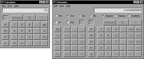 Of course, with flexibility comes complexity. In the Calculator example you'll have a much larger test effort than if there's just one view. The test impact of flexibility is felt most in the areas covered in Chapter 5, "Testing the Software with Blinders On," with states and with data:
ComfortableSoftware should be comfortable to use. It shouldn't get in the way or make it difficult for a user to do his work. Software comfort is a pretty touchy-feely concept. Researchers have spent their careers trying to find the right formula to make software comfortable. It can be a difficult concept to quantify, but you can look for a few things that will give you a better idea of how to identify good and bad software comfort:
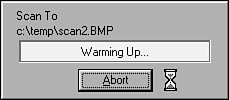
CorrectThe comfort trait is admittedly a bit fuzzy and often can be left to interpretation. Correctness, though, isn't. When you're testing for correctness, you're testing whether the UI does what it's supposed to do. Figure 11.6 is an example of a UI that isn't correct. Figure 11.6. This software has a completely useless Abort button.
This figure shows a message box from a popular page-scanning program for Windows. The box appears when a scan is started and is supposed to provide a way for the user to stop the scan mid-process. Unfortunately, it doesn't work. Note that the cursor is an hourglass. An hourglass means (according to the Windows standard) that the software is busy and can't accept any input. Then why is the Abort button there? You can repeatedly click the Abort button during the entire scan, which can take a minute or more, and nothing happens. The scan continues uninterrupted until it completes. If clicking the Abort button with the hourglass cursor did stop the scan, would that be a bug? You bet it would! Correctness problems such as this are usually obvious and will be found in your normal course of testing against the product specification. You should pay attention to some areas in particular, however:
UsefulThe final trait of a good user interface is whether it's useful. Remember, here you're not concerned with whether the software itself is useful, just whether the particular feature is. A popular term used in the software industry to describe unnecessary or gratuitous features is dancing bologna. Think of a sausage bouncing around on the screencompletely unnecessary! When you're reviewing the product specification, preparing to test, or actually performing your testing, ask yourself if the features you see actually contribute to the software's value. Do they help users do what the software is intended to do? If you don't think they're necessary, do some research to find out why they're in the software. It's possible that there are reasons you're not aware of, or it could just be dancing bologna. Those superfluous features, whether they be in a solitaire program or a heart monitor are bad for the user and mean extra testing for you. |
EAN: 2147483647
Pages: 233