6.13. Color Balance
| < Day Day Up > |
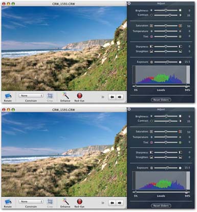
6.12. Brightness and Contrast SlidersOnce you've massaged the Exposure and Levels controls, the overall exposure for a picture usually looks pretty good. In effect, you've managed to create a full range of tones from dark to light. So why, then, does Apple include Brightness and Contrast sliders, which govern similar aspects of your photo's appearance?
Reason #1: They've always been part of iPhoto, and millions of people are used to them. Reason #2: They're not quite the same as Exposure and Levels. 6.12.1. BrightnessWhen you move the Brightness slider, you're making the entire image lighter or darker . You're literally sliding the entire histogram to the left or right without changing its shape (Figure 6-9). (Remember that the Exposure and Levels controls affect the midtones, highlights, and shadows independently.) In other words, if the picture's contrast is already exactly as you want it, but the whole picture could use darkening or lightening, Brightness should be your tool of choice. 6.12.2. ContrastThe Contrast slider, on the other hand, does change the shape of the histogram. Contrast is the difference between the darkest and lightest tones in your picture. If you increase the contrast, you "stretch out" the shape of the histogram, creating darker blacks and brighter whites. When you decrease the contrast, you're scrunching the shape of the histogram inward, shortening the distance between the dark and light endpoints. Since the image data now resides in the middle area of the graph, the overall tones in the picture are duller. Photographers might call this look "flat" or "muddy." |
| < Day Day Up > |