| Buttons are interactive links on a menu that let viewers play content like video or a slide show, or jump to other menus. Studio supplies an album of buttons, and you can convert any ungrouped object to a button. Once you add a button to a title, it magically becomes a menu. Like titles, menus can be either full screen or overlays displayed over an underlying video track. Studio's Title editor is a great place to produce attractive, custom menus, but you can also choose from an extensive range of customizable menus on the Disc Menus tab of the Album, accessible from the Edit menu. The easiest way to get started is to use the supplied templates, described in "Using Menu Templates" in Chapter 12, which also describes how to link content to buttons. The current chapter focuses exclusively on the mechanics of menu creation. To add a button to a title 1. | In the Title editor, do one of the following:
- Click the Buttons icon at the left of the Title Editor Album (Figure 10.68).
Figure 10.68. Time to start authoring! Step 1: open the Buttons Album. 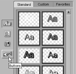
- From the Studio menu, choose Title > Album > Buttons.
Studio opens the Buttons Album.
| 2. | Drag the desired button into the Design window (Figure 10.69).
Figure 10.69. Drag the button from the Buttons Album to the Design window. 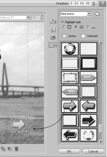
Studio inserts the button into the title.
|
 Tip Tip
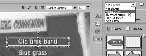
To convert an object to a button 1. | Select the object that you want to convert and click the gray bounding box to display the control points (Figure 10.70).
Figure 10.70. Or convert any menu object text, ellipse, rectangle, image to a button. Start by clicking the object. Note that it's "Not a button" in the button selection tool. 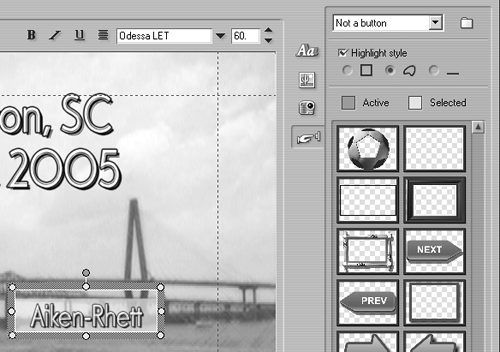
| 2. | At the top of the Buttons Album, open the drop-down menu (Figure 10.71).
| 3. | Choose Normal Button.
Studio converts the text to a button and highlights it with the default-selected color (Figure 10.72). When you return to the Menu view, you'll see that the Menu track is now active, and that the label M1, for Menu 1, appears at the top of the menu (Figure 10.73). Congratulations; you're now authoring a DVD!
Figure 10.72. After converting text to a button, Studio highlights it with the default-selected color. This is the faint shadow you see beneath the highlighted text. 
Figure 10.73. Adding a button converts a title to a menu. Now the Menu track is activated, and Menu 1 (M1) is in place. 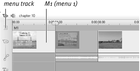
|
To set a highlight style for a button 1. | Select the button that you want to modify and click the gray bounding box to display the control points (Figure 10.72).
| 2. | At the top of the Buttons Album, choose one of the following highlight styles (Figure 10.74):
- Follow Shape: Makes the highlighting follow the object's shape.
- Box: Displays a box around the button.
- Underline: Underlines the button.
Figure 10.75 shows the styles.
Figure 10.75. Here's what the three highlight styles look like when applied to a title. It's tough to see in this grayscale image, but the differences will be clear once you start to experiment. 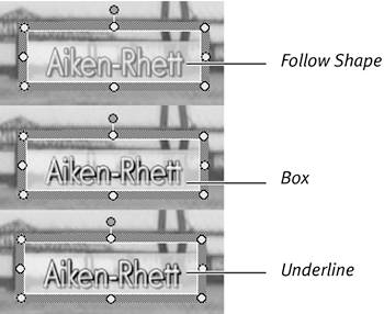
Figure 10.74. Buttons can have three highlight styles, shown here. 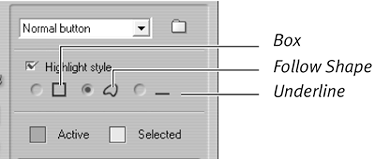
|
Tip
A Taxonomy of Buttons As you can see in the drop-down menu in Figure 10.71, Studio has the following four button types: Normal Button: Links to a video, slide show, or another menu. Thumbnail Button: Links to a video or slide show and displays a thumbnail inside the button (usually shaped like a frame). Next Button: Links to the next menu page. Appears on all but the final page of multi-menu productions automatically created by Studio from menu templates. Previous Button: Links to the previous page. Appears on the second and subsequent pages of multi-menu productions automatically created by Studio from menu templates. If you're building your own menus one by one, always select either the Normal or Thumbnail Button option, even when creating links to previous or next pages. Use the Previous and Next Button options only when you're creating menu templates for auto-completion by Studio (see "Creating DVD Menu Templates" later in this chapter). Studio uses these buttons to enable navigation between menus that it automatically creates from these templates. |
To set active and selected colors 1. | Select the button that you want to modify and click the gray bounding box to display the control points (Figure 10.72).
| 2. | At the top of the Buttons Album, choose the color box next to the state (Active or Selected) that you want to change (Figure 10.76).
Figure 10.76. You can customize the highlight color for the active or selected state. 
Studio's Color Selection dialog box opens (Figure 10.77).
Figure 10.77. Once again, the Color Selection dialog box. 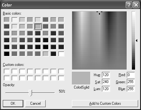
| 3. | Choose the desired color by selecting it from the Basic Colors or Custom Colors palette or by clicking a different color on the spectrum.
| 4. | If you want, save your custom color by clicking the Add to Custom Colors button (Ctrl+A).
Saving your custom color helps you maintain uniformity as you work.
| 5. | Click OK to close the dialog box.
|
|