Creating Your Captioning Standard
| < Day Day Up > |
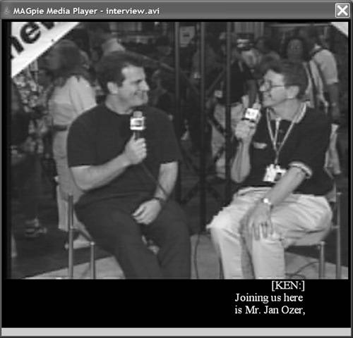
| There are few absolute right or wrong precedents in captioning; what's most important is to be consistent in how captions are created and applied. Before creating your first closed-captioned text, you should define the conventions you'll use to produce your closed captions. I'll cover a list of decisions to consider when creating your captioning standards, along with some suggested approaches. In formulating these standards, I relied heavily on the standards and practices used by the Media Access Group at WGBH in Boston, the world's first captioning agency. The people there have been delivering accessible media to disabled adults, students, and their families, teachers, and friends for more than 30 years. Certain areas I address are largely paraphrased from materials from the Media Access Group, with the group's gracious permission. You can find the Media Access Group's excellent captioning the guide at http://main.wgbh.org/wgbh/pages/mag/services/captioning/faq/sugg-styles-conv-faq.html#copy. The most detailed captioning guide I found (with help from Judy Harkins at Gallaudet University's Technology Access Program) was produced by the Captioned Media Program (CMP) of the National Association of the Deaf, which can be found at www.cfv.org/caai/nadh7.pdf. If you're looking for one document that contains highly detailed recommendations for nearly all caption-related questions (and why wouldn't you?), this is it. The CMP's style guide incorporates consumer research performed by the Technology Access Program at Gallaudet University and summarized at tap.gallaudet.edu/nsi_recom.htm. This link contains a great document for understanding the philosophy behind the CMP practices and procedures. Another resource addressing a variety of captioning issues, including closed captioning tools, is Gary Robson's FAQ, found at www.robson.org/capfaq. For a general perspective on the practices followed by several captioning services, check out Joe Clark's article in Print magazine, "Typography and TV Captioning." Though originally published in 1989, it's still a great (and relevant) read, and can still find it online at: www.joeclark.org/design/print/print1989.html, and other valuable material from Joe at www.joeclark.org/access/captioning. Step 1: How Many LinesThe first decision you'll make in defining your captioning standard is how many lines of captions. Television captions tend to be three or four lines, while most Hollywood DVD titles tend to use two lines. Most streaming producers also use two lines. Some companies, such as the Media Access Group, add a third line at the top of the caption to identify the speaker (Figure 11.1). Unless you have a strong reason to choose otherwise, two lines of text is probably a good place to start. More on the speaker identification issue later. Figure 11.1. Two lines of text plus a separate line to identify the speaker. Step 2: Which Captioning Technique?There are three styles used to make captions appear and disappear from the screen:
Paint-on appears to be the preferred approach for movies and other nonlive media, and is the only approach sanctioned by the Captioned Media Program. If you choose Roll-up captions, most of the rules identified next apply, except that two "greater than" symbols should appear before each new speaker. For example, the text in Figure 11.1 would appear as follows: >> KEN: Joining us here is Mr. Jan Ozer. Sometimes in newscasts, three "greater than" symbols are used to indicate a change from one story to another. Step 3: Tips on Text SegmentationLet's step back for a minute and consider what's actually happening when you convert a script or transcribed speech into captions. Most conversations involve a give and take between two or more individuals. Sometimes a comment from one might be a single word like "yes" or "no." Sometimes a response can be three or four sentences long, involving dozens of words. Irrespective of the length of the speaker's comments, during captioning we break them down into their most comprehensible chunks. One very relevant chunk is the number of lines within a caption. If you choose two-line captions, this means that all dialog must be subdivided into chunks of two lines each. However, each line must also be limited to a certain number of characters for optimum readability. For example, the Captioned Media Program requires a maximum of 32 characters per line a hard limit due to the limitations in television displays. While streaming and DVD formats have more flexibility, you should try to average between 30 and 35 characters per line, including spaces. So to recap, you must subdivide all speech into two-line chunks, each containing approximately 30 to 35 characters per line. It doesn't matter if you're captioning Rhett Butler's famous last words in Gone With the Wind ("Frankly, my dear...") or the Presidential State of the Union address; you've got to break it down in the same way. At a high level, when dividing up your text, understand that people don't read letter by letter or even word by word, they read in chunks of words, or phrases. For this reason, captions are most readable when divided into logical phrases, both within the two lines in a caption and from caption to caption. I've illustrated this in Table 11.1.
The phrasing on the right violates both rules; there's poor phrasing within Caption 1 (breaking up a name) and between Captions 1 and 2 (breaking up a title). If you read both versions out loud, you'll instantly see that the first column reads much more naturally. "If it sounds like good phrasing, it probably is good phrasing" is the general approach, but for some truly definitive rules, go to page 10 of the Captioned Media Program document I referenced earlier. Column 2 (right) violates another rule of segmentation: a period should always end a caption (though not all captions have to end with periods). Specifically, in Caption 2, where the first sentence ends with "Magazine," the next sentence should start a new caption, as it does on the left. Here's what we've learned from this section (with one additional point):
Now that you have your text divided into captions, it's time to decide how to present the text. Step 4: Choose Your Font and CaseTypically, when it comes to print or static (onscreen) text, fonts with serifs, such as Times New Roman, are more readable than sans serif fonts, and words are more recognizable, since most books and magazines use fonts with serifs. The Media Access Group recommends using the Roman font, and Times New Roman is the most similar font installed on most computers. However, some research indicates that sans serif fonts work better for closed captions than fonts with a serif (there's more information on this at www.joeclark.org/access/captioning/bpoc/typography.html). According to Gallaudet officials, in their experience sans serif fonts are more readable. The Captioned Media Program appears to share this view, as it chose Helvetica Medium, a sans serif font, as its standard. All in all then, sans serif fonts are probably the best choice. As discussed in Chapter 5, text with mixed capitals and lowercase lettering is easier to read than all uppercase text, and therefore the recommended practice for streaming media and DVDs. If you think that recommendation differs from most television captions, you're correct, and here's why. Most closed-caption decoders on TV sets can't display the below-the-line segments of letters such as j, g, q, and y (also called descenders). Instead, they display the entire letter above the line, producing a distracting appearance that decreases legibility. That's why television uses all caps. Streaming technologies and DVDs don't have these limitations, so you're free to use the more readable mixed-case lettering. Step 5: Choose Your Font SizeFont sizes vary by captioning program, making it impossible to recommend a specific font size. In general, larger fonts are obviously more readable, but if your font is too large, your caption will wrap to the next line, or extend outside the viewing area. There are also stylistic elements to consider. For example, PBS programs tend to use very small but elegant captions that torture my 40-something eyes (for example, see www.pbs.org/wgbh/nova/). Those shown on the Web site of the National Center for Accessible Media (part of the Media Access Group) are much larger and much more readable (see, for example, http://ncam.wgbh.org/richmedia/examples/92.html). My recommendation is to prioritize readability over elegance. In deciding what font size to use, preview your options within your target player. MAGpie was a fantastic tool, but the appearance of the font size within its preview window didn't always accurately represent what ultimately appeared in the player. Step 6: Define Text Placement and Speaker IdentificationHere we'll discuss where to place your captions within (or underneath) the screen, and how and when you announce your speaker. As you would suspect, placement of text, in certain situations, can provide strong clues as to who is speaking. For this reason, in Figure 11.1, the text is positioned on the right, underneath the interviewer, Ken Santucci. This leads us to Rule Number One in caption placement; if there are two consistently placed speakers, place captions beneath their respective positions. Note that under television rules, both captions, irrespective of placement, would be left-justified. However, since many streaming formats can't display left-justified text on the right side of the screen, you should right-justify text placed on the right, and left-justify text placed on the left. If there's only one speaker, place the caption in the center of the screen and center-justify the text. In addition, if the speaker is off-screen, include the name or identification of the speaker, place the caption in the screen center and center-justify the text. You should also identify the speaker whenever the viewer has no clear visual clues as to their identity. For example, if the video starts up and an off-screen narrator begins to speak, you should identify the speaker as narrator. If your interview has a J-cut, where the audio from the second video starts playing while the first video remains onscreen (see Chapter 5), you should identify the speaker. If there are multiple on-screen speakers in a fast-paced discussion, consider identifying the speaker in all captions. Alternatively, since most speakers talk for longer than one or two captions, consider identifying the speaker only when the speaker changes. As speaker identification is not spoken information, typically it's set off from the main captioning in some way. For example, in Figure 11.1, the speaker identification is positioned on its own line, in all caps, placed in brackets, and set off with a colon, which is the practice of the Media Access Group. The Captioned Media Program uses italics or brackets, with no colon, and also positions the title on its own line. In contrast, PBS, in its closed-captioned streaming videos, uses all caps offset with a colon, on the same line as the first line in the caption, which looks like this: KEN: Joining us here is Mr. Jan Ozer. Gallaudet's recommendation is prescient in this regard. "If the character cannot be identified by name, then a descriptor should be provided," he states. "An acceptable format for explicit identification is the character's name or descriptor in upper/lower case, surrounded by parentheses, above the caption and left-justified with the caption. Other formats are probably uncontroversial." Basically, pick one approach, and apply it consistently. Let's break these rules down for easy scanning:
There's one real-world caveat to these rules: not all players and/or closed-captioned tools can create or implement left-justified, right-justified, and centered captions. For example, because of alignment problems encountered when playing closed-captioned streams in Windows Media Player, the Media Access Group modified MAGpie to produce only left-placed captions. In addition, RealPlayer can only display left and center-aligned captions (though, of course, you could right-justify the text using space or tab commands). In fact, the only streaming player that properly implemented our speaker-placement strategy was QuickTime. Positioning within a DVD stream was a little more straightforward, and should be feasible in most authoring programs. Still, before selecting a caption-positioning strategy, test to ensure that all development tools and/or players comply with the strategy. Step 7: Define Rules for Noises and Other Points of EmphasisAs we've discussed already, closed captions must describe a broad range of audio events to enhance the viewer's comprehension of the video. As with speaker identifications, these audio events need to be visually different from the spoken information. The Media Access Group recommends showing sound-effect captions parenthetically, in lowercase italics (but don't italicize the parentheses), typically presented as a standalone caption. In the context of our interview footage, which was shot during the hustle and bustle of a trade show, captions included the one shown in Figure 11.2, displayed as the video is fading in from black at the start. This lets the viewer know that we're shooting in a crowd, and you should identify both the source of the noise and the noise itself. Figure 11.2. Captioning audio events. You can use these same indicators to describe the intonations that flavor the speech. In the interview, Ken and I were swapping stories, and he recalled a joint presentation where the equipment setup went less than smoothly. I laughed, and commented, "What a mess that was!" This would be captioned as shown in Figure 11.3. It's also appropriate to caption emotion (e.g., angry frown, deep in thought, daydreaming) even if there is no accompanying speech. Figure 11.3. Captioning the speaker's intonation. The styles shown in Figures 11.2 and 11.3 are from the Media Access Group. The Captioned Media Program recommends brackets instead of parenthesis, and places on-screen noises and intonations in normal case, and off-screen noises in italics. It's acceptable to use onomatopoeia, or text strings that sound like the noise being described, though Gallaudet University found that most consumers preferred both a text description and onomatopoeia. These would appear as follows: (dog growling) Grrrrrrr, or (putt drops into cup) Kerplunk! In addition to noises and sound effects, consider identifying other information that's apparent in the audio but not in the text description. This would include accents (e.g., French accent), audience reaction (laughing, loud boos) and the pace of speech (slow drawl). Step 8: Choose Your Music TreatmentMusic often sets the mood of the video, so when background music is present, it should be indicated. Television sets use a special musical note character to identify music playing, or when someone is singing, but the character is not universally recognized by all streaming media players. If it's not available to you, use the word music in italics surrounded by either parenthesis (Media Access Group) or brackets (Captioned Media Program). If the music has no lyrics, be as descriptive as possible (soothing music, disco music) and identify the name and the composer if known. Caption the lyrics if they are being sung, starting and ending with the special music character. Step 9: Editing the TextThe goal with captions is to present them with the actual spoken word, but some people talk faster than others can read. In these instances, it's accepted practice to edit the text to achieve a certain reading speed. In this regard, the Captioned Media Program guide presents some very interesting statistics about reading rates along with very clear guidelines. Specifically, the guide states that most elementary or secondary students can read at 120 words per minute (wpm), and adults up to 160 wpm. For Captioned Media Program videos, the guide requires that "no caption should remain onscreen less than 2 seconds or exceed 235 wpm." When editing the text, the Media Access Group advises that caption producers "try to maintain precisely the original meaning and flavor of the language as well as the personality of the speaker. Avoid editing only a single word from a sentence as this doesn't really extend reading time. Similarly, avoid substituting one longer word for two shorter words (even write a shorter word for a longer word) or simply making a contraction from two words (e.g., contracting 'should not' to 'shouldn't')." Note that virtually all style guides recommend against modifying for correct English (substituting "isn't" for "ain't," or "you all" for "y'all"). Finally, if you find yourself having to shorten major sections of speech to meet your desired wpm rate, page 14 of the Captioned Media Program style guide offers some great guidelines. Step 10: Other IssuesThe first nine steps covered the main issues, but there are many additional standards to address. Two of the most common include:
For others, such as fractions, dates, dollar amounts, and more, consult the Captioned Media Program style guide. |


| < Day Day Up > |
EAN: 2147483647
Pages: 110
- Linking the IT Balanced Scorecard to the Business Objectives at a Major Canadian Financial Group
- Measuring and Managing E-Business Initiatives Through the Balanced Scorecard
- A View on Knowledge Management: Utilizing a Balanced Scorecard Methodology for Analyzing Knowledge Metrics
- Technical Issues Related to IT Governance Tactics: Product Metrics, Measurements and Process Control
- Governance Structures for IT in the Health Care Industry