Lighting Fundamentals
| < Day Day Up > |
| As you've seen, the mechanics of three-point lighting are fairly simple. However, unless you know what kind of lights to set up and why, your results will be suboptimal, if not downright disappointing. Here's what you need to know. Your Camera Doesn't "See" As Well As Your EyesJust because your eyes can perceive details in a shot, doesn't mean that your camera can. Video is definitely not a What You See Is What You Get affair. This reality causes problems primarily in scenes with "high-contrast" lighting in other words the very significant differences between the brightest area in the shot and the darkest. Typically, you get excessive contrast when you're shooting a subject with extremely bright lights in the background, whether produced by the sun or a spotlight. When you're looking at the scene with your eyes, you can see good detail at both extremes because your eyes have a contrast range of around 1,000:1. This compares to a contrast range of about 250:1 for the best video cameras, approximately 64:1 for cameras in the Sony VX2000 or Canon XL1 class, and as low as 30:1 in consumer camcorders. Without getting too technical, this means that while your eyes will be able to perceive detail at both the darkest and lightest extremes, your video camera will not. This is why the left side of my face lost detail in the key light-only image in Figure 3.2. Simply stated, the contrast range between the darkest and lightest regions was too dramatic. If too much lighting contrast exists in your scene, you have no good choices. If your exposure favors the darker area, the more lighted areas become washed-out blobs with no detail. If you adjust exposure to favor the lighter areas, darker regions turn completely black, and show no detail. Use an average exposure and you'll lose both extremes. Interestingly, the "spotlight" or "backlight" control found on most camcorders doesn't really fix the problem. Rather, it simply tells the camera to ignore the bright background, and choose the best exposure for the face. While this restores some facial detail, you lose detail in the background, usually causing it to look slightly washed out. Spotlight and backlight controls are a great solution when you can't manage the lighting, but when you can, it's better to reduce the contrast range to acquire good detail and color throughout the scene. Application
All Lights Have a Different Color TemperatureLet's start with two fairly common situations to explain what this means: Situation 1: You're shooting indoors, using sunlight streaming in from a window as your key light, and a lamp in the room as a fill light. Situation 2: You're shooting indoors, lighting the scene primarily with fluorescent lights in the office ceiling, using an incandescent lamp to reduce facial shadows. Now, as they say in law school, what result and why? Situation 1 is hopeless, and your subject's face will be either blue or orange. Same result in Situation 2 (unless you're very lucky), except that the face will be either overly green or orange. Now, the why. Simply stated, white is not "white" under all types of light. As shown in Figure 3.5, different lights produce slightly different coloring on the Kelvin scale, named after renowned Scottish physicist Lord Kelvin. The bottom of the scale, between 2,000 and 3,000K, occupied by candles, and incandescent (normal light bulbs) and tungsten (shop lights and many pro lighting fixtures) sources is slightly orange, and generally considered one of the "warm tones." At the other end of the spectrum is the bluish color produced by the blue sky, and generally considered one of the "cool tones." In between is the noon sun and "cool, white" fluorescent light bulbs. Figure 3.5. Color temperature and Color Rendering Index for common lighting types.The mere existence of this scale may surprise many readers. After all, our eyes see "white" irrespective of the color of the light. As it turns out, however, this is a case where our brain overrules our eyes. We see white paper, poster board, or other objects that we know are white, and our brain tells us they are white. Unfortunately, video cameras aren't that smart; you have to tell them what is white; and you do this when you set the camera's white balance. Most video cameras have at least two white balance settings: one for outdoors, which assumes that the prevailing light is slightly bluish, and one for indoors, which assumes that the light is tinted slightly orange. In both instances, the camera corrects for the prevailing tint and makes white objects white. In addition, most prosumer and all professional cameras have a manual white balance control; this obviously adds great flexibility when you're shooting somewhere between daylight and incandescent light say, under cool, white fluorescent bulbs. However, if you have two light sources with conflicting color temperatures, white balance doesn't help, and the colors on some part of your image will be distorted. Now, back to our scenarios. In the first scenario, you're mixing sunlight (5,600K) with an incandescent lamp (3,000K). If the white balance is set to indoors, the portion of the face lighted by the sun through the window will be blue. If it's set to outdoors, the portion of the face lighted by the indoor lamp will appear slightly orange. The second scenario is more interesting. First, recognize that today's fluorescent bulbs have much more range color-wise, so just because you're using fluorescent lighting doesn't doom your subjects to a sickly green coloring. Second, while you can buy "cool white" fluorescents that produce light in the 4,000K range, you can also buy warmer lights that output close to the 2,700 to 3,000K produced by incandescent bulbs. If the color output of your incandescent and fluorescent bulbs match, you've eliminated the white balance issue, and picture quality should be good. While color temperature values are seldom listed on a bulb's packaging, stores such as Lowe's often provide this information at the point of sale, and it's generally available on the manufacturer's Web site. I'll describe how to avoid problems in both scenarios in the Problem Solving section. Application
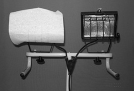
The Color Rendering Index (CRI)In addition to the color temperature of common lighting types, Figure 3.5 also shows the Color Rendering Index (CRI) of these lights. Briefly, CRI is a measure of how accurately the light portrays color, with 100 being ideal. Lights in the 60 to 65 range can make people and objects appear washed out, while lights in the 80 to 100 range bring out the colors. The difference is too subtle to detect on the grayscale pages of this book, but General Electric has comparison shots posted at www.gelighting.com/na/institute/quality.html. If you browse around the web site, you'll find it's a solid resource for additional information on lighting temperature and CRI. Scan the lighting racks at Lowe's or Web sites such as www.bulbs.com and you'll see that lights with higher CRIs cost a bit more. But in my experience they're well worth it. Hard Versus Soft LightingHard light is light transmitted from a lighting source in sharp, parallel rays that produce hard edges and dark, clearly defined shadows. Typically, hard light sources produce high quantities of light from a very compact space, accompanied by lots of heat, which causes problems in many environments. The sun is a classic "hard light," as are unfrosted incandescent light bulbs and spotlights. In Figure 3.6, I used a hard light to produce the shot on the left. In addition to producing a slight shine on my forehead, the hard lighting produces significant contrast between the bright, right side of my face, and the left side, cast in dark shadows. This is the same effect we saw in the key light-only image in Figure 3.2. Without the fill light to minimize the shadows, details become lost in the darker regions of the frame. Figure 3.6. Hard lighting on the left creates contrast; soft lighting on the right is more even. Look at the effect the soft light has on the right in Figure 3.6. As you can see, it produces even lighting across my face and over the background, and minimal shadows. This makes soft light your only real choice for flat lighting, and for lighting backgrounds for chromakeying. (I'll explain chromakeying later.) You can produce soft light (at least) three ways. First, you can use lights that are naturally softer, such as fluorescent lights. Second, you can "bounce" a hard light off of a light surface, such as a bounce card, which removes the hard edge, but typically requires either another person to hold the card or a dedicated stand. Finally, you can install a diffuser, as shown on the left in Figure 3.7, over a hard light source, as shown on the right in the figure. I'll cover both bounce cards and diffusion kits in the upcoming Lighting Toolset section. For now, note that diffusers are pieces of cloth or other material that disperse the harsh light from a tungsten or incandescent source, converting hard light to soft light. In this instance, I used a cloth sheet from a Rosco diffusion kit that cost about $30 at Wolf Camera. Applied over one lamp of the $35 tungsten shop light I bought at Lowe's, it produces good, even lighting that can't be beat in terms of bang for the buck. Figure 3.7. Halogen shop lights with a diffusion sheet on the left. Many television stations such as CNN are moving to fluorescent lights, which produce soft light and run much cooler than incandescent lights. The downside is that you need many more bulbs to create the same light as hard light sources such as the tungsten halogen lighting they are replacing. This makes fluorescent a great option for permanent studios, but less attractive for portable lighting. If you need to move your lights around, consider a hard light source such as tungsten or incandescent converted to soft light via a bounce card or diffuser. Finally, while soft light is very flattering in many "people" shots; it can obscure detail in product or object-oriented shots. If you plan to shoot both objects and people, you'll probably need both hard and soft light sources. Application
Defining "Good Lighting"With this as background, let's briefly touch on what constitutes good lighting. In this regard, I find a quick review of Maslow's hierarchy very instructive. Briefly, Maslow's hierarchy defines a range of human needs: from food, water, and sleep (physiological) to self-actualization. According to Maslow, human beings can't address higher-level needs until the more basic needs are satisfied. Lighting has a similar hierarchy. It's lovely to consider how different lighting schemes can create moods or convey emotions, but in most business or academic shoots, our needs are much simpler. Here is my hierarchy of good lighting:
|

| < Day Day Up > |
EAN: 2147483647
Pages: 110
- ERP System Acquisition: A Process Model and Results From an Austrian Survey
- Enterprise Application Integration: New Solutions for a Solved Problem or a Challenging Research Field?
- Distributed Data Warehouse for Geo-spatial Services
- Intrinsic and Contextual Data Quality: The Effect of Media and Personal Involvement
- Relevance and Micro-Relevance for the Professional as Determinants of IT-Diffusion and IT-Use in Healthcare